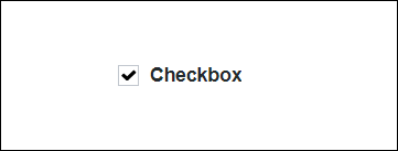
Checkbox Widget (Themable)
The Checkbox widget enables you to add a checkbox to your mashup and allow a user to select the checkbox option.
 |
The Checkbox widget is available as a standard widget in the platform and as a web component that can be imported from an SDK.
|
The properties of the checkbox widget are listed below.
|
Property Name
|
Description
|
Base Type
|
Default Value
|
Bindable? (Y/N)
|
Localizable? (Y/N)
|
||
|---|---|---|---|---|---|---|---|
|
State
|
Enables you to set the state of the checkbox widget, as selected or not selected.
|
BOOLEAN
|
False
|
Y
|
N
|
||
|
Disabled
|
Use this property to disable the checkbox widget in the mashup. The widget is displayed but you cannot click it in the mashup.
|
BOOLEAN
|
False
|
Y
|
N
|
||
|
PartialState
|
Enables you to have a parent checkbox in a partially checked state,  . . |
BOOLEAN
|
False
|
Y
|
N
|
||
|
Label
|
The text that is displayed in the widget near the checkbox.
|
STRING
|
Checkbox
|
Y
|
Y
|
||
|
CustomClass
|
Enables you to define the CSS to the top div element of the widget. Multiple classes can be entered, separated by space.
|
STRING
|
n/a
|
Y
|
N
|
||
|
LabelMaxWidth
|
Enables you to set a maximum width for the label and the label is displayed in multiple lines when the maximum width is reached.
|
NUMBER
|
n/a
|
N
|
N
|
||
|
TabSequence
|
The sequence in which widgets are highlighted when a user presses Tab key.
|
NUMBER
|
n/a
|
N
|
N
|
||
|
Changed
|
The event that is triggered when the state of this widget is modified.
|
n/a
|
n/a
|
Y
|
N
|
||
|
ResetToDefaultValue
|
Resets the inputs for this widget to its default values.
|
n/a
|
n/a
|
Y
|
N
|
||
|
Width
|
The width of the widget. The width is set to the width of the label by default. Enter a value in the property panel or resize the widget in the canvas to set a fixed width.
|
NUMBER
|
n/a
|
N
|
N
|
||
|
Height
|
The height of the widget. The height is set to the maximum width of the label by default. It increases if the widget has multiline label. Enter a value in the property panel or resize the widget in the canvas to set a fixed height.
|
NUMBER
|
n/a
|
N
|
N
|
||
|
TooltipField
|
Sets a tooltip text that is displayed when you hover over the widget.
|
STRING
|
n/a
|
Y
|
Y
|
||
|
TooltipIcon
|
Sets an icon image for the tooltip of the widget.
You can add an image or specify an image URL path.
|
MEDIA ENTITY
|
n/a
|
N
|
N
|
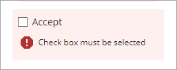
Validating the Checkbox Widget State
You can use the TrueRequired property to force users to select the check box at run time. Use the RequiredMessage property to set the failure message when the check box is not selected.
For more information about the validation properties, see Applying Validation to Widgets.
The following table lists the available validation properties on the Validation panel in ThingWorx 9.3.4 or later.
Property | Description | Base Type | Default Value | Bindable (Y/N) | Localizable (Y/N) | ||
|---|---|---|---|---|---|---|---|
CriteriaMessage | The message to display for the validation criteria and when the validation fails. | STRING | n/a | Y | Y | ||
CriteriaMessageDetails | The details to display for the validation criteria and failure message. | STRING | n/a | Y | Y | ||
RequiredMessage | The message to display when selection is required and the check box is not selected. | STRING | Check box must be selected | Y | Y | ||
ShowValidationCriteria | Shows a hint message about the required input when editing the check box. | BOOLEAN | False | Y | N | ||
ShowValidationFailure | Show a failure message when the entered value fails the validation. | BOOLEAN | False | Y | N | ||
ShowValidationState | A bindable service that enables you to display the validation state before a user interacts with the widget at run time. By default, the validation state is only displayed after user interaction.
| Service | n/a | In | N | ||
ShowValidationSuccess | Show a success message when the entered value is validated as successful. | BOOLEAN | False | Y | N | ||
SuccessMessage | The message to display when the validation is successful. | STRING | n/a | Y | Y | ||
SuccessMessageDetails | A secondary message that displays more information about the validation success message. | STRING | n/a | Y | Y | ||
Validate | An event that is triggered when the widget value is changed. Bind this event to service or function to apply a validation pattern or expression. | event | n/a | Y | N | ||
ValidationCriteriaIcon | Select an SVG icon to display within the hint message for the validation criteria. | IMAGELINK | info | N | N | ||
ValidationFailureIcon | Sets the SVG icon to display within the status message when the validation fails. | IMAGELINK | error | N | N | ||
ValidationOutput | Retrieves the output of the widget validation. Returned values are Undefined,Unvalidated ,Valid , orInvalid. | STRING | n/a | Y | N | ||
ValidationState | A bindable property that sets the validation state. You can set this property to Undefined, Unvalidated, Valid, Invalid. | STRING | Undefined | Y | N | ||
ValidationSuccessIcon | Select an SVG icon to display within the message when the validation succeeds. | IMAGELINK | success | N | N | ||
TrueRequired | Require an item in the list to be selected. | BOOLEAN | False | Y | N |