Grid Widget
Use the Grid widget to inspect, view, and analyze data from an infotable source. Each infotable column in the data source is displayed as a column on the Grid.
The following configurations are available in ThingWorx 9.4.2 or later:
• Trigger a ServiceInvokeCompleted event on the data service when expanding nodes in a tree grid.
The following configurations are available in ThingWorx 9.4 or later:
• Display custom actions on the grid toolbar.
• Highlight new rows that are added to the grid.
• Configure the ShowRowNumbers property dynamically.
The following configurations are available in ThingWorx 9.3.7 or later:
• Keep the selected row IDs when the grid is paginated and the page is changed.
The following configurations are available in ThingWorx 9.3.6 or later:
• Trigger an event instead of opening a URL when a hyperlink is clicked. For example, you can pass link data and navigate to a mashup.
The following configurations are available in ThingWorx 9.3.4 or later:
• Bind child data to create a hierarchal tree grid with multiple levels of parent and child data.
• Set the maximum number of rows that users can expand at run time.
• Migrate legacy dynamic configurations from advanced grids.
• Expand rows automatically by specifying the ID of a row in a service.
• Disable parent rows and their children.
• Configure the selection behavior of the focus box when using keyboard navigation.
• Configure the visibility and icons of validation messages on the Validation panel.
The following configurations are available in ThingWorx 9.3 or later:
• Enable editing on a grid, row, or cell level.
• Resize and reorder columns at run time.
• Display a run-time menu that enables users to show, hide, and reorder columns on the grid.
• Define validation rules and messages to validate input when editing is enabled.
• Display row number in a separate column.
• Set a minimum and a maximum width for the grid columns.
• Configure the widget dynamically using JSON configuration data.
 |
You must update the output of existing data services for the Grid (Advanced) widget to JSON.
|
• Add a footer section.
• Display a confirmation message when deleting rows. This configuration is available in ThingWorx 9.3.1 or later.
The following is a list of available configurations in ThingWorx 9.2:
• Format data columns using renderers and apply state formatting.
• Sort column data in a descending or an ascending order.
• Filter data using a filter box.
• Align content within the header and body cells.
• Display a check box for row selection.
• Set the column width automatically or manually using pixel, percentage, or fraction values.
• Display the header and body rows as a single line and prevent text wrapping.
• Set the minimum and maximum height of the grid rows.
• Select single or multiple rows on the grid.
In addition, you can combine the Grid with other widgets such as the Pagination, Chip Based Data Filter, and the Toolbar to create unique and interactive data views within a mashup.
|
|
The Grid widget is also available as a web component in the ThingWorx Web Component SDK.
|
Performance Considerations
The Grid widget supports large data sets that contain millions of rows. However, displaying millions of rows impacts load time performance, and makes it difficult to find and analyze information. Following are best practices for the Grid widget:
• Avoid creating data tables with millions of rows.
• Set appropriate minimum and maximum row height to display data rows in an accessible way.
• Use pagination to break large sets into multiple pages and allow users to control how many rows to display on each page.
Grid Widget Anatomy
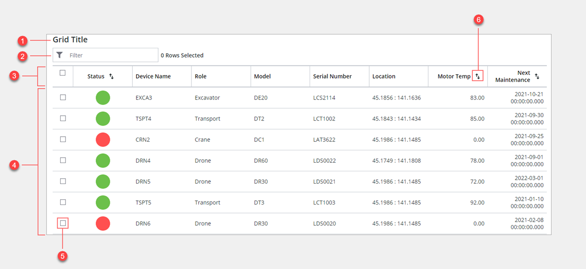
1. Title
2. Grid filter area
3. Header row
4. Body rows
5. Row selection check box
6. Column sort button
Keyboard Keys
Key | Grid | Tree Grid |
|---|---|---|
TAB | Change the focus box to highlight the main grid elements, such as the filter, selection check boxes, and sort buttons in the header. | Change the focus box to highlight the main grid elements, such as the filter, selection check boxes, and sort buttons in the header. You can configure the focus using the Focus |
Arrow keys | Use the UP, DOWN, LEFT, and RIGHT arrow keys to change the focus vertically or horizontally. | RIGHT — Expands the focused row. LEFT—Collapses the focused row. UP and DOWN—Moves to the next and previous focused row or cell. |
HOME END | Focus on the first or last cell in the current row. | Focuses on the first or last cell or row. |
PAGE UP PAGE DOWN | Focus on the first or last visible cell in the current column or row. | Focus on the first or last visible cell or row in the current grid view. |
SPACE ENTER | Trigger a RowClicked event or select the current row when row selection is enabled. | Expands or collapses parent rows. |
The following table lists the properties of the Grid widget that are available in ThingWorx 9.4.4 and 9.3.14 or later:
Property Name | Description | Base Type | Default Value | Bindable | Localizable |
|---|---|---|---|---|---|
DoubleClicked | An event that triggers when the widget is double-clicked in all selection modes: None, Single, or Multiple. You can use this event to execute other services or functions in the mashup. When this property is bound to a service, the default browser text selection behavior is not applied. | Event | N/A | Y | N |
The following table lists the properties of the Grid widget that are available in ThingWorx 9.4.2 or later:
Property Name | Description | Base Type | Default Value | Bindable | Localizable |
|---|---|---|---|---|---|
ChildDataServiceEvent | Triggers a ServiceInvokeCompleted event for the service that is bound to the ChildData property when expanding nodes in a tree grid. | BOOLEAN | False | N | N |
The following table lists the properties of the Grid widget that are available in ThingWorx 9.4 or later:
Property Name | Description | Base Type | Default Value | Bindable | Localizable | ||
|---|---|---|---|---|---|---|---|
RowSelected | Returns True when one or more rows on the grid are selected. For example, you can use this property to show custom actions on the toolbar when one or more rows are selected. | BOOLEAN | False | Y | N | ||
ToolbarActionsData | An infotable that defines the custom actions to display on the grid toolbar. When you bind a service to this property, additional properties for each custom action are added to the Properties panel. | Infotable | Y | N | |||
ToolbarActionsPosition | Controls the position of the toolbar custom actions relative to the edit, add, and delete buttons on the grid. Options: None, Before, After.
| STRING | After | N | |||
HighlightNewRows | Highlights new rows that are added to the grid at run time. | BOOLEAN | False | N | N |
The following table widget properties that are available in ThingWorx 9.3.7 or later:
Property Name | Description | Base Type | Default Value | Bindable | Localizable | ||
|---|---|---|---|---|---|---|---|
SelectedRowsIDs | An infotable that contains the IDFieldName value of all selected rows on the grid. When the grid data is paginated, this property returns selected ID values from all pages. You can use this property to preserve the selected rows when the page is changed.
| Infotable | N/A | Y | N |
The following table widget properties that are available in ThingWorx 9.3.6 or later:
Property Name | Description | Base Type | Default Value | Bindable | Localizable |
|---|---|---|---|---|---|
LinkClicked | An event that triggers when a hyperlink within a grid cell is clicked. | Event | N/A | Y | N |
ClickedLinkData | An infotable that contains the row data for the hyperlink. | Infotable | N/A | Y | N |
ClickedLinkColumn | Returns the column name of the last clicked hyperlink. You can use this property when the grid contains more than one column with hyperlinks. | STRING | N/A | Y | N |
The following table lists the properties of the Grid widget that are available in ThingWorx 9.3.4 or later:
Property Name | Description | Base Type | Default Value | Bindable | Localizable | ||
|---|---|---|---|---|---|---|---|
ChildData | An infotable that defines the data source for child nodes that load dynamically when tree nodes are expanded. Tree Grid only. | Infotable | N/A | Y | N | ||
ParentIDFieldName* | Specifies the infotable column in the tree grid data which contains the parent ID of each child. This ID is used to create the hierarchical tree structure. Tree Grid only. | STRING | parentId | Y | N | ||
HasChildrenFieldName* | Specifies the name of the infotable column used to indicate whether a row has child data available. To indicate that a row does not have children, enter one of the following: ‘0’, 0, ‘false’, false, an empty string, or undefined. Any other value means that the row does have children. Tree Grid only. | STRING | hasChildren | N | N | ||
IncludeRowExpansionParents* | Determines whether parent rows that are not included in preloaded client-side data are included when selecting or expanding child rows. When True, the parent rows are retrieved with the child rows and the hierarchy is kept. Tree Grid only. | BOOLEAN | False | N | Y | ||
ExpandableRows | An infotable that contains the IDs of tree nodes that are expandable. Only the Row ID column is required to make a grid row expandable. When AlwaysExpanded is selected, this data is ignored and all rows are expanded. Tree Grid only. | Infotable | N/A | Y | N | ||
AlwaysExpanded* | Expands all tree nodes on the grid. To use the PreserveRowExpansion property, set this property to False. Tree Grid only. | BOOLEAN | False | N | N | ||
ExpandCollapseAll* | Adds controls that enable you to expand and collapse all tree nodes on the grid. Tree Grid only.
| BOOLEAN | False | N | N | ||
PreserveRowExpansion* | Preserve expanded rows when the grid is refreshed. When AlwaysExpanded is true, all preloaded rows are expanded. You must set the CacheRuntimeChanges property to preserve expanded rows when changing the grid view or navigating between pages. Tree Grid only. | BOOLEAN | False | N | N | ||
ExpandCollapseIcon* | Controls the type of icon used to expand and collapse the tree nodes on the grid when no data is bound to the ChildData property. Tree Grid only. Supported options: Caret, Arrow, Plus/Minus | STRING | Caret | N | N | ||
ExpandLoadedRows | Automatically expands all preloaded data when the grid is launched. This property must be turned off to use the PreserveRowExpansion property. Tree Grid only. | BOOLEAN | False | Y | N | ||
SelectFocusedItem* | When true, the focus box is used to select items. When false, the focused and selected states are set separately. Tree Grid only. | BOOLEAN | False | N | N | ||
SelectParentOnly | Disables the automatic selection of child nodes when a parent is selected. Tree grid only. | BOOLEAN | N | N | |||
FocusNavigationMode* | Controls the element to focus on initially when the focus is changed. You can navigate to rows first, cells first, or cells only. Tree Grid only. | STRING | Row First | N | N | ||
PrimaryColumnFixedSize* | Disables resizing for the primary column and sets it to a fixed size. Tree Grid only. This property is ignored when ResizeColumns is true. | BOOLEAN | False | N | N | ||
IDPathSeparator* | Enables you to specify the character used to separate the ID path. The path separator character is used in Tree Grid for selections of rows that are dynamically loaded by the grid but are not loaded on the client side. Tree Grid only. | STRING | :; | N | N | ||
AllowDisabledNodes | Enables you to disable nodes on the tree grid. | BOOLEAN | False | N | N | ||
DisableChildNodes | Disables the child rows of a parent nodes that is disabled. | BOOLEAN | False | N | N | ||
DisabledStateField | Specifies the infotable column used to set the disabled state for each row on the tree grid. | INFOTABLE | N/A | N | N | ||
LegacyConfiguration | A bindable property that enables you to configure the grid dynamically using a configuration string instead of widget properties. This property is used to support migration from the Grid (Advanced) widget. To add a new configuration, use the JSON Configuration property instead. | STRING | N/A | Y | N | ||
ResetButtonClicked | A bindable event that triggers when the Reset button is clicked. | Event | N/A | Y | N |
The following table lists the properties of the Grid widget that are available in ThingWorx 9.3 or later:
| | Properties that are marked with asterisk (*) are supported in the dynamic Grid configuration. For more information about dynamic configuration, see Configuring the Grid using JSON Data. |
Property Name | Description | Base Type | Default Value | Bindable? | Localizable? (Y/N) |
|---|---|---|---|---|---|
IsEditable* | Enables users to edit the grid data at run time. By default, the grid data is saved automatically when the edit mode is applied to the entire grid. | BOOLEAN | False | In/Out | N |
EditLevel* | Controls how users can edit the grid data at run time. Select Entire Grid to edit and save all changes at the same time, Single Row to edit and save changes for one row at a time, or Single Cell to edit and save changes for one cell at a time. | STRING | Single Cell | No | N |
EditButton* | Displays an edit control on the grid toolbar that allows users to turn editing on or off. | BOOLEAN | False | No | N |
RowAddButton* | Displays an Add button on the grid toolbar, which enables users to add new rows to the grid using a form. | BOOLEAN | False | No | N |
RowDeleteButton* | Displays a button on the grid toolbar that allows users to delete the selected rows. | BOOLEAN | False | No | N |
ConfirmDelete | A bindable service that enables you to bind the delete row button to a Confirmation function. | Service | N/A | In | N |
DeleteRowClicked | An event that triggers when the delete row button on the grid toolbar is clicked. | Event | N/A | Out | N |
RowEditFormTitle* | Specifies a title to display for the row edit form. To hide the title and use the area for the form, leave this empty. | STRING | N/A | In | Y |
EditControlVisibility* | Specifies when to display the editing controls on the grid. Supported options are: On hover or focus, Always, None. | STRING | On hover or focus | In | N |
EditControlType* | Sets the control element to use for editing the grid. The available options are Icon or Link. You can choose an icon or set the link text using the EditControlIcon and EditControlLabel properties. | STRING | Link | No | N |
EditControlLabel* | Sets the label for the edit control when EditControlType is set to Link. | STRING | Edit | In | Y |
EditControlIcon* | The icon to display for the edit control when EditControlType is set to Icon. | IMAGE | N/A | No | N |
EditCellStarted | An event that triggers when a user starts editing a cell on the grid. | Event | N/A | Out | N |
EditCellCompleted | An event that triggers when a user finishes editing a cell on the grid. | Event | N/A | Out | N |
EditRowStarted | An event that triggers when a user starts editing a row on the grid. | Event | N/A | Out | N |
EditRowCompleted | An event that is triggered when a user finishes editing a row in the grid. | Event | N/A | Out | N |
EditCanceled | An event that triggers when a user clicks the Cancel button. | Event | N/A | Out | N |
Cancel | A bindable data service that cancels current edits to the grid without saving. | Service | N/A | In | N |
EditStarted | An event that triggers when the Edit button is clicked. | Event | N/A | Out | N |
EditCompleted | An event that triggers when the Save clicked button is clicked after making edits. | Event | N/A | Out | N |
EditedData | An infotable that contains the edited items on the grid. | INFOTABLE | N/A | Out | N |
DeletedData | An infotable that contains deleted items on the grid. To delete the data from the server, bind the infotable to a custom data service. | INFOTABLE | N/A | Out | N |
HighlightDraftState | Highlights cells with unsaved changes using a different color when editing on a cell level. | BOOLEAN | False | No | N |
ShowValidationSuccess* | Show a success message when the entered data is validated as successful. | BOOLEAN | False | No | N |
ValidationSuccessIcon* | The icon to display next to the success message. | media picker | Success icon | No | N |
ShowValidationFailure* | Show a failure message when the entered data fails the validation. | BOOLEAN | False | No | N |
ValidationFailureIcon* | The icon to display next to the failure message. | media picker | Info icon | No | N |
ShowValidationCritera* | Show a hint message about the required input pattern when editing a cell on the grid. | BOOLEAN | False | No | N |
ValidationCriteriaIcon* | The icon to display next to the hint message for the validation criteria. | media picker | Info icon | No | N |
ShowFooter* | Adds a footer area to the grid. | BOOLEAN | False | No | N |
ShowHeaderRowInFooter* | Shows the header row within the grid footer when ShowFooter is set to True. | BOOLEAN | False | No | N |
FooterData* | An infotable that contains configuration data for the grid footer. | INFOTABLE | N/A | In | N |
ShowRowNumbers* | Shows row numbers in a separate column on the grid. | BOOLEAN | False | N/A | N |
ColumnsMenuOptions* | Controls the options to display within the column configuration menu at run time. Select None to hide the menu. • None—Hides the menu button. • Visibility—Displays a check boxes next to each column name, which enables you to control the column visibility. • Order—Displays a drag icon next to each column name, which enables you to reorder columns. • Visibility and Order—Displays both of the previous options. | STRING | None | No | N |
ColumnsMenuVisibleItems* | Sets the number of items to display initially when the columns configuration menu is opened at run time. Use this property to restrict the menu height. A scroll bar is displayed for additional columns. | NUMBER | 6 | No | N |
The following table lists the properties of the Grid widget in 9.2 or later:
Property | Description | Base Type | Default Value | Binding | Localizable | ||
|---|---|---|---|---|---|---|---|
CacheRuntimeChanges | Stores the grid sorting options within the browser cache, which persist when a user navigates to a different page or mashup. | BOOLEAN | True | N/A | N | ||
ClearFilteredSelection | Controls whether row selection is retained when filtering or sorting the grid data. Enable this property to clear selections when a selected row is outside the grid view.
| BOOLEAN | N/A | N/A | N | ||
Data | The infotable data source to display when the grid is viewed at run time. | INFOTABLE | N/A | In | N | ||
DefaultSelectedRows* | Specifies the row numbers to select in advance when the Grid is loaded. You can type a numeric range such as 1-10, or a comma-separated list such as 2, 4, 5. This property is applied to tree grids in ThingWorx 9.4.1 or later. | STRING | N/A | In | N | ||
ShowFilter | Displays a filter box on the grid. | BOOLEAN | False | Y | N | ||
Filter | An event that triggers when the grid is sorted or filtered. | Event | N/A | N/A | N | ||
FilterLabel* | Sets the label of the filter box. | STRING | N/A | In | Y | ||
FilterString* | The filter string of the simple filter box. | STRING | N/A | In/Out | N | ||
HeaderVerticalAlignment | Controls the vertical alignment of content within the header row. | STRING | Top | N/A | N | ||
HideHeaderRow* | Hides the header row. | BOOLEAN | False | In | N | ||
IDFieldName* | Select the infotable column which contains the primary key or the ID for each row on the grid. | STRING | id | N/A | N | ||
Label* | Specifies the text for the grid label. | STRING | Grid Title | In | Y | ||
LabelType* | Sets the grid label type. | STRING | Sub-Header | N/A | N | ||
LastClickedRow | An infotable that contains the data of the last clicked row in the grid. | INFOTABLE | N/A | N/A | N | ||
MaxHeaderHeight | The maximum height for the grid header in pixels. | NUMBER | Auto | In | N | ||
MaxRowHeight | Specifies the maximum height of rows on the grid in pixels. By default, the height value is set based on the content of each row | NUMBER | Auto | In | N | ||
MinRowHeight | Specifies the minimum height of rows on the grid in pixels | NUMBER | 48 | In | N | ||
QueryFilter | A bindable property that contains the filter query to apply to the grid data. You can bind the property to a Data Filter widget and a data service to filter data on the grid. | QUERY | N/A | In/Out | N | ||
Reset | A bindable service that enables you to reset the Grid widget to its initial configuration at run time. | Service | N/A | N/A | N | ||
RowClicked | An event that triggers when a row in the grid is clicked. | Event | N/A | N/A | N | ||
RowFormat | Opens a dialog box that enables to select a state definition that you can you apply to the grid rows. You can override this state formatting for cells by applying state formatting to columns in the widget configuration dialog box. | State Definition | N/A | N/A | N | ||
RowSelection* | Controls the number of data rows on the grid that a user can select at the same time. The available options are: None (default), Single, and Multiple. | STRING | None | In | N | ||
SelectedRows | An infotable property that enables you to set or retrieve the selected data rows on the Grid. This property does not preserve the selected row data when moving between pages in a paginated grid. To pass the selected rows from all pages, use the SelectedRowsIDs property instead. | INFOTABLE | N/A | In/Out | N | ||
RowsVerticalAlignment | Controls the vertical alignment of content within rows. | STRING | Top | N/A | N | ||
SelectedRowsChanged | An event that triggers when the selected rows are changed. | Event | N/A | N/A | N | ||
SelectedRowsChangedCallback* | Triggers the SelectedRowsChanged event when the selected rows are changed manually or using a data service. When set to False, the event is triggered only when row selections are changed manually. | BOOLEAN | True | N/A | |||
SelectionCheckBoxHeaderAlignment | Controls the vertical alignment of the selection check box in the header row. | STRING | Top | N/A | N | ||
SelectionCheckboxRowAlignment | Controls the vertical alignment of check boxes in the row selection column. | STRING | Top | N/A | N | ||
SingleLineHeader* | Displays the header row text on a single line. Text is truncated when it exceeds the available space. By default, the header text is displayed across multiple lines. | BOOLEAN | False | In | N | ||
SingleLineRows* | Displays the content of each row on a single line. An ellipsis is displayed when the full content cannot fit within a row. By default, content is displayed across multiple lines.
| BOOLEAN | False | In | N | ||
SortSelectionColumn* | Add a sort button to the check box selection column. This enables you to sort data rows based on whether they are selected or not. | BOOLEAN | False | N/A | N | ||
TabSequence | The sequence number of the widget when you press the TAB key. | NUMBER | 0 | N/A | N |