ALT Plots
Once the data set is calculated, the ALT Plot pane displays the one or more plots generated. All plots shown in this pane are based on selections made in the ALT Plot Options pane.
Viewing various plots in the ALT Plot pane helps you to identify the best parameter values for the data set and provides you with additional insights.
For example, the probability plot might show that the parameter values that you initially specified for the data set do not fit its data points very well. You might change the distribution and/or model selection to see if a better fit can be found.
• For an ALT data set, you can perform best fit analysis to find the distribution that best fits its data points. This is done in the same manner as for a Weibull life data set. For more information, see Finding the Best Fit Distribution for a Data Set.
• For an accelerated degradation data set, you can perform best fit analysis to find the degradation model that best fits the data set. This is done in the same manner as for a Weibull degradation data set. For more information, see Finding the Best Fit Degradation Model for a Degradation Data Set.
Any time that you change a data point or parameter value, above the plot, the following message is shown:
Data Set needs to be recalculated to display changes
Once suitable parameter values are found, you can use the resulting analysis to accurately predict trends in the data and estimate future failures.
For best viewing, you can display the ALT Plot pane in the full screen mode. For more information, see Displaying a Pane in the Full Screen Mode. In addition, you can print the plot, save it to an image file, and zoom in and out on it. To perform any of these tasks, you right-click the plot and select the appropriate command. For more information, see Life Data Set How-Tos.
You can also view and modify plot properties. When you right-click in the ALT Plot pane and select Edit Plot Properties, the Plot Properties window opens. For more information, see Plot Properties. If you modify a plot’s default properties, a command becomes available on the shortcut menu for resetting properties to their default values.
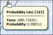
When you place the mouse cursor over the plot line, a tooltip displays data for the nearest data point. For interval data, the tooltip includes the start and end times, a weighted average time, and a probability value. On most ALT plots, a legend is also shown. For more information, see ALT Plot Legend.

To compare plots for multiple ALT data sets, you insert a special data set under the top-level folder named Multiple Data Sets Plots. For this type of data set, the ALT Plot Options pane is the only one in which you enter parameters. For more information, see Multiple Data Set Plots for ALT Analysis.