Adding Custom Actions to the Grid Toolbar
In ThingWorx 9.4 or later, you can define custom actions to display on the grid toolbar.
Overview
• Button
• Dropdown
• Link
• Toggle Button
Configuring Custom Actions for the Grid Widget Toolbar
1. In Composer, create a data service that returns an infotable with the required data for the action definitions. For more information about the supported data formats, see Example: Sample Toolbar Configuration.
2. In Mashup Builder, add the service to the mashup using the Data panel.
3. Bind the service infotable to the ToolbarActions property of the Grid widget. Additional properties for the custom actions are listed on the Properties panel.
4. On the Properties panel, configure the toolbar actions. To create internal widget bindings, use the bindings configuration dialog.
5. Click Save, then View Mashup.
Custom Action Properties
The following table lists the properties for each type of custom action that you can add to the Grid widget.
|
Action Type
|
Property/Event Name
|
Description
|
Example
|
|---|---|---|---|
|
Button
|
<actionId>_Clicked
|
An event that triggers when the button is clicked.
|
Button1_Clicked
|
|
<actionId>_Disabled
|
Disables the button on the toolbar.
|
Button1_Disabled
|
|
|
<actionId>_Visible
|
Controls the visibility of the button on the toolbar.
|
Button1_Visible
|
|
|
Dropdown
|
<actionId>_Disabled
|
Disables the dropdown on the toolbar.
|
Dropdown1_Disabled
|
|
<actionId>_SelectedText
|
This bindable property enables you to set and retrieve the value of the selected text in the dropdown action.
|
Dropdown1_SelectedText
|
|
|
<actionId>_SelectedTextChanged
|
An event that triggers when the selected item in the drop-down list is changed.
|
Dropdown1_SelectedTextChanged
|
|
|
<actionId>_Visible
|
Controls the visibility of the dropdown on the toolbar.
|
Dropdown1_Visible
|
|
|
Link
|
<actionId>_Disabled
|
Disables the link on the toolbar.
|
Link1_Disabled
|
|
<actionId>_Visible
|
Controls the visibility of the link action on the toolbar.
|
Link1_Visible
|
|
|
Toggle Button
|
<actionId>_Disabled
|
Disables the toggle button on the toolbar.
|
Toggle1_Disabled
|
|
<actionId>_State
|
This bindable property enables you to set and retrieve the state of the toggle button action.
|
Toggle1_State
|
|
|
<actionId>_StateChanged
|
An event that triggers when the state of the toggle button is changed.
|
Toggle1_StateChanged
|
|
|
<actionId>_Visible
|
Controls the visibility of the toggle button action on the toolbar.
|
Toggle1_Visible
|
Example: Creating a Service to Configure Custom Actions for the Grid Toolbar
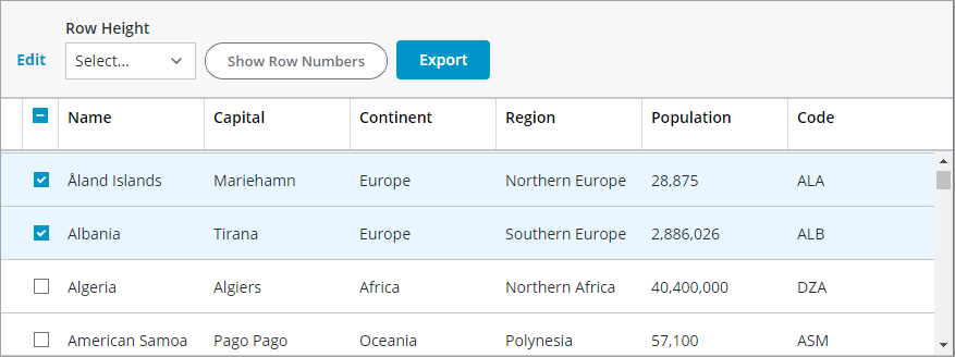
The following example shows a service that creates following custom actions on the grid toolbar:
• A drop-down that controls the row height.
• A toggle button that controls the visibility of row numbers.
• An export button to export selected rows on the grid.
In Composer, create a data service that returns an infotable with the required data for the custom actions. For more information about the supported data formats, see Defining Toolbar Actions Using an Infotable.
var result = Resources["InfoTableFunctions"].CreateInfoTableFromDataShape({
infoTableName : "InfoTable",
dataShapeName : "ToolbarAction"
});
// Dropdown start
result.AddRow({
actionId: "DD1",
actionType: "dropdown",
actionLabel: "Row Height",
actionTooltip: "Change row height",
actionDisabled: false,
actionVisible: true,
dropdownData: [{label:"36 px", value: "36"}, {label:"48 px", value: "48"}, {label:"64 px", value: "64"}],
actionMaxWidth: 200,
dropdownHintText: "Select..."
});
// Dropdown end
// Toggle start
result.AddRow({
actionId: "T1",
actionType: "toggle",
actionLabel: "Show Row Numbers",
actionTooltip: "Adds a column that shows row numbers.",
actionDisabled: false,
actionVisible: true,
toggleChipIcon: true,
toggleState: false,
toggleLabelPosition: 'right',
actionMaxWidth: 200
});
// Toggle end
// Button start
result.AddRow({
actionId: "B1",
actionType: "button",
actionLabel: "Export",
actionTooltip: "Export the selected rows data.",
actionDisabled: false,
actionVisible: true,
buttonType: "primary",
actionMaxWidth: 100
});
// Button end
In Mashup Builder, create the following bindings:
• To control the height of the grid rows, bind the SelectedText drop-down property to an Expression function that converts the string base type to a number. You can then bind the output of the function to the MinRowHeight grid property.
• To control the visibility of the row numbers, bind the T1_State property of the toggle button to the ShowRowNumbers grid property.
• To display the export button when rows are selected, bind the RowsSelected grid property to the B1_Visible button property.
For more information about the available configuration options for custom actions, see Example: Sample Toolbar Configuration.