Using the Styles Tab
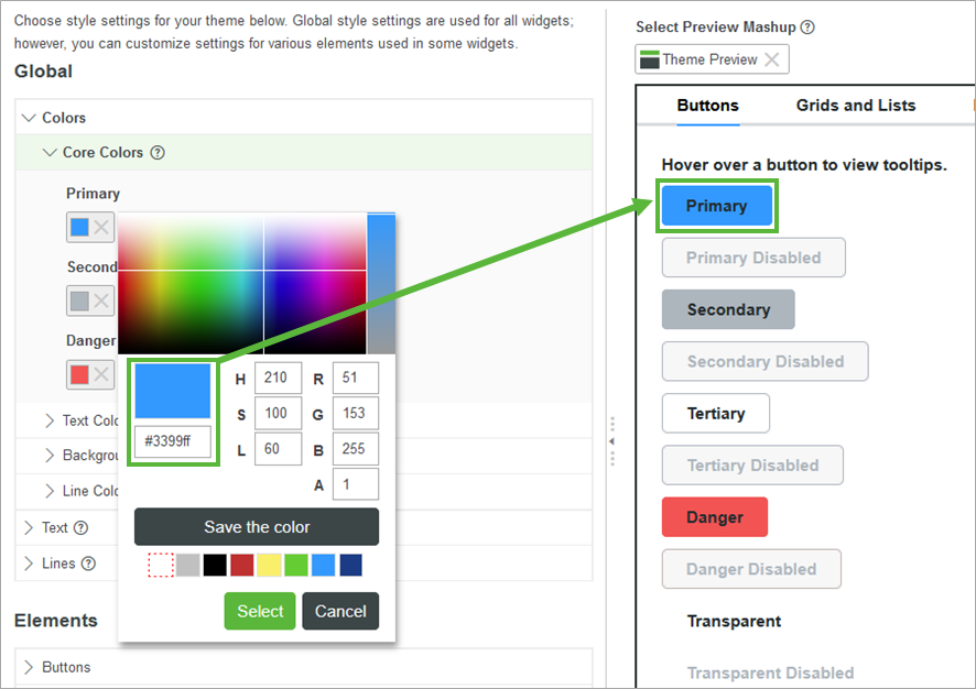
On the Styles tab, you can modify two types of style theme settings: Global and Elements. By default, style settings cascade from Global to Elements.
The Styles tab consists of three components:
Styles
Global Style Settings
The following table lists the global properties for items.
|
Setting
|
Description
|
||
|---|---|---|---|
|
Colors
|
The colors of the following elements:
• Core Colors—Core color values for items. Includes Primary, Secondary, Success and Danger
• Text Colors—Headers, labels, and body text
• Background Colors—Background colors for pages and widgets
• Line Colors—Borders, dividers, and interior lines
|
||
|
Text
|
The font, thickness, and size of the following text elements:
• Headers
• Labels
• Body
• Links
|
||
|
Lines
|
The thickness of the following types of lines:
• Borders—Lines around the edges of a widget
• Dividers—Lines dividing sections in a widget
• Interior—Lines appearing inside some widgets
|
||
|
Focus
|
The color, type, and thickness of the focus box lines.
|
Element Style Settings
Enables you to customize the look of specific widget elements. You can override global style properties by modifying specific elements that cascade to widgets. The overrides active icon indicates elements that override global settings. To restore global settings to modified elements, click Restore. You can modify the following elements:
|
Element
|
Description
|
||
|---|---|---|---|
|
Buttons
|
Background, border, text, sizing, and padding for the following types of buttons:
• Primary buttons
• Secondary buttons
• Tertiary buttons
• Danger buttons
• Transparent buttons
You can modify the active, hover, pressed, and disabled button states.
|
||
|
Grids and Lists
|
Background, border, text, sizing, and padding for the following types of widgets:
• Grids
• Lists and Dropdowns (Styles)
• Lists (Sizing and Padding)
• Dropdowns (Sizing and Padding)
|
||
|
Input Elements
|
Style settings such as background, border, text, sizing, and padding for the following types of widgets:
• Text Fields & Text Areas
• Checkboxes—Selected and unselected states
• Radio Buttons—Selected and unselected states
|
||
|
Layout
|
Style settings such as the background and border of layout containers within a mashup.
|
||
|
Navigation
|
Style settings such as background, border, and text for the following types of widgets:
• Menus—Background, border, divider, and text for menu elements
• Primary Links—The active, hover, pressed, disabled, and visited states for primary links in a mashup
• Secondary Links—The active, pressed, disabled, visited, and hover states for secondary links in a mashup
|
||
|
Information
|
Style settings such as the default size, background, border, and text for widgets tooltips.
|
||
|
Charts
|
Colors used to style each data series within charts. These styles affect chart elements such as lines, highlighted areas, bars, and columns, depending on the chart type and its configuration.
|
||
|
Toolbar
|
Background and border color of toolbars in the mashup. You can also set the border line width for the top, bottom, left, and right sides of the Toolbar (Preview) widget.
|
Styles Preview
The Styles tab shows a mashup preview that is updated automatically. You can select any mashup to preview how style setting changes affect the look of your mashup. By default, the preview displays styles in a mashup entity named Theme Preview. The preview mashup includes a set of widgets and elements to which themes can be applied.
To change the preview mashup, perform the following steps.
1. Under Select Preview Mashup, click  to remove the current mashup.
 to remove the current mashup.
2. Click  . A list of available mashup entities opens.
 . A list of available mashup entities opens.
3. Select a mashup from the list.

You can also use the Styles tab to preview CSS rules for the style theme. |