Breadcrumb Widget (Themable)
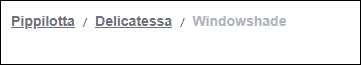
Breadcrumb is a UI component that is constructed of links and the links are executed when you click on those. The Breadcrumb widget displays the data in a sequential order. The Breadcrumb widget is a user interface widget that works on the input you provide. The Breadcrumb does not know the location of the user in the application or any state in the application itself.
The data source for the Breadcrumb widget in your mashup is an infotable that you can use through a service. The infotable should have columns that represent the DisplayField, URLField, TypeField, and MashupNameField. For information about these fields, see the property table.
 |
The Breadcrumb widget is available as a standard widget in the platform and as a web component that you can import from an SDK.
|
For information about creating and configuring a mashup, see Creating a Mashup and the related topics under the Mashup Builder section.
The properties of the Breadcrumb widget follow. You must configure these properties when you use the Breadcrumb widget in the mashup.
|
Property Name
|
Description
|
Base Type
|
Default Value
|
Bindable? (Y/N)
|
Localizable? (Y/N)
|
||
|---|---|---|---|---|---|---|---|
|
ShowCurrentLevel
|
Shows the link for the current page in the Breadcrumb.
|
BOOLEAN
|
True
|
Y
|
N
|
||
|
TruncateLinks
|
Truncates the links that have long names in the Breadcrumb.
|
BOOLEAN
|
False
|
Y
|
N
|
||
|
LinkMaxWidth
|
Sets the maximum width for each link in pixels. The links that exceed this width are truncated.
|
STRING
|
120
|
Y
|
N
|
||
|
Disabled
|
Disables the widget in the mashup. The widget appears in the mashup but it cannot be used.
|
BOOLEAN
|
False
|
Y
|
N
|
||
|
CustomClass
|
Defines the CSS to the top div of the widget. When entering multiple classes, separate each class with a space.
|
STRING
|
n/a
|
Y
|
N
|
||
|
TabSequence
|
The sequence number of the Breadcrumb widget when you press TAB.
|
NUMBER
|
n/a
|
N
|
N
|
||
|
Data
|
Binds the data from an infotable source to populate the breadcrumb entries.
|
INFOTABLE
|
n/a
|
Y
|
N
|
||
|
DisplayField
|
The DisplayField represents the text that is displayed in the breadcrumb.
This property defines the field in the infotable that contains the data that appears as the label for each breadcrumb link.
|
INFOTABLE
|
n/a
|
N
|
N
|
||
|
URLField
|
The URLField represents the target URL links and it is used when the breadcrumb has URL links.
The Breadcrumb is constructed of links. Clicking the URL link takes you to the specified URL.
|
INFOTABLE
|
n/a
|
N
|
N
|
||
|
TypeField
|
The TypeField specifies the type of target link as a mashup or URL.
|
INFOTABLE
|
n/a
|
N
|
N
|
||
|
MashupNameField
|
The MashupNameField represents the target mashup names and it is used when the breadcrumb has links to mashups.
|
INFOTABLE
|
n/a
|
N
|
N
|
||
|
MashupControl
|
Controls an embedded mashup in the current page, or binds parameters to an embedded mashup. The available options are Control Current Mashup and Bind To Mashup Parameters.
You can use Control Current Mashup to replace an entire mashup or use Bind To Mashup Parameters to replace a contained mashup while keeping the container mashup.
|
STRING
|
Control Current Mashup
|
N
|
N
|
||
|
Mashup
|
Binds to the mashup that is selected when you selct Bind To Mashup Parameters value in the property MashupControl.
|
STRING
|
n/a
|
Y
|
N
|
||
|
DataChanged
|
A bindable event that triggers when the data changes in the Breadcrumb.
|
n/a
|
n/a
|
Y
|
N
|
||
|
Clicked
|
A bindable event that triggers when the Breadcrumb is clicked.
|
n/a
|
n/a
|
Y
|
N
|
||
|
MaxNumberOfLinks
|
Defines the maximum number of links in the Breadcrumb. Any additional link is displayed in the overflow list.
An overflow pattern is added in the Breadcrumb based on your selection of MaxNumberOfLinks property. Earlier, there were navigation arrow buttons that allows you to navigate to the left or right in the breadcrumb links. This has been modified to an overflow control icon for ThingWorx 9.3.0 and later versions.
The number that you set here includes the current page when the ShowCurrentLevel property is set to True.
|
NUMBER
|
4
|
N
|
N
|