Migrating Legacy Widgets
The following topic contains use cases for migrating the following legacy widgets:
• Divider
• Button
• Button widget with a confirmation dialog
• Logout
• Navigation
Migrating a Legacy Divider Widget
Legacy Divider widgets are migrated to the standard Divider widget. The height and width properties of the legacy widget are not migrated. All legacy Dividers are migrated to a horizontal Divider. By default, the standard Divider widget has a horizontal orientation. You can change the orientation of the widget by enabling the VerticalDivider property. For more information about the Divider widget, see Divider Widget (Themable).
Migrating a Legacy Button Widget
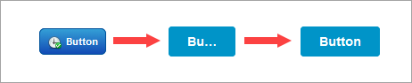
When you migrate a legacy Button, the new standard Button is styled using the mashup style theme. The default style theme (PTC Convergence Theme) has a larger text size for labels. The migrated dimensions of the legacy Button cause the label to appear truncated in the standard Button. You can adjust the widget by changing the height and width properties of the standard Button widget, or by applying a style theme with a smaller font size to the mashup. The replacement widget is responsive. We recommend that you reset any fixed width or height values to use responsive sizing.
The following figure shows how the button appears with the PTC Convergence Theme after you migrate and reset the Height and Width properties:
Migrating a Legacy Button Widget with a Confirmation
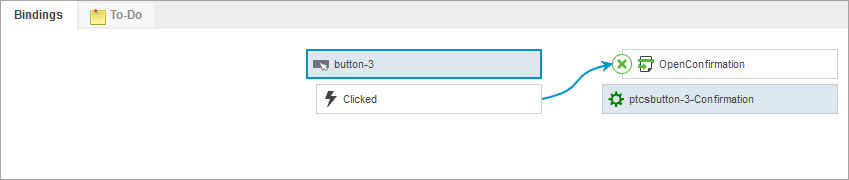
The confirmation dialog functionality of the legacy Button widget is replaced by the Confirmation function. A legacy Button widget that displays a confirmation is migrated to a standard Button widget and a Confirmation function. Existing bindings and properties of the legacy widget, such as the confirmation dialog title, message, and button labels are migrated to the Confirmation function. When you migrate this widget, a new confirmation function is added to the Functions panel, and the legacy Button is replaced by a standard Button. The function is created using the ID property of the standard Button widget as follows: <WidgetID>-Confirmation. The Clicked event of the standard Button widget is bound to the OpenConfirmation service of a new the Confirmation function.
Migrating a Legacy Logout Button Widget
You can migrate a legacy Logout widget to a standard Button widget and a Logout function. The target mashup or URL of the legacy Logout widget is migrated to the function. When you migrate, a binding is created between the Clicked event and the Logout service of the function.
A Confirmation function is created when the ConfirmationRequired property of the Logout widget is enabled. Bindings are automatically created between the Logout and Confirmation functions. Properties for the confirmation dialog within the legacy Button widget are also migrated to the Confirmation function. The following image shows an example of bindings between a standard Button widget and the Confirmation and Logout functions after migration.
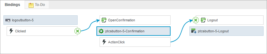
The Logout service is triggered by the ActionClick event of the Confirmation function.
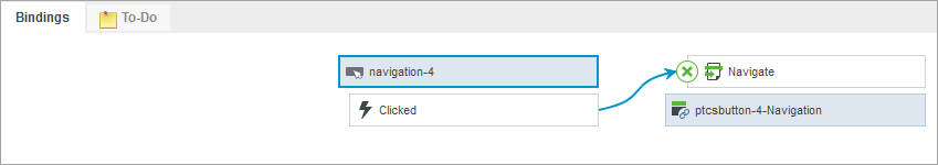
Migrating a Legacy Navigation Widget
Legacy Navigation widgets are migrated to a standard Button widget and a Navigation function. The target mashup or URL of the legacy widget is migrated to the function. When you migrate this widget, a binding is created between the Clicked event of the widget and the Navigate service of the function.
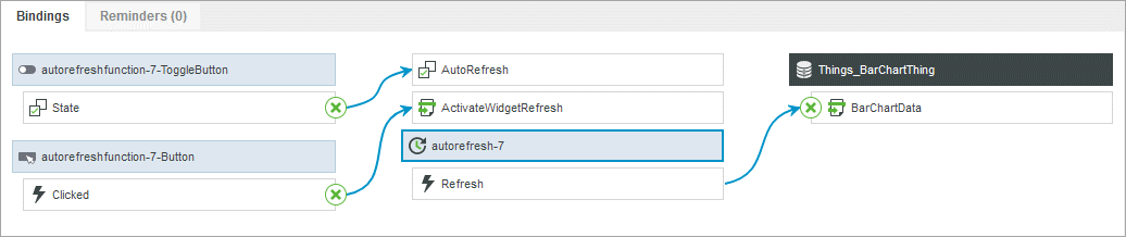
Migrating a Legacy Auto Refresh Widget
Legacy Auto Refresh widgets are migrated to a standard Button, a Toggle Button, and an Auto Refresh function. The two buttons are bound to the function properties. When you migrate this widget, a binding is created between the Clicked event of the Button widget and the ActivateWidgetRefresh service of the function. The State property of the Toggle Button is bound to the AutoRefresh property of the function.