The Mashup Builder Workspace
The following tabs are available when you create or modify a mashup in ThingWorx Composer:
• General Information—Specifies general information such as the entity name and description.
• Design—Opens the Mashup Builder workspace.
• Custom CSS—Opens the Custom CSS page for the mashup.
For more information, see Custom CSS.
• Mobile Settings—Defines the mobile device settings for the mashup.
• Permissions—Specifies visibility, run time, and design time access to the mashup.
• Change History—Displays previous changes made to the mashup.
• View Relationships—Defines dependencies and inheritance rules for the mashup.
The Mashup Builder workspace is on the Design tab.
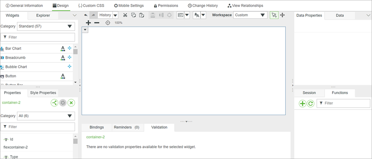
The Parts of the Design Workspace
The Mashup Builder workspace consists of the following sections:
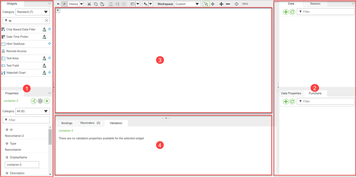
1. Left dock
2. Right dock
3. Canvas and toolbar
4. Bottom dock
The canvas part of the workspace is where you design your mashup. You can drag widgets from the Widgets panel and arrange them as required. To select multiple widgets, drag a selection box on the canvas, or press CTRL and click each item. Click  in the upper-left corner of a widget to configure bindings and events.
in the upper-left corner of a widget to configure bindings and events.Right Dock
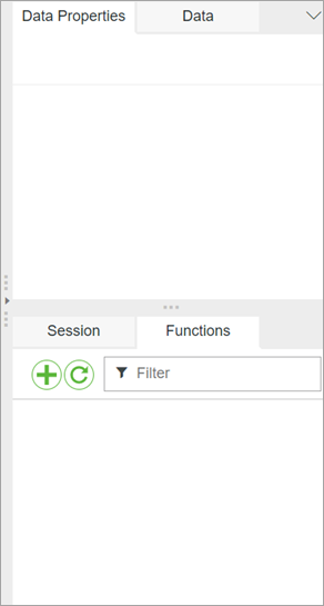
By default, the right dock contains two sections with the following panels:
• Data—Provides access to the data to display in your mashup.
The data is provided by a ThingWorx entity, such as a Thing or Thing Template. Click  to open the Add Data window where you can find entities and add selected services from them.
to open the Add Data window where you can find entities and add selected services from them.For more information about the data services, see Data Services and Bindings.
• Session—Provides access to the session parameters.
Session parameters are similar to global variables and can be used by multiple mashups. Session parameters keep information such as cookies or security information for a logged-in user inside the current application session. For more information about the Session panel, see Session Parameters.
• User—Provides access to the properties of the current user. For more information about the User panel, see User.
• Data Properties—Displays a list of properties for the currently selected data service. This includes parameters, events, and so forth.
• Functions—Displays the list of functions within your mashup.
For more information about functions, see Functions.
Left Dock
By default, the left dock contains two sections with the following panels:
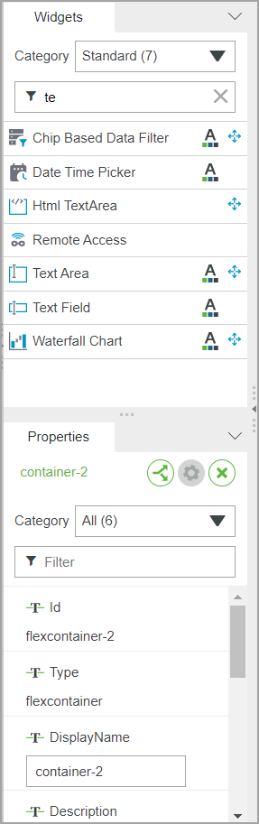
• Widgets—Provides a list of widgets that you can add to your mashup. You can drag a widget from the list onto the layout area.
• Layout—Displays layout options for containers and items in a responsive mashup.
• Mashups—Provides a list of available mashups in your environment.
You can drag a mashup from this list onto the layout area to make it into a contained mashup within your mashup. Note that a contained mashup must be in a Contained Mashup widget. You can enter text in the filter field to filter the list according to the mashup name.
• Explorer—Displays the widgets currently in your mashup in a hierarchical tree.
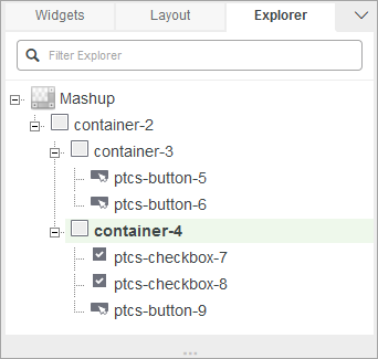
You can use this list to select widgets that can be hidden in the layout. You can start entering text in the filter field to filter the list based on the text you enter.
• Properties—Displays a list of properties for the currently selected widget.
Modify the properties to configure the widget. You can use the filter field to filter the list of properties.
• Style Properties—Displays the style properties for the mashup.
Bottom Dock
By default, the bottom dock contains three panels:
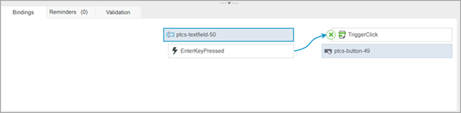
• The Bindings panel shows the flow of data and events for the selected widget, data entity, or function. For example, the following figure shows bindings between the TriggerClick service of a Button widget and the KeyPressedEvent of a TextField widget.
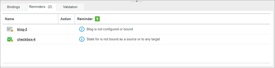
• The Reminders panel, which contains a list of tasks that you should perform to configure the widgets in the mashup.
You can click a task to highlight the related widget on the canvas.
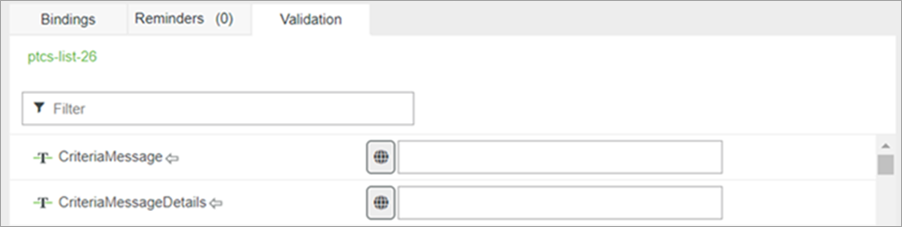
• The Validation panel shows a list of validation properties available for the selected widget.
You can toggle the validation properties that are related to the widget.
The Canvas Toolbar
The toolbar is located above the canvas.

The following table lists the available clipboard commands:
Command | Description |
|---|---|
 | Undo |
 | Redo |
 | Enables you to view the change history for the mashup in the current session. To return to specific state, select an operation from the list. |
 | Cut |
 | Copy |
 | Paste |
Use these commands to resize selected items in the mashup as follows:
Command | Description |
|---|---|
 | Same width |
 | Same height |
 | Same size |
Use these commands to set mashup resolution and localization, and to specify workspace settings.
Command | Description |
|---|---|
 | Sets the mashup resolution during design time. |
 | Sets the language for the Localization Tokens during design time. |
 | Specifies the workspace layout. For more information, see Customizing the Mashup Builder Workspace. |
Use the following commands to control the selection and the display of items on the canvas:
Command | Description | ||
|---|---|---|---|
 | Selects items on the canvas. This is the default tool. | ||
 | Enables you to move across the canvas area. Click and drag anywhere on the canvas to move across it.
| ||
 | Zooms in by 10% to view the mashup in more detail. | ||
 | Zooms out by 10% to get a wider perspective of the mashup. | ||
 | Resets the zoom to default. |