 |
Once a widget is nested under the 3D Panel widget, its coordinate position is relative to the panel, not the canvas.
|
|
|
Once a widget is nested under the 3D Panel widget, its coordinate position is relative to the panel, not the canvas.
|
Property | JavaScript | Type | Description |
Height | height | number | Height of the 3D button in meters. The minimum value is 0.04 meters. |
Width | width | number | Width of the 3D button in meters. The minimum value is 0.04 meters. |
Button Color | buttonColor | color | Color of the pin button in the upper-right corner. Select a color from the color picker. |
Panel Color | panelColor | color | Color of the panel. Select a color from the color picker. |
X Coordinate | x | number | Location of the widget on the x-axis. |
Y Coordinate | y | number | Location of the widget on the y-axis. |
Z Coordinate | z | number | Location of the widget on the z-axis. |
X Rotation | rx | number | Rotation of the widget about the x-axis. |
Y Rotation | ry | number | Rotation of the widget about the y-axis. |
Z Rotation | rz | number | Rotation of the widget about the z-axis. |
Visible | visible | boolean | When this checkbox is selected, the widget is visible at runtime. |
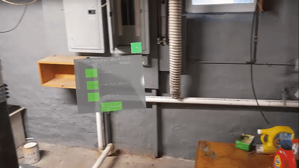
Tagalong | tagalong | boolean | Makes the panel stay within the your frontline view and ensures that it placed in a convenient location in the environment. Users can also pin and unpin the panel when viewing an experience using the pin icon:  This allows individual users viewing an experience to change the Tagalong property. |
| | The bindable properties listed below are only displayed on the Select Binding Target window when binding a property to the 3D Panel widget. For example, if you drag and drop the Pressed property of a 3D Checkbox widget onto the 3D Panel, the Select Binding Target window appears and the three properties below are available to select to bind to the panel. |
Bindable Property | JavaScript | Type | Description |
Offset X (m) | offsetx | number | Offset of the panel from the user on the X axis (in meters). |
Offset Z (m) | offsetz | number | Offset of the panel from the user on the Z axis (in meters). |
Snap distance (m) | snap | number | The distance at which the panel will start to move if the user exceeds this distance if Tagalong is selected (in meters). |
Service | JavaScript | Description |
Show | show | Shows the panel. |
Hide | hide | Hides the panel. |
Event | JavaScript | Description |
Tethered | tethered | Triggered when the panel is switched into follow mode. |
Untethered | untethered | Triggered when the panel is taken out of follow mode. |
Aligning | aligning | Triggered if the HoloLens aligningnative event is dispatched. When the Tagalong property is enabled for the panel, the panel follows the user’s movement. • When the panel begins to move, the aligning event is triggered. • When the panel stops moving, the aligned event is triggered. |
Aligned | aligned | Triggered if HoloLens the aligningnative event is dispatched. When the Tagalong property is enabled for the panel, the panel follows the user’s movement. • When the panel begins to move, the aligning event is triggered. • When the panel stops moving, the aligned event is triggered. |
Minimum Steps Required for Use | What It Looks Like | ||
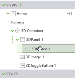
1. Drag and drop a 3D Panel widget onto the canvas. 2. Drag and drop the widgets you want displayed in front of the panel. For this example, we’ve added a 3D Button, 3D Image, and 3D Toggle Button widget.
| 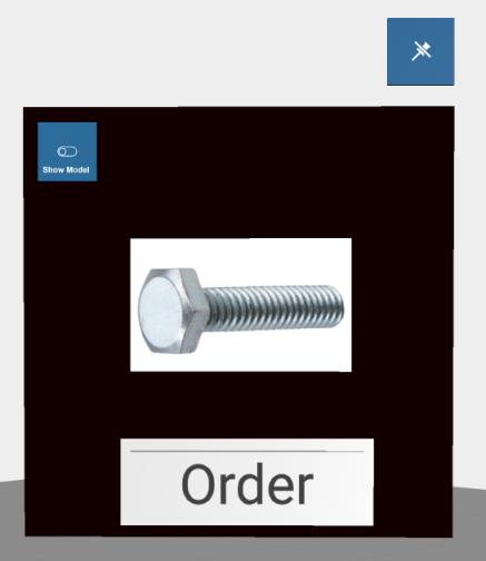 |