3D Press Button
 |
Available only in 3D Eyewear projects.
|
What Does This Widget Do?
The 3D Press Button widget allows you to utilize fully articulated hand tracking on a HoloLens 2. You can also Gaze and Air tap a 3D Button if using a HoloLens.
When Should I Use This Widget?
A 3D Press Button is particularly useful when you want to trigger an event. For example, a 3D Press Button can be used to start playing a sequence.
The 3D Press Button is extremely useful when the experience will be viewed on a HoloLens 2 and you want to utilize articulated hand tracking. However, the 3D Press Button can be used for any user actions similar to the 3D Label and 3D Image widgets.
Are There Any Special Properties, Services, Events, or Actions?
To view a list of common widget properties, services, and events, see Common Widget Properties, Services, and Events.
The following table is a list of properties that are specific to this widget.
|
Property
|
JavaScript
|
Type
|
Description
|
|---|---|---|---|
|
Text
|
text
|
string
|
Text that appears on the button.
|
|
Image
|
src
|
resource url
|
To include an image, you can do one of the following:
• Click next to the field to add a new image file.
• Enter or copy and paste an image URL directly into the field.
• Select an image from the drop-down menu.
Supported file formats include:
• .png
• .jpg
|
|
Height
|
height
|
number
|
Height of the button in meters. The minimum value is 4 cm.
|
|
Width
|
width
|
number
|
Width of the button in meters. The minimum value is 4 cm.
|
|
Font Color
|
fontColor
|
color
|
Color of the font. Select a color from the color picker.
|
|
X Coordinate
|
x
|
number
|
Location of the button on the x-axis.
|
|
Y Coordinate
|
y
|
number
|
Location of the button on the y-axis.
|
|
Z Coordinate
|
z
|
number
|
Location of the button on the z-axis.
|
|
X Rotation
|
rx
|
number
|
Rotation of the button about the x-axis.
|
|
Y Rotation
|
ry
|
number
|
Rotation of the button about the y-axis.
|
|
Z Rotation
|
rz
|
number
|
Rotation of the button about the z-axis.
|
|
Button Color
|
color
|
color
|
Color of the button. Select a color from the color picker.
|
|
Visible
|
visible
|
boolean
|
When this checkbox is selected, the widget is visible at runtime.
|
|
Disabled
|
disabled
|
boolean
|
Selected this checkbox disables clicking of the widget.
|
|
Event
|
JavaScript
|
Description
|
|---|---|---|
|
Pressed
|
pressed
|
Triggered when the button is pressed. If the button is disabled, the event is not triggered.
|
The Widget in Action
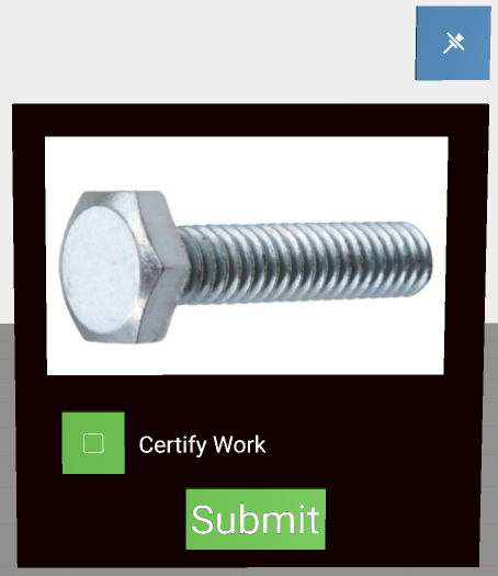
Here’s an example of what your widget might look like!
|
Minimum Steps Required for Use
|
What It Looks Like
|
||||||
|---|---|---|---|---|---|---|---|
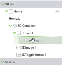
1. Drag and drop a 3D Panel widget onto the canvas.
2. Drag and drop a 3D Press Button widget onto the canvas. Move the widget to position where you want it.
3. Enter the text you want displayed in the Text field or bind a data property to the Text field of the widget. For this example, we’ve used Submit.
4. Add the following code to Home.js:
$scope.hidePanel = function(){
This ensures that all widgets nested under the panel are also hidden when the Submit 3D Press Button is clicked.
5. Navigate back to the DETAILS pane of the 3D Press Button, an scroll down to EVENTS.
6. Click JS next to the Pressed event, and enter hidePanel().
|
 |