Creating a Menu Bar Layout
Before you begin, design the layout of the application. Create the required mashup visualizations or web pages that you want to include in your solution.
The Menu Bar is a responsive widget that you can configure to grow and shrink dynamically or by using a toggle button. To display the widget correctly in a layout, you must configure the containers within the layout appropriately. You can create a mashup layout with a Menu Bar widget in one of two ways:
• Manually by adding and configuring containers in a layout.
• Using a predefined Mashup Template.
By default, the provided template splits the mashup into two containers to create a side bar that contains the menu bar. You can also customize the template and create your own layouts by adding a third container that stretches horizontally above the two containers. The following figure shows the default layout on the left and an example of a custom layout on the right.

After you build your layout, you can display content in the containers using one of two methods:
• Adding the menu bar to a mashup, and embedding the pages in a contained mashup. This enables you to build more scalable solutions and separates different parts of your solution into multiple mashups. You can bind data from the parent mashup to mashup parameters of the contained mashup. For more information, see Displaying Content inside a Contained Mashup.
• Replacing the entire mashup page, including the Menu Bar widget. This requires that you add the Menu Bar widget to each mashup in your application.
You can configure the Menu Bar widget for each method using the MashupControl property. For more information, see Configuring the Menu Bar Widget.
Configuring the Mashup Layout Manually
1. In Composer, click New, and then choose Mashup or Master. The New Mashup window opens.
2. Select Responsive, then click OK.
3. Type a name for the mashup, then click Save.
4. Click the Design tab to open the Mashup Builder interface. A blank mashup with one container is displayed on the canvas.
5. On the Layout panel, under Add Container, click Add Left. The main container is split into two containers and the layout is divided vertically.
6. Select the main container using the Explorer panel, then configure it using the Layout panel.
◦ Under Container Scrolling, choose Scroll Current Container.
7. Select the left container on the canvas, then configure it using the Layout panel.
◦ Under Align and Distribute, choose Stretch.
◦ Under Advanced, set the Grow Ratio and Shrink Ratio properties to 0.
Optionally, under Container Size, select Size Range, then set the max-width to the maximum width that you wish to display the widget. By default, the menu bar is set to a maximum width of 296 pixels.
8. Drag the Menu Bar widget from the Widgets panel to the left container.
9. Save the mashup.
Using a Predefined Mashup Template
1. In Composer, click New, and then choose Mashup or Master. The New Mashup window opens.
2. Select the Left Panel with Menu responsive template, and then click OK. A new mashup entity is created.
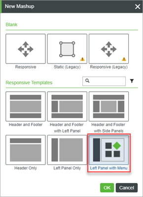
3. Enter a name and choose a project for the new entity, then click Save.
You can now add widgets to build the mashup on the Design tab. The template contains a mashup with a Menu Bar widget that you can use without performing additional configurations to containers in the layout.
After you add the menu bar to a mashup, you can configure the Menu Bar widget, then bind data to define the items to display. For more information about defining items, see Defining the Menu Bar Items Using an Infotable and Defining the Menu Bar Items Using a Menu Entity.