Configuring the Menu Bar Widget
Displaying Content Inside a Contained Mashup
After you create a menu layout and bind data for the items, you can choose how to display the target mashups. Use the MashupControl property to configure how the widget switches between different mashups. By default, when you navigate to an item on the menu bar, the full page is replaced by a mashup or a web page. You can configure the layout to only replace a contained mashup based on the current selection:
1. In Mashup Builder, select the Menu Bar widget, and then open the Properties panel.
2. Next to the MashupControl property, select Bind To Mashup Parameters.
3. Add the Contained Mashup widget to an empty container in the layout.
4. Bind the Mashup property of the Menu Bar widget to the Name property of the Contained Mashup widget.
5. Bind any required mashup parameters from the parent mashup with the menu bar to the contained mashup. For more information, see Configuring Mashup Parameters.
6. Click Save, then View Mashup.
When you select a mashup item on the menu bar at run time, the contained mashup widget is updated.
Choosing a Submenu Type: Cascade or Accordion
Use the SubMenuType widget property to specify how submenus of items open on the menu bar. You can display submenus using a cascading menu that opens in a new menu level to the right, or a nested accordion that expands vertically and is indented to the right. The following figure shows the two menu types side by side using the same data.
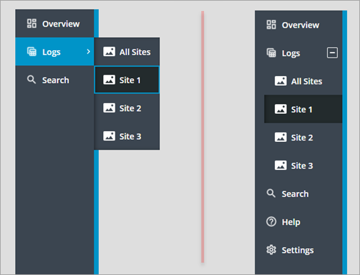
The secondary and primary sections are displayed as one section in the accordion. The following table list the main differences between the two menu types:
Cascading Menu | Nested Accordion |
|---|---|
• Submenus open as new menu levels to the right. • Primary and secondary navigation items are displayed separately. Primary items are aligned to the top and secondary items are aligned to the bottom. • Icons for the top-level items are displayed in compact mode. • Submenus do not affect the overall width or height of the menu bar. • You can restrict the number of primary navigation items using the PrimaryNavMaxItems property. By default, the maximum number is set to 5. Additional items are displayed in an overflow menu. | • Submenus open in a tree-like structure. • Primary and secondary navigation items are combined into one area. • Icons for the top-level items are not displayed in compact mode. • Submenus affect the overall width or height of the menu bar. • All primary navigation items are displayed |
Choosing a Data Source: Infotable or Menu Entity
You can define items on the menu bar using Menu entities, or with an infotable that lets you create data-driven menus using a service. For more information, see Defining the Menu Bar Items Using an Infotable.
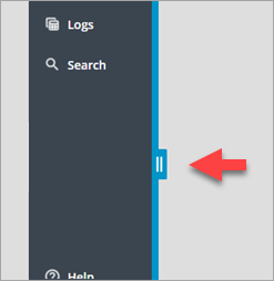
Disabling Resizing
You can use the drag handles at run time to change the menu bar width when it is expanded. Resizing lets you expand the menu bar to view the full text of truncated labels. You can also minimize the width to focus on the current page. Additionally, you can display submenus that are out of view when using the nested accordion mode. Make sure the sizing of the menu matches the expected sizing of the menu items. By default, the menu bar container is set to a width of 296 pixels. When you set the menu bar to a width that is higher than its container, horizontal scroll bars are displayed on the container. Use the MinWidth and MaxWidth width properties to constrain the menu bar width. To disable resizing at run time, set the DisableResizing property to True.
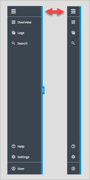
Disabling Compact Mode
By default, the menu bar expands and collapses at run time using a toggle button at the top of the widget. You can toggle between a compact view that shows icons only and an expanded view that shows the text labels for each item. The compact view allows you to display a menu bar, with minimal space on the screen. Make sure that the icons of your all Menu items are clear and reflect the label accurately. Consider enabling the ShowAlternateIcons. To disable the compact view mode, set the AlwaysExpanded widget property to True.
 | Icons for the primary and secondary navigations sections are hidden in compact mode when using the nested accordion submenu type. |
Limiting the Number of Items in the Primary Section
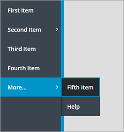
Use the PrimaryNavMaxItems property to control the number of primary navigation items to display. By default, the property is set to 5. Additional items are displayed in an overflow menu that you can open by clicking the More... item. The overflow menu is also displayed when the primary navigation items use 50% of the available menu bar height.
| | This property is not available when the submenu type is set to a nested accordion. |
Hiding the Alternate Icons of Menu Items
You can display icons for items on the Menu by enabling one or both of the PrimaryNavIcons and SecondaryNavIcons properties. The menu bar displays icons from the Menu entity or the bound infotable. When an item does not have an icon, an alternative icon is automatically displayed. Make sure that you consistently apply icons to all items or none of the items. Missing icons make it more difficult to distinguish between different navigation levels of the menu bar items. It is recommended that you keep this property enabled. To hide the alternative icons, enable the HideAlternateIcons property.
Adding Branding Icons in the Footer Area
The menu bar supports multiple branding options in the footer area. You can display an icon using the widget FooterIcon property, or a full-sized brand logo using the FooterLogo property. When the widget is expanded and enough space is available, the logo replaces the branding icon and text. The icon and text are always displayed when the widget is expanded and a logo is not set. However, only the icon is displayed when the widget is collapsed.
