Configuring Grid Columns
After you bind a data source to a grid, you can use the Configure Widget dialog box in Mashup Builder to customize the grid:
• Add custom column titles.
• Align content within the header and within cells.
• Set minimum and maximum width for the columns.
• Customize the renderer and apply state formatting.
• Exclude specific columns from the data source and rearrange the column order on the grid.
• Control the column widths using pixels, percentages, or fractions.
• Turn on editing for specific columns when editing is enabled for the grid.
• Apply input validation for specific column when editing is enabled.
To configure a grid column, perform the following steps:
1. Select a Grid widget on the canvas or using the Explorer panel.
2. On the Properties panel, click  . The grid column configuration dialog box opens and the infotable columns are listed.
. The grid column configuration dialog box opens and the infotable columns are listed.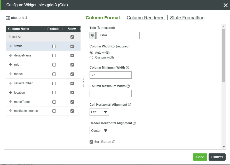
3. In the left pane, the following configurations are available:
◦ To change the display order of columns on the grid, drag and sort the columns in the list.
◦ To exclude a column from the grid data, select the Exclude check box on the right.
◦ To hide a column from the default grid view, clear the check box under Show. You can control the visibility of hidden columns at run time using the Display menu, or by dragging the column headings when the ReorderColumns property is enabled.
4. Select a column from the left panel, and then configure the following options on the right:
◦ Column Format—General options about the column format on the grid.
▪ Title—A friendly name for the column title.
 | By default, the field definition name is displayed within the column header. To change the header text, you must type a title or select a localization token. |
▪ Column Width—Sets the column width. By default, the available space is divided equally between columns.
▪ Column Minimum Width—Sets the minimum width that the current column can shrink to.
▪ Column Maximum Width—Sets the maximum width that the current column can grow to.
| | The minimum and maximum width values are ignored when you set a column to a fixed width. |
▪ Cell horizontal and vertical alignment—Align the content within the body cells to the top, middle, and bottom, or left, right, and center.
▪ Header horizontal alignment—Align the content within the header cell to the top, middle, and bottom, or left, right, and center.
▪ Sort Button—Adds a sort button to the column header that enables users to sort values at run time.
▪ Initial Sort—Enables you to sort the column values in a descending or an ascending order when the grid is displayed at run time.
▪ Editable—Turns on editing for the column content when the grid is in edit mode.
For more information about the validation, see Validating Input within the Grid.
▪ Required—Specifies whether a value is required in each cell when editing the grid data.
▪ Validation Criteria Expression—Specifies the expression to use to evaluate the input when editing the column at run time.
▪ Validation Message—The message to display for the input criteria and failure.
▪ Validation Criteria Details—Additional details to display under the validation criteria or failure message.
▪ Validation Success Message—The message to display when the validation is successful.
▪ Validation Success Details—Addition details to display under the success message.
▪ Exclude from Row Edit form—Excludes the column from the row editing form when the grid editing mode is set to a row level.
◦ Column Renderer—Enables you to select and configure a renderer for the column data. For more information, see Grid Column Renderers and Formats.
◦ State Formatting—Apply state formatting to the column using a state definition entity. To apply a state definition to a row, use the RowFormat widget property.
5. Click Done to apply the changes to the grid.
Changing the Order of Grid Columns
You can sort columns on the grid in one of the following ways:
• Add the ordinal attribute when defining columns dynamically to the infotable data. For example:
.AddField({ name: column, baseType: "STRING", ordinal: 0.0})
| | The ordinal attribute is only support in ThingWorx 9.3.2 or later. When JSON configuration data is used to set the order, the ordinal value is ignored. |
• Specify the order using the columnIndex property in the JSON widget configuration.
• Change the order of columns using the columns configuration dialog box.
• Add a sort button that enables users to sort column data at run time.
• Set the widget ColumnsMenuOptions property to Order, then use columns configuration menu at run time.
Triggering an Event when a Hyperlink is Clicked
By default, the linked URL opens when a hyperlink on the grid is clicked at run time. In ThingWorx 9.3.6 or later, you can configure the widget to trigger an event instead.
1. In the grid configuration dialog, select an infotable column that contains hyperlink data.
2. On the Column Renderer tab, select Route links using an event.
3. Click Done to close the dialog.
The following properties are now listed on the Properties panel.
• LinkClicked—An event that triggers when a link is clicked.
• ClickedLinkData—An infotable that contains the data row of a clicked link.
• ClickedLinkColumn—Returns the column name of the last clicked link. You can use this property when a grid contains multiple columns with hyperlinks.
You can bind these properties to pass link data to services or functions within the mashup. For example, you bind the LinkClicked and ClickedLinkData properties to a Navigation function that passes data to a new mashup.