Date Time Picker Widget (Themable)
The Date Time Picker enables the user to select date and time values in a mashup. At run time, users can specify dates, by selecting the month, year, and day. Optionally, you can configure the widget to include hours, minutes, and seconds. This topic contains the following sections:

Widget Anatomy
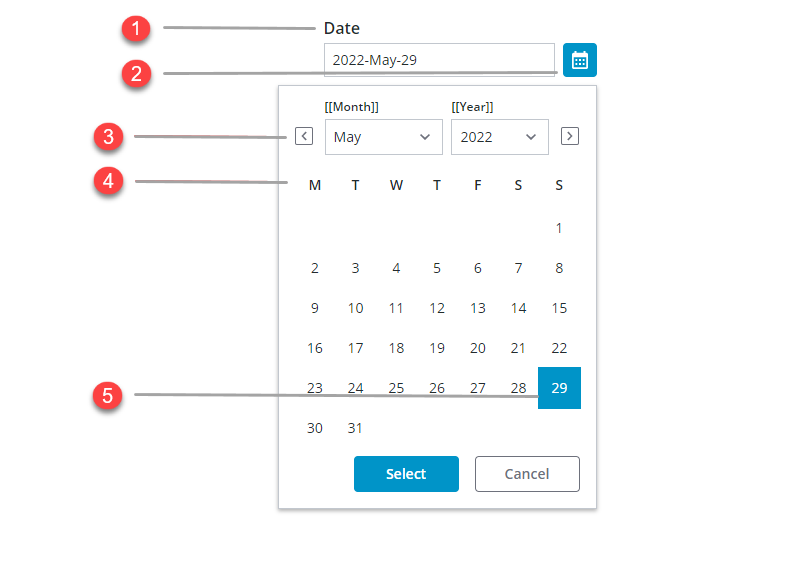
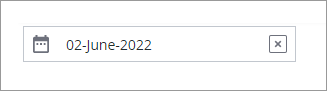
1. Text field
2. Start date
3. End date
4. Month dropdown
5. Year dropdown
6. Day label
7. Selected date
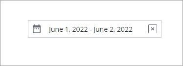
Range Selection Mode
To enable range selection, set the DateRange configuration to true, Range selection mode allows the user to limit the date or time to a specific range. You can also restrict the range selection by typing a numeric value in the YearRange property.
Time Selection
By default, the date-time picker allows you to select dates. To enable time selection, set the widget DateOnly property to false. Disabling the property allows users to select both time and date. To add seconds set the DisplaySeconds property to true.
Interval Properties
Use the Interval property to offset the default selected value relative to the current date or time when you open the calendar. You can offset the selected value forwards or backwards by days, hours, minutes, or seconds using the IntervalType property. For example, to advance the selected time on the date picker widget by 30 minutes, set the IntervalType to Minutes and Interval to 30.
Formatting Date and Time
You can format the date and time using the following properties.
• The DateOrder property allows you to set the date order. By default, the date order is automatically set at run time based on the locale of the user at run time.
• FormatToken allows you to customize the date and time format, the FormatTokenproperty overrides these following properties DisplaySeconds, DateOnly, DateDelimiter, MonthFormat, and DateOrder.
◦ DisplaySeconds: The DisplaySeconds property allows users to display seconds in two different formats.
a. 0:59
b. 00 59.
◦ DateOnly: The DateOnly property allows users to display the days of the month in three formats.
a. Day of the month as a number range between 1 and 31.
b. Day of the month as a number range between 1 and 31 including an ordinal indicator, where the first day is 1st and last day is 31st.
c. Displays The day number between 01 and 31.
◦ DateDelimiter: The DateDelimiterproperty allows users to use one of five different types of punctuation characters as separators between different time and date unit.
a. 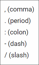
◦ MonthFormat: The MonthFormat property allows users to display the months of the year in one of five different formats.
a. Displays the month number as a range between 1 and 12, where January is 1 and December is 12.
b. Displays the month number as a range between 1 and 12 with an ordinal indicator, where January is 1st and December is 12th.
c. Displays the month number as a range between 01 and 12, where January is 01 and December is 12.
d. Displays the month as an abbreviated string, where January is Jan.
e. Displays the full month name as a string: January.
◦ DateOrder: The DateOrder: property allows users to set the date order in one of three distinct orders.
a. Day-Month-Year. This the default format
b. Month-Day-Year.
c. Year-Month-Day.
For more information, see Formatting Date and Time for Widgets.
Property | Description | Base type | Default value | Bindable? (Y/N | Localizable? | ||
Label | The text that is displayed in the label of the Date Time Picker widget. | STRING | N/A | Y | Y | ||
Disabled | Use this property to disable the widget in the mashup. The widget is displayed in the mashup but you cannot click it. | BOOLEAN | FALSE | Y | N | ||
HintText | Displays placeholder text that explains what should be entered in the field. | STRING | SELECT DATE & TIME | Y | Y | ||
DateOnly | Enables you to display only the date. | BOOLEAN | TRUE | N | N | ||
DisplaySeconds | Enables you to display the time with seconds. | BOOLEAN | FALSE | N | N | ||
DateDelimter | Sets the character used to separate the day, month, and year. For example, a — (hyphen) or / (slash) as in 05/10/2020. | STRING | N/A | N | Y | ||
MonthFormat | Enables you to display the month in either full, short , or numeric format. | STRING | FULL | N | N | ||
PrimaryActionPosition | Enables you to set the position of the primary action button to the Left or Right The primary action is the • Done button in the button group | STRING | LEFT | N | N | ||
DateOrder | Enables you to set the format of the date display. The different formats are Auto, Day-Month-Year Month-Day-Year and Year-Month-Day When the default Auto is selected, the system date appears in the widget. Also, the DateDelimiter and MonthFormat properties are disabled by the widget. | STRING | AUTO | N | N | ||
FormatToken | When the default Auto is selected, the user locale is used to format the date. This property overrides the DateDelimiter and MonthFormat properties.
| STRING | N/A | N | Y | ||
IntervalType | Enables you to set an interval type as Hours, Minutes, or Days
| STRING | HOURS | N | N | ||
Interval | Enables you to set an interval type as Hours, Minutes or Days.
| NUMBER | 0 | N | N | ||
MaxRange | Sets the maximum number of days that users can select between the start and end dates.
| NUMBER | N/A | N | N | ||
MaxRangeFailureMessage | The message to display when the selected range between the start and end dates exceeds the MaxRange value.
| STRING | N/A | Y | Y | ||
CustomClass | Enables you to define the CSS to the top div of the widget. Multiple classes can be entered, separated by space. | STRING | N/A | Y | N | ||
TabSequence | The sequence of the widgets in which they are highlighted when the user presses Tab key. | NUMBER | N/A | N | N | ||
WeeklyCalendarStart | Enables you to set the weekly calendar to start on Sunday or Monday. | STRING | MONDAY | N | N | ||
InitializeWithCurrentDateTime | Enables you to set the DateTime property with current date and time. If this property is not selected, you must enter the date and time. | BOOLEAN | TRUE | N | N | ||
LabelAlignment | Enables you to align the label to the left, right or center on the widget. | STRING | LEFT | N | N | ||
DateTime | Source for date and time value of the date time picker. | DATETIME | N/A | Y | N | ||
Changed | A bindable event that is triggered when the data for this widget is modified. | N/A | N/A | Y | N | ||
ResetToDefaultValue | Resets the inputs for this widget to its default values. | N/A | N/A | Y | N | ||
DateRange | Allows you to set a date range in years, months, days. When you select this property, the following properties are added: • StartDate • StartDateLabel • EndDate • EndDateLabel • RangeHintText • RangedChanged
| BOOLEAN | False | N | N | ||
Width | The width of the widget. | NUMBER | N/A | N | N | ||
Height | The height of the widget. The height is set to the maximum width of the label by default. It increases if the widget has multiline label. Enter a value in the property panel or resize the widget in the canvas to set a fixed height. | NUMBER | N/A | N | N | ||
CurrentDateButton | Adds a button that allows you to select the current date. | BOOLEAN | True | N | N | ||
YearRange | Allows you to select the year range of the mashup. | NUMBER | 10 | N | N |