Applying State formatting to the Combo Chart
To apply state formatting to a data series in a combo chart, perform the following steps:
1. In Mashup Builder, select the chart on the canvas or using the Explorer panel.
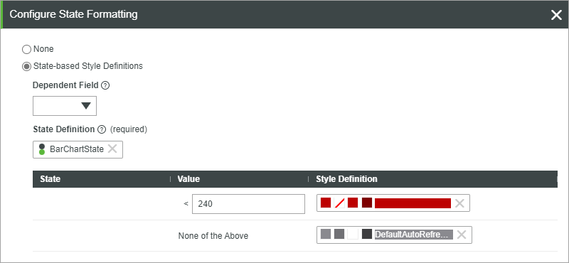
2. On the Properties panel, click State Formatting next to the DataSeriesStyleN property to open the state formatting dialog box.

3. Select State-based Style Definitions, and then choose a state definition entity.
You can also select a dependent field from the bound infotable with the data to use when evaluating the state condition.
4. Click Done to close the dialog box, and then view the mashup.
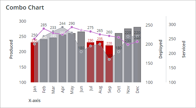
At run time, the chart data is displayed and each category is colored according to the defined states within the applied State Definition entity. The following example shows a combo chart with state formatting applied.

The applied state definition to the first series are as follows:
• Numeric values that are lower than 240 are styled in a red color.
• Any other value is styled using a gray color.
For more information about state formatting, see Example: Applying State Formatting to Charts.