Column Configuration from the Context Menu
When the data source for your grid is using a Data Shape, you can configure column options using the column configuration dialog box.
Configuring Columns in a Grid
1. In the Mashup Builder: Place the pointer on the menu drop down arrow in the top left corner of the grid, then click Configure Grid Columns. The Configure Widget dialog box opens.
in the top left corner of the grid, then click Configure Grid Columns. The Configure Widget dialog box opens.
2. Select Configure Grid Columns.
3. Configure column properties in the following areas of the dialog box:
◦ Left pane: Reorder the columns by dragging them to different locations in the list. When a column is selected, the tabs on the right display property settings specific to the selected column. You can also define which columns are seen by the end user of the grid:
▪ The Show and Exclude options define whether a specific grid column is visible to the end user. When selected, the end user does not see the column and does not have control over its appearance. However, you can still use data in the excluded column for state formatting. This property corresponds to the inLayout property when writing a configuration service.
◦ Use the Column Format tab to edit the name and description of a specific column and to control the following column formatting options:
▪ Title—Enables you to customize the column name by typing a string or selecting a localization token.
▪ Auto width—Column width automatically adjusts to fit the content of the selected column.
▪ Custom width—Set column width to a fixed pixel size or to a percentage. At run time, after any fixed-width columns are sized, percentage-width columns divide up the remaining space according to the assigned percentages.
If the total of all the percentage column widths exceeds 100%, each percentage column width is recalculated based on the specified percentage relative to the total. For example, if three columns are each assigned a percentage width of 50%, the calculation for each column width becomes: 50/150 = 33%.
Use percentage widths to automatically resize the grid responsively when the browser size changes.
 | To set individual column widths, clear the Auto width check box. |
▪ Cell Alignment and Header Alignment—Set the alignment of text in column cells and in the column header.
▪ Cell editing options—Select the Editable check box for a specific column to enable run time editing. Make sure that the IsEditable widget property is also enabled. You can edit cells at run time for different base types. For more information about the supported base types, see Column Renderers and Formats.
| | When configuring the order of columns in a tree grid, you can not configure an editable column as the first column. |
To validate cell data when a user is editing a cell within the selected column, define the following:
a. Validation Criteria Expression—An expression that validates input when a user edits a cell. You can use this box to define rules for each cell value under the column. For example, you can use the following syntax to validate that the numeric value of column 1 is smaller than column 2: column1 < column 2
b. Validation Criteria Message—A message that appears when the user types an incorrect value based on the defined expression.
See section Cell Editing in Advanced Grids for more information.
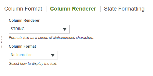
◦ Use the Column Renderer tab to control how the data within the selected column cells is rendered. You can choose a column Column Renderer and a corresponding Column Format. For more information about column renderers and their available formats, see Column Renderers and Formats.
◦ Use the State Formatting tab to apply static or conditional formatting to the widget. You can select Fixed Style Definition or State-based Style Definitions. The State formatting that you set on this tab is cell-based and overrides any row-based formatting set in Mashup Builder or through a configuration service.