Cell Validation
You can validate cells in the Advanced Grid and Advanced Tree Grid. Cell validation is essential to avoid any invalid entry in the grid during editing. Through cell validation, you can display a validation error and provide an error correction message in a tooltip. You can display validation errors in the Mashup Builder configuration using the ValidationErrorCellStyle and ValidationErrorTooltipStyle properties. You can also do cell validation using the JSON configuration.
• Use ValidationErrorCellStyle property to style the cell when a validation error occurs. This style supersedes any other style that is configured for a cell.
• Use ValidationErrorTooltipStyle property to style the tooltip when a validation error occurs.
• You can configure validation expressions and an error messages using JSON or using the widget configuration dialog. To localize the error message, use a localization token.
When a validation fails, the configured error message appears in the tooltip for the cell, and the cell border is outlined in either red or yellow depending on the type of error.
There are two types of validation errors:
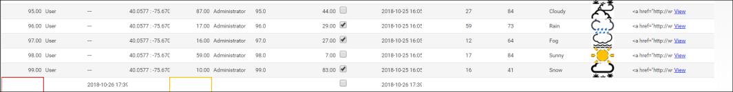
• Blocking error: These are warning errors. For example, the errors in an id column or the errors in an empty cell that is configured with the NotEmpty validator. You cannot save the edits until these errors are resolved. These errors are highlighted with a red border by default.
• Non blocking error: These are not critical, such as a string value entry in a cell that was configured for integer. You can save the edits before resolving these errors. These errors are highlighted with a yellow border by default.
See the following example to see the difference between these errors.
 | Cell validation is important on the primary key column to avoid any server error or exception. The primary key column is assigned using the IDFieldName property. Usually, it is the id column. |
Add the following content for cell validation and to define the validation error style and tooltip style.
"cellEditor": { // optional: defines cell-editing options for this column
"enabled": true, // *{boolean} to indicate whether cell editing is enable for this column
"validator": { // optional: when defined will validate input values against the chosen validator types and error and success messages will be displayed.
"types": ['NotEmpty'], // {Array} optional: defines list of validator types, e.g. 'NotEmpty', 'ValidURL' or 'Custom'.
"errorMessage": "[[invalidNumberNotEmpty]]", // *{string} localization token name of the error message.
"errorStyle": "cellValidationErrorStyle" // *{string} style definition name of the error message. }
}
"cellValidationErrorStyle": {
"backgroundColor": "",
"secondaryBackgroundColor": "",
"foregroundColor": "black",
"textDecoration": "none",
"image": "",
"lineColor": "red",
"borderStyle": "solid",
"borderWidth": "1px",
"fontFamily": ["helvetica", "arial"],
"fontStyle": "normal",
"fontSize": "11px",
"fontWeight": "normal"
},
"cellValidationErrorTooltipStyle": {
"backgroundColor": "red",
"secondaryBackgroundColor": "",
"foregroundColor": "white",
"textDecoration": "none",
"image": "",
"lineColor": "white",
"borderStyle": "solid",
"borderWidth": "1px",
"fontFamily": ["helvetica", "arial"],
"fontStyle": "normal",
"fontSize": "11px",
"fontWeight": "normal"
},
"tooltipStyle": {
"backgroundColor": "#0000ff",
"secondaryBackgroundColor": "",
"foregroundColor": "#ffffff",
"textDecoration": "",
"image": "",
"lineColor": "",
"borderStyle": "none",
"borderWidth": "",
"fontFamily": ["helvetica", "arial"],
"fontStyle": "normal",
"fontSize": "12px",
"fontWeight": ""
},
Validation is available for each renderer type. Depending on the column renderer type, you can specify the validator in the JSON configuration. The following validators are available for each renderer type:
Renderer | Validators |
|---|---|
string | <None>, NotEmpty, ValidURL |
integer | <None>, NotEmpty, (ValidInteger is default) |
long | <None>, NotEmpty, (ValidNumeric is default) |
number | <None>, NotEmpty, (ValidNumeric is default) |
boolean | <None>, NotEmpty, (ValidBoolean is default) |
location | <None>, NotEmpty, (ValidLocation is default) |
html | <None>, NotEmpty |
imagelink | <None>, NotEmpty |
hyperlink | <None>, NotEmpty, ValidURL |
datetime | <None>, NotEmpty, (ValidDatetime is default) |