Using the Style Properties Panel
By default, the panel is located in the lower section of the left dock. You can use it to perform the following tasks:
• Change the style theme for the current mashup by choosing from a list or using a binding.
• Override style theme properties for a specific item.
• Edit style definitions for items to which style themes cannot be applied.
The mashup style theme applies style properties that control the look and feel of all the items in a mashup. By default, all items that support theming in a mashup derive their styling properties from the applied style theme. Style themes are global, and you may want to customize a specific widget differently. You can use the Style Properties panel to modify the style of individual items in the mashup. Each supported item has its own set of style properties. You can modify style properties to override the style theme and create a different look for two widgets of the same type.
There are two types of style properties on the panel:
• Predefined properties—Style properties that are set using values and settings from the current style theme.
• Empty properties—Additional style properties that you can modify to customize the look of the selected widget. These properties are not set in the style theme, and are only listed on the panel. You can use these properties to perform advanced style configuration of each widget in a mashup.
 |
You cannot modify style theme settings in the Style Properties panel. For more information, see Modifying a Style Theme and Using the Styles Tab.
|
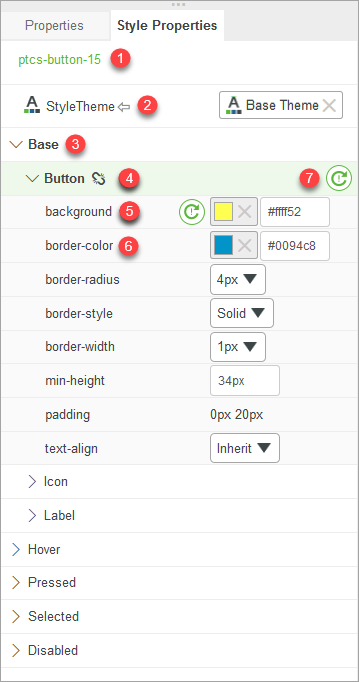
The Panel Interface
1. The name of the selected item.
2. The Mashup style theme property.
3. The item state.
4. The element within the item.
5. A style property.
6. A style property with active overrides.
7. Resets all properties under the element.
Selecting Items for Styling
You can select an item to modify its style properties in one of the following ways:
• Select an item from the list in the Explorer panel.
• Click an item directly on the mashup.
The style properties for the item are displayed on the Style Properties panel.
Modifying Style Properties
To customize the look of a specific item, perform the following steps:
1. Select the item.
2. Click the Style Properties panel.
For example, the default style for a Button widget in the base state is as follows:

To customize the Button widget, on the Style Properties panel, expand the Base state, and then edit style properties under the following elements:
• Button:
◦ background—Specifies the background color of the widget.
Enter #ffff52 in the value field.
◦ border-style—Specifies the style of the button borders.
Select Dashed from the list.
• Label:
◦ font-family—Sets the font used for the button label.
Select Courier from the list.
The changes are automatically applied in the mashup. The button appearance changes to the following:

Different widget types have different states and style properties, depending on the widget function and structure. For example, the Slider widget has more states than the Button widget.
Resetting Style Properties
The  icon indicates that a style property was modified. You can restore the style theme value for a single property, or all the properties under an element:
icon indicates that a style property was modified. You can restore the style theme value for a single property, or all the properties under an element:• To reset a single property, click  next to the property.
next to the property.• To reset all properties under an element, click next to the element group.
next to the element group.