Applying State Formatting to Widgets
Applying State Definitions to Widgets
You can edit and apply state formatting to a widget by clicking the Renderer and State or State Formatting button on the Properties panel.
 |
Some widgets, such as the Grid Advanced, list state formatting options when you open the widget configuration dialog box.
|
The following table lists the property names that you can use to apply style formatting to themed widgets in ThingWorx 9.1 and later:
|
Widget
|
Property Name
|
Available Configuration
|
|---|---|---|
|
Line Chart
Bar Chart
Pareto Chart
|
DataSeriesStyle
|
State formatting only
|
|
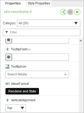
Value Display
|
ValueFormat
|
Renderer and state formatting
|
|
Grid Advanced
|
RowFormat
|
Renderer and state formatting
|
|
List
List Shuttle
DropDown List
|
ListFormat
|
Renderer and state formatting
|
|
|
Before you can apply a state definition to the List and List Shuttle widgets, you must bind the widget to a data source.
|
The following image shows the ValueFormat property for the Value Display widget. To open the data and state formatting dialog box, click Renderer and State.
When you open the state formatting dialog box, different options are displayed depending on the widget categories:
For legacy and standard widgets that use style definitions:
• None—Uses the style definitions that are set on the Style Properties panel.
• Fixed Style Definition—Sets a fixed style for the widget at run time. This option overrides other styles defined on the Style Properties panel.
• State-based Style Definitions—Specifies the state definition entity to apply to the widget. You can edit and configure the style definitions within the state definition entity for the current widget.
For Standard widgets that are styled using a style theme:
• None—Uses styles from the mashup style theme and any overrides on the Style Properties panel.
• State-based Style Definitions—Specifies the state definition entity to apply to the widget. The state styling overrides the style theme and style properties.
Some widgets such as the Value Display and List display a Renderer drop-down list. This drop-down list enables you to specify the data type such as a number, string, HTML, XML, and more to display in the widget. When you select an option, additional formatting options are displayed, depending on your selection.
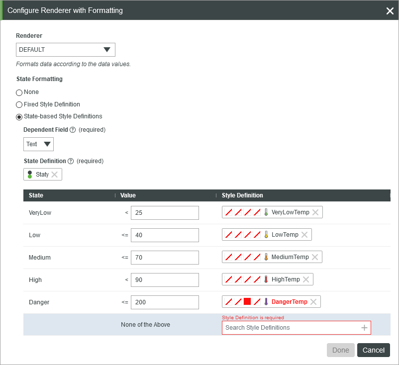
When you select a state definition, its defined states are listed in a table. The default value of each state is displayed next to the condition based on the values in the state definition entity. Specifying a default state is optional within each state definition entity; however, you must select a style definition when applying a state definition to a widget. When you select a state definition, you must specify a style definition to use when none of the state values are matched.
The Dependent Field is a required option for most widgets. The field specifies the infotable column to use when evaluating the state formatting conditions. For some widgets, such as themed charts, the dependent field is optional and you can leave this option empty. This enables you to apply state formatting based on the value of each data series separately instead of using on a specific column.
To apply a custom style without creating an entity or using an existing entity, click New Custom Style in the entity picker. This opens the Custom Style Definition dialog box where you can create a custom style definition.
| | Custom style definitions that you create using the dialog box are not saved when you remove or reset the state formatting. |
To change the default value for different states within the state definition entity, type a new value under the Value column. The new values override the defaults for the current widget.
After you apply the state definition, properties for each state are added to the Properties panel. These properties are named using the following pattern: <PropertyName>_<StateName> where state name is the name that you defined for each state. Each property shows the current value for the state. To override the values in the state formatting dialog box, type a value manually, or bind a value from a service or another widget. For example, the following image shows bindable state value properties for the Value Display widget:

Each state from the applied state definition is listed as a bindable property: You can use these properties to override the values that are defined in the state formatting dialog box.
| | To reset the state values, remove and then add the state definition, or click  next to the state formatting property. next to the state formatting property. |