Confirmation
 |
In previous releases of ThingWorx, the Confirmation dialog was part of the Button and Logout widgets. This function merges the functionality into a set of properties that you can bind to any widget. To create the same functionality, bind the Clicked event of a Button or a Logout widget to the function.
|
The confirmation function enables you to display confirmation dialogs within your mashups. You can use the confirmation dialog to add the following functionality:
• Highlight important information as a message.
• Verify that the user wants to perform an action.
• Offer the user multiple choices when performing a task.
To open the confirmation dialog during run time, bind events, such as the Clicked event property of a Button widget, to the OpenConfirmation service. When the button is clicked, the Clicked event triggers the OpenConfirmation service and the confirmation dialog opens.

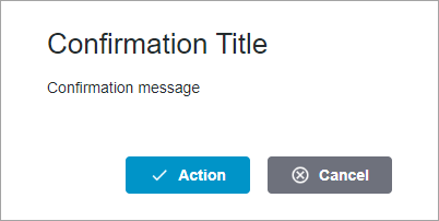
By default, the dialog has an action and a cancel button. You can add an additional action button and a close button. To customize the action and cancel buttons, specify a text label, an icon, or a combination of a text label and an icon. The following figure shows a confirmation dialog with buttons that contain text and icons.
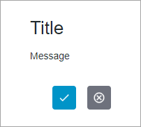
You can remove the default labels and use only icons for the action and cancel buttons. This enables you to create smaller confirmation dialogs. In the following figure, the dialog buttons have icons instead of text labels.
You can change the text type, size, and color, in addition to the style of the dialog buttons by customizing global and element style theme settings. For more information about style theme settings, see Using the Styles Tab.
Function Options
You can configure the confirmation function by setting the following options:
Option | Description |
|---|---|
Description | A description for the function |
Title Text | The title of the confirmation dialog |
Message Text | The message to display in the confirmation dialog |
Dialog Width | Specifies a fixed width for the dialog. Set to 600 by default |
Dialog Height | Specifies a fixed height for the dialog. Set to 260 by default |
Cancel Button Label | The label for the Cancel button |
Cancel Button Icon | Specifies the icon for the cancel button. |
Cancel Button Tooltip | The text label for the cancel button tooltip |
Cancel Button Tooltip Icon | Specifies the icon for tooltip of the cancel button |
Action Button Position | The position of the action button in the dialog. You can set it to Left or Right |
Action Button Label | The text label for the action button |
Action Button Icon | Specifies the icon for the action button |
Action Button Tooltip | The text label for the action button tooltip |
Action Button Tooltip Icon | Specifies the icon for the action button tooltip |
Action Button Type | The action button type. You can set it to Primary or Danger |
Add a Second Action Button | Displays a second action button |
Second Button Label | The text label for the second action button |
Second Button Icon | Specifies the icon for the second action button |
Second Button Tooltip | The text label for the tooltip of the second action button |
Second Button Tooltip Icon | Specifies the icon for tooltip of the second action button |
Close Button | Displays a close button in the confirmation dialog |
Creating a Confirmation Function
1. On the Functions panel, click  . The New Function dialog opens.
. The New Function dialog opens.2. Select the Confirmation function from the drop down list.
3. Enter a name for the function, and then click Next.
4. Modify the function options as required.
5. Click Done.
The confirmation function is added to the Functions panel.
Function Properties
The Confirmation function contains the following properties.
Property | Description | Base Type | Default Value | Bindable? (Y/N) | Localizable? (Y/N) |
|---|---|---|---|---|---|
TitleText | Sets the title of the dialog. | STRING | n/a | Y | Y |
MessageText | Sets the text message for the dialog. | STRING | n/a | Y | Y |
DialogWidth | Sets a fixed width for the dialog. | NUMBER | 600 | Y | N |
DialogHeight | Sets a fixed height for the dialog. | NUMBER | 260 | Y | N |
OpenConfirmation | A service that opens the confirmation dialog. | n/a | n/a | Y | N |
ActionClick | An event that triggers when the primary action button is clicked. | n/a | n/a | Y | N |
SecondActionClick | An event that triggers when the second action button is clicked. | n/a | n/a | Y | N |
CancelClick | An event that triggers when the cancel button is clicked. | n/a | n/a | Y | N |