Scorecard
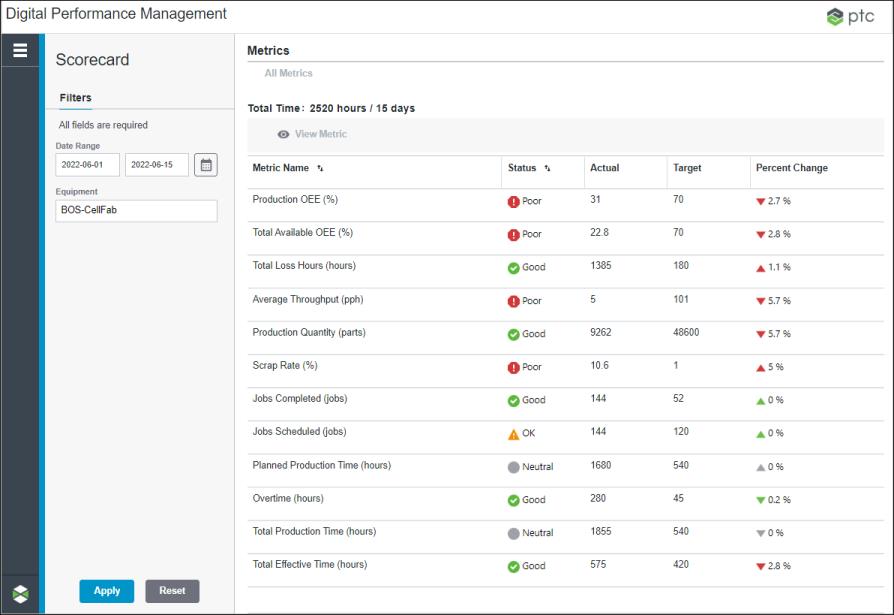
The Scorecard tool provides a dashboard displaying the performance data of work centers across the enterprise using a predefined set of key manufacturing metrics. From the dashboard, you can view trends for individual metrics, and drill down to view metric information at different levels of the equipment hierarchy. This tool helps manufacturing executives, plant managers, and supervisors to visualize, analyze, and track progress at different levels of the equipment hierarchy. The data can be further leveraged by executives to understand the financial impact.
You can access this tool by selecting Scorecard from the navigation menu on the left.

The metrics table displays the operational and performance data for all of the selected work centers in the filtered date range. The information on this page is read-only.
Total Time represents the total possible production time in hours for all of the work centers in the filtered date range and equipment. When the filter includes the current date or a future date, the total time is calculated up to the current time of the current day. For example, if there are 10 days in the filtered date range starting from a past date through today with the current time as 10:00, and the filtered equipment is a site with 7 work centers, then the total possible production time in hours is 1582, calculated as 9 days multiplied by 24 hours each day plus 1 day multiplied by 10 hours, multiplied by 7 work centers. In this case, the Total Time value is 1582 hours/9 days.
For each metric, the following columns are displayed:
Column | Description |
|---|---|
Metric Name | The name of the metric. |
Status | The current status for the metric. • • • • For more information on how these statuses are defined, see Status Threshold Tab. |
Actual | The current value of the metric for the filtered date range. The displayed value is a positive number, rounded to one decimal place for metrics with a unit of measure as parts per hour or percent. The value for metrics with a unit of measure as parts, hours, or jobs are displayed as positive whole numbers. This value is calculated for the filtered date range. |
Target | The target value for the metric. The value is rounded to one decimal place for metrics with unit of measure as parts per hour or percent. The value for metrics with a unit of measure as parts, hours, or jobs are displayed as positive whole numbers. This column is blank if no target value has been specified for the metric. For metrics with the aggregate roll-up behavior, the target value is normalized for the filtered date range. For example, a target value that is set to 100 parts each day is displayed as 700 if the filtered date range is 7 days. For more information, see Metric Roll-Up Behavior. |
Percent Change | The percentage change from the start date to the end date of the filtered date range. This value is derived by comparing the actual values from the start date to the end date of the filtered date range, and is rounded to one decimal place. • • • • • • A 0% change is represented as For more information, see Understanding the Percent Change. |
You can sort the table on Metric Name and Status columns.
From the metrics table, you can drill down to analyze the trend and the hierarchy breakdown for individual metrics in the Metrics page. To open the Metrics page, select a metric and click View Metric. To view more information about drilling into a metric, see Viewing Individual Metrics.
To view more information about the metrics used in Scorecard, see Metrics List.