Product Page
Most product pages include a navigation path and menu bar. For more information, see
Page Navigation.
|
|
The product Summary page does not include the elements discussed below. See the section Product Summary Page below for details on working with this page.
|
Product Page Header
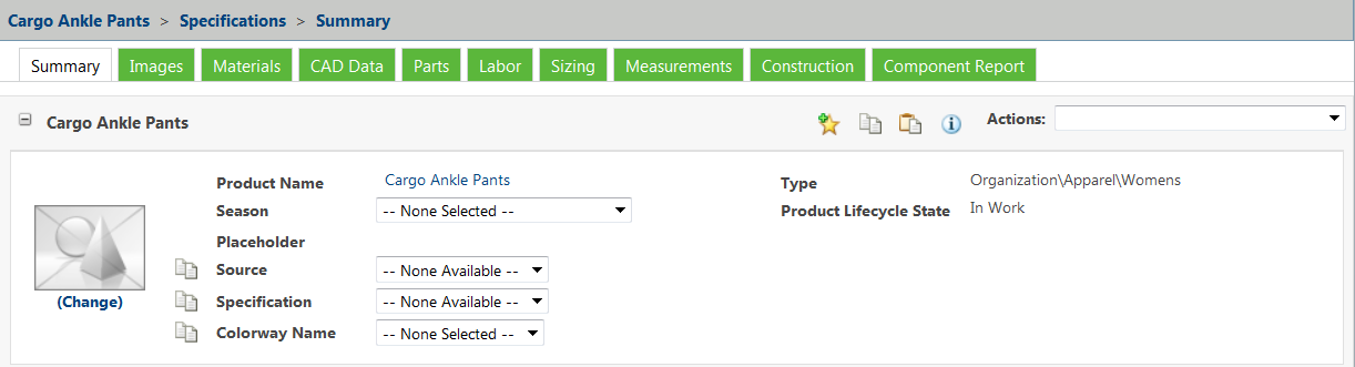
Some product content pages include a header box, which includes product information and a set of product filters that enable you to filter product information for that page. The available menus vary, depending on the product content page you are viewing.
• The Type field contains the product type, such as apparel or footwear.
| Product types are defined by your administrator. |
• The Product Lifecycle State field contains the current state (such as In Work, Pending, or Approved) for the product, source, specification, or colorway, depending on the content page you are viewing.
• The system displays an image thumbnail, which you can update by doing the following:
◦ Selecting > and browsing to a file from the Thumbnail field. You can drag and drop of file on the update page of product.
◦ You can update thumbnail on the view page of product in all tabs by dragging an image file from your desktop or a folder and dropping it onto the thumbnail.
The following graphic appears when no image is available:

• The Actions menu allows you to perform actions that apply to the entire product. This is referred to as the main Actions menu when the page contains other menus that are specific to the contents of that page. Other menus are referenced by the page in which they are found, such as the Specification menu.
• There are four icons to the left of the Actions menu:
◦ The favorites icon

adds the current product to your list of favorites, and allows you to select it from the
Favorites section of the
Site tab.
◦ The copy icon

copies all product options for the current product to the clipboard.
◦ The paste icon

allows you to select product options on the clipboard to paste into the current product.
◦ The information icon

displays existing relationships between the current product and other products.
• When you scroll down on some product pages, a smaller header appears as you navigate through the page. The header contains the navigation path, icons,
Actions menu, product thumbnail, selection lists, and menu bar. You can collapse or expand the header by clicking the collapse

or expand

icon in the upper left corner of the header. The default behaviour of collapsed or expanded mode of the sticky header is controlled by
stickyProductHeader.Toggle.Expand property. For more information see,
System-Wide Property Settings in PTC FlexPLM | You cannot update the product thumbnail in the smaller header. To update the product thumbnail, scroll to the top of the page. |
Non-Header Content
Non-header content of product pages varies depending upon the page. See the documentation for the specific page for more details.
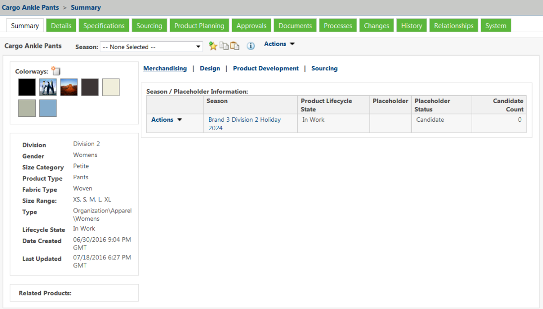
Product Summary Page
The product Summary page provides you with an overview of the product. It allows you to quickly access product options and pages. It includes the four product header icons, as well as an Actions menu and a Season menu.
The product Summary page also includes links to four additional sections, the Merchandising, Design, Product Development, and Sourcing sections. Clicking the name of each section displays product information related to that area, grouped into sections.
The product Summary page also displays the colorways for that product/season combination, key information about the product, and related products such as linked or copied products.