KPI Reports
OEE Report
The overall equipment effectiveness (OEE) report provides an overview of factors that are impacting OEE for the selected piece of equipment and time frame.
The Daily KPI Trend chart shows the trend of the KPI values over the selected time frame. From the Mode drop-down, choose between displaying the chart in Daily mode or Progression mode. Hover over a data point in the chart to see the KPI details for that day. To export the raw data used for this chart as a CSV file, click Export.

The Utilization Timeline chart shows the time spent by the selected equipment in each utilization category: Uptime, Work Unit Restraint, No Category, and Unavailable. Users can zoom in and out on the chart to view information for specific time frames as well as hover over the bar for any of the downtime categories to view details for that downtime occurrence. To export the raw data used for this chart as a .csv file, click Export.

Availability Report
The availability report provides an overview of factors that are impacting availability for the selected piece of equipment and time frame. Users can drill down to see details about the high-impact reasons, which can help to determine the priorities for improving the availability KPI.
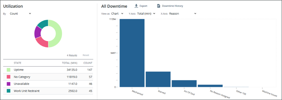
The Utilization pane displays a pie chart that shows the breakdown of uptime and downtime information grouped by reason category. The grid beneath the chart displays the total minutes and event count for each reason category. If there are more than eight reason categories, the additional categories are grouped into one category named Others. All reason categories are listed
By default, the right pane displays the information for all downtime categories and is organized from highest impact to lowest impact. Users can select a reason category in the utilization grid to display information for that category in the right pane. To return to the default view for both panes, click Reset.
Click Downtime History to open a new tab for a grid of filtered downtime results from the selections in the report.
The view can be modified in the right pane using the following options:
• View as—Choose between viewing the information as a chart or grid.
• Y-Axis—When viewing the information as a chart, users can choose to display it on the Y-axis by count or by total minutes.
• X-Axis—When viewing the information as a chart, users can choose to display the information grouped on the X-axis by Product, Product Category, Shift, Crew, or Reason, as appropriate for the reason category or categories displayed. If there are more than eight bars in the chart, the additional information is grouped into a bar named Others.
• By—When viewing the information as a grid, users can choose whether the information by is presented by Product, Product Category, Shift, Crew, or Reason, as appropriate for the reason category or categories displayed. Each piece of information is listed individually in the grid. For each piece of information presented, the total minutes and count are displayed.
Performance Report
The performance report provides an overview of factors that are impacting performance for the selected piece of equipment and time frame. Users can drill down to see details about which product, crew, or shift has the highest impact on performances losses, which helps to identify areas that are the best candidates for improving the performance KPI.
The Percent of Ideal Production pane displays a pie chart showing the breakdown of time spent in each production percentage range. The grid beneath the chart displays each percentage range and its percentage of the total.
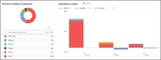
By default, the Slowdown Losses pane displays slowdown losses by percentage for each product, organized from highest impact to lowest impact. Select a percentage range from the Percent of Ideal Production grid to see a drilldown of that percentage range in the Slowdown Losses pane. Click Reset to return to the default view for both panes.
The view can be modified in the right pane using the following options:
• View as—Choose between viewing the information as a chart or as a grid.
• Y-Axis—When viewing the information as a chart, users can choose to display it on the Y-axis by Quantity or Percentage. When displayed by quantity, the stacked bar displays the quantity as the minutes lost that correspond to each percentage range.
• X-Axis—When viewing the information as a chart, users can choose to display the information grouped on the X-axis by Product, Product Category, Shift, or Crew. If there are more than eight bars to display, the additional information is grouped into a bar named Others.
• By— When viewing the information as a grid, users can choose whether the information is presented by Product, Product Category, Shift, or Crew. Each piece of information is listed individually in the grid. For each piece of information in the grid, the ideal production, actual production, slowdown losses, and unit of measure are displayed.
To export the raw data used for this report as a .csv file, Click Export.
Quality Report
The quality report provides an overview of factors that are impacting the quality for the selected piece of equipment and time frame. Users can drill down to see details about the high impact reasons, which can help to determine the priorities for improving the quality KPI.
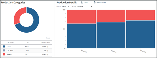
The Production Categories pane displays a pie chart that shows the breakdown of production grouped by category: Good, On Hold, and Rejects. The grid beneath the chart displays the percentage, units, and unit of measure for each category.
By default, the Production Details pane displays a chart that shows the state percentage for each product, organized from highest impact to lowest impact.
The view can be modified in the right pane using the following options:
• View as—Choose between viewing the information as a chart or as a grid.
• X-Axis—When viewing the information as a chart, users can choose to display it grouped on the X-axis by Reason, Product, Product Category, Shift, or Crew, as appropriate for the production category or categories being viewed. If there are more than eight items to display, the additional information is grouped into a bar named Others.
• By—When viewing the information as a grid, users can choose whether the information is presented by Product, Product Category, Shift, Crew, or Reason, as appropriate for the production category or categories being viewed. Each piece of information is listed individually in the grid. For each piece of information in the grid, the produced quantity and unit of measure are displayed.
Select a category in the Production Categories grid to see a drilldown for that category in the Production Details pane. Click Reset to return to the default view for both panes.
To export the raw data used for this report as a .csv file, click Export. Click Waste History to view the waste display for the selected equipment and time frame.