KPI Drilldowns
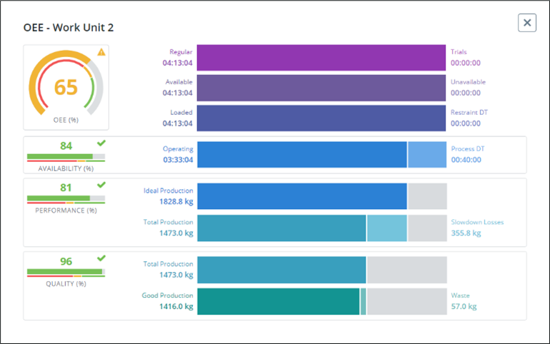
OEE
The OEE drilldown provides additional details about the information that is used to calculate the overall equipment effectiveness (OEE).
The following information is displayed in the OEE drilldown:
• OEE detail—Displays multiple time considerations for the equipment. Each line represents a new loss of available time based on specific category.
• Availability detail—Displays the maximum available time of the asset for production. You can find more detail in the Availability drilldown.
• Performance detail—Displays the ideal production metric, compared to the actual total production and slowdown losses, based on the operating time. You can find more detail in the Performance drilldown.
• Quality detail—Displays the total production compared to the good quality production and waste. Waste is typically production that is rejected due to nonconformity with the quality requirements. You can find more detail in the Quality drilldown.
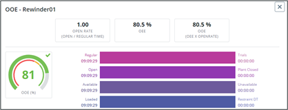
OOE
The OOE drilldown shows additional details about the information used to calculate the overall operation effectiveness (OOE). The OOE KPI calculation includes unscheduled time, such as time when the plant is closed, while looking at the total operations time as the maximum. The OOE detail portion of this drilldown includes an additional line showing whether the plant is open or closed. The rest of this drilldown is the same as the OEE drilldown.
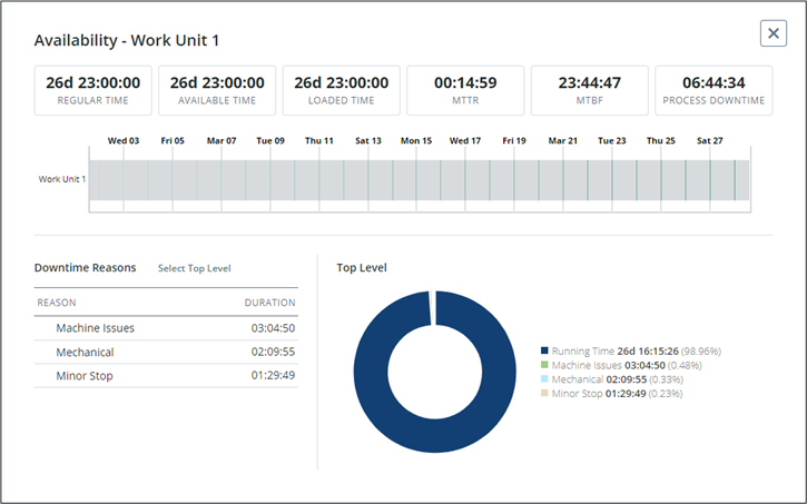
Availability
The Availability drilldown shows the availability over time for the selected asset.
The metrics at the top of the window show details related to availability. Any time metrics displayed here use the following convention: D HH:MM:SS. If the metric is less than a day, the time will just appear as HH:MM:SS.
Users can zoom in and out on the availability timeline to view information for different time frames. The default time frame that is displayed is the time frame selected in the KPI dashboard filter.
The reason tree on the left shows the reasons for each availability category. The circle chart on the right shows the breakdown of the equipment’s availability by category. Users can hover over a segment in the chart to see a tooltip of detailed information for the segment.
Select a specific availability reason in the reason tree to filter the data that is displayed in the chart. Click Select Top Level to return to the top-level chart view.
• Regular Time is the total amount of time between two dates.
• Available Time is the time when the equipment is available to run. This removes unavailable time from calendar time.
• Loaded Time is the time an equipment is scheduled to run.
• Mean time to repair (MTTR) is a maintenance metric that measures the average time required to troubleshoot and repair failed equipment. It reflects how quickly an organization can respond to unplanned breakdowns and repair them. The MTTR formula is calculated by dividing the total unplanned maintenance time spent on an asset by the total number of failures that asset experienced over a specific period. MTTR is commonly measured in hours.
• Mean time between failures (MTBF) is the average time between system breakdowns. MTBF is a crucial maintenance metric to measure performance, safety, reliability, and equipment design, especially for critical or complex assets like generators or airplanes. MTBF is one half of the formula used to calculate availability, together with mean time to repair (MTTR). The MTBF formula uses only unplanned maintenance and doesn’t account for scheduled maintenance, like inspections, recalibrations, or preventive parts replacements. To calculate MTBF, divide the total number of operational hours in a period by the number of failures that occurred in that period. MTBF is commonly measured in hours.
• Process Downtime is the aggregation of all downtime on the equipment not categorized as Unavailable or Work Center/Work Unit Restraint.
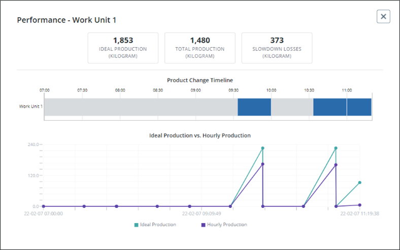
Performance
The Performance drilldown shows the production over time for the selected asset.
Users can zoom in and out on the Product Change Timeline to view different time frames. The default time frame displayed is the time frame selected in the KPI dashboard filter. Hover over a segment to give detailed production information, such as the start time, end time, and product.
The Ideal Production vs. Hourly Production chart shows a comparison of the ideal production and the hourly production over time. You can select a point on the chart to display production detail information.
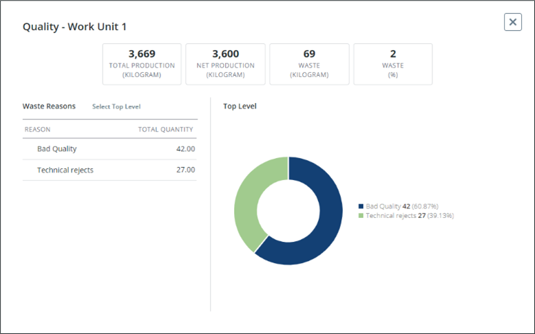
Quality
The Quality drilldown shows production numbers for the selected asset during the time frame displayed on the main KPI dashboard.
The reason tree on the left shows the detailed waste reasons for each main category. The chart to the right of the Quality drilldown shows the breakdown of machine waste. Hover over a segment in the chart to see a popup of detailed information for the segment.
Select a specific waste reason in the reason tree to filter the data that is displayed in the chart. Click Select Top Level to return to the top-level pie chart view.