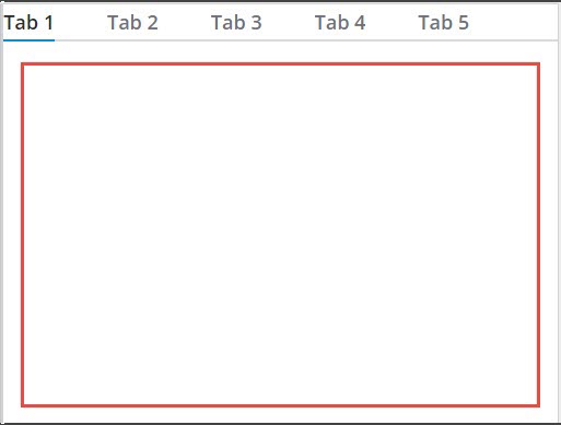
Tabs Widget (Themable)
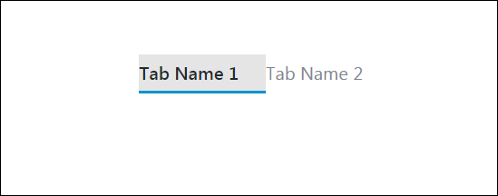
The Tab widget enables you to organize mashup content into separate views. Each view is a tab with a label that you can define using widget properties. At run time, only one tab is open at a time and the current tab is highlighted using an underline. The Tabs widget is a responsive widget that grows and shrinks based on the size of its container. You can set the widget to a fixed width or height by controlling the dimensions of the container, or using the widget Width and Height properties.
 |
The Tabs widget is available as a standard widget in the platform and as a web component that can be imported from an SDK.
|
You can configure the widget in the following ways:
• Specify the number of tabs and their labels.
• Specify the default tab to open when the mashup is viewed at run time.
• Set maximum a width for the tab labels.
• Enable and configure lazy loading for tab containers.
|
|
This feature is supported in ThingWorx 9.3.2 or later.
|
Using Lazy Loading in the Tabs Widget
By default, all tabs in the widget are loaded when the mashup is opened. Services that are bound to a widget on tab are executed when events, such as the mashup Loaded event, are triggered at run time. Executing services and loading widgets on background tabs can reduce performance when the Tabs widget contains multiple complex visualizations that include a large collection of widgets. You can configure lazy loading to defer loading non-visible tabs until they are needed at run time, which improves mashup and network performance. When you configure lazy loading on the widget, make sure to exclude the default tab from lazy loading because it is displayed instantly when the mashup opens. To enable lazy loading for a tab in the widget, perform the following steps:
1. In Mashup Builder, select a tab on the widget to display its content.
2. Select the container on the tab. The container properties are listed on the Properties panel.
3. On the Properties panel, set the LazyLoading property to True. Additional properties, services, and events for lazy loading are listed.
For more information about the lazy loading properties, services, and events, see Using Lazy Loading in a Mashup.
4. Bind the container Loaded event to execute any data services that are bound to widgets within the lazily-loaded container.
| | Avoid using the Loaded event of the mashup to execute services for a lazily loaded container. The returned data of services is displayed only when the tab is opened or the container is loaded using the LoadContainer service. |
5. Repeat the previous steps to enable lazy loading for any additional tab on the widget.
6. Click Save, then View Mashup.
At run time, lazily loaded tabs are automatically loaded when you open the tab. When the EnableContainerUnload property is enabled for a tab container, the container is automatically unloaded to free system resources and improve performance when it is not visible. When you switch back to an unloaded tab, the tab is automatically reloaded. You can create additional bindings to the lazy loading services of a tab to manually load and unload content using other events in the mashup, such as the Clicked event of a Button widget.
Widget Properties
| | All tab specific properties like Tab1Name, Tab1Value, Tab1Visible, and Tab1Disabled are available for each tab by default. For example, the Tab1Name property for the first tab appears as Tab2Name property for the second tab and as Tab3Name for the third tab. |
Property Name | Description | Base Type | Default Value | Bindable? (Y/N) | Localizable? (Y/N) | ||
|---|---|---|---|---|---|---|---|
SelectedTabValue | The value of the selected tab. | STRING | n/a | Y | N | ||
Disabled | Use this property to disable the widget in the mashup. The widget is displayed in the mashup but you cannot click it. | BOOLEAN | False | Y | N | ||
SelectedTabName | The name of the selected tab. | STRING | n/a | Y | N | ||
CustomClass | Enables you to define the CSS to the top div of the widget. Multiple classes can be entered, separated by space. | STRING | n/a | Y | N | ||
TabSequence | The sequence of the widgets in which they are highlighted when the user presses Tab key. | NUMBER | n/a | N | N | ||
NumberOfTabs | Sets the total number of tabs. The maximum number of tabs that you can set is 16 and the minimum is 1 tab. | NUMBER | 2 | N | N | ||
DefaultTabNumber | Enables you to select the tab that you want to show at run time when the mashup is loaded initially. For all subsequent mashup loadings, the tab that the user selected last at run time is shown. | NUMBER | n/a | Y | N | ||
TabNameHeight | Enables you to set the height of the tab name area. To hide the tab name area, set this property to 0. | NUMBER | 34px | Y | N | ||
Tab1Name | The name of the first tab. | STRING | Tab Name 1 | Y | Y | ||
Tab1Value | The value of the first tab. | STRING | Tab Value 1 | Y | N | ||
Tab1Visible | Sets the first tab to visible. | BOOLEAN | True | Y | N | ||
Tab1Disabled | Use this property to disable the first tab in the mashup. The tab is displayed in the mashup but you cannot click it. | BOOLEAN | False | Y | N | ||
Tab2Name | The name of the second tab. | STRING | Tab Name 2 | Y | Y | ||
Tab2Value | The value of the second tab. | STRING | Tab Value 2 | Y | N | ||
Tab2Visible | Sets the second tab to visible. | BOOLEAN | True | Y | N | ||
Tab2Disabled | Use this property to disable the second tab in the mashup. The tab is displayed in the mashup but you cannot click it. | BOOLEAN | False | Y | N | ||
SelectDefaultTab | A bindable service to reselect the default tab that is configured for this widget. | n/a | n/a | Y | N | ||
ResetInputsToDefaultValue | Resets all of the contained widgets to their default values. | n/a | n/a | Y | N | ||
TabNameMaxWidth | Sets a maximum width for the tab names. The excess characters are truncated in the tab name. | NUMBER | n/a | Y | N | ||
SwitchTabOnFocus | Switches to the focused tab automatically when using the arrow keys to change the focus.
| BOOLEAN | False | Y | N |