Tabs — Responsive Widget (Legacy)

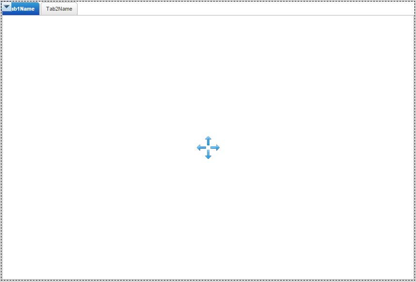
The Responsive Tabs widget is a special type of container. Each individual tab within the widget (you configure the number of tabs) has its own content. Only one tab can be visible at a time, although all the tabs load their content for fast switching between tabs.
You can change the selected tab by using another mashup environment event to change the SelectedTabValue or Name property.
Properties
For information about common widget properties, see Widgets. Properties that are specific to the Responsive Tabs widget are described in the table below.
|
Property Name
|
Description
|
Base Type
|
Default Value
|
Bindable? (Y/N)
|
Localizable? (Y/N)
|
|---|---|---|---|---|---|
|
CustomClass
|
User defined CSS class to apply to the top div of the widget. Multiple classes can be entered, separated by a space.
|
STRING
|
n/a
|
Y
|
N
|
|
NumberOfTabs
|
Number of tabs to display
|
NUMBER
|
2
|
N
|
N
|
|
DefaultTabAtRuntime
|
Tab that is active at run time when the mashup is loaded
|
NUMBER
|
1
|
N
|
N
|
|
SelectedTabValue
|
The value for the selected tab
|
STRING
|
n/a
|
Y
|
N
|
|
SelectedTabName
|
The label for the selected tab
|
STRING
|
n/a
|
Y
|
Y
|
|
TabHeight
|
Height of tabs in the widget
|
NUMBER
|
27
|
N
|
N
|
|
TabSpacing
|
Spacing between tabs in the widget
|
NUMBER
|
2
|
N
|
N
|
|
RoundedCorners
|
Shows tabs with rounded or sharp corners
|
BOOLEAN
|
true
|
N
|
N
|
|
Tab1–2Name
|
The label of the tab. This is the tab name displayed on the mashup and the value for SelectedTabName when a user tab change event is fired.
|
STRING
|
Tab1Name
|
N
|
Y
|
|
Tab1–2Value
|
The value on the tab. This is the value for SelectedTabValue when a user tab change event is fired.
|
STRING
|
Tab1Value
|
N
|
N
|
|
Tab1–2Image
|
The image displayed for the tab. You can choose a media entity.
|
IMAGE
|
n/a
|
N
|
N
|
|
Tab1–2Visible
|
Determines if the tab is visible or hidden.
|
BOOLEAN
|
true
|
Y
|
N
|
|
Tab1–2Disabled
|
Determines if the tab is disabled or enabled.
|
BOOLEAN
|
false
|
Y
|
N
|
Services
SelectDefaultTab
Use an event to return the Tab control to the Default tab.
ResetInputsToDefaultValue
Use an event to reset all input widgets in the Tab control to their default value.
Events
TabSelected
Fires when a tab is first selected. This event fires when the page loads for the first time and the default tab is selected in addition to when a user changes tabs.