Numeric Entry Widget
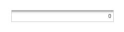
The Numeric Entry widget limits the user's input to numeric values only. The values will be range limited to numbers between the Minimum and Maximum values if the ConstrainValue property is true. The decimal places will be limited as well to the number of FixedDigits, if the value of FixedDigits is greater than zero. There is an option to allow or disallow negatives using the AllowNegatives property.
 |
Styles and common widget properties are not included in the table below.
|
|
Property Name
|
Description
|
Base Type
|
Default Value
|
Bindable? (Y/N)
|
Localizable? (Y/N)
|
|---|---|---|---|---|---|
|
CustomClass
|
User defined CSS class to apply to the top div of the widget. Multiple classes can be entered, separated by a space.
|
STRING
|
n/a
|
Y
|
N
|
|
Value
|
Value of the numeric value entry.
|
NUMBER
|
0
|
Y
|
N
|
|
ConstrainValue
|
Set to true to limit the value inputs to be between the minimum and maximum values.
|
BOOLEAN
|
False
|
N
|
N
|
|
Minimum
|
Minimum allowable data entry value.
|
NUMBER
|
0
|
Y
|
N
|
|
Maximum
|
Maximum allowable data entry value.
|
NUMBER
|
100
|
Y
|
N
|
|
FixedDigits
|
Number of allowable digits to the right of the decimal (zero is no limit).
|
NUMBER
|
0
|
N
|
N
|
|
AllowDecimals
|
When set to true, allows decimal values.
|
BOOLEAN
|
True
|
N
|
N
|
|
AllowNegatives
|
When set to true, allows negative values.
|
BOOLEAN
|
True
|
N
|
N
|
|
ValueAlign
|
The positioning of the value (Right, Left, or Center).
|
STRING
|
Right
|
N
|
N
|
|
LabelAlignment
|
The positioning of the label (Right, Left, or Center).
|
STRING
|
Left
|
N
|
N
|
|
InnerShadow
|
Adds an inner shadow effect to the inside of the textbox.
|
BOOLEAN
|
True
|
N
|
N
|
|
TabSequence
|
Order in the tab sequence.
|
NUMBER
|
0
|
N
|
N
|
|
ToolTipField
|
Optional tooltip that is displayed when hovering over the widget in run time.
|
STRING
|
n/a
|
Y
|
Y
|
|
Changed
|
Event. Triggered when there is a change in the data.
|
n/a
|
n/a
|
Y
|
N
|
|
ResetToDefaultValue
|
Service. Can be triggered using an Event. This will reset the numeric input to its default value.
|
n/a
|
n/a
|
Y
|
N
|
|
Label
|
The text to display to the top left of the widget.
|
STRING
|
n/a
|
N
|
Y
|