List Widget (Legacy)
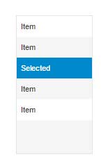
The List widget allows you to display any data set in a single column list view. The List supports many different ways to render the single column, including color contexting and rendering images in a cell. You can configure the basic rendering type, which column to view, and state formatting through the List widget's properties. You can configure the list to show as a simple list box, combo box, drop down list box, or a radio button list.
List Configuration
After linking a data service to the list, you can pick the column to display in the widget properties panel.
To use a specific renderer for the data, or to use state formatting, press the Renderer and State button next to the ListFormat property. For the displayed column, you can:
• Choose the renderer for the cell (used for specific data type handling in the data to be displayed).
• Choose styling (Fixed or State Formatting).
• If you wish to apply a fixed (non-dynamic) style, select Fixed Style and choose a previously defined style definition. If you wish to do dynamic formatting (color context, etc. based on returning data in a row), then choose State-based Formatting.
With State-based Formatting, you can apply a style to a row in the list based on any column in that row. To define a State Formatter:
1. Select the column that the formatting will be dependent on (it can be any column in the returning data service).
2. Select the state definition you wish to use for the displayed column (it should match the data type of the dependent field).
3. Accept the default values for the state definition or override them specifically for this list definition and rendering.
Combo Box
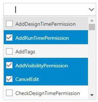
The combo box allows you to use a type-ahead search to narrow down the list of options in the drop-down. The Multiselect property allows you to add check boxes next to all list items (an alternate to using CTRL + SHIFT keys).
The following style definitions can be used with the Combo Box:
• ComboTextboxStyle
• ComboDropdownButtonStyle
Property Name | Description | Base Type | Default Value | Bindable? (Y/N) | Localizable? (Y/N) | ||||
|---|---|---|---|---|---|---|---|---|---|
CustomClass | User defined CSS class to apply to the top div of the widget. Multiple classes can be entered, separated by a space. | STRING | n/a | Y | N | ||||
ListFormat | The ListFormat property is used to apply a specific renderer for the data, and/or to apply a Fixed Style or State Based Formatting to the displayed data. | n/a | Renderer and State Value Formatting | N | N | ||||
MultiSelect | Allows you to select multiple items in the list. Checkboxes are added to each list item. | BOOLEAN | False | N | N | ||||
AutoSelectFirstRow | Auto select the first row of data when the data service is loaded. | BOOLEAN | False | N | N | ||||
View | Determines the type of list (List, Dropdown, Combo Box, or Radio Button List). The Combo Box allows you to perform a type-ahead search to narrow down list. | STRING | List | N | N | ||||
WidthOfDropdownView | The width (in pixels) of the dropdown view. The dropdown portion of the widget can be wider than the widget. | NUMBER | 110 | N | N | ||||
NumberOfItemsInDropdownView | The number of items to view in the list when in drop-down view. | NUMBER | 6 | N | N | ||||
NumberOfItemsPerPage | Enables you to set the number of items that is displayed per page in the Combo Box list view. Enter a value ≤ 0 to disable the pagination. | NUMBER | 500 | N | N | ||||
TabSequence | The index of widget in the tab sequence. | NUMBER | 0 | N | N | ||||
Alignment | The alignment of the widget (Left Aligned, Right Aligned, or Center Aligned). | STRING | Left Aligned | N | N | ||||
LabelAlignment | The alignment of the label (Left, Right, or Center). | STRING | Left | N | N | ||||
Data | The source of the data for the widget. | INFOTABLE | n/a | Y | N | ||||
DisplayField | The infotable field which represents the data to be displayed. | n/a | n/a | N | N | ||||
ValueField | The infotable field which represents the value. | n/a | n/a | N | N | ||||
EnableKeyboardSelections | The keyboard selection is enabled. | BOOLEAN | True | N | N | ||||
TextIfNoSelection | The text to display if nothing is selected in the list. | STRING | n/a | N | Y | ||||
TextIfNoSelectionType | Sets the text entered in the TextIfNoSelection property field to appear as a placeholder or an editable text in the mashup. | STRING | editable | N | N | ||||
ClearIfNoSelection | Clears the SelectedText if there is nothing selected. | BOOLEAN | False | N | N | ||||
DisableSelectedStyle | Disables the style that applies to any combo item that is selected. | BOOLEAN | False | N | N | ||||
SelectedText | The infotable field value that is currently selected.
| STRING | n/a | Y | N | ||||
SelectedItems | The infotable field values which are currently selected.
| INFOTABLE | n/a | Y | N | ||||
ListBackgroundStyle | The style of the list’s background. | STYLEDEFINITION | n/a | N | N | ||||
ListItemStyle | Style the drop down items. | STYLEDEFINITION | n/a | N | N | ||||
ListItemAlternateStyle | Styles the alternate rows in the dropdown. | STYLEDEFINITION | n/a | N | N | ||||
ListItemHoverStyle | Styles the hover of the items in the dropdown. | STYLEDEFINITION | n/a | N | N | ||||
ListItemSelectedStyle | Styles the selected item(s) in the dropdown. | STYLEDEFINITION | n/a | N | N | ||||
ListLabelStyle | Styles the text of the dropdown label which displays above the Combo Box. | STYLEDEFINITION | n/a | N | N | ||||
ListFocusStyle | The style of the textbox when in focus. | STYLEDEFINITION | n/a | N | N | ||||
ToolTipStyle | The style of the tooltip when it is enabled. | STYLEDEFINITION | n/a | N | N | ||||
DropdownButtonStyle | The style of the dropdown button. | STYLEDEFINITION | n/a | N | N | ||||
DropdownStyle | The style of the dropdown container. | STYLEDEFINITION | n/a | N | N | ||||
DropdownSelectedStyle | Styles the text color of the selected item. | STYLEDEFINITION | n/a | N | N | ||||
ComboTextboxStyle | Styles the Combo Box’s textbox. | STYLEDEFINITION | n/a | N | N | ||||
ComboDropdownButtonStyle | Styles the drop-down icon of the Combo Box. | STYLEDEFINITION | n/a | N | N | ||||
ComboItemHighlightedStyle | The combo item highlighted style. | STYLEDEFINITION | n/a | N | N | ||||
RowHeight | The height of each row at run time. | NUMBER | 28 | N | N | ||||
TextVerticalAlignment | Enables vertical alignment of the text in the row. The default value is 30 which applies to font sizes smaller than 14 px. For any larger font size, you have to adjust this value to a larger setting to ensure that the text is fully visible in the row.
| NUMBER | 30 | N | N | ||||
DoubleClicked | Event. The DoubleClicked event allows you to have a single click select on the data object, but still use a double click for another event, such as linking a double click to trigger a navigation link. | n/a | n/a | Y | N | ||||
Label | The label to display on the widget. | STRING | n/a | Y | Y |