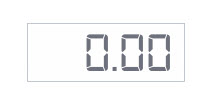
LED Display Widget

The LED Display widget is designed to take a numerical data value and display it on the mashup with contexting. You can use state formatting to do things like change the color of a numeric display based on its value.
|
|
Styles and common widget properties are not included in the table below.
|
|
Property Name
|
Description
|
Base Type
|
Default Value
|
Bindable? (Y/N)
|
Localizable? (Y/N)
|
|---|---|---|---|---|---|
|
CustomClass
|
User defined CSS class to apply to the top div of the widget. Multiple classes can be entered, separated by a space.
|
STRING
|
n/a
|
Y
|
N
|
|
Data
|
Data source for the widget.
|
NUMBER
|
n/a
|
Y
|
N
|
|
Digits
|
Number of digits to show in the widget.
|
NUMBER
|
5
|
N
|
N
|
|
Decimals
|
Number of decimals to show in the widget.
|
NUMBER
|
2
|
N
|
N
|
|
ZeroFill
|
Fill the widget with leading zeros.
|
BOOLEAN
|
False
|
N
|
N
|
|
LEDSize
|
LED Display Size (Extra Small, Small, Normal, Large, and Extra Large)
|
STRING
|
Normal
|
N
|
N
|
|
LEDFormatter
|
Optional rules to apply dynamic (state) formatting
|
STATEFORMATTING
|
n/a
|
N
|
N
|
|
LabelAlignment
|
Alignment setting for the label (Left, Right, or Center).
|
STRING
|
Left
|
N
|
N
|
|
ToolTipField
|
Optional tooltip field that will be displayed when a user hovers over the button in run time.
|
STRING
|
n/a
|
Y
|
Y
|
|
Label
|
Label for the widget that displays to the top left.
|
STRING
|
n/a
|
N
|
Y
|