Gauge Widget
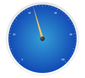
The Gauge widget is displays a needle gauge that visualizes a single value within a specific range. You can configure the widget in the following ways:
• Define how many sections or intervals the gauge has.
• Control the visibility and formatting of value labels.
• Set the aperture and reference angle values to control how the data range is displayed.
• Display a legend that describes the data.
• Control the sizing of the tick markers, needle, center dot, and the gauge border.
Binding Data to the Gauge Widget
To display data on the Gauge widget, you must bind a numeric property to its Data property.
1. In Mashup Builder, bind a numeric property from a service to the widget Data property.
2. On the Properties panel, configure the following properties:
◦ To set the range on the gauge, use the MinValue and MaxValue properties.
◦ To format the values and labels of the widget, use the ValueDecimals and LabelDecimals properties.
◦ To set the aperture of the value range, use the Aperture property. By default, the aperture is set to 255.
3. Click Save, then View Mashup.
The gauge value is displayed when the bound data service is executed at run time.
In ThingWorx 9.4 or later, you can bind a data source to the ValueDecimals and LabelDecimals properties to set the number of decimals dynamically. Different types of data may require specific formatting of value and label decimals. For example, you can match the value formatting to the current data type when the gauge displays data from multiple sources.
Configuring the Gauge Value Label
By default, the widget displays current value using the gauge needle. You can display a value using the widget ValueDisplayMode property. The following are the available options:
• None—Hides the value label (default).
• Inside—Inside the gauge.
• Top—Above the gauge.
• Bottom—Below the gauge.

Widget Properties
 | Styles and common widget properties are not included in the table below. |
Property Name | Description | Base Type | Default Value | Bindable? (Y/N) | Localizable? (Y/N) | ||
|---|---|---|---|---|---|---|---|
CustomClass | User defined CSS class to apply to the top div of the widget. Multiple classes can be entered, separated by a space. | STRING | n/a | Y | N | ||
Data | The widget data source. You must bind a single numeric value.
| NUMBER | n/a | Y | N | ||
MinValue | Minimum value for the gauge | NUMBER | 0 | Y | N | ||
MaxValue | Maximum value for the gauge | NUMBER | 100 | Y | N | ||
ValueFormatter | Styling rules for gauge needle and value display. | STATEFORMATTING | State Formatting | N | N | ||
FormatNeedle | Applies State Formatting to the needle. | BOOLEAN | True | N | N | ||
Intervals | Number of gauge intervals (affects ticks, labels, and indicator ring). | NUMBER | 10 | N | N | ||
IntervalsPerLabel | Number of gauge intervals per label (affects the amount of labels). | NUMBER | 2 | N | N | ||
LabelDisplayMode | Location to display the Label (inside, outside, or none). | BOOLEAN | Inside | N | N | ||
ShowDataLoading | Displays a spinning icon when data is loading. | BOOLEAN | True | N | N | ||
MinorTicks | Number of minor ticks between major ticks. | NUMBER | 4 | N | N | ||
TickLength | Length of major tick. | NUMBER | 8 | N | N | ||
MinorTickLength | Length of minor tick. | NUMBER | 4 | N | Y | ||
ValueDisplayMode | Location to display the Value (top, bottom, inside, or none). | STRING | Bottom | N | N | ||
LabelDigits | Number of digits used to display the label values. | NUMBER | 3 | N | N | ||
LabelDecimals | Number of decimals used to display the label values. | NUMBER | 0 | Y | N | ||
ValueDigits | Number of Digits used to display the values. | NUMBER | 3 | N | N | ||
ValueDecimals | Number of Decimals used to display the values. | NUMBER | 0 | Y | N | ||
LegendDisplayMode | Location to display the legend (Top, Bottom, or None). | STRING | Bottom | N | N | ||
Legend | Text for the gauge legend. | STRING | n/a | Y | Y | ||
ReferenceAngle | Angle that controls the gauge orientation (degrees). | NUMBER | 225 | N | N | ||
Aperture | Angle that controls the gauge size (degrees). | NUMBER | 270 | N | N | ||
NeedleDiameter | Diameter of the gauge needle (pixels). | NUMBER | 10 | N | N | ||
CenterDiameter | Diameter of the gauge center (pixels). | NUMBER | 20 | N | N | ||
GaugeBorder | Width/thickness of the gauge border (pixels). | NUMBER | 20 | N | N | ||
RingWidth | Width/thickness of the gauge ring (pixels). | NUMBER | 10 | N | N | ||
ToolTipField | Optional tooltip that is displayed when hovering over the widget in run time. | STRING | n/a | Y | Y | ||
ShowDataLoading | Shows data loading. | BOOLEAN | True | N | N | ||
Visible | Sets the visibility of the widget at run time. | BOOLEAN | True | Y | N |