Dynamic Panel Widget (Themed)
 |
The Dynamic Panel is available as a standard widget in the platform and as a web component that you can import from an SDK.
|
The Dynamic Panel widget is a type of container that users can adjust dynamically at run time. You can use the widget to show or hide a container in a mashup. The dynamic panel can anchor to the left, right, top, or bottom of the parent container. You can adjust the panel width and open and collapse the panel dynamically at run time. You can use the dynamic panel to provide additional information or form inputs that are related to the main container in a layout.
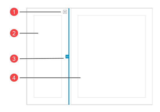
1. Expand and collapse button
2. Side container
3. Drag handle
4. Main container
Configuring the Panel as Collapsible Sections
In ThingWorx 9.3.3 or later, you can use the DynamicPanelType property to configure the widget as collapsible sections. Using this variant saves space by hiding non-essential details or controls from the main layout. Users can manually expand and collapse sections as required. Unlike the adjustable panel, the containers do not automatically grow to fill the available space in the layout, and their height changes based on their content.
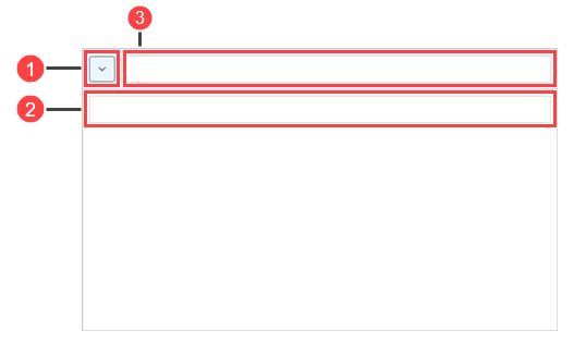
1. Expand and collapse button
2. Section body
3. Section header
| | To display a contained mashup in the body section of the dynamic panel, you must specify a value in the SectionBodyMinHeight property. |
Widget Properties
Property Name | Description | Base Type | Default Value | Bindable? (Y/N) | Localizable? (Y/N) |
|---|---|---|---|---|---|
TabSequence | Sets the sequence in which the widget is highlighted when you press TAB. | NUMBER | n/a | N | N |
SectionBodyMaxHeight | Sets the height of the section header. | NUMBER | Autosize | N | N |
SectionBodyMinHeight | Sets the minimum height of the section header. | NUMBER | Autosize | N | N |
SectionHeaderHeight | Sets the height of the section header. | NUMBER | Autosize | N | N |
HideTriggerButton | Hides the trigger button. | BOOLEAN | False | N | N |
HideDragHandle | Hides the dragging handle. | BOOLEAN | False | N | N |
Disabled | Disables the widget in the mashup. The widget appears but it is not available to use. | BOOLEAN | False | Y | N |
DynamicPanelType | Controls the dynamic panel type. You can display an adjustable panel or a collapsible section. | STRING | Adjustable Panel | N | N |
CustomClass | Defines the CSS to the top div of the widget. When entering multiple classes, separate each class with a space. | STRING | n/a | Y | N |
PanelSize | Sets the panel size. | STRING | 220 | Y | N |
ClickOutsideToClose | Closes the panel when you click outside the panel. | BOOLEAN | False | Y | N |
Behavior | Sets the panel to Push Content or Flyover. | STRING | Push Content | Y | N |
AnimationSpeed | Sets the speed of the animation of the panel that expands and collapses as Fast, Medium or Slow. | STRING | Medium | Y | N |
MinSizeWhenExpanded | Sets the minimum width of the panel when expanded along the horizontal axis. The minimum value is 34 pixels. If the panel is at the top, this property defines the height along the vertical axis. | STRING | 50 | Y | N |
MaxSizeWhenExpanded | Sets the maximum width of the panel when expanded along the horizontal axis. If the panel is at the top, this property defines the height along the vertical axis. | STRING | 100% | Y | N |
SizeWhenCollapsed | Sets the width of the panel when collapsed along the horizontal axis. If the panel is at the top, this property defines the height along the vertical axis. | STRING | n/a | Y | N |
AnchorLocation | Sets the location of the anchor as Left, Top, Right, or Bottom in the panel. | STRING | Left | Y | N |
CollapseByDefault | Sets the panel to collapse by default when the mashup is loaded. | BOOLEAN | False | Y | N |
TriggerButtonLocation | Sets the location of the trigger button to Top, Center, Bottom, Panel, or None. | STRING | Top | Y | N |
TriggerButtonType | Sets the type of the trigger button to Double Carets, Single Caret, Plus/Minus, or Close. | STRING | Double Carets | Y | N |
TriggerButtonSide | Controls the location of the trigger button on the header when the widget is configured as a collapsible section. | STRING | Left | Y | N |
TriggerButtonIcon | Specifies the icon to display for the trigger button when the widget is configured as a collapsible section. Options: Single Caret, Triangle | STRING | Single Caret | Y | N |
ToggleExpandCollapse | When triggered, expands the panel if it is in a collapsed state or it collapses the panel if it is in an expanded state. | n/a | n/a | Y | N |
Expand | When triggered, expands the dynamic panel. | n/a | n/a | Y | N |
Collapse | When triggered, collapses the dynamic panel. | n/a | n/a | Y | N |
ResetToDefaultValue | Resets all the contained widgets to their default values. | n/a | n/a | Y | N |
ResetInputsToDefaultValue | Resets the input for the Dynamic Panel widget to their default values. | n/a | n/a | Y | N |
HandleTooltipField | Displays a tooltip text when you hover over the handle. | STRING | n/a | Y | Y |
HandleTooltipIcon | Sets an icon image for the tooltip of the handle. | MEDIA ENTITY | n/a | N | N |
TriggerButtonTooltipField | Displays a tooltip text when you hover over the trigger button. | STRING | n/a | Y | Y |
TriggerButtonTooltipIcon | Sets an icon image for the tooltip of the trigger button. | MEDIA ENTITY | n/a | N | N |