Styling a Container
You can apply styling to a container through the mashup style theme, or directly on the Style Properties panel. Using style properties overrides the global theme styling for a specific widget. By default, containers are styled using the mashup style theme, but you can also use style definitions. The UseTheme property on the Properties panel controls theming mode for the container.
To display style theme properties for a container, do the following:
1. Select a container from the Explorer panel.
◦ Alternatively, click an empty area inside a container.
2. Click the Style Properties panel.
3. Expand the Base state. The style properties are listed under the Container section.
You can switch from style theme styling to style definitions. To use style definitions, do the following:
1. Select a container.
2. On the Properties panel, clear the UseTheme check box.
3. Click the Style Properties panel.
Style definitions for the container are now displayed instead of style properties.
Custom CSS
You can apply different combinations of styles to containers, such as custom CSS, style themes, and style properties. The following is a list of styling rule priority, from highest to lowest:
|
Priority
|
Styling Method
|
Description
|
|---|---|---|
|
Highest
|
Style Property
|
Styles that are applied to a container using the Style Properties panel. You can use style properties to override the default styles that are applied from the style theme.
|
|
Mashup custom CSS
|
CSS rules that are applied on the Custom CSS tab of a mashup entity. A mashup CSS rule override style theme CSS rule when both rules have the same specificity.
|
|
|
Style Theme custom CSS
|
CSS rules that are applied on the Custom CSS tab of a style theme entity.
|
|
|
Lowest
|
Style Theme
|
Styles that are inherited from the style theme that is applied to the mashup. You can use themes to apply consistent default styles to all containers in a mashup.
|
In general, mashup-level CSS has higher priority than the style theme CSS. However, the priority may change depending on the specificity of the CSS rules. For example, you can increase the specificity of a custom CSS rules by adding the !important rule to a property as follows:
.containerClass > .widget-content {
margin: 50px !important;
padding: 25px !important;
}
margin: 50px !important;
padding: 25px !important;
}
|
|
We strongly recommend that you use styles themes and style properties instead of writing custom CSS rules.
|
Style Properties
You can specify the following style properties.
|
Property
|
Description
|
|---|---|
|
background
|
The background color of the container.
|
|
border-color
|
The color of the border lines.
|
|
border-radius
|
The radius of border corners. The property applies to all four corners of the container.
|
|
border-style
|
The style of border lines. You can set it to Dotted, Dashed, Solid, Double, Groove, Ridge, Inset, Outset, Inherit, or None.
|
|
border-width
|
The width of the border lines.
|
You can use style properties to configure padding for the container in ThingWorx 9.3.3 or later using the following properties:
• padding-bottom
• padding-left
• padding-right
• padding-top
For more information, see Configuring Margins and Padding for Containers.
Customizing Container Style Properties
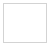
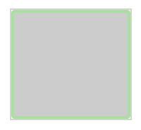
The following table lists the style property values for the flexcontainer element, compared to custom values for a styled container.
|
Style/Property
|
Default
|
Styled
|
|---|---|---|
|
Properties
|
• background—#ffffff
• border-color—inherit
• border-radius—None
• border-style—None
• border-width—None
|
• background—#cccccc
• border-color—#AAE09F
• border-radius—4px
• border-style—Solid
• border-width—4px
|
|
Preview
|
 |
 |
|
|
The default style property values are derived from the mashup style theme.
|