Optimizing a Mashup for Mobile Devices
A mobile device has a smaller screen than a desktop monitor and your mashup may not appear the same. You can configure the mobile settings to optimize the mashup appearance on mobile devices at run time. When you open a mashup on a mobile device, the browser renders the page based on a default size, and then fits the content based on those dimensions. Mobile browsers render web pages according to a pre-defined set of settings that are referred to as the viewport.
The viewport is the size of the browser window that you can use to display the mashup. On mobile devices, the viewport may not be the same size as the device display. A default size, which may be larger than the device display, is used to render web pages in the browser . The web page is then scaled to fit those dimensions. Loading content in a viewport that is larger than the device display can prevent responsive elements from wrapping properly. You can set the mobile settings to override the default viewport settings of the browser.
To optimize a mashup for mobile devices, set the viewport meta tag by configuring the mashup mobile settings. These settings only affect mobile devices. A mashup that is not configured correctly may not display properly on a mobile device, which can lead to poor user experience.
You should consider the following practices when designing a mashup for mobile devices:
• Build a responsive mashup using responsive layouts and widgets.
• Avoid building a layout where users must scroll horizontally to interact with the mashup.
• Apply the mobile settings to the top-level mashup in your visualization.
• Set the width and height of the mashup relative to the device screen.
 |
When a mashup has a master or a contained mashup, the settings of the top-level mashup are used.
|
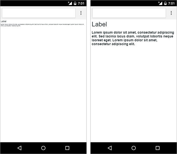
The following mashup contains two Label widgets inside in a responsive container. The container is set to a vertical alignment direction. In the left browser view, the mobile width and height settings are set to a custom value that is larger than a device screen. When the mashup loads, the mashup is rendered according to the specified dimensions. The text appears small relative to the display, which makes it difficult to view the mashup.
The right browser view shows the same mashup with the height and width settings set to that of the device. Responsive widgets are scaled to compensate for the smaller screen size and the widgets are easy to read.
You can set the mobile settings to control the view of the mashup on mobile devices. Global settings apply to mobile devices of all types. iOS settings apply to Apple devices. You can set the page width, height, and zoom scale to improve the user experience and visibility on smaller screens. You can also create mashups with a similar look to a native application on iOS and Android by using full screen mode. For more information about the available mobile settings, see Configuring Mobile Settings.