Composite Components
A composite component can contain a set of atomic components, or a set of other composite components, or a combination of atomic and composite components. The composite components have some business logic embedded in them. The ThingWorx contained mashup, widgets created using SDK are some examples of composite components.
Use the following best practices while creating composite components.
Subcomponents of Composite Components
The composite component consists of all or some of the following subcomponents:
• User interface (UI)
• Business logic
• Model along with services
• Data adapter
When you use a composite component, one of these subcomponents is considered as the top-level component. The top-level component is used as the access point for the composite component.
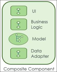
The composite component establishes the top-level component using the hierarchy of subcomponents. The highest in the hierarchy of subcomponents is the UI, followed by the business logic, model along with services, and data adapter as shown in the following figure:

For example, if a composite component has the UI defined for it, then the UI is the access point for the component. If the composite component has no UI and has the model defined for it, then access point is the model along with services. If no UI or model is defined for a component, then the access point is the data adapter.
It is recommended not to expose all the subcomponents below the top-level component to users.
Types of Composite Components
The following types of composite components are available:
• Contained mashup—Non-editable, can be configured using parameters or customized using custom CSS.
It is recommended to keep the number of parameters to a minimum, whenever possible.
• Widgets created using SDK—Non-editable, can be configured using parameters or customized by inheritance.
• Business logic—Use a configuration table or parameters for customization.
For example, a business logic which consists of the component model and data adapter.
• Gadgets—Non-editable
• Dashboard—Non-editable
• Dynamic menu
Configuring the Composite Components
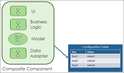
You can configure composite components using a configuration table, parameters, or configuration mashups. The configuration values are passed to the top-level component, which further passes the values to the downstream components in the dependency hierarchy. For example, you can use a configuration table with key-value pairs to change the behavior of the component. The configuration table is not a part of the component upgrade.

Upgrading the Composite Components
A composite component and its subcomponents should not be editable to support upgrades. When you upgrade subcomponents, the composite component should not break.
Customizing and Extending the Composite Components
Extend and customize the composite component, as required. See the section Extending and Customizing a Component, for more information.
For example, consider a case where you want to customize and extend an out-of-the-box contained mashup. The out-of-the-box contained mashup is non-editable. To configure and extend this contained mashup, create a copy of the component. Customize and extend the copy. Use configuration tables or parameters to replace the original contained mashup with the customized contained mashup.