Example: Quantile-Quantile Plots
Use the qqplot function to make quantile-quantile (Q-Q) plots.
Two Data Sets
Compare the quantiles from two data sets in a Q-Q plot to test wether they the same distribution.
1. Define a data set.
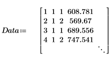
Column 2 shows batch in which the measurement was made, and column 3 shows the measured strength of bars of bonded Si nitrate.
2. Extract the two columns of interest, 2 and 3.

3. Call vlookup to divide the data depending on whether the measurements were taken in batch 1 or 2.


4. Calculate the first and third quartiles of each batch.


5. Plot a Q-Q plot and the quantiles.


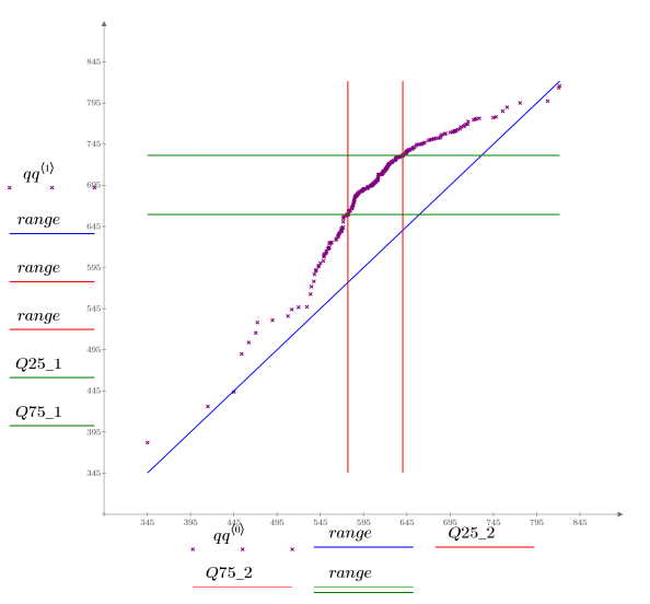
A 1-to-1 reference line is plotted to emphasize how the data vary.
The Q-Q plot shows that the two batches do not share the same distribution, although the values for very small and very large percentiles are similar. The batch 1 quantiles are significantly higher than those for batch 2, suggesting very different processing conditions.
Normal Distribution
Determine if the measurements from a heatflow meter were drawn randomly. Check if the measurements are normally distributed by comparing them with the normal distribution in a Q-Q plot.
1. Define a data set that describes the heatflow.
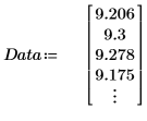
2. Find the data points for the normal Q-Q plot.

3. Find the line of best fit to view how close the data quantiles are to the normal distribution quantiles.


4. Plot the Q-Q plot and the line of best fit.
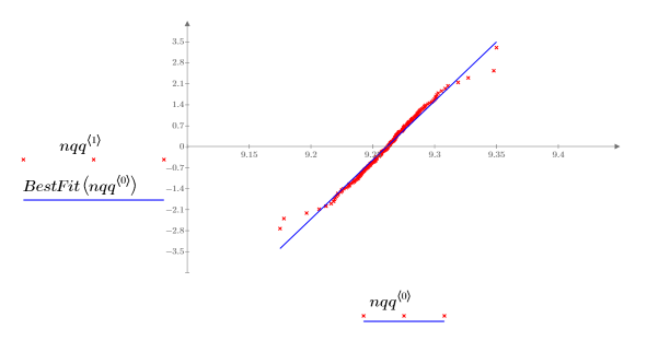
The very close correlation with the reference line indicates that the samples are normally distributed.
The check of normality is one of the tests performed when detecting outliers.
Weibull Distribution
Test if a set of data follows a Weibull distribution.
1. Record in vector R the electrical insulation failure-voltages for cables which are subjected to increasing voltage stress.

2. Plot a histogram of the data.


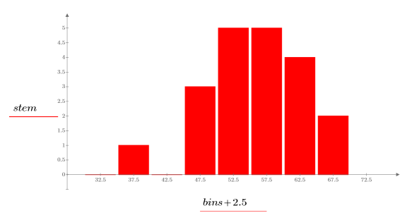
The histogram shows that the data is not normal in distribution. The data is skewed to one side. You can compare the data to a Weibull distribution in a Q-Q plot.
3. Find the data points for the Weibull Q-Q plot.

4. Find the line of best fit to view how close the data quantiles are to the Weibull distribution quantiles.


5. Plot the Q-Q plot and the line of best fit.
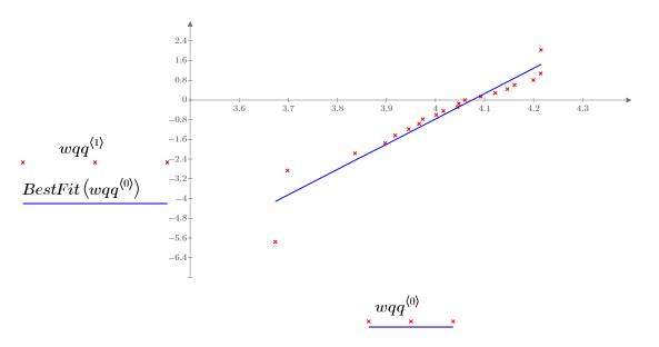
The close correlation with the reference line indicates that the data set can be modelled by a Weibull distribution.
For Weibull Q-Q plots, a logarithmic scale is used. |
Reference
Lawless, J.F., Statistical Methods for Lifetime Data, second ed, Wiley-Interscience, 2002.