Navigating Kepware+
Main Interface
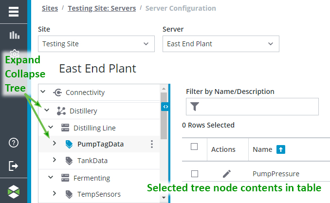
The user interface has three panes: the Title and breadcrumb area, the left Tree Navigation, and the Detail Pane. You can create, edit, and delete sites, servers, channels, devices, tag groups, and tags in the Detail Pane. In addition, data from configured Kepware server and the connection status of the Kepware+ Agent also are displayed here. When creating or deleting entities, a pop-up window appears on top of the Detail Pane. When modifying entities, panels containing the current configuration slide over the Detail Pane. Once sites and servers are configured, a navigational tree appears on the left side of this pane to help you organize data for a selected server by channels, devices, and tag groups.
 |
Kepware+ provides two types of links: icons and highlighted, underlined text. The icon links display a sliding panel window, while the text links display a new page. For example, the Edit icon for a server displays the current configuration in a sliding panel, while clicking the underlined name of the server opens a pop-up window to request credentials for the server and then opens the page for that server.
|

| | The interface uses Icons for common functions. |
Menu
The Menu provides access to dashboards, configuration settings, the Administration Center, organization selection, Help Center (online user manual), Kepware+ Overview (online feature preview), About Kepware+ (version and copyright information), Privacy Policy (PTC's personal data privacy policy), and Terms of Use (PTC's contract for Cloud/ SaaS products).

Detail Pane
The Detail Pane contains the data, often in grid form, related to the current selection / active item, such as sites, servers, channels, devices, tags, etc. Each type contains unique columns and information. For example, site properties, server status and version or level selector for the Event Log.
The Detail Pane supports Filtering and Sorting to help you find information efficiently. Use the Refresh button to update the contents of the detail pane based on your filter choices.
| | When there is no data for the grid view of the Details Pane, a message appears provides information about why tghe grid is empty or what can be created in the current grid view. |
The contents of the Detail Pane can exceed the browser page. In this case, the page navigation at the bottom provides convenient controls. The number of results (rows) displayed per page is configurable through a drop-down menu. The forward and back arrows allow you to step through the result pages. The Jump to page: field allows you to enter a page number to display.
Tree Navigation
The Tree View displays the hierarchy of data for quick navigation. Expand or collapse nodes in the tree using the directional carrots or arrows. The contents of the node selected in the tree are displayed in the grid view of the Detail Pane.
Tabs
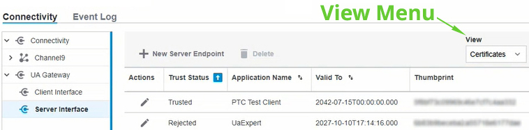
The Detail Pane often has enough information that is separated into different tabs. These tabs logically organize the information related to the selected item in the tree. Site information is divided into General Information and Servers tabs. Server information is divided into Connectivity and Event Log tabs.

Views
The Detail Pane can have enough information to separate into different views. These views logically organize the information related to the selected item in the table. Endpoint information is divided into Certificates and Instance Certificates views (see Certificate Management).