Trend Chart for a Metric
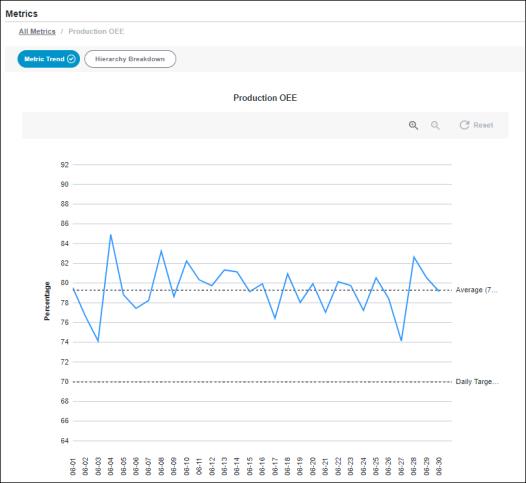
The trend chart for an individual metric shows the metric’s actual value on each day in the filtered date range for the selected equipment. The average value and the target value for the metric are also shown on the chart for comparison. The title of the trend chart is the name of the metric.

The X-axis displays a data point for each day for the filtered date range in the format mm-dd. The Y-axis displays the actual value of the metric for the corresponding day. Hover over the trend line to see a tooltip with the date, metric name, actual value, and unit of measure for that data point.
The Daily Target reference line identifies the daily target value for the metric as a positive number, rounded to one decimal place. For metrics with the average roll-up behavior, the Daily Target value is the target value that is specified for this metric. For metrics with the aggregate roll-up behavior, the Daily Target value is normalized to a day to make the target value comparable with the actual value data points. Hover over Daily Target to see the target value. This reference line is displayed only when a target value has been set for the metric.
The Average line represents the average value for the metric for the filtered date range and equipment. Hover over Average to see the average value of the metric and its unit of measure. The average value is displayed as a positive number, rounded to one decimal place.
To zoom in, click  . You can also zoom in by clicking and dragging over the portion of the chart that you want to see in more detail. To zoom out, click
  . Click Reset to return to the full chart display. Zooming or resetting the chart does not impact the filtered information.
Click All Metrics in the navigation breadcrumb to return to the Scorecard page.