Metric Correlation
Metrics can have one of three correlation types: positive, negative, and neutral. When a metric has a positive correlation, higher values are better. When a metric has a negative correlation, lower values are better. When a metric has a neutral correlation, no value is better than another, higher or lower. Correlation is used to measure and analyze the status and trend of a metric. The correlation for each metric is defined as follows:
|
Metric
|
Correlation
|
|---|---|
|
Production OEE
|
Positive
|
|
Total Available OEE
|
Positive
|
|
Total Loss Hours
|
Negative
|
|
Average Throughput
|
Positive
|
|
Production Quantity
|
Positive
|
|
Scrap Rate
|
Negative
|
|
Jobs Completed
|
Positive
|
|
Jobs Scheduled
|
Positive
|
|
Planned Production Time
|
Neutral
|
|
Overtime
|
Negative
|
|
Total Production Time
|
Neutral
|
|
Total Effective Time
|
Positive
|
Status and Metric Correlation
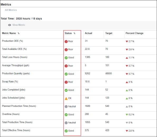
As shown in the image below, the Status column for a metric in the Scorecard tool shows the status (Good, Poor, or Neutral) for the metric. This status value depends on the status threshold values that are specified for the metric.

• For metrics with a positive correlation, the value for the status threshold between OK and Good must be greater than the status threshold between Poor and OK. If the actual value for the metric is:
◦ Less than the threshold value between Poor and OK threshold, the status is red ( ).
).
◦ Greater than or equal to the threshold value between Poor and OK threshold value, and less than the threshold value between OK and Good, the status is yellow ( ).
).
◦ Greater than or equal to the threshold value between OK and Good, the status is green ( ).
).
• For metrics with a negative correlation, the value for the status threshold between Poor and OK must be greater than the value for the status threshold between OK and Good. If the actual value for the metric is:
◦ Less than or equal to the threshold value between Poor and OK, the status is red ( ).
).
◦ Greater than the threshold value between Poor and OK, and less than or equal to the threshold value between OK and Good, the status is yellow ( ).
).
◦ Greater than the threshold value between OK and Good, the status is green ( ).
).
• For metrics with a neutral correlation, there are no status thresholds. The status for all values is Neutral and grey ( ).
).
Percent Change Trend and Metric Correlation
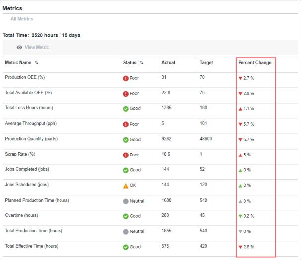
As shown in the image below, the color of the arrows in the Percent Change column depends on the correlation of the metric. For more information about calculating percent change, see Understanding the Percent Change.

For a metric with a positive correlation:
•  indicates that the percent change has increased, which is a positive trend.
•  indicates that the percent change has decreased, which is a negative trend.
For a metric with a negative correlation:
•  indicates that the percent change has increased, which is a negative trend.
•  indicates that the percent change has decreased, which is a positive trend.
For a metric with a neutral correlation:
•  indicates that the percent change has increased or remained the same.
•  indicates that the percent change has decreased.