Trend Analysis Chart
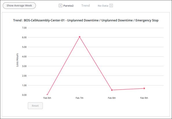
For the lowest level reason of a reason tree branch, the trend analysis chart shows a data point for the loss hours with that reason for each day for the selected equipment and date range. Days in the chart for which there are no loss hours, and which fall on or before the current date, have their data point plotted at 0. The loss hours are shown on the day that the loss events were entered, in the time zone for the current user.
The title for the trend chart is a breadcrumb showing the selected work center, event category, loss category, and the sequence of reasons for the Pareto charts that were viewed to reach the trend chart.

Hover over the data point for a date in the chart to see details for that day on the work unit that caused the event, event category, loss category, and the sequence of reasons, as well as the total time loss duration for that date in a tooltip. A data point can represent more than one loss event.
To zoom in, click and drag over the portion of the chart that you want to see in more detail. Click Reset to return to the full chart display.
The data shown in this trend chart includes data from loss events which match the event category, work unit which caused the event, loss category, and loss reason that you selected in the waterfall and Pareto charts while navigating to the trend chart. This is different from the Time Loss Trend and Total Loss Hours charts in Action Tracker. Those trend charts show data from loss events which match the loss category and loss event for the individual action or the applied Loss Category filter, respectively. The event category for those loss events is not considered for those charts. |
 to move back up the levels of