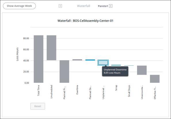
Time Loss Waterfall Chart
The time loss waterfall chart visualizes global losses, providing a framework for understanding high-level loss categories. The data displayed in the waterfall chart is determined by the applied filters. The title for the waterfall chart includes the name of the equipment selected in the filters.

The grey bars on the waterfall chart represent the following information:
• Total Time—The total number of hours in the date range for all pacemakers within the selected Equipment filter. For example, you’ve applied a Date Range filter of April 5 through April 14, and an Equipment filter for Site A. The date range has a total of 10 days or 240 hours. Site A has 4 work centers. Each work center has 1 pacemaker, for a total of 4 pacemakers. The total time displayed in the waterfall chart is 960 hours, or 10 days multiplied by 24 hours, multiplied by 4 pacemakers.
• Unscheduled—Time that is outside of a scheduled shift.
• Planned Production—Time that is scheduled for production as scheduled shifts.
• Overtime—Time that is worked outside of scheduled shifts and shifts that are designated as overtime shifts.
• Unaccounted Time—Time loss for which no loss event has been entered.
• Effective Time—The total time being used to effectively produce materials. This is calculated by subtracting all losses from the planned production time plus any overtime.
For more information, see Time Calculations in DPM.
The blue bars on the waterfall chart display the high-level loss categories for which time loss has been accounted. In the waterfall chart, these are the loss categories that are set as the Event Category when entering a loss event. Only those loss categories that have data for the selected equipment and date range are displayed as blue bars in the waterfall chart. The time loss displayed in each bar is the sum of all loss events with that event category on all work units within the selected Equipment filter, including previous pacemakers.
• Planned Downtime—Scheduled time during which the equipment is non-operational, for example, during routine maintenance.
• Unplanned Downtime—Time that was not scheduled during which the equipment is non-operational, for example, during a power loss.
• Changeover—Time that is spent reconfiguring equipment to produce a different material.
• Speed Loss—A loss in efficiency while the equipment is operational, for example, when the equipment running is impaired.
• Small Stops—Time lost to minor stops in operation that are too small to be considered downtime.
• Scrap—The time loss equivalent for scrapped material, based on ideal cycle time. The time loss for scrap is calculated as the number of scrapped units multiplied by the ideal cycle time for that material on that equipment.
• Unknown—Time loss with an unknown cause.
If you are viewing information for a work center, you can select one of the blue bars and click  in the top bar to drill down into the loss reason Pareto charts for that loss category.
 in the top bar to drill down into the loss reason Pareto charts for that loss category.
Use the Show Average Week toggle to view the data normalized to a 168 hour week.
Hover over a bar in the chart to see the total time for that bar in a tool tip.
After selecting a bar in the chart, you can use the right and left arrow keys on your keyboard to navigate to other bars and view their tooltips. Once you have navigated to a blue bar, you can press ENTER to select the bar. This is particularly useful in situations where you have both very large and very small bars in the chart, as the small bars can be difficult to hover over and select. |
To zoom in, click and drag over the portion of the chart that you want to see in more detail. Click Reset to return to the full chart display.