![Integration Kit What's New [Integration Kit What's New]](../Nav02_WhatsNew.png)
![Integration Kit What's New [Integration Kit What's New]](../Nav02_WhatsNew.png) |
This document is aimed for dialog developers that want to add new commands to the UI of Creo Elements/Direct Modeling. This document contains several example dialogs and a complete reference manual.
Dialogs can be created by means of a dialog generator. The input to the dialog generator is a specification of the intended dialog behavior. The output of the dialog generator is code that defines the user interface and enables the execution of the dialog.
The resulting dialogs will always have have the 'look and feel' of Creo Elements/Direct Modeling dialogs. The dialogs can be inserted into a Creo Elements/Direct Modeling or application-specific ribbon tab for easy activation via mouse click. The dialog will be inserted into the Creo Elements/Direct Modeling toolbox if this is explicitly specified.
The task of designing a dialog can essentially be defined as follows:
The collection of the input data can be either in a parallel or sequential mode. In a truely parallel input mode, the input data can be entered in any arbitrary order. Sometimes dependencies between different pieces of data force a partial ordering of the input sequence of an otherwise parallel dialog. In these cases, it is possible to temporarily disable input to a certain data field or to check the feasibility of an input to a data field. Furthermore, dependent data can be calculated as soon as a new proposal can be determined.
It is important to emphasize an important Creo Elements/Direct Modeling 'look and feel' issue at this stage: All feasibility checks of input data should occur immediately and as far as possible while the data is being entered. This technique avoids the generation of error messages at later stages of the user interaction and enhances the users confidence and understanding of the purpose of the dialog. The dialog generator supports a rich set of functions that enable immediate checking of input data and updating of dependent data.
A dialog action can consist of an individual LISP function, a sequence of function calls and calls to other dialogs.
Since many checks occur immediately while data is being entered by the user, the action function does not need to repeat these checks. Note that the action function should not generate interactive dialogs (except for error messages).
A dialog that is called within another one must be supplied with a sufficient number of inputs so that it can execute without becoming interactive.
The dialog generator produces dialogs that can be activated simultaneously with other dialogs in the standard Creo Elements/Direct Modeling manner. The resulting dialogs are managed by a common underlying dialog execution model, called action routines.
All the complete dialog examples of this manual can be activated by loading the example file dg_examples_dialogs_lsp.html. Loading the file dg_examples_ui_lsp.html creates a ribbon tab in the fluent ui containing all example dialogs.
The following examples illustrate the programming of dialogs and aim to give a 'feeling' of the dialog generation scheme.
This dialog illustrates how existing Creo Elements/Direct Modeling dialogs can be customized to the needs of a user. The following dialog behaves exactly like extrude, but does not bother the user with a toggle for "Keep WP", "To Part" and "Reverse Dir":
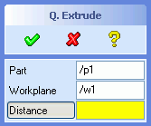 |
(sd-defdialog 'quick_extrude
   :dialog-title "Q. Extrude"
   :toolbox-button t
   :variables
     '((QE_PART
          :value-type :part-incl-new
          :modifies :contents
          :title "Part"
          :prompt-text "Identify part to be modified")
       (QE_WP
          :value-type :wp-with-profile
          :title "Workplane"
          :prompt-text "Identify workplane to extrude")
       (DISTANCE
          :value-type :length
          :prompt-text "Specify distance to extrude"))
   :ok-action
      '(sd-call-cmds
         (extrude :part qe_part
                  :wp  qe_wp
                  :distance distance)))
|
The keyword :variables contains the description of all the
input data that can be specified by the dialog user. As soon as this input
data is defined, the dialog user can execute the code specified in
:ok-action by activating the OK button. In the
above example, the Creo Elements/Direct Modeling command
extrude is called.
Comments:
quick_extrude will be inserted into the
Toolbox. The command can alternatively be inserted into a Creo
Elements/Direct Modeling or application specific ribbon tab, as described
in Dialog, Ribbon and UI Customization. The keyword
:toolbox-button can be used to more explicitly
control the insertion of the dialog into the Creo Elements/Direct Modeling
toolbox.OK and
CANCEL buttons. This kind of dialog is called a parallel
dialog, since it can react to several different user interactions.OK button is pressed, an error message will be generated and
the dialog will remain active, without executing the
:ok-action code. Variables that are allowed to remain
unspecified during the execution of the :ok-action code must
be marked by setting the :initial-optional key of that
variable to t.:variables list can be
referenced within other parts of the dialog description (e.g. in
:ok-action).:value-type called :part-incl-new
accepts the input of either an existing part or a name of a new part that
does not exists but will be created within the dialog. If the part exists,
it will be represented as a sel_item. Otherwise, the value of
the variable QE_PART will be a string, as it was typed in by
the user.:value-type called :wp-with-profile
ensures that only workplanes that contain a profile are accepted for the
variable QE_WP. The variable QE_WP is a
sel_item.:value-type called :length specifies
that the variable DISTANCE is always assigned to a length in
internal units, i.e. [mm]. The input and display of this
variable is, however, based on the current unit settings.
The purpose of the following examples is to illustrate various techniques that control the consistency of data within a dialog before the dialog action is triggered. It is a good strategy to reject non-feasible user inputs at the earliest possible time.
Consider a simple dialog that contains two variables, color
and valid_part. Let us assume that the value of
valid_part depends on the value of color in some
way. The following examples illustrate how to ensure that user inputs at all
times satisfy such a dependency.
One way to ensure the correct assignment of a value to a variable is to
force a sequential input of the data by means of temporarily disabling the
variable. For example, the valid_part variable could be kept
disabled until the value color satisfies a certain
condition.
Assume, that valid_part selections are not allowed when
color is set to "red". That is,
    If: color has been set to "red",
    Then: the valid_part variable must
           1. be set to nil, and
           2. be disabled
    Else: the valid_part variable must be enabled
This dependency can be included in the dialog description by inserting
the above dependency into the :after-input form:
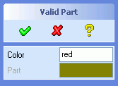 |
(sd-defdialog 'dependent_enable_demo
    :dialog-title "Valid Part"
    :variables
     '((COLOR :value-type :string
              :after-input
                (if (string= color "red")
                  (progn
                   (setq valid_part nil)
                   (sd-set-variable-status 'valid_part :enable nil))
                  (sd-set-variable-status 'valid_part :enable t)))
       (VALID_PART
             :value-type :part
             :modifies NIL
             :title "Part"
             :initial-value nil))
    :ok-action
     '(pprint valid_part))
|
Initially, the variables color and valid_part
both have the value nil. Note that :initial-value
of valid_part has explicitly been set to nil,
since it defaults to the current part.
The keyword :after-input contains code that will be executed
whenever the value of color has been defined by the dialog
user.
If a "red" color is entered, this code sets the
valid_part variable to nil, using the standard
LISP setq form, and then disables the valid_part
variable by means of the function sd-set-variable-status. These
two calls could also have been carried out in the opposite order.
Note that no user input is possible for a variable while it is disabled. The variable field is greyed out on the screen and input via the prompt area is rejected.
All values of color that do not coincide with
"red" simply enable the input to valid_part.
The ok-action in the above examples simply prints out the
value of the variable valid_part to the startup window.
In some cases it is not feasible to temporarily disable inputs, since the
validity of a selection can also depend on the details of the object being
selected itself. For example, there might be restrictions on certain
properties of the valid_part that make it feasible for
selection, in addition to the current choice of color.
In this section we consider a valid_part that cannot be
selected if color is set to "red" AND the name of
the part starts with the letter "p". Other part names, like
"/b1", will be accepted.
The keyword :check-function supports the checking of a new
value for a variable. A new value is considered to be feasible whenever the
:check-function-function returns :ok and not
feasible if it returns (values :error an-error-message),
or (values :error t) or simply :error.
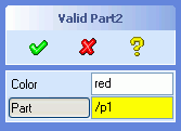 |
(sd-defdialog 'dependent_check_demo2
  :dialog-title "Valid Part2"
  :variables
   '((COLOR :value-type :string
            :after-input
              (case (colored-part-satisfies-name valid_part color)
                (:error (setq valid_part nil))
                (:ok t)))  ;Do nothing
     (VALID_PART
            :value-type :part
            :modifies NIL
            :title "Part"
                  :prompt-text "Identify part to be shown"
            :check-function
               #'(lambda (a-part)
                   (colored-part-satisfies-name a-part color))))
  :ok-action
   '(pprint valid_part))

(defun colored-part-satisfies-name (new-part color)
;In: new-part {sel_item}
;    color    {string}
;Out: {:ok or (value :error a-message)}
  (let ((name (sd-inq-obj-basename new-part)))
    (if (and (string= color "red")
             (char-equal (elt name 0) #\p))
      (values :error "Sorry, a red part with name p... is NOT selectable")
      :ok)))
|
Whenever color is assigned to a new value, the
:after-input form will be executed, thereby possibly resetting
the value of valid_part. In contrast to the previous example,
no disabling takes place.
The decision on accepting or rejecting a value for the variable
valid_part can be inserted into a :check-function.
The above :check-function calls the function
colored-part-satisfies-name which receives as argument a part
that is to be checked and the current value of the color
variable. The function accesses the name of the new-part and
rejects the part if color is "red" and the name
starts with the letter "p".
Note that a new value will be subjected to the
:check-function before it is assigned to the dialog variable. A
check function cannot be written as a LISP form (e.g. like
:after-input) that directly accesses all dialog variables,
since the assignment has not yet taken place. A wide range of syntactic
possibilities exist for defining check functions, ranging from defining a
function symbol (by means of defun) to defining a nameless
Lambda-form as shown in the above example (see Check Functions). Note that a
:check-function must specify a function that can be called with
one argument (namely the new value that is to be checked for validity).
The value of the new-part-argument in the check function is
a sel_item structure. The exact meaning of this structure is
not relevant to the dialog designer. The sel_item structure is
simply a handle that identifies an object and that can be used to extract
all relevant information about that object.
This example is basically equivalent to the extrude command in Creo
Elements/Direct Modeling. The code can be developed by extending the
Quick_Extrude implementation described above and by including the variables
DIRECTION, TO_PART and KEEP_WP:
 |
(sd-defdialog 'full_extrude
  :dialog-title "Full Extrude"
  :variables
   '((FE_PART
       :value-type :part-incl-new
       :title "Part"
       :prompt-text "Identify part to be extruded"
       :modifies :contents)
     (FE_WP
       :value-type :wp-with-profile
       :title "Workplane"
       :prompt-text "Identify workplane to extrude from"
       :modifies nil
       :after-input
         (if (sd-inq-obj-parent-contents-read-only-p fe_wp)
           (progn
             (setq keep_wp t)
             (sd-set-variable-status 'keep_wp :enable nil))
           (sd-set-variable-status 'keep_wp :enable t)))
     ("-")
     (DISTANCE
       :value-type :length
       :prompt-text "Specify distance to extrude")
     (TO_PART
       :value-type :part
       :initial-value nil
       :title "To Part"
         :prompt-text "Identify to part"
       :modifies nil)
     (DIRECTION
       :value-type :wp-normal
       :title "Reverse")
     ("-")
     (KEEP_WP
       :value-type :boolean
       :title "Keep WP"
       :initial-value t
       :initial-enable
         (if fe_wp
           (not (sd-inq-obj-parent-contents-read-only-p fe_wp))
           t)))
  :mutual-exclusion '(distance to_part)
  :ok-action
    '(sd-call-cmds
       (extrude :part fe_part
                :wp fe_wp
                :distance distance
                :to_part (if to_part to_part "")
                (if (sd-vec-equal-p (sd-inq-wp-w-dir fe_wp) direction)
                  ""
                  :reverse)
                :keep_wp (if keep_wp :yes :no))))
|
Comments:
full_extrude must be a unique
name. Naming collisions - such as giving the dialog the existing name
extrude - will be detected and rejected by the dialog
generator.:mutual-exclusion list ensures that only one of the
variables distance and to_part in the list is
assigned to a value at one time. A diamond shaped indicator shows which
variable can possess a value. The selection of the alternative variable
will cause the indicator to switch to the selected variable and at the
same time will remove the value of the other variable.fe_part, hence
no read-only parts should be accepted as values. It is the responsibility
of the dialog to ensure that no read-only parts can be passed to the
:ok-action.:modifies. The
pair :modifies :contents ensures that only parts whose
contents are allowed to be modified will be accepted as values. In
addition, the part will be marked as modified when the
:ok-action of the dialog is executed.to_part is not modified by the
extrude command. It has therefore been set to :modifies
nil.keep_wp is set to nil, the workplane
will be deleted within the :ok-action. The deletion of a
workplane implies that it will be removed from the contents of its parent
workplane. Thus, the contents of the parent of the workplane must be
modifiable.:modifies :parent-contents cannot be employed
in this case, because the manipulation of the workplane depends on the
current value of the variable keep_wp.:after-input code together with careful
:initial-value settings, can be applied to ensure that the
keep_wp variable is always consistent with the current value
of fe_wp.("-"), that appears between the variables
fe_wp and distance and between
direction and keep_wp, generates separator lines
on the screen between the variable fields.This section offers an overview of all the functions and keywords for describing dialogs.
(sd-defdialog dialog-name
             :module module
             :dialog-title title
             :variables variable-definitions
             :after-initialization LISP-form
             :local-functions function-definitions
             :dialog-control dialog-control
             :without-show boolean
             :mutual-exclusion mutual-exclusion
             :toolbox-button toolbox-button
             :start-variable start-variable
             :initial-variable initial-variable
             :token-sequence list-of-tokens
             :prompt-variable prompt-variable
             :top-prompt-text top-prompt-text
             :precondition precondition-form
             :exception LISP-form
             :dialog-type dialog-type
             :disable-automatic-reload {t nil}
             :ok-action-precondition LISP-form
             :must-variables-scope keyword
             :ok-action LISP-form
             :ok-action-next-variable LISP-form
             :cancel-action LISP-form
             :cleanup-action LISP-form
             :help-action LISP-form
             :undo-modelling-steps-on-cancel boolean
             :after-initialization-ui LISP-form
             :display-token keyword
             :enter-ui LISP-form
             :exit-ui LISP-form
             :complete-focus-variable LISP-form
             :mutual-exclusion-persistent-data-storage boolean
             :persistent-data-storage-module application
             :persistent-data-storage-variant-variable dialog-variable
             :taskBarPage boolean
             :undocumented boolean

         ;;  Subaction Options
             :embedded-ui boolean
             :shrinkable boolean
             :close-behavior a-keyword-or-a-dialog-variable
             :x-offset number
             :y-offset number

        ;;  Connection to File Manager.
             :filing-variables variables
             :file-type file-type
             :file-type-title file-type-title
             :patterns patterns
             :in-cmd-file-type-match string
             :out-cmd-file-type-match string
             :override-elements-text text
             :attempt-in-form-with-any-file boolean
             :exclude-from-universal-load boolean
             :universal-load-with-user-units boolean
             :display boolean
             :enable-form LISP-form

             :in-patterns patterns
             :out-patterns patterns
             :in-display boolean
             :out-display boolean
             :in-enable-form LISP-form
             :out-enable-form LISP-form
             :in-form String-with-LISP-expression
             :in-title in-title
             :out-title out-title
             :in-cmd-show-options boolean
             :out-cmd-show-options boolean
             :auto-complete-on-filename keyword
             :allow-old-revision boolean
             :allow-load-as-version boolean

       ;;  UICT Connection
             :uict-option-menu-name name-of-dialog-shell
             :uict-install-function ui-creation-function-name
             :uict-parameter-list list-of-LISP-forms

       ;;  Debugging Support
             :trace type
)
     :module "SHEETADVISOR"

  or

     :module '(:and "SHEETADVISOR" "ANNOTATION")
'((variable_name_1
;;-- see 4.1 Value Types --
:value-type ;default=nil
;;-- see 4.1.1.1 Selection of Objects --
:part :part-with-body :part-incl-new :assembly :part-assembly
:container :wp :wp-with-profile :wpset
:coord-sys-object
:edge :face :feature :edge-2d :geom-2d
:layout :view :docuplane :docuplane-set
;;-- see 4.1.1.2 Numbers, Strings, Booleans --
:length :positive-length :raw-length
:angle :raw-angle :number :positive-number :scale :dynamic-scale
:integer :positive-integer
:boolean :grouped-boolean
:string :viewport :rgb-color :list :keyword
;;-- see 4.1.1.3 Points and Vectors --
:point-2d :point-3d :measure-point :measure-vector :measure-vector-list
:measure-direction :measure-axis
:wp-normal :wp-reverse-normal :raw-vport-pick
:point-3d-pick
;;-- see 4.1.1.4 File Selection --
:filename
;;-- see 4.1.1.5 Display Only --
:display-only
;;-- see 4.1.1.6 Image --
:image
;;-- see 4.1.1.8 Directory Selection --
:directory
}
;;-- 4.1.1.7 Multiple Value Types --
:secondary-value-type a-value-type-or-list-of-value-types
:gui-value a-lisp-form
:editable-primary-value-type {t nil} ;default=nil
:check-secondary-value-type {t nil} ;default=nil
;;-- see 4.1.1.1.1 Options for Selection of Objects --
(when :value-type = {:part :part-with-body :part-incl-new :assembly :part-assembly
:container :wp :wp-with-profile :wpset
:coord-sys-object
:edge :face :feature :edge-2d :geom-2d
:layout :view :docuplane :docuplane-set})
:multiple-items {t nil} ;default=nil
:wire-part-allowed {t nil} ;default=nil
:face-part-allowed {t nil} ;default=nil
:allow-graphics-only a-list-of-keywords ;default=nil
:with-container {t nil} ;default=t
:with-stock-container {t nil} ;default=nil
:color rgb integer ;default=nil
:persistent-highlight {t nil} ;default=nil for :value-type parts, workplanes...
t for :selection or :value-type edges, faces...
:no-highlight {t nil} ;default=nil
:incremental-selection {nil :on-non-empty-list t}
;default=nil
:on-empty-selection {:exit :exit-with-error
:repeat :repeat-with-error
:reset-variable} ;default=:exit
:empty-space-pick-exit-keyword dialog-variable-keyword ;default=nil
:no-geometry-modified {t nil}
:curr-wp-only {t nil} ;default=t
;;-- see 4.1.1.1.2 Read-Only Objects
:modifies {:position :instance :contents :parent-instance
:parent-contents :contents+instance
:instance+parent-contents nil
a-function-name}
;default=nil or :contents
;;-- see 4.1.1.1.3 Combined Object/Position Selection
:incl-position {nil :2d :3d} ;default=nil
:ignore-position-if-in-focus list-of-focus-types ;default=nil
:store-pick-point {t nil} ;default=nil
;;-- see 4.1.1.1.4 UI Support for Selection of Objects
:show-select-menu {nil t} ;default=nil or
; =t if :incremental-selection=t
;;-- 4.1.1.1.5 Preselection
:preselection-definition-time {:suppress :loadtime :runtime}
;default=:loadtime or :runtime
;;-- 4.1.1.1.6 Keep Workplane and Profile Options
:keep-wp-profile {nil t} ;default=nil
:keep-wp-profile-embedded-location a-variable ;default=nil
:keep-wp-profile-pre-separator {nil t} ;default=t
:keep-wp-profile-post-separator {nil t} ;default=nil
:keep-wp-before-input LISP-form ;default=nil
:keep-wp-after-input LISP-form ;default=nil
:keep-profile-before-input LISP-form ;default=nil
:keep-profile-after-input LISP-form ;default=nil
;;-- 4.1.1.2.1 Options for RGB Color
:include-none-item {nil t} ;default=nil or
; t if :toggle-type = :indicator-toggle-data
:pre-color-range choices ;default=nil
:post-color-range choices ;default=nil
;;-- see 4.1.1.2.2 Options for Scale --
:minimum a-number ;default=0
:maximum a-number ;default=100
:increment a-number ;default=1
:suppress-title a-boolean ;default=nil
:title-alignment {:right :left :center} ;default=:center
:suppress-scale-value a-boolean ;default=nil
:decimal-points an-integer ;default=0
:drag-callback a-LISP-form ;default=nil
:maximum-label a-string ;default="maximum scale value"
:minimum-label a-string ;default="minimum scale value"
:suppress-min/max-labels a-boolean ;default=nil
;;-- see 4.1.1.2.3 Options for Dynamic Scale --
:toggle-push-function a-LISP-function
:toggle-release-function a-LISP-function
:drag-callback a-LISP-form ;default=nil
:value-change-callback a-LISP-form ;default=nil
;;-- see 4.1.1.3 Options for Points and Vectors --
:reference-wp a_variable_name ;default= a_wp_if_unique
; when :value-type = :wp-normal or :wp-reverse-normal
:built-in-feedback a-boolean ;default=t
:catch-flyby a-boolean ;default=t
;;-- see 4.1.1.4 Options for File Selection --
(when :value-type = :filename)
:direction {:input :output :io} ;default=:io
:if-exists {:overwrite :append :confirm-overwrite
:confirm-overwrite-or-append}
;default = :confirm-overwrite
; if :direction={:output, :io}
:initialDirectory a-string ;default = shell dependent
:fileType a-keyword ;default = see environment
:initialPattern a-string ;default = nil
:relative-position list-of-x-y-coordinate-offsets
;default = (-450 -250
; :bottomleft)
:add-suffix {t nil} ;default=t if :direction={:output,
; :io}
;default=nil if :direction=:input
:filename-incl-path {t nil} ;default=t
;;-- see 4.1.1.5 Options for Display Only --
:display-units {:length :angle :length-2d :length-3d} ;default=nil
;;-- see 4.1.1.6 Options for Image --
:image-file a-string ;default=nil
:image-name a-string ;default=nil
:image-height a-number ;default=derived from image
:image-alignment (:left :center :right ;default=:center
:image-Valignment (:bottom, :center, :top) ;default=:center
;;-- see 4.1.2 Range Selection --
:range choices ;default=nil
:display-units {:length :angle} ;default=nil
:alignment {:left :center :right} ;default=:left
;;-- see 4.1.3 Object Selection --
:selection list-of-focus-types ;default=nil
;;-- 4.1.4.1 Input Feedback --
:before-input LISP-form ;default=nil
:start-input-feedback LISP-form ;default=nil
:end-input-feedback LISP-form ;default=nil
;;-- 4.1.4.2 Input Tools --
:show-input-tool LISP-form ;default=nil
:hide-input-tool LISP-form ;default=nil
;;-- 4.1.4.3 Proposals --
:proposals list-of-strings-or-numbers ;default=no proposals UI
:max-visible-proposals integer ;default=15, min=1 max=15
:max-proposals integer ;default=20, min=1
:auto-add-proposals {t nil} ;default=nil
:proposals-order {:new-input-at-top :sorted :last-input-at-top nil}
;if :auto-add-proposals=t
; default=:new-input-at-top, else
; default=nil
;;-- 4.1.4.4. Additional Token String
:additional-token-string a-string ;default=nil or
; =":start" if :incremental-selection=t
;;-- see 4.1.5 Setting Values of Variables --
:initial-value LISP-form ;default=nil
:check-function LISP-function-definition ;default=nil
;input value -> {:ok, :error}
:filter-function LISP-function-definition ;default=nil
;input value -> {:ok, :error}
:confirmation
(return-value-of-check-function-or-push-action
:dialog {:question :warning :triple-choice}
:prompt advisor-text-in-window
:prompt-text text-in-prompt-line
:ok-cleanup LISP-form
:cancel-cleanup LISP-form
:severity {:low :medium :high :none}
:top-label warning-title
:push-1 title-of-ok-button
:push-2 title-of-cancel-button
:push-3 title-of-custom-help-button
:push-info LISP-form-for-custom-help-button
:info-image Image-displayed-in-warning-decoder
:push-other title-of-other-button
:yes-cleanup LISP-form-for-yes-triple-choice
:other-cleanup LISP-form-for-other-triple-choice
:other-allowed boolean
:display-dont-show-again boolean
)
:after-input LISP-form ;default=nil
:mutual-exclusion-cleanup LISP-form ;default=nil
:repeat-input-until-defined {t nil} ;default=t
:no-focus-change {t nil} ;default=nil
:input-focus-variable LISP-form ;default=nil
;;-- see 4.1.6 Activating Side Effects --
:push-action LISP-form ;default=nil
:position-part a_variable_with_:part_or_:assembly_or_:part-assembly ;default=nil
:position-wp a_variable_with_:wp_or_:wpset ;default=nil
:reference-wp a_workplane sel_item ;default=nil
:after-input-ui LISP-form ;default=nil
:push-action-ui LISP-form ;default=nil
;;-- see 4.1.7 Screen Representation --
;;-- 4.1.7.1 Variable Representation --
:initial-optional Boolean-LISP-Form ;default=nil
:initial-visible Boolean-LISP-Form :default=t
:initial-enable Boolean-LISP-Form ;default=t
:size {:half :third} ;default=:half
:digits integer ;default=6 for lengths
; =10 for angles
:value-visibility-alignment ;default=:left for numbers
{:left :right} ; =:right for non-numbers
:title title-string ;default="variable_name"
:title-alignment {:right :left :center} ;default=depends on type of variable
:toggle-type ;default=depends on :value-type
{:left-toggle :wide-toggle :right-toggle
:grouped-toggle :invisible :indicator-toggle-data}
:default-value LISP-form ;default=nil, only applicable for
:toggle-type = :indicator-toggle-data
:indicator-type {:square :diamond :none}
;default=:diamond if variable mutually excluded
; :square if variable boolean
; :none otherwise
:prompt-text a-text or LISP-form
:title-pixmap-name name-string ;default=nil
:title-insensitive-pixmap-name name-string ;default=nil
:title-select-pixmap-name name-string ;default=nil
:title-select-insensitive-pixmap-name name-string ;default=nil
:title-pixmap-file file-string ;default=nil
:ui-toggle-behavior {t nil} ;default=nil, valid for :push-action variables
:expand-shrink-behavior {t nil} ;default=nil, valid for :push-action variables
:minimal-ui {t nil form} ;default=nil
:minimal-ui-title string ;default=variable title
:minimal-ui-width integer ;default=7 (* 11 pixel = grid size in X-direction)
:minimal-ui-value lisp-form ;default=variable value
:minimal-ui-type {:generic :length :angle :mass :string :pathname :pathnames}
;default depends on :value-type
:minimal-ui-close-action lisp-form ;list form
:minimal-ui-auto-close {t nil} ;default=t
;;-- 4.1.7.2 Expand Shrink --
:expand-shrink list_or_lists_of_variables ;default=nil
:expand-shrink-toggle-type
{:push-action :boolean :toggle-pair} ;default=:push-action
:expand-shrink-range choices ;default=nil
:expand-token keyword ;default=:variable_name_expand
:shrink-token keyword ;default=:variable_name_shrink
;; -- Additions for :expand-shrink-toggle-type = :toggle-pair
:expand-title title-string ;default="Expand"
:shrink-title title-string ;default="Shrink"
;;-- 4.1.7.3 External Expand Shrink --
:external-expand-shrink list_of_variables ;default=nil
:external-expand-shrink-toggle-type
{:push-action :boolean} ;default=:push-action
:external-dialog-title a-string ;default same as :title
:ref-variable a-variable ;default=current variable
:x-offset a-number ;default=-160
:y-offset a-number ;default=0
;;-- 4.1.7.4 Non-Standard User Interface Layouts --
:uict-tx name-of-text-field
:uict-tb name-of-togglebutton
:uict-indicator-tb name-of-indicator-togglebutton
:uict-cr name-of-color-range-field
:uict-cb name-of-color-field
:uict-ra name-of-range-field
:uict-lb name-of-labelbutton
:embedded-area-definition LISP-expression ;default=nil
:title string ;default=nil
:frame boolean ;default=nil
:margin integer ;default=0
:spacing integer ;default=0
:height integer ;default=80
:cellSize 2d-vector ;default=1,1
:cellSizeX integer ;default=first coordinate of :cellSize
:cellSizeY integer ;default=second coordinate of :cellSize
:bitmap bitmap-name ;default=nil
:ui-update-condition LISP-expression ;default=t
;;-- 4.1.8 Sequentialization in Parallel Dialogs
:next-variable LISP-form ;default=nil
;; -- Boolean Tokens, see 4.4 Command Syntax --
:on-token a-keyword ;default=:on
:off-token a-keyword ;default=:off
;;-- 4.1.9 Application Extensions
;;== 4.1.10 Online Reference
:undocumented boolean ;default=nil
;;-- 4.6 Subactions
:subaction-name subaction-symbol ;default=nil
:default LISP-expression ;default=nil
:embedded-location a-variable ;default=nil
:ref-variable a-variable ;default=current variable
:x-offset a-number ;default=-10
:y-offset a-number ;default=+10
:subaction-close-behavior a-keyword ;default=nil
:collapsed boolean ;default=nil
;;-- 4.8 Persistent Data Storage (PDS)
:persistent-data-storage {t nil :session :simple :session-simple} ;default=nil
:persistent-proposals {t nil :session} ;default=:session
;;-- 3D Copilot
;;-- Drag Options
:drag-from-polestar a-polestar ;default=nil
or :picked-polestar
:drag-mode {:linear :circular :planar}
;default=derived from
:drag-from-polestar
:drag-line-dir 3d-vector "
:drag-plane-nor 3d-vector "
:drag-circle-cen 3d-vector "
:drag-circle-axis 3d-vector "
:drag-zero-pos 3d-vector "
:drag-max-value number ;default=nil
:drag-min-value number ;default=nil
:drag-scale number ;default=1
:offset number ;default=0
:result-type {:distance :angle :vector-transform}
;default=derived from :value-type
:polestar-passenger {t nil} ;default=nil
:jump {t nil} ;default=nil
:initial-prompt-text a-string ;default="Drag or enter value"
:eat-pick {t nil} ;default=t
:drag-plus-minus-range {t nil} ;default=t
:drag-fast-complete {t nil} ;default=t
;;-- Quickview Options
;-- Profile-based Quickview ------
:quickview-type {:extrude-profile :mill-profile :turn-profile :bore-profile}
:quickview-wp workplane-variable or workplane-sel_item
:quickview-shaded t/nil ;default=t
:quickview-dir 3d-vector ;default normal to :quickview-wp
:quickview-use-both-sides t/nil ;default=nil
;-- Parcel-based Quickview ------
:quickview-type :qv-parcel
:quickview-parcels sel_items
:transfer-to-model {t nil} ;default=t
;-- Lisp-based Quickview ------
:quickview-type :lisp-feedback
:feedback-init-function function-name
:feedback-update-function function-name
:feedback-destroy-function function-name
:feedback-apply-function function-name
:offset number
)
(variable_name_2 ....) ..... ;;more variables
)
The keywords can be specified in any order and in practically any
combination or be left out if the default values are sufficient or if they are
not required.
By contrast, the ordering of the variable names, e.g.
variable_name_1 and variable_name_2, in the
:variables list is very important (see Dialog Behavior).
:initial-value specifications). The
:after-initialization form is a good place to finalize
the state of the dialog before it becomes interactive (see 4.1.5 - Initial Value). t, this option suppresses the display of
the UI of a :parallel dialog when it is activated. The
default is nil, causing the UI of the dialog to appear
      '(variable_1 ... variable_n) or
      '((variable_1 ... variable_n) ...
        (var_1 ... var_m))
:start-variable can be entered immediately by a user.
:variables list. :OK,
the dialog will be cancelled (see Preconditions). :ok-action can
be executed or not. Note that this option is only applicable when
the :ok-action option is specified. This form must
return a either a keyword {:ok :default} or a
values form containing the keyword
:error and an error message::ok-action will be
executed.:ok-action can be triggered.:ok-action will
not be triggered.:ok-action-precondition form is executed in
the following situations::ok-action-precondition code executes swiftly and
without user interaction.T in case 1 and NIL in case 2.:ok-action-precondition form but to rathermore
return the error message as described above. If that cannot be
avoided, then the function sd-entering-ok-action-p can be
used to avoid calling error messages in case 2.
:ok-action.sd-return-from-ok-action. occured on
the :ok-action. If the form returns nil,
then the dialog enters either a non-empty non-optional variable (a
so-called 'must' variable) or the top prompt state. (see 4.1.8.2 Next Variable After Deferred Dialog
Termination) :ok-action , :cancel-action or
:exception. (see 4.2.4 Dialog
Actions). t, all modelling steps are
undone when the dialog is cancelled. The modelling state that existed
before the dialog activation is restored. It is recommended to use
this option if modelling steps are created outside the scope of the
:ok-action.:after-initialization but is delayed until the UI of the
dialog has appeared on the screen (see 4.1.6.4
UI Side Effects). :after-initialization-ui (see also 4.1.6.4 UI Side Effects). :complete-focus-variable variable will be
activated when the enabled 'Enter' key (on the keyboard) is pressed.
The 'Enter' key is enabled as soon as the must variable check is
satisfied and no dialog variable is active.:complete-focus-variable is set to
nil. In this case the OK button is activated when the
enabled 'Enter' key is pressed. Thus there is no need to press the
left or middle mouse buttons to excute the command. This is
particularily convenient, when the last input was a keyboard data
entry since it reduces the hand movement between the keyboard and the
mouse. This functionality is available when the UI setting Control
setting 'Set input focus to complete button' is activated.nil.:complete-focus-variable
'next associates the 'Enter' key with the value of a dialog
variable called next. By contrast,
:complete-focus-variable ''next associates the 'Enter'
key with the variable called next.
      :mutual-exclusion '(variable_1 ... variable_n)
      :mutual-exclusion-persistent-data-storage 't


      :mutual-exclusion '((variable_1 ... variable_n) ...
                          (var_1 ... var_m))       ;several variable groups
      :mutual-exclusion-persistent-data-storage '(t ... nil)
or
      :mutual-exclusion-persistent-data-storage 't ;store all variable groups
t, thus placing the dialog options on the taskbar
page.nil to achieve a
separate window. :subaction and has a user
interface, i.e. if it is :parallel, then this option can
be used to specify how the subaction UI will appear.t, which is the default, the
subaction UI will expand the window of the calling dialog. By default,
the subaction UI will be appended to the end of the UI of the calling
dialog. Alternatively it can be inserted into the UI of the calling
dialog by means of the option :embedded-location.nil, then the subaction will
appear in a separate window, provided the option :taskBarPage is set to nil.:no-cancel, :cancel or a dialog variable.:filing-variables
involves the selection of objects, or if:file-type has been selected. t, the dialog will not be included for consideration in
the universal load command. T for file types that load environment files.
:enable-form. NIL then the
dialog will not be included in the file type list. :patterns for the
load file manager. :patterns for the
save file manager. :display option for the load file
manager. :display option for the save file
manager. :enable-form option for the load file
manager. :enable-form option for the save file
manager. :file-type-title option. :file-type-title option. :ok-action.:uict-option-menu-name:uict-install-function. The
LISP-expressions are evaluated whenever the dialog is activated.
(sd-defdialog 'my_dialog
  :dialog-title "My Dialog"
  :variables
    '((MY_PART :value-type :part)
      (MY_NUMBER :value-type :number)
      (MY_SIZE :range (:big :small)))
  :ok-action '(my-action my_part my_number my_size))
In the above example, all top-level lists and symbols are supplied
with a quote symbol '. Other top-level data types like
strings and numbers evaluate to themselves, hence they do not need to be
quoted.
The reason for quoting the top-level keyword values is that they are evaluated before they are used for generating the dialog code. The dialog input code can thus, itself, be the result of other LISP function calls.
Typically, applications that require standard objects (i.e.
:parts, :wp) as arguments require only a small
number of keywords to be specified, like :value-type and
:prompt-text, while the other keywords can be ignored (see
Example 1: Quick_Extrude)
Variables that depend on other variables can typically be implemented
by means of the keywords :after-input and
:check-function (see Example 2:
Dependent Variables)
(sd-set-variable-status variable
                        :enable enable
                        :optional optional
                        :visible visible
                        :title title
                        :value value
                        :title-pixmap-name pixmap-name
                        :title-insensitive-pixmap-name pixmap-name
                        :title-select-pixmap-name pixmap-name
                        :title-select-insensitive-pixmap-name pixmap-name
                        :indicator keyword
                        :image-file string
                        :image-name string)
:enable, :optional, :title, and
:value are given by the :initial-enable,
:initial-optional, :initial-visible,
:title, and :initial-value specifications of
that variable.
The image keywords can be used to modify the properties of an image variable.
A call to sd-set-variable-status is only valid for
dialogs with an options block containing input fields, or more
precisely, for dialogs in which :dialog-control is set to
:parallel (the default).
The function is a local function, hence it must be used within the lexical scope of the dialog (see 4.3 Procedural Attachments).
NIL, the variable will be
disabled. All other return values of the LISP-form cause the variable
to be enabled.:initial-enable in the
:variables specification (See see 4.1.7 Screen Representation).NON-NIL value, the variable
will be considered to be optional. Otherwise, i.e. if the return value
of the LISP-form is NIL, it will be treated as a non-optional
variable.:initial-optional in the
:variables specification (See see 4.1.7 Screen Representation).NON-NIL value, the variable will be be
visible. Otherwise, i.e. if the return value of the LISP-form is NIL,
the variable will become invisible and disappear from the screen.:initial-visible in the
:variables specification (See see 4.1.7 Screen Representation).:before-input code and tests the
validity of the supplied value. The validity tests fail if
NIL or -in the case of multiple
items - a list containing feasible selection items and
NILs.:check-function fails to accept the
value, or:confirmation code branch is entered.
The :confirmation code is designed for interactive
usage only and will not be executed during a
sd-set-variable-status call.:after-input code of that variable is
executed.:show-input-tool or
:start-input-feedback, is not executed.:mutual-exclusion set, then the other mutually excluded
variables are automatically reset to NIL.:check-function and the
:after-input. The setq and setf calls will
automatically update the UI and the highlighting in the graphics
viewport, if applicable.
:boolean variable that consists of an
indicator and a label. The specified :indicator value
will switch the indicator on or off.(sd-set-variable-status ...
:value ...) or (setq ...) - then some additional
manipulation of the indicator may become necessary.
(sd-set-variable-status 'my_variable :enable t)
(sd-set-variable-status 'my_variable :enable nil)
(sd-set-variable-status 'my_variable :enable (my-enable-status ...))

(sd-set-variable-status 'my_variable :optional t)
(sd-set-variable-status 'my_variable :optional nil)
(sd-set-variable-status 'my_variable :optional (my-optional-status ...))

(sd-set-variable-status 'my_variable :enable t   :optional nil)
(sd-set-variable-status 'my_variable :enable nil :optional t)
(sd-set-variable-status 'my_variable :enable (my-enable-status ...)
                                     :optional (my-optional-status ...))

where my-enable-status and my-optional-status are assumed to be
lisp functions.
(sd-set-range variable range)
:range
specification.
A call to sd-set-range is only valid for dialogs with an
options block containing input fields, or more precisely, for dialogs in
which :dialog-control is set to :parallel (the default).
The function is a local function, hence it must be used within the lexical scope of the dialog (see 4.3 Procedural Attachments).
Further information is provided in Range Selection
The function sd-set-range can also be used to modify the
choices of an :expand-shrink-range variable (see end of
section Accessing and Manipulating Expand
Shrink Variables).
:label followed by a string (or a form
that evaluates to a string at dialog runtime). Further keywords
followed by strings are :pixmap-name and
:pixmap-file.(sd-set-range 'my-part '(:big :medium :small)) (sd-set-range 'my-part '((:big :label "large") :medium :small))
(sd-disable-must-variable-check)
:ok-action code. Unspecified "must"
variables, i.e. variables with an input field and the status
:optional = nil, can prevent the execution of the
:ok-action code on activation of the OK-button.
The function is a local function, hence it must be used within the lexical scope of the dialog (see 4.3 Procedural Attachments).
Further information is provided in 4.2.4 Dialog Actions
(sd-disable-must-variable-check)
(sd-enable-must-variable-check)
:ok-action code. Unspecified "must" variables, i.e.
variables with an input field and the status :optional =
nil, can prevent the execution of the :ok-action code on
activation of the OK-button.
The function is a local function, hence it must be used within the lexical scope of the dialog (see 4.3 Procedural Attachments).
Further information is provided in 4.2.4 Dialog Actions
(sd-enable-must-variable-check)
(sd-return-from-ok-action)
:ok-action code and
also prevents the termination of the dialog. The dialog returns to a
non-empty non-optional variable or to the top prompt state, in which no
variables are active. Alternatively, if applicable, the dialog will
enter the :prompt-variable input state or the variable that
is specified in the return value of the
:ok-action-next-variable form.
A call to sd-return-from-ok-action should be preceeded
by the display of an error message, by means of the function sd-display-error.
If the :ok-action executes modelling operations, then
the state must be restored to the initial state before calling
sd-return-from-ok-action.
A call to sd-return-from-ok-action is only valid for
dialogs with an options block containing input fields, or more
precisely, for dialogs in which :dialog-control is set to
:parallel (the default).
The function is a local macro which can only be used within the
lexical scope of the :ok-action (see
4.2.4 Dialog Actions).
    :ok-action
        '(let ((initial-state (sd-set-model-checkpoint))
               (error nil))
            ...do some modelling operations...
            ...set error to t in case of a failure...
            (when error
              (sd-display-error "my error")
              (sd-return-to-model-check-point initial-state)
              (sd-return-from-ok-action)))
(sd-set-dialog-title title-string)
:dialog-title.
In the following example, a dialog named shared is
called from two different available commands called from two different
ribbon buttons. This difference controls the initial setting of an
invisible dialog variable (named A) which in turn defines
the dialog title.
(sd-defdialog 'my_shared
   :variables
     '((A :value-type :boolean
          :toggle-type :invisible
          :after-input
            (sd-set-dialog-title
              (format nil "Title ~A" (if a "ON" "OFF"))))
       (NUM :value-type :number)))

(sd-define-available-command
 "SolidDesigner"
 "Ribbon UI Examples"
 "Title On"
 :action      "my_shared :a :on"
 :description "Changes Dialog title."
 )

(sd-define-available-command
 "SolidDesigner"
 "Ribbon UI Examples"
 "Title Off"
 :action      "my_shared :a :off"
 :description "Changes Dialog title."
 )

(sd-fluentui-add-ribbon-button
  :parent '("DIALOG_GENERATOR_MANUAL" "Examples")
  :availCmd '("SolidDesigner" "Ribbon UI Examples" "Title On")
)
(sd-fluentui-add-ribbon-button
  :parent '("DIALOG_GENERATOR_MANUAL" "Examples")
  :availCmd '("SolidDesigner" "Ribbon UI Examples" "Title Off")
)
(sd-accept-dialog)
:ok-action and then
terminates the dialog, or the subdialog. This
macro can only be used within the scope of :push-action,
:next-variable or :ok-cleanup
code.
The following dialog immediately terminates when a number has been
assigned to the variable NUM while the boolean variable
A has the value t.
(sd-defdialog 'accepted1
   :variables
     '((A   :value-type :boolean)
       (NUM :value-type :number
            :next-variable
             (when a
               (sd-accept-dialog))))
   :ok-action
     '(pprint (list a num)))
The following dialog immediately terminates when the push action
DO is pressed, while the boolean variable A has the
value t.
(sd-defdialog 'accepted2
   :variables
     '((A :value-type :boolean)
       (DO :push-action
             (when a
               (sd-accept-dialog))))
   :ok-action
     '(pprint (list a)))
(sd-abort-dialog)
:cancel-action and
then terminates the dialog or the subdialog.:push-action, :next-variable
or :cancel-cleanup code.
NUM:
(sd-defdialog 'canceled
   :variables
     '((NUM :value-type :number
              :toggle-type :invisible
              :next-variable
                (unless (number-is-legal num)
                  (sd-abort-dialog)))
       (A_PART :value-type :part :modifies NIL))
   :ok-action
     '(create-parts num a_part))
(sd-set-proposals variable proposals)
A call to sd-set-proposals is only valid for dialogs
with an options block containing input fields, or more precisely, for
dialogs in which :dialog-control is set to :parallel (the default).
The function is a local function, hence it must be used within the lexical scope of the dialog (see 4.3 Procedural Attachments).
(sd-set-proposals 'my-part '("big" "medium" "small"))

(sd-set-proposals 'my-number '("1" "2" "3"))
(sd-get-variable-ui-properties dialog variable property)
The function returns the value of the specified property. If no property is specified, a list containing all the properties and values is returned.
Some properties of general interest are:
           :tb   Name of the push button associated with the variable,
           :tx   Name of the edit field associated with the variable,
           :indicator-tb Name of the indicator of a variable
                 with :toggle-type set to :indicator-toggle-data,

           :tbs  List of push button names associated with a variable
                 that occurs in several external expand-shrink groups,
           :txs  List of edit file names associated with a variable
                 that occurs in several external expand-shrink groups,
           :indicator-tbs List of indicator names of a variable
                 with :toggle-type set to :indicator-toggle-data
                 that occurs in several external expand-shrink groups.
In general a variable only has one control for each UI component, even
if the variable is used within different expand shrink groups.Warning: The property names and UI component names returned by this function are closely related to the internal workings of the dialog generator and are therefore subject to change in future releases of Creo Elements/Direct Modeling. It is therefore good practice to avoid using explicit comonent names and to use this function instead.
Warning: This function should only be called after the UI components have been generated. As a general rule, the UI components are created when the dialog is entered and becomes interactive. They can therefore be called e.g. in the :after-initialization-ui form or any of the personality forms designed for UI manipulations, see 4.1.6.4 UI Side Effects.
The function is a global function.
(sd-get-variable-ui-properties 'my_dialog 'my_variable)
                              -> (... :tb "MY_DIALOG_OPT-CONT-MY_VARIABLE-TB" ...)
(sd-get-variable-ui-properties 'my_dialog :my_variable)
                              -> (... :tb "MY_DIALOG_OPT-CONT-MY_VARIABLE-TB" ...)

(sd-get-variable-ui-properties 'my_dialog :my_variable :tb)
                              -> "MY_DIALOG_OPT-CONT-MY_VARIABLE-TB"
(sd-online-reference)
The function is a global function.
(sd-with-suspended-feedback form_1 ... form_n)
Built-in feedback includes things such as direction and axis feedback
objects and the highlighting of selected objects. The macro
sd-with-suspended-feedback makes sure that all feedback
continues to be visible after the above mentioned kind of undo step
within the protected code. Furthermore, it ensures that no dangling
feedback objects can occur (see also description of Built-In Feedback).
This macro is also useful to encapsulate a modelling operation that
possibly destroys an object assigned to a dialog variable. In this, case
it is important to reset or redefine that variable within the
scope of the sd-with-suspended-feedback macro in order to
avoid a reference to a dangling sel item, while attempting to
reestablish the highlighting or while subsequently executing some
inquire or modelling function.
  :variables
   '((CHECKPOINT :initial-value (sd-set-model-checkpoint))
     ...
     (DIR :value-type :measure-direction)
     (DO_IT :push-action
               (sd-with-suspended-feedback
                 (establish-profile)
                 (unless (execute-extrude)
                   (sd-return-to-model-checkpoint checkpoint))))
     ...)
establish-profile and
execute-extrude are assumed to be two local functions
that return T when successful. In the above example, the
:push-action code may cause the model checkpoint to
return to the checkpoint that was set on entering the dialog, that is,
a checkpoint prior to the creation of the feedback associated with the
DIR variable.
  :variables
   '((FACE1
       :value-type :face
       :face-part-allowed t)
     (DELETE_FACE
       :push-action
         (sd-with-suspended-feedback
           (sd-call-cmds (remove_face_rep face1))
           (setq face1 nil)))
     ...)
(sd-suspend-feedback)
  :variables
   '((CHECKPOINT :initial-value (sd-set-model-checkpoint))
     ...
     (DIR :value-type :measure-direction)
     (DO_IT :push-action
              (progn
                 (sd-suspend-feedback)
                 (establish-profile)
                 (unless (execute-extrude)
                   (sd-return-to-model-checkpoint checkpoint))
                 (sd-resume-feedback))
     ...))
(sd-resume-feedback)
(sd-get-embedded-area-name dialog embedded-area-variable)
:embedded-area-definition specification. The
:embedded-area-definition code can use the area name as
parent to add UICT controls.:embedded-area-definition specification.(sd-get-variable-status variable property)
:enable:optional:visible:indicator(sd-get-variable-status 'my_variable :enable) (sd-set-variable-status 'my_variable :optional) (sd-set-variable-status 'my_variable :visible)
(sd-entering-ok-action-p)
:ok-action is about to be executed.t if the option :ok-action-precondition was called
due to the termination of the dialog.nil if the option :ok-action-precondition was called
due to a redetermination of the input focus.(sd-get-slider-value dialog variable)
(sd-set-slider-value dialg variable value)
(sd-get-dynamic-slider-control dialg variable index)
(sd-set-dynamic-scale-bounds dialg variable
          :minimum minimum   ;default=-1000
          :maximum maximum   ;default= 1000
          :increment index   ;default= 20
          :value value)      :default= minimum if supplied, else maximum.
:minimum:maximum:increment:value
(sd-start-dialog dialog
          :reference-dialog reference-dialog
          :reference-variable reference-variable
          :reference-control reference-widget
          :attachment attachment  ;default= :left-center
          :x-offset x-offset      ;default= 0
          :y-offset y-offset)     ;default= 0
Warning: The function has a very limited usage and cannot be used to replace the standard approaches based on subactions and on external expand shrink.
The function sd-start-dialog should only be used
The reference position of the dialog can be controlled either by a reference dialog and reference variable pair or by a reference control. The attachment, x-offset and y-offset arguments specify the offset relative to the reference position.
Note that a dialog can be called from a top-level UICT control by means of the function sd-call-dialog.
(sd-set-cancel-recover-state state)
sd-set-model-checkpoint at
the time sd-set-cancel-recover-state is called.t.(sd-get-pds-variable-value dialog variant variable default)
(sd-get-pds-variable-value 'pds_dialog  nil 'bool)
(sd-get-pds-variable-value 'pds_dialog  nil :bool)

(sd-get-pds-variable-value 'pds_variant :on :bool)
(sd-disable-dialog-pds :initialize boolean :store boolean)
(sd-disable-dialog-pds :initialize t)
(sd-disable-dialog-pds :store t)
(sd-retrieve-pick-point sel_item)
T.
(MY_FACE :value-type :face
         :store-pick-point t
         :after-input
           (let ((point (sd-retrieve-pick-point my_face)))
              (when point
                ...))
)
See also 3D Copilot Manual.
The dialog :variables specify the names and behavior of the
variables used within the dialog.
The name of a variable must be a symbol that is distinct within the
:variables list.
If a variable is defined as a string, it will be interpreted to be a subtitle on the screen. (See see 4.1.7 Screen Representation for specifying language dependent titles.)
The special string "-" is reserved to indicate a separator.
Variables that are intended to be used for accepting user interaction must have one of the following keywords specifications:
:value-type:range:selection:expand-shrink:external-expand-shrink:push-action:position-part:position-wpThe above list specifies the priority of the keywords in case of
conflicting keyword usage. Basically, only one of the above keywords can be
used simultaneously in a variable. An exception is the use of
:expand-shrink and :external-expand-shrink
together with :push-action.
Variables that have none of the above keyword specifications do not invoke user interaction (in general) and can be used for internal bookkeeping purposes within the dialog.
All dialog variables can be regarded as local variables that can be accessed and manipulated within the dialog LISP-forms according to the rules described in 4.3 Procedural Attachments.
The keyword :value-type specifies a high-level variable
type. Each :value-type implies a particular LISP data type of
the dialog variable.
In many applications, it is sufficient to forward the value of the dialog
variable to the :ok-action, since all dialog related issues are
included with the :value-type definition.
At the latest, the code specified by :ok-action must extract
the required information from the LISP data type. Some of the
:value-types, like :part,
:part-incl-new, :point-2d may require the use of
special access functions for extracting the desired information from the
LISP data type.
The LISP data type is also relevant for application-oriented dialog code
that accesses and manipulates a variable. For example, the
:check-function, that accepts or rejects user inputs, must be
designed to cope with the specified LISP data type.
The following :value-types deal with the selection of
objects:
        :value-type               LISP Data Type          Dimension      Default Value
        -----------               --------------          ---------      -------------

        :part                      sel_item                              Current Part
        :part-with-body            sel_item                              Current Part
        :part-incl-new             sel_item      if part exists          Current Part
                                   string        if part does not exist
        :assembly                  sel_item                              Assembly containing
                                                                         Current Part
        :part-assembly             sel_item                              Current Part or
                                                                         Assembly containing
                                                                         Current Part
        :container                 sel_item

        :wp                        sel_item                              Current WP
        :wp-with-profile           sel_item                              Current WP
        :wpset                     sel_item                              WPset containing
                                                                         Current WP
        :coord-sys-object          sel_item
        :edge                      sel_item
        :face                      sel_item
        :feature                   sel_item
        :edge-2d                   sel_item
        :geom-2d                   sel_item

        :layout                    sel_item
        :view                      sel_item
        :docuplane                 sel_item
        :docuplane-set             sel_item
The objects of type :edge, :face,
:edge-2d and :geom-2d are highlighted on the
screen, whenever they are assigned to dialog variables. The object remains
highlighted as long as it is assigned to a variable or until the dialog is
terminated. The color of the highlighted object can be specified by means of
the keyword :color.
Other objects, like parts and workplanes, are not highlighted and are
rathermore displayed by name in the input field of the variable. The
highlighting behavior can be enabled and disabled by means of the keyword
:persistent-highlight.
Note, that the redefinition of an object selection variable by means of
an assignment automatically updates both the corresponding display field in
the dialog window and the highlighted color of the selected items. Thus,
assuming that my_edge is an :edge variable, an
assignment such as (setq my_edge nil) updates both the command
UI area and the edge feedback in the graphics area.
The highlighting of objects is suppressed when a dialog is called within
a sd-call-cmds form. This ensures that the highlighting of
objects within the interactive calling dialog are not destroyed by the
called dialog.
Other kinds of objects - not listed in the above mentioned
:value-type list - or combinations of the above value types,
can be specified by means of the keyword :selection, as
described in 4.1.3 Object Selection. The
additional keyword described in the next sections also apply to
:selection.
Additional keywords can be provided to control the selection of an object:
        :multiple-items {t nil}        ;default=nil, must be nil for :part-incl-new
        :wire-part-allowed {t nil}     ;default=nil
        :face-part-allowed {t nil}     ;default=nil
        :allow-graphics-only a-list-of-keywords ;default=nil
        :with-container {t nil}        ;default=t  , usable for assembly selection
        :with-stock-container {t nil}  ;default=nil  , usable for assembly selection
        :color          rgb-integer    ;default=nil
        :persistent-highlight {t nil}  ;default=nil for :value-type parts, workplanes...
                                                t for :selection or :value-type edges, faces...
        :no-highlight {t nil}          ;default=nil
        :incremental-selection {nil :on-non-empty-list t}
                                       ;default=nil
        :on-empty-selection {:exit :exit-with-error
                             :repeat :repeat-with-error
                             :reset-variable}
                                       ;default=:exit
        :empty-space-pick-exit-keyword dialog-variable-keyword
                                       ;default=nil
        :no-geometry-modified {t nil}
        :curr-wp-only         {t nil}  ;default=t
        :disable-assignment-selector-check {t nil}
                                       ;default=nil
Further options for object selections are described in the next chapters,
When :multiple-items is set to t, a list of
sel_items is assigned to the variable. Note that the
:check-function is applied to each individual item (and not to
the entire list).
The
:allow-graphics-only option specifies the selection of
lightweight parts and assemblies. The following values are possible:
  nil                       ;default
  (list :part)
  (list :assembly)
  (list :part :assembly)
Lightweight parts have no loaded geometry and should be used with care, since only limited functionality is available.
The :color option specifies the color to be used for
highlighting the selected object. The option
:persistent-highlight enables/disables the highlighting of
selected objects.
Setting :persistent-highlight set to nil does
not suppress the temporary highlighting of the object while it is being
selected. This temporary highlighting is removed with the next redraw of the
graphical viewport.
The option :no-highlight suppresses the highlighting of the
selected object. The option :no-highlight will completely
suppress the highlighting, overriding the value of
:persistent-highlight.
The option
:incremental-selection allows the user to incrementally
redefine the objects that have been assigned to a variable. The previously
selected elements are used as initial selections when entering the selection
process again.
This functionality is particulary useful for modifying variables that store a large number of objects.
When :incremental-selection is set to t, the
Select Menu is automatically displayed on the screen and the
list START button is initially pressed. This is achieved by
automatically setting the following defaults
:show-select-menu is t.:additional-token-string is
":start".When :incremental-selection is set to
:on-non-empty-list, the option has no effect as long as the
variable has the value nil, which is equivalent to an empty
list (). If the variable does have a value, then the activation
of the variable displays the Select Menu with the
START button initially pressed, thus allowing the user to add
and remove objects for the variable.
By default, incremental selection is switched off and input selections for a variable need to be defined from scratch each time they are modified.
The option :on-empty-selection controls the behavior of the
dialog when the select subaction is terminated without having selected any
elements. This can, for example, be achieved by pressing the 'End' button in
the Select Menu during a list selection. The following values
are possible for :on-empty-selection
:exit - This is the default. The selection is ignored and
the previously assigned variable value is left untouched. The variable is
exited. Note that the variable may immediately be reentered, if it is a
must variable and if it was previously empty.:exit-with-error - An error message is issued, the
selection is ignored, and the previously assigned variable value is left
untouched. The variable is exited.:repeat - The selection state is immediately
reentered.:repeat-with-error - An error message is issued and the
selection state is immediately reentered.:reset-variable - The variable is reset to
NIL and the :after-input code is executed. Note
that the :check-function is not called in this case and that
the :after-input code must cope with the variable value
NIL (which contrasts with normal usage).The option :empty-space-pick-exit-keyword specifies a
variable that will be activated after a pick in empty space. The variable is
specified as a keyword, e.g. in order to enter a variable called
MY_VARIABLE the option is specified as follows
:empty-space-pick-exit-keyword :my_variable
The option :no-geometry-modified indicates that the geometry
of the object assigned to the variable will be modified in the course of the
dialog execution. This information is used to speed up the update of views
in the Annotation application, since only geometric modifications need to be
updated. The option :no-geometry-modified can only be used in
conjunction with a non-nil :modifies option (see next section
4.1.1.1.2 Read-Only Objects).
Setting the option :curr-wp-only to nil allows
2D elements to be selected on non-active workplanes. The default value of
the option :curr-wp-only is t, that is, 2D
elements are only selected on the current workplane.
The option
:disable-assignment-selector-check disables the checking of an
:initial-value initialization and of an
assignment via a call to (sd-set-variable-status ... :value ...) of a
selection variable. By default this option is set to NIL, which
ensures that the value to be assigned to the selection variable is subjected
to the same selection options as during an interactive assignment. If this
option is set to T, then the selection check is disabled, but
the :check-function is still applied.
In database and concurrent engineering applications, very careful attention must be paid to the following two issues:
save_sd_modified).The :modifies keyword provides a means to ensure that
:ok-action of the
dialog is executed.Creo Elements/Direct Modeling action routines always check the
appropriate read-only flag before carrying out modification operations. If
the wrong :modifies value is specified in sd-defdialog, then
the action routines and low-level primitives called from sd-defdialog will
catch read-only errors. But this is much too late for the end user. Such
errors can and should be avoided from the very start by specifying the right
:modifies option in sd-defdialog.
A wrong :modifies specification may lead to errors during a
incremental saving operation. Some modified objects may fail to be marked as
modified and will not be saved incrementally, thus leading to loss of
data.
It is good practice not to rely on the default for
:modifies, but to specify each variable explicitly.
The possible values for :modifies are:
        :modifies {:position :instance :contents :parent-instance :parent-contents
                   :contents+instance :instance+parent-contents
                   a-function-name
                    nil}

                   ;default=nil or :contents
The default value :contents is used for :part
:part-with-body :part-incl-new :assembly :part-assembly value types,
provided the :dialog-type has the default value
:terminate. In all other cases, the default value is
NIL, which causes the read-only status of the selected objects
to be ignored.
A global or local function can be specified if the value of
:modifies depends on the selected object. The function must
accept one argument, the selected object, and return one of the keywords
mentioned above or nil, e.g.
        :modifies my-get-modifies
where
        (defun my-get-modifies (item)
          (if (my-instance-attachement item)
            :instance
            :contents))
Note that the Creo Elements/Direct Modeling action routine railroad
specifications do not document the details of their modifications. Hence,
some general rules need to be observed when specifying the
:modifies option.
The :modifies option of a variable can be tested by viewing
the current read-only status and then running the dialog.
Some of the properties of an object can be viewed in the Graphical
Structure Browser. A more exhaustive description can be obtained by means of
the dialog called OBJFLAGS, which can be used to inquire, set
and change the read-only status of any filable object.
The dialog OBJFLAGS can be obtained by loading a file
(load "dbdialog")
which adds the dialog to the toolbox. A detailed description of this dialog can be found in the Goodies Documentation.
Parts, assemblies and workplanes are separated into two descriptions: instance and contents descriptions. The instance description stores the name, position, colors, density etc. of the part, while the contents description store the geometry and contents-id of the part. When a configuration is activated, the position will be stored to the owner of the configuration instead.
In order to understand the above terms better, consider 3 parts, Part1, Part2, Part3, in an assembly. Assume that Part2 and Part3 have shared contents. Then we get the following hierarchy of descriptions:
                      Instance  (name, position, color....)
         Assembly:      |
                        V
                      Contents  (geometry, contents-id)
                        |
                        V
       +----------------+---------------------+
       |                |                     |
       V                V                     V
    Instance        Instance              Instance
Part1  |          Part2 |               Part3 |
       V                |                     |
    Contents            |                     |
                        +----> Contents <-----+
One way to get a better feeling about the :contents and :instance distinction is to consider shared parts. Rule of Thumb: Everything that can be shared (e.g. geometry) is a :contents property, while individual part properties (e.g. name, color, position) are :instance properties.
The correct choice of the :modifies option does not depend
on the file structure that is used for permanant storage.
For the sake of completeness, we mention that Creo Elements/Direct Modeling supports several types of mappings of the instance/contents hierarchy to permanent storage in files. By default, the permanent saving of the above objects generates 4 files:
        File 1: Assembly Instance
        File 2: Assembly Contents + Part1 Instance + Part2 Instance +
                Part3 Instance
        File 3: Part1 Contents
        File 4: Part2+3 Shared Contents
Another technique consists of creating a separate file for each instance and for each contents description, thus creating 7 files in the above example.
If the dialog is going to modify the geometry or contents-id of a part,
then :modifies must be set to :contents.
If the dialog is going to modify the name or color of a part, then
:modifies must be set to :instance.
If the dialog is going to modify the position of a part, then
:modifies must be set to :position.
A part in an assembly is attached to the contents of the parent part.
Thus, the removal of a part from an assembly, requires that
:modifies is set to :parent-contents in the part
variable.
If the dialog is going to modify both the geometry and the name of a
part, :modifies must be set to
:contents+instance.
Combined modifications such as :contents+instance should be
avoided whenever possible. A concurrent engineering environment quickly
leads to a situation in which many of the parts loaded into the Creo
Elements/Direct Modeling session are read-only parts while only a small
number of parts can actually be modified by the designer. Dialogs should
therefore possess a small and focussed modification scope, in order not to
be blocked by the need of simultaneously modifying other parts that happen
to be read-only. Whenever possible, it is better to replace a dialog that
modifies :contents+instance by two dialogs, one that modifies
:contents and another one that modifies
:instance.
The use of combined modifications such as :contents+instance
require special attention if the exact modification inpact cannot be
determined in advance. Assume that, for example, :contents is
always modified but :instance is only modified in very special
and very rare cases that cannot be inquired in advance. Then, it is probably
best to choose :contents to get maximum benefit of the dialog
and to (rather hesitatingly) rely on the underlying action routines to
detect and reject the rare error cases. Creo Elements/Direct Modeling action
routines will set the modifies flags whenever necessary.
Here is another general rule: all 2D manipulations modify the contents of
the workplane. Hence the contents of workplane must be modifiable. 2D
dialogs that do not explicitly display the workplane in the options block,
e.g. :sequential dialogs, should do this check in a
:precondition form in sd-defdialog (see example in Preconditions).
The selected object and the position of the selection can be returned in a list format by means of the following additional keyword:
:incl-position {nil :2d :3d} ;default=nil
The value that is returned by the object selection and assigned to the dialog variable at hand is defined as follows:
:multiple-items|:incl-position|    Variable Value    | Example of LISP Data Type
---------------+--------------+----------------------+-------------------------------
     nil       |     nil      | object               | sel_item  (default row)
     nil       |  :2d or :3d  | object and position  | (sel_item 2,3,4)
      t        |     nil      | objects              | (sel_item1 sel_item2)
An object, like a part, assembly, workplane, workplane, edge or face, is
defined in terms of a sel_item structure.
The above mentioned object value types support the selection of one kind
of object. If several kinds of objects are desired, then the variable needs
to be specified by means of the keyword :selection, as
described in 4.1.3 Object Selection.
The returned position is automatically derived from the pick ray when the selection is focussed on an edge, face, vertex or workplane. In all other cases, the user is explicitly requested to enter a position point. Explicit positions are, for example, requested when the selected element
It is possible to suppress the determination of a position, depending on the type of object that has been selected, by means of the following keyword:
:ignore-position-if-in-focus list-of-focus-types ;default=nil
Thus, for example, a position can be requested for face selections but not for part selections, as follows:
        :selection                    (*sd-face-seltype* *sd-part-seltype*)
        :incl-position                :3d
        :ignore-position-if-in-focus  *sd-part-seltype*
:store-pick-point {t nil} ;default=nil
stores the pick point during a selection and makes it available for access via the retrieval function sd-retrieve-pick-point
The pick point returned by sd-retrieve-pick-point only
exists if the selected element was picked in the graphics viewport or via a
3d coordinate. A pick point is returned after the selection of an edge,
face, vertex or feature component. A graphical pick on a part, assembly or
workplane also yields a pick point.
In contrast to the option :incl-position, which ensures that
a position on the selected element is defined, the access function
sd-retrieve-pick-point may return NIL.
The retrieval function sd-retrieve-pick-point returns
NIL if the selected element was selected via
Warning: The pick point obtained by
sd-retrieve-pick-point should only be used for visualization
and feedback purposes but not for modelling purposes. Pick points
that influence modelling operations should be based on the option
:incl-position in order to guarantee that the pick point is
defined and that the dialog can be called in a reproducible and controlled
way via sd-call-cmds calls and during the replay of recorder
files.
The Select Menu controls the exact nature of the selection
of an object. The Select Menu appears on the screen upon
activating the SELECT button. The following keyword can be used
to immediately pop up the Select Menu as soon as the variable
has been selected for data entry:
        :show-select-menu {nil t}      ;default=nil or
                                       ;       =t   if :incremental-selection=t
The initial state of the Select Menu can be controlled by
means of the keyword :additional-token-string (see section
Addition Token String).
The Select Menu is also displayed when the option :incremental-selection is used. In this case, the list
START button is initially pressed.
Variables with commonly used selection types can be specified before the
dialog is initiated by means of the preselection facility. When a
:parallel dialog is initiated, the preselected objects will
automatically be inserted into the visible and invisible variables that have
a matching value type. Preselected objects can also be inserted into a
:sequential dialog, provided the first prompting dialog
variable is a selection type variable. Preselection is currently supported
for elementary selection types, such as parts, assemblies, workplanes, edges
and faces.
Preselected objects are transferred to a dialog after the dialog has been called and as soon as the system reaches an interactive state. Thus, entering a command into the user input line will invoke the transfer of preselected objects to suitable selection variables in the dialog.
The assignment of preselected objects to a variable can be disabled by adding the following specification to that variable
:preselection-definition-time :suppress
Disabling preselection for specific variables can be useful if several variables with the same selection focus exist within a dialog.
By default, the option :preselection-definition-time is set
to :loadtime or :runtime which both enable the
preselection capability of the variable at hand. The value
:loadtime is used when the selection focus of the variable is
defined as a global constant at load time, while :runtime is
automatically employed, if the focus of the the object selection is not
defined while loading (or compiling) the dialog.
Once an object has been preselected, a context sensitive popup menu can be activated that conveniently presents a set of possible matching commands. Further information on customizing dialogs with preselection support are described in Adding New Dialogs.
A workplane variable, that is a variable with the value type :wp or :wp-with-profile, supports the generation of two additional dialog variables,
KEEP_WP, andKEEP_PROFILEThese two variables are automatically enabled and disabled depending on
the read-only properties of the workplane. In addition, the variable
KEEP_PROFILE depends on the value of KEEP_WP. The
above option is, for example, used in several machining dialogs in Creo
Elements/Direct Modeling.
The additional variables can be generated and controlled as follows:
        :keep-wp-profile {nil t}                         ;default=nil
                         ; Enables creation of two auxilliary variables
                         ; called KEEP_WP and KEEP_PROFILE.


   Optional Parameters:

        :keep-wp-profile-embedded-location a-variable    ;default=nil
                         ; By default, the two variables are inserted at the
                         ; bottom of the UI block. This option inserts the
                         ; variables immediately before the specified variable.

        :keep-wp-profile-pre-separator {nil t}           ;default=t
                         ; Inserts a separator before the two variables
        :keep-wp-profile-post-separator {nil t}          ;default=nil
                         ; Inserts a separator after the two variables

        :keep-wp-before-input       LISP-form            ;default=nil
                         ; :before-input code for the KEEP_WP variable
        :keep-wp-after-input        LISP-form            ;default=nil
                         ; :after-input code for the KEEP_WP variable

        :keep-profile-before-input  LISP-form            ;default=nil
                         ; :before-input code for the KEEP_PROFILE variable
        :keep-profile-after-input   LISP-form            ;default=nil
                         ; :after-input code for the KEEP_PROFILE variable
Numbers and integers correspond to standard LISP data types.
        :value-type               LISP Data Type          Dimension      Default Value
        -----------               --------------          ---------      -------------

        :length                    number                 [mm]
        :positive-length           number                 [mm]
        :raw-length                number                 [mm]
        :angle                     number                 [rad]
        :raw-angle                 number                 [rad]
        :number                    number
        :positive-number           number
        :scale                     integer
        :integer                   integer
        :positive-integer          integer
        :boolean                   boolean {t nil}
        :grouped-boolean           boolean {t nil}
        :string                    string

        :viewport                  string
        :rgb-color                 rgb integer                           Default Part Color
        :list                      list
        :keyword                   keyword
All :value-types that have a dimension entry in the above
table store the variable value in the specified units, irregardless of the
current units settings. The dialog user interface supports the input and
display of variables using the current units settings. Internally, however,
all variables are stored in internal Creo Elements/Direct Modeling units,
i.e. [mm] for lengths and [rad] for angles.
The number types :length and :positive-length
are checked for compatiblity with the worksphere size, while the
:value-type = :raw-length does not include any
value checking. Similarily, :angle includes a check, while
:raw-angle is void of checks.
Positive numbers and integers do not include the number zero.
A boolean variable is defined by :boolean or
:grouped-boolean and is used to represent binary data. The
value of a boolean variable is either t or nil.
The value of a boolean variable can be changed by clicking on the status
indicator or by entering :on or :off into the
prompt area. For example, the command :check :off will set the
variable :check to nil and switch the indicator
off.
The keyword :mutual-exclusion can be used with boolean
variables to ensure that only one of the specified variables will have the
value t. The first variable in the list will be set to t,
unless an :initial-value has been specified for another
variable in the :mutual-exclusion group.
The prefix :grouped-.. for indicator and push toggles causes
the toggle to be spread out horizontally in the on the screen (see Screen Representation).
The value-type :rgb-color displays a color in the data field
of the variable. The UI of a color variable gives immediate access to the
range of colors that belong to the currently used palette. That range also
gives access to the Creo Elements/Direct Modeling Color Editor:
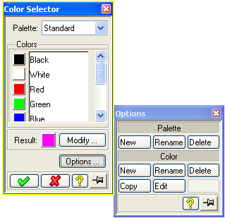
By default the selection of a color generates an integer. The option
:include-none-item t ;default=nil or t if :toggle-type = :indicator-toggle-data
adds an additional item named "None" to the color range thus allowing the
user to set the value of a color variable to NIL.
Further range items can be added before and after the color range by means of the following options
   :pre-color-range  choices      ;default=nil
   :post-color-range choices      ;default=nil
The items in the choices must be keywords and can be specified in the same way as a :range variable, e.g.
    (COL :value-type :rgb-color
         :pre-color-range ((:pre-color :label "Pre color"))
         :post-color-range ((:post-color :label "Post color")))
A :scale variable specifies an integer that must lie between
a lower and an upper bound. This variable is represented as a scale with a
shiftable slider in an elongated region on the screen (similar to a
scrollbar).
Note that the enable check box enables and disables the slider.
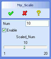  |
(sd-defdialog 'my_scale
  :variables
    '((NUM    :value-type    :number
              :initial-value  10
              :after-input   (setq scaled_num num))
      (ENABLE :value-type    :boolean
              :initial-value t
              :after-input
                (sd-set-variable-status 'scaled_num :enable enable))
      (SCALED_NUM
              :value-type      :scale
              :minimum         1
              :maximum         20
              :initial-value   10
              :after-input     (setq num scaled_num)
              :initial-enable  t))
  :ok-action
     '(pprint (list 'scaled_num scaled_num)))
|
The lower and upper bounds can be specified through the following keywords
        :minimum                  an-integer    ;default=0
        :maximum                  an-integer    ;default=100
By default, the displayed scale contains the variable title, the scale value and labels with the maximum and minimum values at the ends of the scale. These UI elements and other UI behavior can be modified or removed by means of the following keywords
        :suppress-title           a-boolean   ;default=nil
        :title-alignment    {:right :left :center} ;default=:center
        :suppress-scale-value     a-boolean   ;default=nil
        :decimal-points           an-integer  ;default=0

        :maximum-label            a-string    ;default="maximum scale value"
        :minimum-label            a-string    ;default="minimum scale value"
        :suppress-min/max-labels a-boolean    ;default=nil

        :increment                a-number    ;default=1

        :drag-callback            a-LISP-form ;default=nil
The option :increment specifies the amount to move the
slider when a user takes an action that moves the slider by a multiple
increment (e.g. by clicking next to the slider in the elongated rectangular
region).
The option :decimal-point modifies the display of the slider
value and of the minimum and maximum labels. For example, if the slider
value is 234 and the :decimal-point is 2 then a value 2.34 will
be displayed above the slider bar.
The option :drag-callback specifies code that is executed
while the slider is being moved. When the sliding movement has come to a
completion, the slider position is assigned to the dialog variable, thus
triggering the :after-input code.
The function sd-get-slider-value can be used to inquire the slider position from the user interface during the slider movement
(sd-get-slider-value dialog variable)
The variable symbol can also be replaced by its keyword or a string with the variable's name.
Thus, for the sake of illustration, the above dialog could provide some additional feedback during the dragging of the slider by including the following statements:
        :drag-callback
            (format t "~%Dragged to ~A."
                      (sd-get-slider-value 'scaled_extrude 'distance))
Warnings
:drag-callback form is not allowed to contain local
dialog functions in compiled code. Dialog variables can be accessed but
not modified.:drag-callback code, that
are called via the sd-call-cmds wrapper, need to explicitly
update the graphics screen. This can be achieved by provoking an
interactive event, say by (sd-put-buffer ""), or by calling
the (unsupported) function (frame2:update-screen).A :dynamic-scale variable displays a scale and a set of 9
indexed buttons that are spread out above the scale. One of the buttons is
always pressed. The pressed button can control the kind of action that has
to be taken when the slider is moved.
A :dynamic-scale variable simply generates UI controls and
does not store the index and slider position as variable values for later
reference (in contrast to a :scale variable). One consequence
of this fact is that a :dynamic-scale variable does not support
:after-input code attachments. Other consequences are that
manipulations in the :dynamic-scale UI do not follow the
standard railroad patterns and do not generate build-in entries into
recorder files.
The following options are supported:
        :toggle-push-function     a-LISP-function ;default=nil
        :toggle-release-function  a-LISP-function ;default=nil
        :drag-callback            a-LISP-form     ;default=nil
        :value-change-callback    a-LISP-form     ;default=nil
Note that the display of titles and bound labels is not available, as
opposed to a :scale variable.
A set of functions are provided to manipulate the UI of the dynamic scale to support the multiple usage of the slider:
  (sd-set-slider-value dialg variable value)

  (sd-set-dynamic-scale-bounds dialg variable
          :minimum minimum   ;default=-1000
          :maximum maximum   ;default= 1000
          :increment index   ;default= 20
          :value number)     ;default= minimum if specified, else maxium.

  (sd-get-dynamic-slider-control dialg variable index)
The use of the above options and functions is illustrated in the example dialog below.
Note that the 9th button is disabled and greyed out. Each time an index button is pressed, the slider position is set to the zero location. The slider bounds have been set to -10 and 10 for the first index button, and -100 and 100 for all other index buttons.
 |
(defvar *scale-index* nil "Currently used dynamic scale index.")
(defvar *scale-values* nil "Property list containing values for each index.")

(sd-defdialog 'multiple_drags
  :dialog-title "Multiple Drags"
  :variables
    '((A_FACE
        :value-type :face)
      (DRAG
        :value-type :dynamic-scale
        :toggle-push-function    #'my-toggle-push-function
        :drag-callback           (my-track-slider-value "drag callback")
        :value-change-callback   (my-track-slider-value "value change callback")))
  :after-initialization-ui '(my-initialize-multiple-drags-scale)
  :ok-action '(pprint (list 'scale-values *scale-values*)))

(defun my-toggle-push-function (index)
  (format t "~%Index ~A pushed." index)
  (my-set-drag-bounds index)
  (setq *scale-index* index))

(defun my-set-drag-bounds (index)
  (sd-set-dynamic-scale-bounds 'multiple_drags 'drag
          :minimum (case index
                     (1 -10)
                     (otherwise -100))
          :maximum (case index
                     (1 10)
                     (otherwise 100))
          :increment (case index
                       (1 1)
                       (otherwise 10))))

(defun my-track-slider-value (text)
  (let ((value (sd-get-slider-value 'multiple_drags 'drag)))
    (format t "~%~A ~A with index ~A." text value *scale-index*)
    (setf (getf *scale-values* *scale-index*) value)))

(defun my-initialize-multiple-drags-scale ()
  (sd-disable-control
     (sd-get-dynamic-slider-control 'multiple_drags 'drag 9))
  (sd-set-togglebutton
     (sd-get-dynamic-slider-control 'multiple_drags 'drag 1)
     :callAction t)
  (my-set-drag-bounds 1)
  (setf *scale-values* nil))
|
Warning: The :drag-callback and
:value-change-callback forms are not allowed to contain local
dialog functions.
The following :value-types have points and vectors as
values:
        :value-type               LISP Data Type                Dimension
        -----------               --------------                ---------

        :point-2d                  gpnt2d                       [mm,mm]
        :point-3d                  gpnt3d                       [mm,mm,mm]
        :measure-point             list with 3 items
                                     - point (gpnt3d)           [mm,mm,mm]
                                     - space handle {space-handle}
                                     - hit sel item
        :measure-direction         list with 3 items
                                     - direction (gpnt3d)       [mm,mm,mm]
                                     - reference point (gpnt3d) [mm,mm,mm]
                                     - up-dir
        :measure-vector            gpnt3d                       [mm,mm,mm]
        :measure-vector-list       list with 3 items
                                     - vector   (gpnt3d)        [mm,mm,mm]
                                     - position (gpnt3d)        [mm,mm,mm]
                                     - u-vector (gpnt3d)        [mm,mm,mm]
        :measure-axis              list with 2 items
                                     - point (gpnt3d)           [mm,mm,mm]
                                     - direction (gpnt3d)       [mm,mm,mm]
        :wp-normal                 gpnt3d                       [mm,mm,mm]
        :wp-reverse-normal         gpnt3d                       [mm,mm,mm]
        :raw-vport-pick            gpntwc
        :point-3d-pick             gpntwc or gpnt3d
The default 2d or 3d catch mode is used during the selection of a
:point-2d and :point-3d, respectively.
The value types :measure-point,
:measure-vector, :measure-vector-list,
:measure-direction and :measure-axis activate Creo
Elements/Direct Modeling's utility tools to provide flexible interactive
input support using flyby feedback.
Points and vectors are defined as instances of the LISP structures
gpnt3d and gpnt2d. A set of functions are provided
to access the components of these structures:
   (gpnt3d-p any-object)  => returns a boolean
   (gpnt3d_x     3d-pnt)  => returns a number
   (gpnt3d_y     3d-pnt)  => returns a number
   (gpnt3d_z     3d-pnt)  => returns a number

   (gpnt2d-p any object)  => returns a boolean
   (gpnt2d_x     2d-pnt)  => returns a number
   (gpnt2d_y     2d-pnt)  => returns a number
Points and vectors are always defined in term of mm units.
The entry of points and vectors via the user input line are interpreted in
current units.
A space handle is used in a :measure-point variable to
specify a local coordinate system that accompanies the definition of the
point. A space handle is a structure that contains the following fields
A set of functions are provided to create, access and manipulate a space handle
  (setq space-handle
    (make-space-handle
       :origin 3d-pnt
       :normal 3d-pnt
       :udir   3d-pnt
       :state  state
    )
  )
  (space-handle-p any object)         => returns a boolean

  (space-handle-origin space-handle)  => returns a 3d vector
  (space-handle-normal space-handle)  => returns a 3d vector
  (space-handle-udir   space-handle)  => returns a 3d vector
  (space-handle-state  space-handle)  => returns :vu :vw :wu or :3d

  (setf (space-handle-origin space-handle) 3d-pnt)
  (setf (space-handle-normal space-handle) 3d-pnt)
  (setf (space-handle-udir   space-handle) 3d-pnt)
  (setf (space-handle-state  space-handle) state)
A :measure-point variable supports the following additional options:
  :measure-feedback-function a-local-function          ;default=nil
  :space-handle              initial-space-handle      ;default=space handle with
                                                       ;          origin 0,0,0
                                                       ;          normal 0,0,1
                                                       ;          udir   1,0,0
                                                       ;          state  :3d

e.g.

  :variables
  '((MY_POINT
      :value-type :measure-point
      :measure-feedback-function my-point-feedback-func
      :space-handle (sd-make-space-handle
                      :origin 0,0,0
                      :normal 0,0,1
                      :udir   1,0,0
                      :state :3d)
    )
   ...
   )

  :local-functions
   '((my-point-feedback-func (point-list) ; (point3d space-handle sel-item)
       ...draw feedback here...
     )
     ...
    )
The :measure-feedback-function is called together with the
point flyby feedback when the mouse hovers over a selectable object or in
space. This function can access and modify local dialog variables. The
argument of this function is a list containing the current point, space
handle and the caught sel item (if applicable).
The option :space-handle specifies the space handle that is
to be used when the measure point variable is activated. This option can be
used to implement a 'follow me' mode that displays a space handle at the
position of the last specified point. The previously used space handle can
be assessed from the value of the measure point variable.
A :measure-direction variable supports the following
additional options:
                                                      Default
  :measure-feedback-function  a-local-function         nil
  :initial-modify-value       list-containing-dir/origin/up-dir     nil
  :enable-u-rotate            boolean                  t
  :enable-v-rotate            boolean                  nil
  :enable-w-rotate            boolean                  t
  :enable-length-drag         boolean                  nil
  :allow-new-direction-on-modify boolean               t
  :initial-direction-negative boolean                  nil
  :initial-ignore-axis        boolean                  nil
  :clear-token                variable                 nil
The :measure-feedback-function is called together with the
direction flyby feedback when the mouse hovers over a selectable object.
This function can access and modify local dialog variables. The argument of
this function is a list containing the current direction, reference point
and up direction.
The option :initial-modify-value specifies an initial
direction list containing a direction, origin and up vector. If this option
is defined then a polestar is displayed that allows the user to modify the
specified initial direction by clicking on appropriate polestar components
and dragging. The options :enable-u-rotate, :enable-v-rotate,
:enable-w-rotate and :enable-length-drag enable/disable the
individual modification modes.
The context menu entry called 'New Dir' is by default disabled when
modifications are restricted to rotations around either the u axis or v
axis. The option :allow-new-direction-on-modify enables the
'New Dir' context menu, independent of the options :enable-u-rotate,
:enable-v-rotate, and :enable-w-rotate.
The option
:initial-direction-negative controls the initial direction that
is used when the mouse hovers over a new element. For example, when the
mouse hovers over a planar face, the default direction is normal to the face
and points outwards, away from the part. If this option is set to
t, then the initial direction will point inwards, into the
part. The tab key or the right-click context menu can be used to flip that
initial direction.
The option :initial-ignore-axis determines whether an axial
direction will initially be determined or not. For example, when the mouse
hovers over an axial face, the axis is used as the default direction. If
this option is set to t, then the initial direction will not be
derived from the face axis but rathermore from the face normal. The tab key
or the right-click context menu can be used to switch the axis orientation
on and off. The tab key can be used to switch between positive and negative
axial and face normal directions.
The option :clear-token specifies a token that will be put
into the input buffer if a user executes the 'Clear' option in the measure
direction context menu.
A :measure-vector-list variable supports the following
additional options:
Default
:measure-feedback-function a-local-function nil
:vector-drag-max-value number nil
:vector-drag-min-value number nil
:vector-drag-scale number 1
:initial-modify-value list-containing-vector/origin/up-dir nil
:enable-u-rotate boolean t
:enable-v-rotate boolean nil
:enable-w-rotate boolean t
:enable-length-drag boolean nil
:initial-direction-negative boolean nil
:initial-ignore-axis boolean nil
:clear-token variable nil
The :measure-feedback-function is called together with the
vector flyby feedback when the mouse hovers over a selectable object. This
function can access and modify local dialog variables. The argument of this
function is a list containing the current vector, reference point and up
direction.
By default, in particular when :initial-modify-value is
nil, the user is requested to first define the direction of the
vector and then second to determine its length. The options
:vector-drag-max-value and :vector-drag-min-value
constrain the drag behavior during the length determination.
The option :vector-drag-scale influences the size of the
drag distance as the mouse moves.
The option :initial-modify-value specifies an initial vector
list containing a vector, origin and up vector. This option and the options
:enable-u-rotate, :enable-v-rotate, :enable-w-rotate and
:enable-length-drag behave in the same way as the
:measure-direction variable.
The options :initial-direction-negative,
:initial-ignore-axis and :clear-token has the same
effect as in the :measure-direction variable.
A :measure-axis variable supports the following additional
options:
                                                      Default
  :initial-direction-negative boolean                  nil
  :initial-ignore-axis        boolean                  nil
These options are described in the :measure-direction
variable.
When measuring a result by means of a flyby or space handle click, the
final result is passed to the variable and there is no trace of which method
was used to determine that result. Additional railroad options are available
in order to specify a method for deriving the measured result. These options
are useful to specify measured data within a sd-call-cmds
call.
The value types :measure-direction,
:measure-axis :measure-vector and
:measure-vector-list support the following options:
     :face_normal     planar_face
     :face_normal     non_planar_face  3d_point_on_face
     :neg_face_normal planar_face
     :neg_face_normal non_planar_face  3d_point_on_face

     :edge_tangent    straight_edge                      {:accept | :reverse}
     :edge_tangent    curved_edge      3d_point_on_edge  {:accept | :reverse}

     :surface_axis    face_with_axis                     {:accept | :reverse}
The :face_normal and :edge_tangent options are
illustrated in the following rudimentary dialog:
(sd-defdialog 'calling_measure_dialog
  :variables
  '((PLANAR_FACE :value-type :face)
    (STRAIGHT_EDGE :value-type :edge)
    ("-")
    (CURVED_FACE :value-type :face
                 :after-input
                  (setq face_point
                        (sd-get-pnt-on-face curved_face :dest-space :global)))
    (FACE_POINT  :value-type :point-3d)
    ("-")
    (CURVED_EDGE :value-type :edge
                 :after-input
                  (setq edge_point
                        (getf (sd-inq-edge-pnt curved_edge
                                 :s 2
                                 :coordinates t
                                 :dest-space :global)
                              :coordinates)))
    (EDGE_POINT :value-type :point-3d)
   )
  :ok-action
  '(pprint
     (list
       :positive
       (sd-call-cmds
         (my_measure_dialog
            :my_direction :face_normal planar_face
            :my_vector :edge_tangent straight_edge :accept 34
            :my_vector_list :edge_tangent curved_edge edge_point :accept 45))
       :negative
       (sd-call-cmds
         (my_measure_dialog
            :my_direction :neg_face_normal planar_face
            :my_vector :edge_tangent straight_edge :reverse 34
            :my_vector_list :neg_face_normal curved_face face_point 45))
     ) ;list
   ) ;pprint
) ;sd-defdialog

(sd-defdialog 'my_measure_dialog
   :variables
    '((MY_DIRECTION :value-type :measure-direction)
      (MY_VECTOR :value-type :measure-vector)
      (MY_VECTOR_LIST :value-type :measure-vector-list)
     )
   :ok-action '(list :dir my_direction :vec my_vector :vec-list my_vector_list))
The following measuring options are provided interactively via measure context menus (obtained by a right-mouse click) and can also be used programatically.
The value type :measure-direction supports the option
:two_pt first_point_3d second_point_3d
The value type :measure-vector supports the options
    :two_pt     first_point_3d   second_point_3d
    :dir_len    any_measure-direction_option(s)  length
The :measure-axis value type supports the options
    :two_pta    first_point_3d   second_point_3d
    :pt_dir     point_3d         any_measure-direction_option(s)
All measure variables support the extraction of information from
    :x
    :y
    :z
    :neg_x
    :neg_y
    :neg_z
    :ref_wp     workplane
    :u
    :v
    :w
    :neg_u
    :neg_v
    :neg_w
    :horiz      v_offset      ;for :measure-axis only
    :vert       u_offset      ;for :measure-axis only
    :neg_horiz  neg_v_offset  ;for :measure-axis only
    :neg_vert   neg_u_offset  ;for :measure-axis only
:measure-axis),
    :vp_dir     viewport
    :neg_vp_dir viewport
When applied to a :measure-vector variable, the length must
follow after any if the above direction specifications.
The definitions :value-type = :wp-normal and
:value-type = :wp-reverse-normal specify the
direction of a vector that is normal and reverse normal, respectively, to a
workplane.
These two value types require the specification of a reference workplane.
By default, any variable that contains a workplane is used as the
:reference-wp, provided only one such variable exists in the
dialog. In the following example,
  :variables
    '((MY_PART     :value-type :part)
      (MY_WP       :value-type :wp)
      (MY_DISTANCE :value-type :length)
      (NORMAL      :value-type :wp-normal)
      ...)
the reference workplane for the NORMAL variable is defined
by the variable MY_WP.
If more than one workplane occurs in the dialog, the desired workplane
variable must be supplied explicitly by means of the keyword
:reference-wp:
e.g.

  :variables
    '((MY_WP_1  :value-type :wp)
      (MY_WP_2  :value-type :wp)
      (NORMAL   :value-type :wp-normal
                :reference-wp my_wp_2)
      ...)
The value type :raw-vport-pick specifies a 2-dimensional
point of a viewport in terms of a structure called gpntwc. This
structure can be passed on to Creo Elements/Direct Modeling commands that
accept viewport picks.
The value type :point-3d-pick returns either a
gpntwc or a 3d point (i.e. a gpnt3d). The first
data type (gpntwc) is obtained when a user clicks within a
viewport and the second data type (gpnt3d) is obtained when the
user explicitly enters a 3d point (say 1,2,3) into the command input area.
The value type :point-3d-pick should be used with care, since
two non-interchangeable data types can be assigned to the same variable.
The :value-types = {:measure-direction :measure-axis
:wp-normal :wp-reverse-normal} automatically generate and manage
feedback on the screen. This automatic scheme can be switched off by setting
:built-in-feedback to nil.
Warning:
Consequently, it is possible that the feedback objects that are held within the dialog can become obsolete due to changes in the modelling state. The macro sd-with-suspended-feedback can be used to protect critical model state changing code from creating problems due to obsolete feedback objects. Failure to protect such code can result in severe segmentation violation errors.
When picking a 2d or 3d point for a variable of the value type
:point-3d, :point-2d or
:point-3d-pick, a built-in flyby feedback marker is displayed
while hovering over a pickable element.
A catch flyby marker is also displayed when a variable possesses a :secondary-value-type of the type :point-2d or :point-3d.
The catch flyby marker can be switched off by means of the option
:catch-flyby, that is, by specifying
:catch-flyby nil ; default=t
File selection variables are specified by setting
:value-type to :filename.
The value attached to a :filename variable is a list of two
items:
        :value-type               LISP Data Type
        -----------               --------------

        :filename                 list: (filename mode)

                                  where filename = a string,
                                        mode = {:overwrite :append nil}
The remaining part of this section only deals with a
:filename variable that triggers a file browser as an input
tool for specifying a file name. The options described below do not apply to
a :filename variable that is integrated with the Creo
Elements/Direct Modeling Load/Save filing system (see 4.7 File Manager). That is, to be more precise, in what
follows the :filename variable does not occur in the
:filing-variables specification of the dialog.
File selections sometimes cause a confirmation dialog to appear on the
screen, requesting the user to choose one of the modes
:overwrite or :append, or to abort the file
selection. The chosen mode is stored as the second element of the variable's
LISP data type.
Note that the :initial-value must be specified in the list
format, e.g.
       (FILE :value-type :filename
             :initial-value '("MYFILE.TXT" :overwrite))
or
       (FILE :value-type :filename
             :initial-value '("MYFILE.TXT" nil))
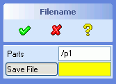 |
(sd-defdialog 'filename_demo
   :dialog-title "Filename"
   :variables
      '((PARTS :value-type :part
               :modifies NIL
               :multiple-items t)
        (FILE :value-type :filename
              :title "Save File"
              :initialdirectory "/tmp"
              :fileType :lisp))
   :ok-action (progn
                 ;...
                 ))
|
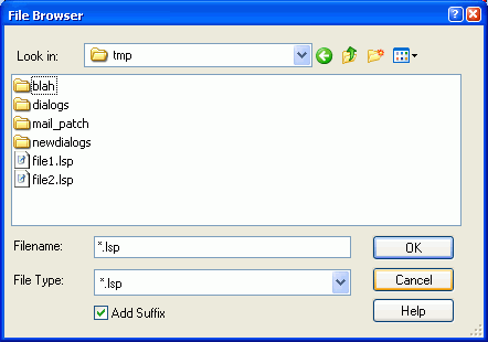 |
|
The precise nature of the file browser can be controlled by means of the following keywords:
        :direction {:input :output :io} ;default=:io
        :if-exists {:overwrite :append :confirm-overwrite
                    :confirm-overwrite-or-append}
              ;default = :confirm-overwrite if :direction={:output, :io}
        :initialDirectory a-string
        :fileType         a-registered-keyword
        :initialPattern   a-string
        :relative-position list-of-x-y-coordinate-offsets
                                    ;default=(-450 -250 :bottomleft)
        :add-suffix {t nil} ;default=t   if :direction={:output, :io}
                            ;default=nil if :direction=:input
        :filename-incl-path {t nil} ;default=t
The possible choices of registered keywords for :fileType
can be obtained by analysing the environment file of Creo Elements/Direct
Modeling. Each file type specifies one or more associated file suffixes.
The specified :fileType can be customized at runtime, i.e.
the associated file suffixes can be defined or redefined at runtime. File
types can be registered or modified by means of the functions
define-file-type and set_file_suffix as
illustrated in any typical environment file.
Note that the :fileType specification can only be used for
file browsers that are used as input tools, that is, for collecting a file
name for a dialog variable. By contrast, load and save dialogs are based on
a different :file-type concept that not only assigns
corresponding file suffixes but furthermore controls the behavior of the
File Manager
The :relative-position specifies the position of the file
browser that pops up when an input is being specified for the variable. The
position specification must contain at least two numbers: the horizontal and
vertical offsets. Examples are
     :relative-position (-200 -300)
and
     :relative-position (-200 -300 :bottomright)
The general form is
     :relative-position (x-offset y-offset attachment)
                                           (optional)
where
      x-offset:     x-direction (positive axis rightwards)
      y-offset:     y-direction (positive axis downwards)
      attachment:   {:bottomleft :bottomcenter :bottomright
                     :lefttop    :leftcenter   :leftbottom
                     :righttop   :rightcenter  :rightbottom
                     :topleft    :topcenter    :topright}
If :add-suffix is set to T, the
:fileType keyword is given and if a default suffix is defined
for the given file type, the file browser uses this default suffix to
complete file names entered by the user. The default value is
:add-suffix = T, when :direction =
{:output, :io} and :add-suffix = NIL
when :direction =:input.
The value type :display-only displays the value of a
variable in a non-editable format. The value of the variable can be of any
LISP value type.
The variable cannot be modified by a user and is not associated with a
command input token (in contrast to most other :value-types).
However, the value of the variable can be modified within the dialog code
using setf or setq.
A typical example is to display important parameters that have been derived from some object to guide the user. The following dialog displays the length of a selected edge as a means to assist the user:
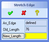 |
(sd-defdialog 'display_only
   :dialog-title "Stretch Edge"
   :variables
     '((AN_EDGE   :value-type :edge
                  :after-input
                    (setq old_length
                      (sd-call-cmds
                        (measure_dist :edge_length an_edge))))
       (OLD_LENGTH :value-type :display-only
                   :display-units :length)
       (NEW_LENGTH :value-type :length)))
|
A variable of the type :display-only is recommended whenever
a variable is intended to be "disabled" permanently. Note that a
:display-only variable need not (and cannot) be disabled.
A variable of the type :display-only cannot occur in a
:mutual-exclusion list.
The keyword :display-units converts the value of the
variable to the current units. The following choices are provided:
:display-units {:length :angle :length-2d :length-3d}
The keywords :length-2d and :length-3d can be
used to display the value types :point-2d and
:point-2d, respectively.
The keyword :alignment defines the horizontal alignment of
the range items:
:alignment {:left :center :right} ;default=:left
A :display-only variable will be editable if the option
:editable is set to T. An editable
:display-only variable additionally supports the
:display-units called :number. The option
:label-text-push-action can be used to override the default
input behavior of an editable :display-only variable.
The value type :image displays an image. A typical example
is to display information in a 2-dimensional graphical format to provide
additional support for the dialog user.
There are no limitations on the image size, other than that its height should be less than the screen height. A horizontal scrollbar will be inserted if the image is wider than the standard width of the dialog.
(sd-defdialog 'black_box
   :dialog-title "Black Box"
   :variables
     '((PICTURE   :value-type :image
                  :image-file "c:/black-box.bmp")
       (N1 :value-type :number)
       (N2 :value-type :number))
   :ok-action '(create-black-box n1 n2))
The following options are available
        :image-file a-string       ;default=nil
        :image-name a-string       ;default=nil
        :image-height a-number     ;default=derived from image
        :image-alignment keyword   ;default=:center
        :image-Valignment keyword  ;default=:center
The options :image-file and :image-name can be
used alternatively. If both are provided, then the :image-file
specification will be ignored.
The possible values for the horizontal alignment,
:image-alignment, are :left, :center
and :right.
The possible values for the vertical alignment,
:image-Valignment, are :bottom,
:center and :top.
An :image variable cannot be modified by a user and is not
associated with a command input token (in contrast to most other
:value-types).
The image of the variable can be modified by using the local function
3.2.1 sd-set-variable-status with the
options :image-file and :image-name.
An :image variable cannot be used within an
:expand-shrink variable list. However, the desired behavior can
be achieved by avoiding the :expand-shrink variable and by
explicitly controlling the visibility of the involved variables (see also
expand/shrink restrictions).
A variable can possess more than one :value-type
specification. When activating such a variable, a user can choose to enter
different kinds of data, say a 3D point or a length. Thus, for example, the
resulting value of the variable can be either a 3D point or a length,
depending on whether the user picked a point in the graphics viewport or
entered a number into the user input line.
Multiple value types should be used with care, since the
:after-input forms must cope with a dialog variable that can
have different types of values.
Note that multiple kinds of selections can be implemented by means of the
keyword :selection (see 4.1.3
Object Selection) without the need to use
:secondary-value-type. Secondary value types can be used
together with :selection.
Secondary value types can be specified as follows:
  :secondary-value-type        a-value-type-or-list-of-value-types

  :gui-value                   a-lisp-form
  :editable-primary-value-type {t nil}  ;default=nil
  :check-secondary-value-type  {t nil}  ;default=nil
Several restrictions exist for the choices of secondary value types:
:face or :part) should be used as primary value
types and not as secondary value types. Similarily, the value type
:viewport is based on a subaction call and cannot be used as
a secondary value type.:positive-number, :integer or
:positive-integer cannot be used as primary or secondary
value types.:filename and :wp-normal
cannot be used as secondary value types.:point-3d-pick does not support
secondary value types (because it internally contains a secondary value
type).:range.The options :gui-value and
:editable-primary-value-type control the data field associated
with the variable, as described below.
In general, the :check-function of a variable is applied to
an input that matches with the primary and the
:secondary-value-type. Furthermore, if a
:confirmation specification is supplied, then it also applies
to inputs that match with the :secondary-value-type.
A selection variable is an exception to the above rule, that is, the
:check-function is by default only applied to the primary value
type but not to a :secondary-value-type. The option
:check-secondary-value-type applies to selection variables and
controls the application of the :check-function. If the option
:check-secondary-value-type is set to t, then the
:check-function will be applied to inputs that match with the
:secondary-value-type.
By default, the input field corresponding the a variable with a secondary value type is non-editable, thus ensuring that different data types can be accomodated in the UI. By default, the value of the variable is displayed in internal units.
The option :gui-value can be used to control the text that
is displayed in the data field of the variable. The value of the supplied
form must return a string or NIL, e.g.
  (OFFSET1 :value-type :length
           :secondary-value-type :point-3d
           :gui-value (when offset1
                        (if (numberp offset1)
                          (format nil "~A" offset1)
                          "defined"))
           :after-input
             (if (numberp offset1)
               (handle-offset-number offset1)
               (handle-point-3d-offset offset1)))

  (defun handle-offset-number (a-number) ...)
  (defun handle-point-3d-offset (a-point-3d) ...)
Note that caution is needed in the :after-input code to
ensure feasible usage of the variable offset1.
The option :editable-primary-value-type causes the input
field to become editable. The resulting value is displayed in current units
and new input can be entered in current units. When using this option, it is
recommended to convert the secondary value type to to the primary value type
within the :after-input code.
The example below illustrates the converson of a secondary value type to
the primary value type in the :after-input form, in this case
from a point-3d to a :length.
  (OFFSET2 :value-type :length
           :secondary-value-type :point-3d
           :editable-primary-value-type t
           :after-input
            (when (gpnt3d-p offset2)
              (setq offset2 (determine-offset-length offset2))))

  (defun determine-offset-length (a-point-3d) ...)
A directory selection variable is specified by setting
:value-type to :directory.
On activating the variable, a modal folder browser is displayed. The
browser displays the :prompt-text of the activated
variable.
Alternatively, the user can directly enter the name of a valid directory into the data field.
The value attached to a :directory variable is a string.
By default, the folder browser starts with the directory value of the
variable. If the variable has no initial value you can specify
:initialDirectory to let the folder browser start in this
specific directory.
A list of choices can be implemented by supplying a :range
list. No values other than those in the currently valid range specification
can be assigned to the variable.
A variable with a :range specification possesses a value at
all times (unless it is included in a :mutual-exclusion list).
The default value is the first item of the :range list.
Examples of variables with :range specifications are
  :variables
   '((KEYWORDS :range (:v1 :v2 :v3))
     (NUMBERS  :range (1 2 3))
     (SYMBOLS  :range (v1 v2 v3))
     (STRINGS  :range ("V1" "V2" "V3"))
     (MIXED    :range (:v1 1 v2 "V3"))
   )
The data types of range items can be mixed freely, as illustrated in the
above dialog variable MIXED.
A separator can be inserted into the range by means of the special item "-", e.g.
(MIXED :range (1 2 3 "-" :a :b :c))
Each range element can individually be replaced by a list that specifies the element and it's screen representation, e.g.
:range ((:v1 :label "Value 1") (:v2 :label "Value 2")
    3)
:range (("V1" :label "Value 1") ("V2" :label "Value 2")
"3"):range (("V1" :label (get-print-name-1)) ("V2" :label
(get-print-name-2))), where the functions
get-print-name-1 and get-print-name-2 return
strings.:range ((:v1 :pixmap-name "PIX1") (:v2 :pixmap-name
"PIX2")):range ((:v1 :pixmap-file "pix1.xbm") (:v2 :pixmap-file
"pix2.xbm"))The first item of a pair is used as the value of the variable (that is
passed on to the dialog function in the :ok-action), while the
expression following :label specifies the screen
representation. The screen representation can be determined by the return
value of a LISP form, such as (get-print-name-1).
The following examples summarizes some uses of the :range
keyword:
 |
(sd-defdialog 'range_demo
    :dialog-title "Ranges"
    :variables
     '((KEYWORDS1 :range (:val1 :val2 :val3))
       (KEYWORDS2 :range ((:val1 :label "Val 1")
                          (:val2 :label "Val 2")
                          (:val3 :label "Val 3")))
       ("-")
       (NUMBERS1  :range (1 2 3))
       (NUMBERS2  :range ((1 :label "one")
                          (2 :label "two")
                          (3 :label "three")))
       ("-")
       (SYMBOLS1  :range (val1 val2 val3))
       (SYMBOLS2  :range ((val1 :label "Val 1")
                          (val2 :label "Val 2")
                          (val3 :label "Val 3")))
       ("-")
       (STRINGS1  :range ("Val 1" "Val 2" "3"))
       (STRINGS2  :range (("Val 1" :label "1.st Val")
                          ("Val 2" :label "2.nd Val")
                          ("3"     :label "3.rd Val")))))
|
The keyword :display-units specifies the units of the range
items, thus causing the range items to be displayed in the current units.
The possible choices are:
:display-units {:length :angle :density}
The range choices can be modified during the execution of the dialog by
means of the function sd-set-range (see 3.2.1 sd-set-range). This function changes the items in
the range. The new items must be of the same type as the previous range;
thus, the range (1 2 3) can be changed to (5 6), but not to ("5" "6").
Typically, the function sd-set-range will be employed in an
:after-input code sequence, as illustrated below:
   :variables
      '((NUMR  :value-type :number
               :after-input
                 (let ((new-range (get-variable-items numr)))
                   (sd-set-range 'choice new-range)
                   (setq choice (first (last new-range)))))
        (CHOICE :range ("none")))

where,

(defun get-variable-items (num)
;;;In: a number
;;;Out: a list ("A1" "A2" ... "Anum")
  (if (numberp num)
    (let ((count 0))
      (mapcar #'(lambda (item)
                  (declare (ignore item))
                  (format nil "A~A" (incf count)))
              (make-list num)))))
After changing the range of a variable, the first range item will be assigned to the variable, unless it has been reset explicitly (as illustrated in the above example).
The function sd-set-range can be used to set the range of a
variable that has to be determined while the dialog is being activated, as
illustrated below:
(defparameter *range-selection-numr* 3)

(sd-defdialog ...
   :variables
      '((CHOICE
          :range ("none")
          :initial-value
            (let ((new-range (get-variable-items *range-selection-numr*)))
              (sd-set-range 'choice new-range)
              (first (last new-range))))
          ...))
where the function get-variable-items is defined above.
Note that the :initial-value returns an initial value for
the variable, after having carried out the side effect of setting up a
range.
The initial range item "none" will never be visible on the
screen, since the range is redefined while the dialog is being initialized.
Note that it is essential to specify a value for :range and
that this range specification must have a type (i.e. a string or keyword or
number) that is compatible with the range items defined by
sd-set-range.
In many cases, one of the predefined :value-types will be
appropriate for the selection of an object (see 4.1.1.1 Selection of Objects)
More advanced kinds of objects or combinations of different kinds of
objects can be defined by means of the :selection keyword:
        :selection list-of-focus-types        ;default=nil
e.g.
     :variables
         ((OBJECT :selection
                     (*sd-circle-2d-seltype* *sd-arc-2d-seltype*))
          ...)
The possible focus type choices are described in Select Interrupt Action.
The additional keywords for object selections, as described in 4.1.1.1 Selection of Objects, can also be used
together with :selection.
The two keywords :start-input-feedback and
:end-input-feedback can accomodate code that supports the user
input activity. A typical application is to provide rubber bands and
graphical objects that follow the movement of the mouse.
The keyword :start-input-feedback will be executed upon the
activation of a variable and it should start the feedback activities
associated with that variable. The keyword :end-input-feedback
should clean up the feedback and will be called either
:check-function,:end-input-feedback code will be executed possibly
several times, irregardless whether the :start-input-feedback
was executed or not.The above behavior leads to the requirement that the
:end-input-feedback code must be executable one or more times,
possibly without a prior execution of
:start-input-feedback.
The keyword :before-input behaves in the same manner as
:start-input-feedback and has been introduced for the sake of
symmetry with :after-input.
The two keywords :show-input-tool and
:hide-input-tool can be used to support specialized user
interface input tools that operate in parallel with the input prompt
areas.
Examples are the selection of data from a dynamically created list or table. The following example illustrates the use of these keywords:
      :variables
       '((MATERIAL
           :range (:st100 :st200))
         (WIDTH
           :value-type :length
           :show-input-tool (show-widths-list material :initial-value width)
           :hide-input-tool (hide-widths-list)))
In the above example, the functions show-widths-list and
hide-widths-list are application-specific functions, designed
by the dialog developer. The function show-widths-list has the
responsability to bring up a tool on the screen that allows the user to
select a width from a list of numbers that depend on the current values of
material and width. The function
hide-widths-list must cause the tool to disappear from the
screen without producing any additional side effects.
When a value has been specified in that tool, e.g. by pressing on the
OK or APPLY button or by doubling clicking an
item, the selected value will be assigned to the dialog variable.
Warning: The LISP code within the :show-input-tool
and :hide-input-tool forms can neither manipulate values of
dialog variables nor access local functions (see 4.3
Procedural Attachments). The options :show-input-tool and
:hide-input-tool are so-called personality options.
Input tools are called when the dialog is used interactively. Input tools
are not called when the dialog is executed within a
sd-call-cmds wrapper or are being replayed in a recorder
file.
The execution of an input tool is delayed until the variable becomes
current and the user interface becomes interactive. Note that values can
also be assigned to variables without entering such an interactive state.
For example, a value 3 can assigned to a variable
:var1 by entering the expression :var1 3 into the
user input line. In this case, the input tool will not be called.
Proposals can be used to assist the input of data to a variable with an freely editable input field by presenting a predefined list of commonly used values.
The list of predefined proposals can be displayed by activating a control located on the right of the edit field. The user can then simply select a proposed value, rather than entering that data manually.
(sd-defdialog 'attach_country
   :variables
     '((REGION :value-type :string
               :proposals ("North America" "Europe" "Asia"))
       (A_PART :value-type :part :modifies NIL))
   :ok-action
     '(pprint (list region a_part)))
|
Proposals do not constrain the input to the input field - in contrast to
:range type variables - but rathermore allow other values, that
are not present in the proposals list, to be assigned to the variable.
The following keywords are provided to control the behavior and the display of the proposals:
        :proposals list-of-strings-or-numbers ;default=no proposals UI

        :max-visible-proposals integer        ;default=15, min=1 max=15
        :max-proposals integer                ;default=20, min=1
        :auto-add-proposals {t nil}           ;default=nil
        :proposals-order   {:new-input-at-top :sorted :last-input-at-top nil}
                                              ;if :auto-add-proposals=t then
                                              ;  default=:new-input-at-top, else
                                              ;  default=nil
The specified :proposals should specify a list of items that
match with the :value-type of the variable. When
:auto-add-proposals = t is used, the initially specified
:proposals list may be (), i.e. NIL.
Proposals for length and angle type variables are displayed in current
units. The standard option :digits can be used to control the
displayed accuracy of the proposals.
The keyword :auto-add-proposals can be used to automatically
insert manual inputs into the proposals list. Added proposal values are
persistently used throughout the user session. The option :persistent-proposals can be used to obtain persistency
between sessions.
The local function sd-set-proposals redefines the list of proposals, e.g.
(sd-set-proposals 'region '("USA" "Germany" "Frace" "Itay" "Sweden"))
Several :value-types - such as :measure-vector
and :measure-direction and :measure-axis - collect
user input by means of a standard Creo Elements/Direct Modeling utility
tool. The keyword :additional-token-string aims to reduce the
amount of clicking required by the user while manipulating the input utility
tool.
The keyword :additional-token-string can be used to
accomodate tokens, that are equivalent to interactive clicks in the fields
of the utility tool:
:additional-token-string a-string ;default=nil
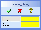 |
(sd-defdialog 'Token_String
     :variables
       '((HEIGHT :value-type :measure-vector
                 :additional-token-string ":dir_len :edge_tangent")
         (OBJECT :value-type :face
                 :multiple-items t
                 :show-select-menu t
                 :additional-token-string ":start"))
  )
|
A click on the variable HEIGHT activates the edge
fly-by-highlighting as described for measure
options.
The second variable, called OBJECT, makes use of the keyword
:show-select-menu to pop up the select menu as soon as the
variable has been selected. The keyword
:additional-token-string causes one of the input fields of the
select menu to become active. In this example the input field
Add will become active immediately, thus simplifying the
collection of the faces.
Thus, a click on the variable OBJECT causes the following
input tool to appear on the screen
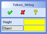 |
 |
Note: The option :additional-token-string can only be
applied to visible variables. Invisible variables do not issue tokens. If
the variable that should receive the additional token is invisible, then the
:additional-token-string specification can generally be shifted
to the visible variable that causes the entry into the invisible variable
(e.g. via a :next-variable option).
The following list summarizes the sequence in which the input support code is executed during a complete interaction cycle with a dialog variable:
                          |
     Keyword              |   Form called ...
--------------------------+----------------------------------------------
 :proposals               | activated via a special UI control
                          |
 :additional-token-string | token string called while activating a
                          | dialog variable
                          |
 :before-input            | after activating a dialog variable
 :start-input-feedback    | immediately after :before-input
                          |
 :show-input-tool         | immediately before user input is enabled
                          |
 :check-function          | when an input was defined
                          |
 :end-input-feedback      | when input was checked and variable was updated
 :after-input             | when input was checked and variable was updated
                          | (immediately after :end-input-feedback)
                          |
 :hide-input-tool         | when updating the screen after completing
                          | the variable interaction
If the input interaction is cancelled, then the
:check-function and :after-input code will be
ignored. If the :check-function denies the user input, then
:after-input code will be ignored.
The :check-function form is not only executed during a user
interaction. It is also used to check the validity of an
:initial-value and a value assigned by calls to
sd-set-variable-status when using the option
:value.
The initial value of a variable is given by the return value of the form
specified in :initial-value. By default, most variables have
the initial value NIL. Some variables take the current part or
workplane as the default value.
Initial values are initialized in the order of their occurence in the
:variables list. The initial value of a variable can be used to
determine the initial values of subsequent variables (the initializations
behave like a LET* form).
The initial value of a variable will be subjected to the
:check-function, if one has been provided (see next section).
If the variable is a selection variable, then
the initial value will be be checked against the selection options of that
variable as well. A selection variable can be assigned to the initial value
NIL or - in the case of multiple items - to a list containing
feasible objects and NILs.
The assignment of an initial value to a variable does not trigger the
:after-input code of that variable.
The dialog keyword :after-initialization is called
after all the variables have been initialized and can be used to finalize
the initial state of the dialog before it becomes interactive.
Check functions can be used to accept or reject a user input (and an
intial-value) by means of an application specific check.
If an :initial-value does not satisfy the
:check-function, then the :initial-value will be
ignored (without displaying the returned error message).
The code that is specified by the keyword :check-function
must define a function that accepts one argument. The LISP data type of the
argument corresponds to the data type of the variable at hand, as given in
the section 4.1.1 Value Types.
Thus, for example, a :check-function for a variable of the
type :part must be able to cope with a sel_item. A
variable of the type :length is is passed as to the check
function in terms of internal units (i.e. mm and rad), and not in the
currently active units.
Exception: The argument of a check function for a variable of type
:filename is a file name (and not a list containing a file name
and a mode).
A check function must return one of the following expressions:
:ok:error(values :error an-error-string)(values :error t)user-defined-keyword (other than :ok
or :error):confirmation
interaction, i.e. the user will be asked whether the value should be
accecpted or rejected (see next subsection).Note that a :check-function can return an error message and
does not need to display it from within the
:check-function.
If a :check-function displays an error message, then the
variable should not be specified with a potentially erroneous initial value,
in order to avoid the appearance of error messages during the initiation of
the dialog.
Note Selection
variables (e.g. variables with the value type :face or :edge) support an
additional option called :filter-function, in order to achieve
a silent selection rejection. The filter function can be specified
syntactically in the same way as a check function, except that it can only
return the values :ok or :error. If the filter
function returns :error then the selection is rejected without
issuing an error message. If the filter function returns :ok,
then the selection is accepted. A selection that is accepted by the filter
function is then subjected to a check function test, if provided.
The following error message has been caused by a
:check-function:
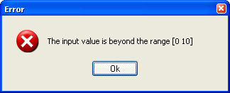
The above error message can be built into the dialog in a variety of ways, such as
Version 1: Check Function is a nomal LISP function:
    :variables
      '((HEIGHT
          :value-type :length
          :check-function my-number-check)
        ...)

or
    :variables
      '((HEIGHT
          :value-type :length
          :check-function #'my-number-check)
        ...)


   (defun my-number-check (new-value)
      (if (and (numberp new-value) (<= 0 new-value 10))
         :ok
         (values :error "The input value is beyond the range [0 10]")))
Version 2: Check Function is a local Lambda expression
(sd-defdialog 'check_func
    :variables
      '((HEIGHT
          :value-type :length
          :check-function
            #'(lambda (new-value)
                (if (and (numberp new-value) (<= 0 new-value 10))
                  :ok
                  (values :error
                       "The input value is beyond the range [0 10]"))))
        ))
The argument new-value is a freely choosen argument name of
the function.
A confirmation interaction displays a question or warning box that allows the user to make a decision whether to accept or reject a given situation. This kind of interaction is therefore sometimes called an advisor dialog.
A confirmation interaction can be used
:check-function by involving the end-user during the process
of accepting or rejecting a new value for a variable. By contrast, a pure
:check-function can only accept or reject an
input value.:push-action. This combination can be employed to trigger
confirmation interaction via software calls (see 4.1.6.2 Push Action with Question/Warning
Confirmation for more details).The :confirmation form is triggered whenever the
:check-function or the :push-action returns a
value that differs from :ok or :error.
A question/warning confirmation interaction can be specified as follows:
     :confirmation
       (return-value-of-check-function-or-push-action

            :dialog dialog       ; {:warning :question :triple-choice}

            :prompt advisor-text

            :prompt-text text-in-prompt-line

          ; Options for :dialog = :warning

            :ok-cleanup LISP-form-executed-on-continue
            :cancel-cleanup LISP-form-executed-on-cancel
            :severity severity
            :top-label label-text
            :push-1 title-of-continue-button
            :push-2 title-of-cancel-button
            :push-3 title-of-custom-help-button
            :push-info LISP-form-for-custom-help-button
            :info-image Image-displayed-in-warning-decoder

          ; Options for :dialog = :question

            :ok-cleanup LISP-form-executed-on-yes
            :cancel-cleanup LISP-form-executed-on-cancel
            :push-1 title-of-yes-button
            :push-2 title-of-no-button
            :display-dont-show-again boolean

          ; Options for :dialog = :triple-choice

            :yes-cleanup LISP-form-executed-on-yes
            :other-cleanup LISP-form-executed-on-other
            :ok-cleanup LISP-form-executed-on-yes-and-other
            :cancel-cleanup LISP-form-executed-on-cancel
            :top-label label-text
            :push-1 title-of-yes-button
            :push-2 title-of-no-button
            :push-other title-of-other-button
            :other-allowed boolean
       )
:ok and
:error) that is returned by the
:check-function.:yes-cleanup and
:other-cleanup. :yes-cleanup the form :ok-cleanup will be
executed.:other-cleanup, the form :ok-cleanup will be
executed.Question and warning confirmations extend the railroad of the variable.
The tokens :yes and :no terminate the
question/warning interaction. A triple-choice confirmation also accepts the
token :other.
The following example illustrates a :confirmation
interaction, in which numbers in the range 10 to 20 require manual
verification, while all other numbers are treated in an automatic way:

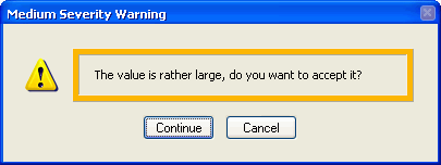
(defun number-in-bounds (candidate)
  (cond ((<= candidate 10) :ok)                 ;==> accept candidate
        ((<= 10 candidate 20) :bad)             ;==> manual decision
        ((>  20 candidate)                      ;==> reject candidate
         (values :error "The value is too big!"))))

(sd-defdialog 'confirmed_number
    :dialog-title "A number"
    :variables
      '((A_NUMBER
           :value-type :number
           :check-function number-in-bounds
           :confirmation
              (:bad
               :prompt "The value is rather large, do you want to accept it?"
               :severity :medium
          ))))
The following dialog creates feedback during the user interaction. The
feedback is created within the check-function and is cleaned up
by means of the :ok-cleanup and :cancel-cleanup
code.
(defun number-in-bounds-with-feedback (candidate)
  (cond ((<= candidate 10) :ok)                 ;==> accept candidate
        ((<= 10 candidate 20)
         (create-bounds-feedback candidate)
         :bad)                                  ;==> manual decision
        ((>  20 candidate)                      ;==> reject candidate
         (create-bounds-feedback candidate)
         (values :error "Value too big!"))))

(sd-defdialog 'feedback_number
    :dialog-title "A Number"
    :variables
      '((A_NUMBER
           :value-type :number
           :check-function number-in-bounds-with-feedback
           :confirmation
              (:bad  :dialog :warning
                     :prompt "Do you want to accept it?"
                     :severity :high
                     :ok-cleanup (cleanup-bounds-feedback)
                     :cancel-cleanup (cleanup-bounds-feedback)))
          ))

(defun create-bounds-feedback (num) ...)
(defun cleanup-bounds-feedback () ...)
Exception: A variable of the type :filename will ignore a
:confirmation specification. Such variables employ a built-in
:confirmation interaction.
As soon as a user input value has been assigned to a variable, the LISP
code specified by :after-input is executed. This code can
assign new values to any of the dialog variables by means of the standard
LISP special forms
setq, e.g. (setq a_part nil) andsetf, e.g. (setf (gpnt3d_x a_point) 0)Note that the special case (setf a_part nil) is essentially
equivalent to (setq a_part nil).
If applicable, setq and setf forms
automatically cause the variable to be updated in the command UI,
highlighted in the graphics and expand-shrink groups to be managed.
The function sd-set-variable-status controls
the user interface behavior of a variable, such as disabling. Although a
disabled variable cannot be modified by the user, it can still be modified
by LISP code at the discretion of the dialog developer, e.g. by means of
setq.
A variable that belongs to a set of mutually excluded variables (as
specified by :mutual-exclusion) is automatically reset whenever
any of the other variables become active. The
:mutual-exclusion-cleanup code supports the specification of
further cleanup activity to be executed after such a variable has been
reset.
By default, variables with a :check-function (with or
without a :confirmation specification) will return to the input
mode after an invalid input was entered. This enables the user to easily
repeat the data entry until a valid input has been entered.
Setting the option :repeat-input-until-defined to
NIL will cause the dialog to exit the data entry mode after the
input was entered, regardless of the validity of the input. The user
guidance scheme will then shift the input focus to the next relevant 'must'
variable or - if none is available - to the idle top prompt. For that
reason, the option :repeat-input-until-defined should only be
used for :invisible variables.
Sequential dialogs will not proceed to the next variable until the
previous variable has successfully been assigned a value. This default
behavior can be overridden by setting the option
:repeat-input-until-defined to NIL, thus allowing
the next variable to be specified despite the potential absence of a value
for the previous variable.
When a dialog variable with a visible input field is activated, then the system input focus is directed to that input field. Consequently, keyboard input is echoed in the input field.
If the variable is invisible or if the input field is disabled, then the system input focus is by default shifted to the user input line. In this case, keyboard input is echoed to the user input line. This default behavior can be switched off by means of the variable option
:no-focus-change t ;; default=nil
On entering an invisible variable it can sometimes be useful to shift the input focus to some other visible variable that will then receive the keyboard input. This can be achieved as follows
:input-focus-variable Lisp-form ;;default=nil
where Lisp-form is evaluated whenever the variable at hand is entered. It
should evalute to a dialog variable symbol or to NIL.
A toggle button that is specified by means of :push-action
can be used to trigger the execution of a side effect, like modifying the
graphical display or executing various kinds of calculations.
Consider the following example:
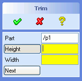 |
(sd-defdialog 'next_demo
   :dialog-title "Trim"
   :variables
     '((A_PART :value-type :part
               :modifies NIL
               :title "Part")
       (HEIGHT :value-type :length)
       (WIDTH  :value-type :length)
       (NEXT   :push-action (trim-part a_part height width)))
   :ok-action
      '(trim-part a_part height width))
|
The :push-action can be triggered repeatedly for varying
values of the variables without exiting the dialog. By contrast, the
execution of :ok-action always immediately terminates the
dialog (regardless whether the operation was successful or not and
regardless of the current settings of the optional-status of the
variable).
A variable that contains a :push-action specification exists
as a variable. It is possible to assign an arbitrary value to that variable
(e.g. by means of setq) within the
:push-action-code (or any other code region) and to modify the
status of the variable (by means of sd-set-variable-status).
However, there is no automatic assignment of values to that variable, since
the variable is primarily of interest for its side effect action.
The following dialog illustrates an application of
:push-action to implement a simple pair of preview and
unpreview buttons.
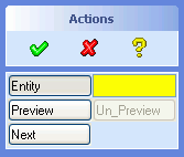 |
(sd-defdialog 'next2_demo
   :dialog-title "Actions"
   :variables
     '((ENTITY :value-type :face)
       (PREVIEW
             :toggle-type :grouped-toggle
             :initial-enable t
             :push-action
               (progn
                 (pprint "Preview Action")
                 (sd-set-variable-status 'preview :enable nil)
                 (sd-set-variable-status 'entity  :enable nil)
                 (sd-set-variable-status 'next    :enable nil)
                 (sd-set-variable-status 'un_preview :enable t)))
       (UN_PREVIEW
             :toggle-type :grouped-toggle
             :initial-enable nil
             :push-action
               (progn
                 (pprint "Unpreview Action")
                 (sd-set-variable-status 'un_preview :enable nil)
                 (sd-set-variable-status 'preview :enable t)
                 (sd-set-variable-status 'entity  :enable t)
                 (sd-set-variable-status 'next    :enable t)))
       (NEXT :push-action (pprint "Do it now"))))
|
The two toggle buttons preview and un_preview
are placed side by side, due to setting :toggle-type to
:grouped-toggle. Only one of these two toggles is enabled at
one time. When one of the buttons is pressed, it executes a side effect,
disables its own toggle button and enables the other toggle-button. During
the preview mode, no variables other than un_preview can be
activated.
A :push-action variable can contain a
:confirmation specification to initiate a confirmation
interaction, as described in 4.1.5.3
Question/Warning Confirmation Interactions.
This section illustrates how to launch a confirmation interaction from a
:after-input and a :ok-action form based on a
:push-action with a :confirmation.
In the first example, let us assume that some :after-input
code needs to be split up into two parts, whereby the execution of the
second part requires the explicit approval of the user.
On first thought, the simplest way to achieve this goal is to use the function sd-display-question (or similarily sd-display-warning), as shown below:
(sd-defdialog 'confirm_in_after_input
    :variables
     '((ASK  :value-type :boolean
             :initial-value t)
       (NUM  :value-type :number
             :after-input
               (progn
                 (pprint "after-input-1")
                 (when (and ask
                            (eq (sd-display-question "Execute after-input-2?")
                                :yes))
                   (pprint "after-input-2")))))
   :ok-action '(pprint (list :ask ask :num num)))
However, the above solution has the following disadvantages:
sd-display-question and
sd-display-warning always require interactive input. Hence, a
command containing such calls can only be used in an interactive mode but
not non-interactively. In particular, undesirable effects occur when the
command
sd-call-cmds), and when itsd-call-cmds form or from the recorder file, respectively.
The key to overcoming the above drawbacks is to integrate the yes/no
answer of the question/warning dialog into the railroad of the command. This can be achieved by
introducing a :push-action variable with a
:confirmation.
The above example can be improved by shifting the second part of the
:after-input code to an invisible :push-action
variable, containing a :confirmation specification, and by
activating that variable via the :next-variable
option:
(sd-defdialog 'confirm_on_after_input
    :variables
     '((ASK  :value-type :boolean
             :initial-value t)
       (NUM  :value-type :number
             :after-input (pprint "after-input-1")
             :next-variable (when ask :push))
       (PUSH :push-action :bad
             :confirmation
               (:bad :dialog :question
                     :prompt "Execute after-input-2?"
                     :ok-cleanup (pprint "after-input-2"))
             :toggle-type :invisible))
   :ok-action '(pprint (list :ask ask :num num)))
With the above approach, the :yes/:no tokens that
acknowledge the question interaction are an integral part of the command
railroad. Thus, for example, the above command
could be called as follows:
(sd-call-cmds (confirm_on_after_input :ask :on :num 11 :yes))
In the second example, let us assume that some :ok-action
code needs to be split up into two parts, whereby the execution of the
second part requires the explicit approval of the user.
Again, the simplest way to achieve this goal is to use the function
sd-display-question, as shown below:
(sd-defdialog 'confirm_in_exit
    :variables
     '((ASK  :value-type :boolean
             :initial-value t))
    :ok-action
      '(progn
         (pprint "ok-action-1")
         (when (and ask
                    (eq (sd-display-question "Execute ok-action-2?")
                        :yes))
           (pprint "ok-action-2"))))
But the disadvantages mentioned above also apply to this solution. Those
disadvantages can be eliminated by shifting the second part of the
:ok-action code to an invisible :push-action
variable, containing a :confirmation specification. That
invisible variable can be activated by returning from the
:ok-action as soon as the first part of the
:ok-action has been executed (by means of the macro sd-return-from-ok-action) and appropriately specifying
the option :ok-action-next-variable:
(sd-defdialog 'confirm_on_exit
    :variables
     '((ok-action-1-executed :initial-value nil)
       (ASK  :value-type :boolean
             :initial-value t)
       (PUSH :push-action :bad
             :confirmation
               (:bad :dialog :question
                     :prompt "Execute ok-action-2?"
                     :ok-cleanup
                       (progn
                          (pprint "ok-action-2")
                          (setq ask nil)
                          (sd-accept-dialog))
                     :cancel-cleanup
                        (progn
                          (setq ask nil)
                          (sd-accept-dialog)))
             :toggle-type :invisible))
     :ok-action
      '(progn
         (unless ok-action-1-executed
           (pprint "ok-action-1")
           (setq ok-action-1-executed t))
         (when ask
           (sd-return-from-ok-action)))
     :ok-action-next-variable
      '(when ask
         'push))
After the execution of the confirmation code, the macro sd-accept-dialog causes the dialog to reenter the
:ok-action. The flag ok-action-1-executed was
introduced to suppress a second execution of the first part of the ok
action. On reentering the :ok-action due to
sd-accept-dialog, the dialog terminates, since the dialog
variable ask was reset in the confirmation code.
The above dialog suffices for use in recorder files.
Note, however, that the :yes/:no acknowledgement token for
the question interaction is consumed after the dialog has entered
:ok-action. Consequently, a fully qualified call of this
dialog, via sd-call-cmds, cannot supply the aknowledgement
tokens for the question interaction (The default is to accept the question).
This issue can be resolved by introducing an additional variable, say
DO_IT, and activating that variable during the call:
      (sd-call-cmds (confirm_before_exit :ask :on :do_it :yes))
      (sd-call-cmds (confirm_before_exit :ask :on :do_it :no))
where
(sd-defdialog 'confirm_before_exit
    :variables
     '((ok-action-1-executed :initial-value nil)
       (ASK  :value-type :boolean
             :initial-value t)
       (DO_IT :push-action (ok-action-1)
              :next-variable
                (when ask
                   'push)
              :toggle-type :invisible)
       (PUSH :push-action :bad
             :confirmation
               (:bad :dialog :question
                     :prompt "Execute ok-action-2?"
                     :ok-cleanup
                       (progn
                          (pprint "ok-action-2")
                          (setq ask nil)
                          (sd-accept-dialog))
                     :cancel-cleanup
                        (progn
                          (setq ask nil)
                          (sd-accept-dialog)))
             :toggle-type :invisible))
     :local-functions
       '((ok-action-1 ()
           (unless ok-action-1-executed
             (pprint "ok-action-1")
             (setq ok-action-1-executed t))))
     :ok-action
      '(progn
         (ok-action-1)
         (when ask
           (sd-return-from-ok-action)))
     :ok-action-next-variable
      '(when ask
         'push))
The two keywords :position-part and
:position-wp can be used to change the position of parts or
assemblies and workplanes or workplane sets, respectively.
A :position-part or :position-wp variable
displays the positioning options while the variable is active.
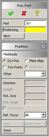


The above examples were generated by the following code:
(sd-defdialog 'position_part_demo
   :dialog-title "Pos. Part"
   :variables
     '((A_PART :value-type :part
               :modifies NIL
               :title "Part")
       (POSITIONING :position-part a_part)
       (NEXT :push-action (install-part a_part))))
and
(sd-defdialog 'position_wp_demo
   :dialog-title "Pos. WP"
   :variables
      '((WP   :value-type :wp
              :title "Workplane")
        (POSITIONING :position-wp wp)
        (NEXT :push-action (install-wp wp))))
On reentering a :position-wp or :position-part
variable, the previously used direction or rotation axis will be
reinserted.
A dialog can contain any number of occurences of
:position-wp and :position-wp variables.
The option
:reference-wp a_workplane sel_item ;default=nil
specifies a workplane onto which the initial polestar will be placed when
the variable is activated. By default, the polestar is initially placed at
the part box boundary or workplane origin as specified by
:position-part or :position-wp, respectively.
Most UI related issues are taken care of by the dialog generator automatically, thus contributing to a consistent use model. Under normal circumstances, the UI of a dialog need not be programmed explicitly and the dialog developer can skip this section.
Nevertheless, a number of options are available that can be used to influence the UI or dialog control in non-standard ways. These types of options are called personality options.
The dialog option
:after-initialization-ui,
and the variable options
        :after-input-ui,
        :push-action-ui
behave much like the options :after-initialization,
:after-input and :push-action respectively, but
their execution is delayed until the user interface reaches an interactive
state. When this delay has elapsed, all UI components can be assumed to
exist.
The dialog options
        :enter-ui,
        :exit-ui
are called after the UI of the dialog has appeared and disappeared,
respectively. Note that :enter-ui is basically equivalent to
:after-initialization-ui. It is simply called before
:after-initialization-ui. Both forms 'see' the same variable
values.
The above personality options are therefore suitable places to insert
code that modify, create, display or delete dialog specific user interface
objects. By contrast, options like the :after-initialization,
:after-input and :push-action should not refer to
UI components because the components may not exist at the time of the form
execution.
The input tool options of a dialog variable
        :show-input-tool,
        :hide-input-tool
are further personality options.
Warning:
sd-call-cmds macro or while being replayed
within a recorder file).
We recall that dialog variables cannot be modified and local functions cannot be called within the supplied code for any of the personality options (see 4.3 Procedural Attachments).
The user interface components of a variable can be accessed via the function sd-get-variable-ui-properties
   (sd-get-variable-ui-properties 'my_dialog :my_variable)
              => returns a property list containing
                 all ui properties, e.g.
                     :tb widget name of variable button or check box
                     :tx widget name of variable input field

   (sd-get-variable-ui-properties 'my_dialog :my_variable a-property)
              => returns the value of the given property.
The name of the dialog UI can be accessed as follows:
(get 'my_dialog :panel-name) => returns the panel name.
Another application of the options :after-initialization-ui,
:after-input-ui and :push-action-ui is to simulate
user input actions, e.g. by means of the function
sd-put-buffer. As mentioned in 4.4.1
Command Syntax of Parallel Dialogs, each variable of a parallel dialog
can be activated manually by entering a token into the input buffer. A
variable can be activated softwarewise by means of the function
sd-put-buffer.
The function sd-put-buffer should be used with care within
dialogs and should only occur within the options
:after-initialization-ui, :after-input-ui and
:push-action-ui.
In the following example, the display of the dialog UI is delayed until a
part has been assigned to the variable PAR:
(sd-defdialog 'delayed_ui
   :initial-variable 'par
   :variables
     '((PAR :value-type :part
            :initial-value nil
            :after-input-ui
              (sd-put-buffer ":display-ui"))
       (NUM :value-type :number)
       (STR :value-type :string))
   :display-token :display-ui
   :ok-action '(pprint (list num str par)))
Due to the presence of a :display-token
specification, no UI is displayed on entering this dialog. Since no UI
appears, an :initial-variable is provided to request a part
from the user. Once a part has been selected, the
:after-input-ui calls the function sd-put-buffer
to send the token :display-ui to the input buffer, which
then causes the UI of the dialog to appear.
If :initial-optional is nil (the default), then
the input field will remain highlighted until a value has been supplied for
that variable. Furthermore, an error message will be issued if the
OK button has been triggered by the dialog user before a value
exists. Variables that for which :initial-optional is
nil, are sometimes referred to as "must"-variables.
The default value for :initial-optional is ignored if the
variable is present in a :mutual-exclusion specification (Only
one of the variables in the :mutual-exclusion list needs to
possess a value).
The value of :initial-optional can be modified from within
the dialog by means of the built-in function sd-set-variable-status (see
3.2.1 sd-set-variable-status).
It is possible to control the visibility of a variable with a user
interface representation. The built-in function sd-set-variable-status (see
3.2.1 sd-set-variable-status) accepts
the keyword :visible. The initial visibility of the variable
can be specified by the option :initial-visible, which defaults
to t.
Variables that should permanently remain invisible can be defined by
setting the option :toggle-type to :invisible. It
is illegal to employ this specification if the :initial-visible
option is specified or if the visibility of the variable is modified by a
call to the local function sd-set-variable-status.
Variables with the above kind of visibility control cannot be used within
an :expand-shrink variable list. However, the desired behavior
can be achieved by avoiding the :expand-shrink variable and by
explicitly controlling the visibility of the involved variables (see also
expand/shrink restrictions).
The option :initial-visible can be used for subtitles and
separators as follows:
    ("-")                                        ;a permanently visible separator
    (my-separator :title "-" :initial-visible t) ;a dynamically visibile separator

    ("My Subtitle")                                       ;a permanently visible subtitle
    (my-subtitle :title "My Subtitle" :initial-visible t) ;a dynamically visible subtitle

e.g.
   :after-initialization
   '(progn
      (sd-set-variable-status 'my-separator :visible nil)
      (sd-set-variable-status 'my-subtitle :visible nil)
    )
The keyword :initial-enable specifies, whether the toggle
will initially accept a user input to a variable. The default initial enable
status is T.
When a variable is disabled, it cannot be modified by the user, neither via direct manipulation in the the options block, nor via the prompt input region, nor via a mouse selection click. A disabled variable is greyed out on the screen to visibly indicate the disable status.
The value of :initial-enable can be modified from within the
dialog by means of the built-in function sd-set-variable-status
(see 3.2.1
sd-set-variable-status).
In :parallel dialogs, variables are displayed on the screen
in a so-called options block.
The variables are displayed vertically, from top to bottom, in the same
order as they occur in the dialog :variables list.
In general, each variable occupies one row of the options block. The
following example illustrates variations of this general scheme, based on
the use of :toggle-type:
 |
(sd-defdialog 'toggle_type_demo
   :dialog-title "Toggles"
   :variables
     '(("Boolean Variables")
       (BOOL       :value-type :boolean)
       (BOOL-LEFT  :value-type :boolean
                   :toggle-type :left-toggle)
       (BOOL-RIG. :value-type :boolean
                   :toggle-type :right-toggle)
       (BOOL-WIDE  :value-type :boolean
                   :toggle-type :wide-toggle)
       (BOOL-G1    :value-type :grouped-boolean)
       (BOOL-G2    :value-type :grouped-boolean)
       ("Push Actions")
       (PUSH       :push-action (pprint "push"))
       (PUSH-LEFT  :push-action (pprint "push-l")
                   :toggle-type :left-toggle)
       (PUSH-RIGHT :push-action (pprint "push-l")
                   :toggle-type :right-toggle)
       (PUSH-WIDE  :push-action (pprint "push-l")
                   :toggle-type :wide-toggle)
       (PUSH-G1    :push-action (pprint "push-g1")
                   :toggle-type :grouped-toggle)
       (PUSH-G2    :push-action (pprint "push-g1")
                   :toggle-type :grouped-toggle)
       ("Combined Bool/Push")
       (BOOL-C1    :value-type :grouped-boolean)
       (PUSH-C2    :push-action (pprint "push-c2")
                   :toggle-type :grouped-toggle)
       ("Indicator")
       (NUM        :value-type  :number)
       (NUM-IND    :value-type  :number
                   :toggle-type :indicator-toggle-data)))
|
The placement of a :boolean variable or a
:push-action variable on a row can be influenced by setting the
keyword :toggle-type to one of the following values:
:left-toggle :wide-toggle :right-toggle
Variables of the types :boolean and
:push-action do not (by default) require the full row width and
can grouped together with other variables horizontally from left to right
within the same row. If there is not enough space to accomodate all the
horizontal toggles in the given width of the options block, new rows will be
created.
The setting :toggle-type =
:indicator-toggle-data inserts an indicator in a toggle button.
This indicator is used to indicate the presence of a value for a variable
and provides integrated clear functionality. The data input field can be
cleared by switching the indicator off, thereby setting the dialog variable
to NIL. The previously cleared value can be retrieved by
switching the indicator back on. If the initial value is NIL,
then the option :default-value can be used to specify a
'previous' value that will be displayed when the indicator is switched on
the first time.
The setting :indicator-toggle-data should only be used with
variables that possess a data field on the screen, and cannot be used in
combination with a boolean type variable or a variable with a push
action.
The keyword :indicator-type is by default normally set to
:square for boolean variables or :none for
non-boolean variables. However, if a boolean variable appears in the
:mutual-exclusion list, then it will be set to
:diamond.
A toggle button can be implemented by adding an
:indicator-type specification to a boolean variable, as shown
in 4.1.7.1.11 Push Action Toggle Button
Behavior.
The example below illustrates various ways to influence the size of a variable field:
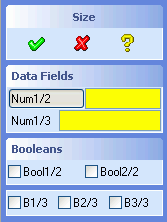 |
(sd-defdialog 'size_demo
   :dialog-title "Size"
   :variables
      '(("Data Fields")
        (NUM1/2  :value-type :number)          ;default :size = :half
        (NUM1/3  :value-type :number
                 :size :third)
        ("Booleans")
        (BOOL1/2 :value-type :grouped-boolean) ;default :size = :half
        (BOOL2/2 :value-type :grouped-boolean) ;default :size = :half
        ("-")
        (B1/3    :value-type :grouped-boolean
                 :size :third)
        (B2/3    :value-type :grouped-boolean
                 :size :third)
        (B3/3    :value-type :grouped-boolean
                 :size :third)))
|
The horizontal width of a :boolean variable can be modified
by the :size keyword.
The :size keyword of a variable with a data field, such as
:value-type = :number, influences the relative
sizes of the label and input fields, while keeping the whole size
unchanged.
Note that the size of a variable with a :push-action cannot
be modified.
The number of digits to be displayed behind the decimal point in the data
field can be controlled by means of the keyword :digits.
The default value for :digits is 6 for
most:value-types. The value type :density uses 12
as the default value of :digits.
The contents of an edit field are always aligned to the left side of an edit field, as long the contents of a variable fit into the edit field.
If the contents exceed the size of the edit field, then the default text alignment is as follows:
:right for strings, thus making the right end of the
string visible.:left for numbers, thus making the most significant
digits of the number visible.The option :value-visibility-alignment can be used to
override the above default behavior.
The toggle title of a variable can be defined by means of
:title.
A variable that contains a :title specification but no other
keywords represents a subtitle. The following two specifications of a
subtitle are equivalent:
  :variables '(... ("Data") ...)

  :variables '(... (a-title :title "Data") ...)
The second specification provides a means to
(my-subtitle :title (get-my-subtitle))
where the function get-my-subtitle returns a string, or to
:expand-shrink variable lists (see next subsection).A separator can be specified in either of the following two ways:
  :variables '(... ("-") ...)

  :variables '(... (a-separator :title "-") ...)
A subtitle or separator can programatically be switched between a visible
and invisible state by adding the option :initial-visible and applying the function
(sd-set-variable-status ... :visible t/nil).
The title of a variable is generally aligned to the left side of title area. In special cases, such a :scale or a wide :push-action variable, different defaults are used.
The title alignment of a variable can be specified as follows
:title-alignment {:right :left :center} ;default=depends on type of variable
The :prompt-text specifies a text that appears in the prompt
area while the user enters data to the variable. If no
:prompt-text is specified, default strings will be
generated.
The keyword :prompt-text can also accomodate a LISP
expression that generates a string. Unpredictable effects occur if this
expression does not generate a string. Looping dialogs sometimes require a
dynamical determination of :prompt-text in order to reflect the
current state of the dialog variables.
A straighforward way to implement a toggle button is to add the option
:indicator-type to a boolean variable, that is,
    :value-type :boolean
    :indicator-type :none
The button will behave like a toggle, that is, it enters the 'pressed'
state when the boolean variable has the value t and it enters
the normal 'unpressed' state when the variable has the value
nil.
An alternative way to implement a toggle button consists of extending a
push action variable and of controlling the status of the button
programmatically. We recall that the UI button associated with a
:push-action variable is immediately reset after the activation
of the push action. This standard behavior can be modified by means of the
specification
:ui-toggle-behavior t ;default=nil
The above specification causes the status of the button to remain pressed
after activating the button. A second activation of the push action will
release the button, again causing the :push-action to be
triggered.
The option :ui-toggle-behavior enables the programmatic
control of the status of the button, e.g. by means of the functions
sd-set-togglebutton, sd-reset-togglebutton. The UI button can
thereby be inquired via the function sd-get-variable-ui-properties.
The UI button of a :push-action variable gets an
expand/shrink "look and feel" by means of the following option
combination:
        :toggle-type            :wide-toggle
        :expand-shrink-behavior t
The :push-action of such a variable should typically modify
the visiblility of dialog variables. This approach can be used to avoid
limitations imposed by an :expand-shrink
variable. For example, the visiblity of the push action variable itself can
be modified at runtime, which is not possible for an
:expand-shrink variable.
The purpose of a minimal UI is to pop up a data input field close to the mouse in the graphics area to accept input for the variable.
Minimal UI input fields are necessary for UI-less dialogs that require number or string inputs, particularily when the user input line is not visible.
Any parallel dialog can be converted to a UI-less dialog by means of the options :without-show or :display-token dialog options or by means of the 'On Request' customization option.
The following option can be used to obtain a minimal UI input field for a specific variable:
:minimal-ui {t nil form} ;default=nil
If :minimal-ui t is supplied, then the minimal UI will be
displayed when the variable has been activated.
If :minimal-ui LISP-form is supplied, then the minimal UI
will only be displayed if the LISP form returns a non-nil value. The LISP
form can access but not modify local dialog variables and cannot call local
dialog functions.
If the above option is set to t or if a form is supplied,
then the following additional options are available:
  :minimal-ui-title     string       ;default=variable title
  :minimal-ui-width     integer      ;default=7  (* 11 pixel = grid size in X-direction)
  :minimal-ui-value     lisp-form    ;default=variable value
  :minimal-ui-type      {:generic :length :angle :mass :string :pathname :pathnames}
                                     ;default depends on :value-type
  :minimal-ui-close-action lisp-form ;quoted form to be executed on closing the minimal UI
                                     ;If a string is provided, it will be entered into
                                     ;the input buffer.
  :minimal-ui-auto-close   {t nil}   ;default=t, i.e. minimal UI disappears after an input.
Dialogs that are in a UI-less state support user-guidance in the same way as dialog with a visible UI.
The option :minimal-ui-close-action can be used to ensure
that a specific dialog variable is entered upon activating the x-control
located in the upper right-hand corner of the minimal UI input field. For
example, the specification:
:minimal-ui-close-action ":my_variable"
will cause the dialog variable MY_VARIABLE to be entered
upon closing the minimal UI via the x-control.
A proposals control will appear in the minimal UI input field if the :proposals option has been specified.
An indicator checkbox will appear to the left of the input field if
:toggle-type has been specified to be
:indicator-toggle-data.
An example application is listed here
The keyword :expand-shrink can be used to control the
visibility of one or more sets of variables on the screen. The button that
changes the visibility of the variables can be specified by means of the
keywords :expand-shrink-toggle-type and
:expand-shrink-range.
The dialog below contains a variable, called PARAMETERS,
that controls the visibility of two variables, called A and
B:
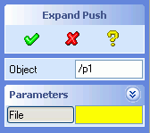

The above dialog is defined as follows:
(sd-defdialog 'expand_push
  :dialog-title "Expand Push"
  :variables
    '((OBJECT :value-type :part
              :modifies NIL)
      (PARAMETERS :expand-shrink (a b))
      (A :value-type :number
         :initial-value 5)
      (B :value-type :number
         :initial-value 6)
      (FILE :value-type :string)))
|
In general, the keyword :expand-shrink can be specified as
follows:
:expand-shrink button. Subsequent activations of the
:expand-shrink button cause the variables to disappear and
appear on the screen.:expand-shrink button cause the expanded and shinked
views to switch.:expand-shrink variable
must contain a :expand-shrink-range specification in this
particular case.Any number of :expand-shrinks is allowed within a dialog. A
variable can appear in more than one of the :expand-shrink
sublists.
The user interface controls to switch between the above sets of variables can be specified as follows:
:expand-shrink-toggle-type can be set to
:push-action (default); A single push button is
provided that causes the shrinked and expanded views of the variables
to toggle back and forth.:boolean; A boolean indicator is provided that causes
the shrinked and expanded views of the variables to toggle back and
forth.:toggle-pair; Two mutually exclusive push buttons are
provided that cause the shrinked and expanded views of the variables
to toggle back and forth. The titles of these buttons can be
specified by means of the following keywords
           :expand-title title-string  ;default="Expand"
           :shrink-title title-string  ;default="Shrink"
The above 3 :expand-shrink-toggle-type methods
support the additional keywords:
        :expand-token keyword       ;default=:variable_name_expand
        :shrink-token keyword       ;default=:variable_name_shrink
These tokens provide additional means to control the railroad of the dialog.
:expand-shrink-range can be specified in the same way as
:range (see 4.1.2 Range
Selection). The number of items in the range list must be equal to the
number of variable lists in the :expand-shrink
specification.The example below illustrates the use of an :expand-shrink
variable of type :boolean:
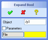
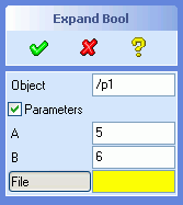
The above dialog is defined as follows:
(sd-defdialog 'expand_bool
  :dialog-title "Expand Bool"
  :variables
    '((OBJECT :value-type :part
              :modifies NIL)
      (PARAMETERS :expand-shrink (a b)
                  :expand-shrink-toggle-type :boolean)
      (A :value-type :number
         :initial-value 5)
      (B :value-type :number
         :initial-value 6)
      (FILE :value-type :string)))
|
The example below illustrates the use of an :expand-shrink
variable of type :toggle-pair:
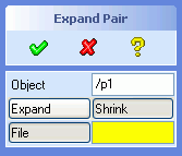
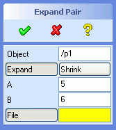
The above dialog is defined as follows:
(sd-defdialog 'expand_pair
  :dialog-title "Expand Pair"
  :variables
    '((OBJECT :value-type :part
              :modifies NIL)
      (PARAMETERS :expand-shrink (a b)
                  :expand-shrink-toggle-type :toggle-pair
                  :expand-token :with_ab
                  :shrink-token :without_ab)
      (A :value-type :number
         :initial-value 5)
      (B :value-type :number
         :initial-value 6)
      (FILE :value-type :string)))
|
The default titles for the two buttons (i.e. "Expand" and "Schrink") are
used in the above example. Other titles can be specified by means of the
keywords :expand-title and :shrink-title.
The :expand-token and the :shrink-token can be
used to control the command syntax (see 4.4 Command
Syntax), i.e. the way the command responds to keyboard inputs. For
example, if a user enters the keyword :with_ab, then the
expanded view with the two variables A and B will
be displayed. The default tokens would have been
:parameters_expand and :parameters_shrink in the
above example.
The example below illustrates the use of the keyword
:expand-shrink-range
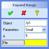
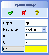
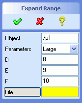
The above dialog is defined as follows:
(sd-defdialog 'expand_range
  :dialog-title "Expand Range"
  :variables
    '((OBJECT :value-type :part
              :modifies NIL)
      (PARAMETERS :expand-shrink ((a) (b c) (d e f))
            :expand-shrink-range ((:small :label "Small")
                                  (:medium :label "Medium")
                                  (:large :label "Large")))
      (A :value-type :number
         :initial-value 5)
      (B :value-type :number
         :initial-value 6)
      (C :value-type :number
         :initial-value 7)
      (D :value-type :number
         :initial-value 8)
      (E :value-type :number
         :initial-value 9)
      (F :value-type :number
         :initial-value 10)
      (FILE :value-type :string)))
|
Variables in the :expand-shrink specification are treated as
normal variables, i.e. they can be accessed and manipulated anywhere in the
dialog code, irregardless of their current visibility.
Restrictions:
The concept of an :expand-shrink variable is not recursive. The
:expand-shrink lists cannot contain variables of the following
types:
:expand-shrink variable,:image.Visibility combinations, involving the above mentioned kinds of
variables, can be achieved by avoiding the use of
:expand-shrink and explicitly controlling the visiblity of the
involved variables by means of sd-set-variable-status /
:visible.
Alternatively, visibility combinations can be implemented individually by
introducing one or more permanently invisible (:toggle-type
:invisible) intermediate expand-shrink variables that define groups
of variables. The visibility of the desired groups of variables can be
controlled by assigning values to those intermediate expand-shrink variables
(see next section). All types of expand-shrink variables can be permanently
invisible, except for :expand-shrink-toggle-type :toggle-pair,
which can in this case simply be replaced by
:expand-shrink-toggle-type :boolean.
Push actions can be given an expand/shrink "look and feel" by means of the option :expand-shrink-behavior.
Expand Shrink variables can be accessed and manipulated much like normal
dialog variables. The value of the :expand-shrink variable
is
t or nil, for all choices of
:expand-shrink-toggle-type:expand-shrink-rangeBy default, the :ok-action will only be executed, if all
visible "must" variables possess a value. This default behavior can be
modified by means of the option :must-variables-scope or by specifying other
preconditions via :ok-action-precondition.
Initially, the dialog appears on the screen in the 'shrink' mode. The
initial state can be specified by providing an :initial-value
for the :expand-shrink variable:
:initial-value for the variable for all
choices of :expand-shrink-toggle-type. The default
:initial-value is nil, causing the 'shrink'
version to be displayed, while the value t causes the
'expand' version to appear. The following example,
(PARAMETERS :expand-shrink (a b)
:expand-shrink-toggle-type :toggle-pair
:initial-value t)
causes the expanded variables, a and b, to appear when the dialog is displayed on the screen.
:expand-shrink-range. The default value is the first item of
the :expand-shrink-range list. E.g.
(PARAMETERS :expand-shrink ((a) (b c) (d e f))
:expand-shrink-range ((:small :label "Small")
(:medium :label "Medium")
(:large :label "Large"))
:initial-value :large)
causes the variables d, e and f to be displayed when the dialog appears on the screen.
The value of an :expand-shrink variable can be manipulated
softwarewise by means of the setq, setf and
sd-set-variable-status .. :value .. forms. Thus, for example,
the variable PARAMETERS introduced above, can be manipulated as
follows:
(setq parameters :medium), or
(setf parameters :medium), or
(sd-set-variable-status 'parameters :value :medium)
In addition, the originally specified :expand-shrink-range
choices can be modified at runtime via calls to sd-set-range,
say,
(sd-set-range 'parameters '((:small :label "small")
(:large :label "large")))
The above statements will automatically update the screen representation of the dialog.
The keyword :external-expand-shrink can be used to display
variables in a separate window.
:external-expand-shrink list_of_variables ;default=nil
The supplied list of variables do not appear in the UI of the dialog, but
rathermore in a separate window when the
:external-expand-shrink variable is activated.
The title and the offset of the window can be controlled by the following keywords:
:external-dialog-title a-string ;default same as :title
:ref-variable a-variable ;default=current variable
:x-offset a-number ;default=-160
:y-offset a-number ;default=0
If offsets :x-offset and :y-offset are
provided, care should be taken to ensure that the separate window does not
overlap the main dialog window, thus avoiding the situation that the
separate window can be covered by the main dialog window. The offset are
measured as distances from the reference variable specified by
:ref-variable.
Since the separate window generally appears at least partially on top of the graphical viewport, it is good practice to avoid the use of selection variables in the separate window.
By default, an :external-expand-shrink variable is
represented as a button. The activation of that button causes the specified
variables to appear in a separate window. The button can be replaced by a
checkbox by setting the keyword
:external-expand-shrink-toggle-type to
:boolean,
:external-expand-shrink-toggle-type {:push-action :boolean}
;default=:push-action
The value of an :external-expand-shrink variable is boolean.
It has the value T when the external window is displayed and
NIL when the external window is not displayed. The value of the
variable can be modified by means of setq, setf or
sd-set-variable-status ...:value..., thus causing the external
window to appear or disappear.
The below example illustrates the use of
:external-expand-shrink. The variables C and
D are only displayed when the variable with the button title
More Parameters is pressed.
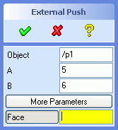


The above dialog is defined as follows:
(sd-defdialog 'external_expand_push
:dialog-title "External Push"
:variables
'((OBJECT :value-type :part
:modifies NIL)
(A :value-type :number
:initial-value 5)
(B :value-type :number
:initial-value 6)
(MORE :external-expand-shrink (c d)
:title "More Parameters"
:external-dialog-title "Detail Parameters")
(C :value-type :number
:initial-value 7)
(D :value-type :number
:initial-value 8)
(A_FACE :value-type :face)))
|
The below example illustrates an external expand shrink variable that has a boolean toggle type:
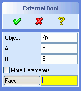
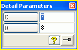
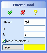
This dialog is very similar to the previous dialog:
(sd-defdialog 'external_expand_bool
:dialog-title "External Bool"
:variables
'((OBJECT :value-type :part
:modifies NIL)
(A :value-type :number
:initial-value 5)
(B :value-type :number
:initial-value 6)
(MORE :external-expand-shrink (c d)
:external-expand-shrink-toggle-type :boolean
:title "More Parameters"
:external-dialog-title "Detail Parameters")
(C :value-type :number
:initial-value 7)
(D :value-type :number
:initial-value 8)
(A_FACE :value-type :face)))
|
In some applications it may be advantageous to abandon the sequential layout of variables and to apply a different layout strategy for the dialog variables. Other layout schemes can be designed and implemented by means of the User Interface Construction Toolkit (UICT).
The standard dialog user interface can be overridden by a UICT based user interface by specifying the following options:
:uict-option-menu-name name-of-dialog-shell :uict-install-function ui-creation-function-name
These two specifications will force the standard UI generation to be suppressed, as for example:

(sd-defdialog 'uict_model_name
:uict-option-menu-name "MODEL-NAME"
:uict-install-function 'install-model-name-ui
:prompt-variable 'the_part
:variables
'((THE_PART :value-type :part
:initial-value nil
:modifies :contents
:after-input
(setq model_name (sd-inq-obj-contents-name the_part))
:uict-tx "PART-NAME-TX")
(MODEL_NAME :value-type :string
:after-input
(sd-call-cmds (part_prop the_part :contid model_name))
:uict-tx "MODEL-NAME-TX")
(HELP :push-action (pprint "display help now")
:uict-tb "MODEL-NAME-HELP-TB")
(CLOSE :push-action (sd-abort-dialog)
:uict-tb "MODEL-NAME-CLOSE-TB"))
)
|
|
The variable options :uict-tx and :uict-tb
specify the names of the UICT controls that are linked to the
variables. Other variable options are described in 4.1.7.4.3 Options for UICT Variables.
The install function |
|
(defun install-model-name-ui ()
(let* ((cell-size (sd-get-default-grid-size))
(cell-x (gpnt2d_x cell-size))
(cell-y (gpnt2d_y cell-size))
(width 38)
(height 10))
;;-------------------- dialog shell --------------------
(sd-create-dialog-shell
"MODEL-NAME"
:title "Part Model Name"
:pin t
:close t
:bottomLine :none
:margin 0)
;;-------------------- base grid -----------------------
(sd-append-grid-area
"MODEL-NAME-BASE-GRID-GA"
"MODEL-NAME-AA"
:width (* width cell-x)
:height (* height cell-y)
:cellSize cell-size
:margin 5
:spacing 0)
;;-------------------- selection display ---------------
(sd-create-label-control
"PART-NAME-LB"
"MODEL-NAME-BASE-GRID-GA"
:title "Part:"
:alignment :left
:x 0
:y 0
:width 7
:height 2)
(sd-create-text-control
"PART-NAME-TX"
"MODEL-NAME-BASE-GRID-GA"
:editable t
:showModified t
:multiline nil
:x 7
:y 0
:width (- width 8)
:height 2)
;;-------------------- model name field ---------------
(sd-create-label-control
"MODEL-NAME-LB"
"MODEL-NAME-BASE-GRID-GA"
:title "Model Name:"
:alignment :left
:x 0
:y 3
:width 7
:height 2)
(sd-create-text-control
"MODEL-NAME-TX"
"MODEL-NAME-BASE-GRID-GA"
:editable t
:showModified t
:useAutoAccept t
:multiline nil
:x 7
:y 3
:width (- width 8)
:height 2)
;;-------------------- Bottom Line --------------------
(sd-create-separator-control
"MODEL-NAME-SEP"
"MODEL-NAME-BASE-GRID-GA"
:x 0
:y (- height 4)
:width (- width 1)
:height 1)
(sd-create-togglebutton-control
"MODEL-NAME-CLOSE-TB"
"MODEL-NAME-BASE-GRID-GA"
:title "Close"
:indicator :none
:x (- width 8 8 1)
:y (- height 3)
:width 8
:height 2)
(sd-create-togglebutton-control
"MODEL-NAME-HELP-TB"
"MODEL-NAME-BASE-GRID-GA"
:indicator :none
:x (- width 8 1)
:y (- height 3)
:width 8
:height 2
:title "Help")
) ;let
)
|
|
The function specified by :uict-install-function is executed
when the dialog is entered interactively for the first time. By default,
later activations of the dialog do not execute the install function.
The option
:uict-parameter-list list-of-LISP-forms
can be used to enable later executions of the install function, thus
overriding the user interface of previous executions. The install function
will be called whenever the return value of any of the supplied Lisp forms
changed since the last call of the install function. These Lisp forms do not
have access to dialog variables. The return values of the Lisp forms in
:uict-parameter-list are passed to the install function, thus
indicating the state on which to create a new suitable user interface. The
install function must possess as many arguments as the length of the list
given by :uict-parameter-list. Each return value of a Lisp form
in :uict-parameter-list is passed to the respective argument of
the install function, e.g.
:uict-install-function 'my-ui
:uict-parameter-list '(list (my-ui-type))
where
- my-ui-type returns e.g. :basic or :advanced.
- (defun my-ui (type)
(case type
(:basic ...)
(:advances ...)))
:embedded-area-definition {LISP-expression [nil]}
The LISP-expression supplied to :embedded-area-definition
will be executed whenever the UI of the dialog has been created.
An embedded area variable supports the following additional options
:title string ;default=nil :frame boolean ;default=nil :margin integer ;default=0 :spacing integer ;default=0 :height integer ;default=80 :cellSize 2d-vector ;default=1,1 :cellSizeX integer ;default=first coordinate of :cellSize :cellSizeY integer ;default=second coordinate of :cellSize :bitmap bitmap-name ;default=nil
For example, the specification
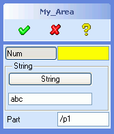 |
(sd-defdialog 'my_area
:variables
'((NUM :value-type :number
:after-input
(setq str (format nil "x_~A" num)))
(FO :embedded-area-definition (create-my-uict-area)
:title "String"
:frame t
:height 73)
(STR :value-type :string
:initial-value "abc"
:uict-tb "MY_AREA-STRING-TB"
:uict-tx "MY_AREA-STRING-TX")
(A_PART :value-type :part
:modifies :contents
:title "Part"))
)
|
inserts an area between the variable
NUM and STR. The name of the created area that
can be filled with UICT controls can be accessed via the function
sd-get-embedded-area-name, as shown below: |
|
(defun create-my-uict-area ()
(let ((area-name (sd-get-embedded-area-name 'my_area :fo)))
(sd-create-pushbutton-control "MY_AREA-STRING-TB" area-name
:x 0
:y 0
:width (- (sd-get-default-dialog-client-area-width) 20)
:height 22
:title "String")
(sd-create-text-control "MY_AREA-STRING-TX" area-name
:x 0
:y 30
:width (- (sd-get-default-dialog-client-area-width) 20)
:height 20))
)
|
|
In both the total and the embedded UICT replacement approaches, each dialog variable that has a corresponding UICT control must specify the name of the associated control by means of the following options:
:uict-tx name-of-text-field
:uict-tb name-of-togglebutton
:uict-indicator-tb name-of-indicator-togglebutton
:uict-cr name-of-color-range-field
:uict-cb name-of-color-field
:uict-ra name-of-range-field
:uict-lb name-of-label-field
Variables that are represented by an input field preceeded by a
togglebutton in general support the controls :uict-tx and
:uict-tb. There are, however, three exceptions. A
:range variable supports :uict-ra (rather than
:uict-tx) and :uict-tb. A variable with the value
type :rgb-color supports :uict-cr and
:uict-cb (both rather than :uict-tx) and
:uict-tb. A variable with the value-type
:display-only supports :uict-lb (rather than
:uict-tx).
A basic example could look like this:
(VARIABLE1 :value-type :boolean
:uict-tb name-of-togglebutton)
(VARIABLE2 :value-type :number
:uict-tx name-of-text-field
:uict-tb name-of-togglebutton)
(VARIABLE3 :value-type :number
:toggle-type :indicator-toggle-data
:uict-tx name-of-text-field
:uict-tb name-of-togglebutton
:uict-indicator-tb name-of-indicator-togglebutton)
The push and selection action of a UICT controls should not be specified in the UICT creation function. The dialog generator will automatically insert a suitable push, release or selection action that matches with the behavior of the dialog variable.
For example, in the above dialog my_area, the
:pushAction and :selectionAction are by default
specified as follows:
(STR :value-type :string
:initial-value "abc"
:uict-tb "MY_AREA-STRING-TB"
:uict-tx "MY_AREA-STRING-TX"
:pushAction ":str" ;;default :pushAction for TB
:enterAction '(sd-put-buffer ;;default :enterAction for TX
(format nil ":str ~s"
(sd-get-text-control-value
"MY_AREA-STRING-TX")))
)
In general, the following variable options can be used to override the default definition of the push, release or selection action of a UICT-based dialog variable:
:uict-tb specification:
:boolean variable supports:
:pushAction:releaseActionpush-action variable supports:
:pushAction:pushAction:releaseAction:uict-tx specification supports:
:enterAction:uict-indicator-tb specification
supports:
:indicator-pushAction:indicator-releaseAction:uict-cr or :uict-ra
specification supports:
:selectionActionRestrictions:: Several special kinds of variables are not supported with UICT, e.g positioning variables and expand-shrink variables.
The variable option
:ui-update-condition LISP-expression ;default=t
can be used to suppress the updating of the UI of a variable. This may be
useful if the variable e.g. has a :uict-tx specification that
is not currently visible on the screen. By default, the UI associated with a
variable is always updated. However, if a LISP expression is specified for
:ui-update-condition and if it returns NIL, then
UI updating of the variable at hand will be suppressed.
The keyword :next-variable can be used to support sequential
input for :parallel dialogs. This keyword is particularily
useful to guide the user to dedicated dialog variables based on criteria
that depend on the current state of the dialog variables. These dedicated
variables need not appear in the screen representation of the dialog (by
setting them to :invisible), thus simplifying the screen
representation of the dialog.
The following example requests the selection of an edge immediately after setting a boolean variable to true:
(sd-defdialog 'collect
:variables
'((REF_EDGE :value-type :boolean
:next-variable
(if ref_edge 'edge))
(EDGE :value-type :edge
:toggle-type
  :invisible
)
...))
In the above example, the user only interacts with the boolean variable
REF_EDGE, but not with the invisible variable
EDGE.
The keyword :next-variable can also be used together with a
:push-action to collect any number of inputs (such as edges or
faces):
(sd-defdialog 'do_with_item
   :variables
     '((TYPE :range (:edge :face))
       (PUSH :push-action (progn)
             :next-variable
               (case type
                 (:edge 'do_edge)
                 (:face 'do_face)))
       (DO_EDGE :value-type :edge
                :toggle-type :invisible
                :after-input (item-function do_edge)
                :next-variable 'do_edge)
       (DO_FACE :value-type :face
                :toggle-type :invisible
                :after-input (item-function do_face)
                :next-variable 'do_face)
    ; .....
    )
  :local-functions
   '((item-function (item)
       (pprint (list :item item))
       ; .....
     ))
)
Each item (i.e. edge or face) is passed to the function called item-function.
The return value of the :next-variable form determines which
variable will receive the next user input. The returned variable must
support user input (and cannot be an internal bookkeeping variable, see
4.1 Variable Specifications). If the value
NIL is returned, then the dialog enters the top prompt state
(unless a :prompt-variable has been specified).
Note that simple looping dialogs can be implemented by means of the the
keyword :prompt-variable (see Looping
Dialogs).
Next variable activations to not cause tokens to be generated in a
recorder file, and thus have a similar behavior as variable transitions in
:sequential dialogs (see 4.4.1 Command
Syntax of Parallel Dialogs).
The option :next-variable can be used to terminate the
dialog, see 3.2.7 sd-accept-dialog and 3.2.8 sd-abort-dialog.
The keyword :ok-action-next-variable controls which variable will
become active when the dialog termination is deferred, that is, when the
:ok-action code encounters a call to sd-return-from-ok-action.
This keyword is useful if a dialog should enter an
:invisible variable after returning from the
:ok-action, as illustrated in the following example:
(sd-defdialog 'pick_several
  :variables
   '((OBJECTS)
     (TYPE :range (:by-face :by-edge)
           :next-variable
             (case type
               (:by-face 'p_face)
               (:by-edge 'p_edge)))
     (P_FACE :value-type :face
             :toggle-type :invisible
             :next-variable 'p_face
             :after-input (push p_face objects))
     (P_EDGE :value-type :edge
             :toggle-type :invisible
             :next-variable 'p_edge
             :after-input (push p_edge objects)))
  :ok-action
   '(progn
      (if (< (length objects) 4)
        (progn
          (sd-display-error "Pick more than 3 objects.")
          (sd-return-from-ok-action))
        (pprint objects)))
  :ok-action-next-variable
    '(case type
       (:by-face 'p_face)
       (:by-edge 'p_edge)))
Additional functionality and :value-types become available
as additional Creo Elements/Direct Modeling modules and applications are
loaded into a Creo Elements/Direct Modeling session. Application specific
extensions are documented separately:
A dialog that has been loaded into Creo Elements/Direct Modeling is by default included in the online reference manual. Call the function sd-online-reference, enter the toolbox and activate the Online Reference command to display the online reference.
The online reference describes all the currently available dialogs in an HTML document. Links are provided to other IKIT documents for further details. If the dialog is described in the online help, a link to that description is provided.
For a parallel dialog, variables that can be modified via the railroad
(i.e. that can be used in an sd-call-cmds call or entered via the input line
or appear in a recorder file) are displayed together with relevant
properties, e.g. a :value-type.
For a sequential dialog, the sequence of the required inputs are described.
A dialog can be excluded from the online reference by setting the dialog
option :undocumented to t.
A variable of a parallel dialog can be excluded from the online reference
by setting the variable option :undocumented
to t.
The online reference includes all dialogs which are based on the
integration kit, i.e. based on the sd-defdialog and
sd-deffeature macros. The displayed data is derived from the
loaded dialog definitions, thus ensuring accurate and up-to-date
descriptions.
Warning: Data that is determined during runtime - such as dynamic ranges - is not included in the online reference.
Warning: The online reference does not include commands that are defined in a non-integration kit style, that is, based on the internal action routine style. Those commands are documented in the Commands Reference Manual. Note that that manual is frozen and is no longer maintained.
The keyword :local-functions can be used to define any
number of local functions. The definition of a local function follows the
same rules as the definition of a LISP function by means of
defun.
A local function is recommended whenever a function, that requires access to local variables, can be used in several places throughout the dialog.
Local functions cannot be shared between two different dialogs. The name of a local function need only be unique within the dialog code.
By contrast, global function definitions (defined by defun)
cannot access dialog variables and but can, on the other hand, be employed
and shared throughout the entire LISP system.
An example of the use of local functions is the following dialog that
collects points in an interactive loop and calculates an interpolation curve
between these points when the OK button is pressed:
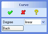
(sd-defdialog 'interpolate_demo
  :dialog-title "Curve"
  :variables
   '((POINT_LIST)          ;internal non displayed variable
     (POINT_FEEDBACK_LIST) ;internal non displayed variable
     (NEW_POINT            ;internal input variable
        :value-type :point-3d
        :toggle-type :invisible
        :prompt-text "Pick a point or press Back"
        :after-input (push-point new_point))
     (DEGREE
        :range ((:linear :label "linear")
                (:quadratic :label "quadratic")
                (:cubic :label "cubic")))
     (BACK :push-action (pop-point)))
  :local-functions
    '((PUSH-POINT (a-new-point)
         (push a-new-point point_list)
         (push (setup-point-feedback a-new-point) point_feedback_list)
         (if (= (length point_feedback_list) 1)
           (sd-set-variable-status 'back :enable t)))
      (POP-POINT ()
         (cleanup-point-feedback (pop point_feedback_list))
         (pop point_list)
         (unless point_list
           (sd-set-variable-status 'back :enable nil))))
  :prompt-variable 'new_point
  :ok-action
    '(progn
       (interpolate-between-points degree point_list)
       (loop ;repeat until no items left
         (unless (pop-point)
           (return)))))
whereby the following (global) functions must exist,
(defun setup-point-feedback (point)
  (print (list :point point))
  (progn "..."))   ;returns feedback object
(defun cleanup-point-feedback (point)
  (print (list :point point))
  (progn "...")) ;return is not used
The above local functions push-point and
pop-point ensure that the two internal dialog variables
point_list and point_feedback_list are always
manipulated jointly. In addition, they control the enable/disable
sensitivity of the variable back.
:dialog-control can be specified to be either
:parallel (the default), :sequential or
:sequential-loop.
In a :parallel dialog, the order of the variables in the
:variables list defines the order of the variables as they
appear in the options block, from top to bottom.
A :parallel dialog displays a so-called options block that
gives parallel access to the dialog variables on the screen. A variable can
be modified by direct manipulation in the options block, unless the toggle
for that variable has been disabled.
After an input to a variable, the dialog enters a so-called top prompt
state, in which a top prompt text is displayed in the prompt area. This
default string can be modified by specifying :top-prompt-text.
The top prompt state can be modified by specifyinig a
:prompt-variable (see Looping Dialogs).
In a :sequential dialog, the order of the variables in the
:variables list defines the order of the dialog sequence. A
variable that does not evoke user interaction is not included in the input
sequence. Erroneous inputs to a variable are ignored. The dialog sequence
remains at that variable until a feasible value has been input by the
user.
In a :sequential dialog, no options block appears on the
screen. Furthermore, no default values are used in a
:sequential dialog. All user interaction takes place in the
prompt area and by means of mouse actions. If no dialog variables remain to
be specified by the user, then the dialog causes immediate execution of the
:ok-action.
A :sequential-loop dialog behaves like a
:sequential dialog, but it loops back to the first variable
once the last variable has received a value. The dialog action of each loop
should be placed in the :after-input of the last variable.
Indicator toggles are often employed to represent a selection of 1 item
from n choices. As soon as a toggle is selected, that toggle needs to be
marked and any other related toggle should no longer be marked. This kind of
behavior is achieved by specifying the list of choices in
:mutual-exclusion. If several sets of choices are required,
then a list of choice lists can be specified.
If a :boolean variable is included in a
:mutual-exclusion list, it appears with a :diamond
indicator, otherwise the indicator will have a :square
shape.
For the sake of comparison, an alternative way to select 1 from n items
is provided by the :range specification. This
:range technique is superior whenever the number of selectable
items is large or varies.
:start-variable specifies the initially active toggle at the
start of an options block dialog. This specification is only applicable to
dialogs triggered from the toolbox.
:initial-variable provides an alternative way to specify the
initially active variable. This option can contain a lisp form and can
access all the dialog variables. If the form returns NIL, then
the dialog initially enters the top prompt state.
If neither a :start-variable nor an
:initial-variable takes effect, Creo Elements/Direct Modeling
will automatically activate the first 'must' variable, i.e. a variable with
a yellow edit field. Other sequences for the user guidance of 'must'
variables can be specified by means of the keyword
:token-sequence list-of-tokens
A token is a keyword that can be sent to the dialog to initialize a specific variable. (see 4.4.1 Command Syntax of Parallel Dialogs).
If :prompt-variable is specified, the dialog loops back to
the specified variable after input has been entered for any of the other
variables, rather than looping back to the top prompt state. This keyword
provides a convenient mechanism to accumulate selected items in a loop.
Variables that have :toggle-type = :invisible
are not not displayed on the screen, but are treated as input variables. The
value :invisible is typically used in combination with the
keyword :prompt-variable to define looping dialogs, for which
the prompting variable is not displayed as a toggle on the screen.
More sophisticated looping dialogs with several 'prompt-variables' or conditional dependencies can be implemented either
:prompt-variable that
evaluates to a dialog variable or to NIL, or:next-variable form to the appropriate
variables (see 4.1.8 Sequentialization in Parallel
Dialogs).The :precondition code should return the value
:ok if the dialog is to be continued, otherwise the dialog will
be canceled before the user can interact with the dialog. The return value
of :precondition follows the same rules as
:check-function.
An example of a :precondition is a function that tests
whether a 2D-operation can be carried out on the current workplane:
     :precondition '(if (sd-inq-obj-contents-read-only-p
                          (sd-inq-curr-wp))
                      :error
                      :ok)
The :precondition form cannot access any of the dialog
variables, since the form is evaluated before the variables are initialized.
The :exception code is executed whenever the dialog
encounters an exception and just before it is terminated.
Exceptions within LISP code can be handled - conveniently and if
necessary - by means of the LISP special form unwind-protect.
However, certain events, like pressing the Break key or errors in lowlevel C
code, cause the dialogs to terminate - triggering the
:exception form - but are unfortunately not recognized by LISP
the unwind-protect wrapper. These kinds of exceptions can cause
windows or files to remain existent, although they have become obsolete due
to the termination of the dialog.
Note that an exception occurs when clicking on an error box in the the top right-hand corner, that is on the button marked x.
The :exception keyword can be used to provide cleanup
actions upon the sudden termination of a dialog. Note that
:cleanup-action is called immediately after
:exception.
Since dialogs can be initiated before other dialogs have been completed, it is necessary to specify the interaction between simultaneously running dialogs.
The keyword :dialog-type essentially specifies the
interference of a dialog with other previously or subsequently initiated
dialogs that exist at the same time.
Three values for :dialog-type can be provided,
:terminate: This kind of dialog terminates every other
dialog before it is initiated.:interrupt: This kind of dialog interrupts the currently
running dialog. When the interrupt dialog is finished, the interrupted
dialog continues from where it was interrupted. There is no limit to the
stacking of interrupt dialogs.:subaction: This kind of dialog can be called from
another dialog and does not interrupt the calling dialog (see 4.6 Subactions for more details).The specifications of :ok-action and
:cancel-action define the behavior of the dialog when the
OK and CANCEL buttons, respectively, have been
activated.
Dialog cleanup actions that should be executed upon any kind of dialog
termination are best defined in :cleanup-action. The
:cleanup-action will be called immediately after
:ok-action, :cancel-action and
:exception.
The return value of the dialog is defined by the return value of the last
form that was executed in the :ok-action or
:cancel-action form. The return value of the dialog can only be
obtained by calling the dialog via the sd-call-cmds wrapper, as illustrated in
this example.
The code specified by :ok-action and
:cancel-action can access all of the local variables and local
functions of the dialog, for example,
  (sd-defdialog 'simple_action
    :variables
      '((VARIABLE_1 ...)
        (VARIABLE_2 ...)
        ...
        (VARIABLE_n ...))
    :local-functions
      '((DETERMINE-N ()
          (if (and (numberp variable_1) (numberp variable_2))
            (setq variable_n (+ variable_1 variable_2)))))
    :ok-action
       '(progn
          (determine-n)
          (my-action variable_2 variable_1 .. variable_n)))

   (defun my-action (arg1 ... argn)
      ....)
The activation of the CANCEL button will trigger the
evaluation of :cancel-action and cause the dialog to be removed
from the screen and to loose all current variable bindings, irregardless
whether :cancel-action was successfully and completely executed
or not. This same cancel procedure applies, when the dialog is terminated by
the starting a :terminate dialog.
The activation of the OK button will not necessarily lead to
the execution of :ok-action and to the termination of the
dialog. The dialog termination will be interrupted if one of the following
situations arise:
:ok-action is can be entered.
Optional variables can be set at initialization time (via
:initial-optional) or during the execution of the dialog (see
3.2.1 sd-set-variable-status). The
scope of the "must" variable check can be controlled by means of the
keyword :must-variables-scope..sd-return-from-ok-action within the
:ok-action code prevents the dialog from terminating.In both of the above two cases, the dialog will remain active, allowing the user to complete or modify some inputs.
Application functions that are to be evaluated repetitively for the same
or for similar variables without exiting the dialog should be shifted from
the :ok-action to the :push-action of a push
action variable. Examples of repetitive executions are NEXT or
PREVIEW type dialogs.
The following example illustrates a dialog that executes an application
specific function my-action whenever a push button is pressed,
without exiting the dialog. The dialog also executes that function upon
pressing the OK button.
(sd-defdialog 'repetitive_action
  :variables
    '((VARIABLE_1
         :after-input (sd-enable-must-variable-check))
      ...
      (VARIABLE_N
         :after-input (sd-enable-must-variable-check))
      (NEXT
         :push-action (main-action)))
  :local-functions
    '((MAIN-ACTION ()
        (my-action variable_1 ... variable_n)
        (setq variable_1 nil)
        (sd-disable-must-variable-check)))
  :ok-action
    '(main-action))
The local function main-action was introduced to be able to
share the call of the main function my-action, together with
all the arguments.
Note that, in the above example, the variable variable_1 is
reset to nil after every activation of the call to
my-action. One consequence is that the function
my-action must survive calls with incomplete arguments.
Another consequence is that a subsequent click on the OK button will
generate a variable check error, due to a missing value. This error message
can be supressed by calling the built-in function
sd-disable-must-variable-check.
The combined use of the two built-in functions
sd-disable-must-variable-check and
sd-disable-must-variable-check allows the design of an
acceptable overall behavior.
The code that is executed in the :ok-action should not
initiate further user interactions, except for error messages. The 'look and
feel' of Creo Elements/Direct Modeling dialogs is to integrate all
forseeable user guidance into the :variables of the dialog, and
to trigger the action based on that information.
The activation of the help button normally causes the Creo
Elements/Direct Modeling help page (associated with that dialog) to appear
on the screen. This behavior can be modified by specifying some other help
behavior by means of :help-action.
The example below displays a URL page when the help button has been pressed:
(sd-defdialog 'my_help
  :variables
    '((bla :value-type :number))
  :help-action
    '(sd-display-url "http://www.ptc.com"))
The :help-action code has access to all dialog variables.
Thus, in the below example, the displayed help page depends on the current
value of the dialog variable HELP_ON:
(sd-defdialog 'my_dyn_help
  :variables
    '((A_PART :value-type :part :modifies NIL)
      (HELP_ON :range (:goodies :lego)))
  :help-action
    '(ecase help_on
       (:goodies
         (sd-display-url (format nil "~A/help/osdm/Common/documentation/goodies/Readme.html"
                           (sd-inq-install-dir))))
       (:lego
         (sd-display-url (format nil "~A/help/osdm/Common/documentation/integration_kit/home.html"
                           (sd-inq-install-dir))))))
This section describes some general programming rules that must be obeyed when LISP code is employed in the design of a dialog. The insertion of application-oriented code within data structures is called procedural attachment.
The following keywords of sd-defdialog support procedural
attachment:
                            | Operation within Procedural Attachment
      Procedural            |
      Attachment            | Access any | Change any | Call any
                            |  Variable  |  Variable  | Local Function
 ---------------------------+------------+------------+---------------
 Attachment to a Variable   |            |            |
                            |            |            |
  :before-input             |    yes     |    yes     |    yes
  :start-input-feedback     |    yes     |    yes     |    yes
  :end-input-feedback       |    yes     |    yes     |    yes
  :show-input-tool          |    yes     |    no      |    no
  :hide-input-tool          |    yes     |    no      |    no
  :initial-value            |    yes     |  possible  |    yes
  :after-input              |    yes     |    yes     |    yes
  :mutual-exclusion-cleanup |    yes     |    yes     |    yes
  :push-action              |    yes     |    yes     |    yes
  :initial-optional         |    yes     |  possible  |    yes
  :initial-visible          |    yes     |  possible  |    yes
  :initial-enable           |    yes     |  possible  |    yes
  :check-function           |    yes     |  possible  |    yes
  :prompt-text              |    yes     |    no      |    no
  :next-variable            |    yes     |  possible  |    yes
  :complete-focus-variable  |    yes     |  possible  |    yes
                            |            |            |
  :confirmation             |            |            |
     :prompt                |    yes     |  possible  |    yes
     :prompt-text           |    yes     |  possible  |    yes
     :ok-cleanup            |    yes     |    yes     |    yes
     :cancel-cleanup        |    yes     |    yes     |    yes
     :severity              |    yes     |  possible  |    yes
     :top-label             |    yes     |  possible  |    yes
     :push-1                |    yes     |  possible  |    yes
     :push-2                |    yes     |  possible  |    yes
     :push-3                |    yes     |  possible  |    yes
     :push-info             |    yes     |  possible  |    yes
     :push-other            |    yes     |  possible  |    yes
     :yes-cleanup           |    yes     |    yes     |    yes
     :other-cleanup         |    yes     |    yes     |    yes
     :other-allowed         |    yes     |  possible  |    yes
                            |            |            |
  :after-input-ui           |    yes     |    no      |    no
  :push-action-ui           |    yes     |    no      |    no
  :minimal-ui               |    yes     |    no      |    no
  :ui-update-condition      |    yes     |    no      |    no
  :embedded-area-definition |    yes     |    no      |    no
  :drag-callback            |    yes     |    no      |    no
  :value-change-callback    |    yes     |    no      |    no
                            |            |            |
                            |            |            |
 Attachment to a Dialog     |            |            |
                            |            |            |
  :precondition             |    no      |    no      |    no
  :exception                |    yes     |  possible  |    yes
  :after-initialization     |    yes     |    yes     |    yes
  :local-functions          |    yes     |    yes     |    yes
  :ok-action-precondition   |    yes     |  possible  |    yes
  :ok-action                |    yes     |  possible  |    yes
  :cancel-action            |    yes     |  possible  |    yes
  :help-action              |    yes     |    no      |    no
                            |            |            |
  :enter-ui                 |    yes     |    no      |    no
  :after-initialization-ui  |    yes     |    no      |    no
  :exit-ui                  |    yes     |    no      |    no
                            |            |            |

   Legend: possible:   is equivalent to yes, but implies that
                       the operation is not recommended for
                       reasons of code modularity. The user
                       interface may or may not be updated.
The values of dialog variables can be accessed in all of the above
attachments except for :precondition.
The values of variables can be changed (e.g. by means of
setq) in all places except :precondition and
so-called personality attachments like :show-input-tool and
:hide-input-tool.
A personality attachment represents a piece of code that is only executed
when the dialog is executed in an interactive mode. It is neither executed
during a call to sd-call-cmds nor during the replay of a
recorder file (see also 4.1.6.4 UI Side Effects).
For consistency reasons, such code should not manipulate the values of
variables.
Local functions (both built-in functions - like sd-set-range
- and those defined by means of :local-functions) can be
employed in all attachments except :precondition and
personality attachments like :show-input-tool,
:hide-input-tool and :prompt-text.
The access and modification of a dialog variable must occur within the LEXICAL scope of the dialog. Thus, such code must be placed between the opening and closing brackets of the dialog, i.e.
(sd-defdialog ..... )
Dialog variables cannot be accessed or modified within global LISP functions, even if they are called from the dialog.
The following example illustrates a simple dialog situation and several equivalent feasible and non-feasible variations:
     (sd-defdialog 'bla
        :variables '((A :value-type :number
                        :after-input
                           (setq b (if (zerop a) nil t)))
                     (B :value-type :boolean))
     )
     (sd-defdialog 'bla
        :variables '((A :value-type :number
                        :after-input
                           (setq b (convert-number-to-boolean a)))
                     (B :value-type :boolean))
     )

     (defun convert-number-to-boolean (a)
        (if (zerop a) nil t))
     (sd-defdialog 'bla
        :variables '((A :value-type :number
                        :after-input (set-boolean)
                     (B :value-type :boolean))
        :local-functions
          '((SET-BOOLEAN ()
              (setq b (if (zerop a) nil t))))
     )
     (sd-defdialog 'bla
        :variables '((A :value-type :number
                        :after-input (setq b (a-to-boolean))
                     (B :value-type :boolean))

     (defun a-to-boolean ()
       (if (zerop a) nil t))

     ;a is not recognized as a dialog variable in the above function.
     (sd-defdialog 'bla
        :variables '((A :value-type :number
                        :after-input (set-number-to-boolean a b)
                     (B :value-type :boolean))

     (defun set-number-to-boolean (a b)
        (setq b (if (zerop a) nil t)))

     ;b is not recognized as a dialog variable in the above function.
The built-in local functions sd-set-variable-status and
sd-set-range must also be called within the LEXICAL scope of
the dialog. The following example illustrates a simple dialog situation and
several variations:
     (sd-defdialog 'bla
        :variables '((A :value-type :number
                        :after-input
                           (sd-set-variable-status 'b
                              :enable (if (zerop a) nil t)))
                     (B :value-type :boolean))
     )
     (sd-defdialog 'bla
        :variables '((A :value-type :number
                        :after-input
                           (sd-set-variable-status 'b
                              :enable (convert-number-to-boolean a)))
                     (B :value-type :boolean))
     )

     (defun convert-number-to-boolean (a)
        (if (zerop a) nil t))
     (sd-defdialog 'bla
        :variables '((A :value-type :number
                        :after-input (set-status a)
                     (B :value-type :boolean))
     )

     (defun set-status (a)
       (sd-set-variable-status 'b
          :enable (if (zerop a) nil t)))
Dialogs and dialog variables can be activated soley by means of keyboard inputs, without using the mouse at all to click buttons or objects on the screen. The command syntax defines the keyboard inputs and sequences of inputs that are feasible.
The command syntax also defines how a dialog is called within the
sd-call-cmds macro (see Calling an Action Routine from within an
User Action).
The command syntax is also very important for understanding the contents of (unsupported) recorder files.
A dialog can be activated by typing in the dialog name into the input buffer.
The assignment of keyboard inputs and object selections to dialog
variables differ for :parallel and :sequential
dialogs. Variables that are used for internal bookkeeping purposes (see
4.1 Variable Specifications) cannot be
explicitly assigned via the keyboard or within a sd-call-cmds
macro.
If :dialog-control = :parallel (the default),
then a dialog options block will appear on the screen, irregardless how the
dialog was triggered (either from the toolbox or from ribon tab to which it
has been added or by entering the dialog name into the input buffer).
Once the dialog is activated, input to a variable can - at any time - be
activated by typing in the variable name, preceeded by a colon (":"), often
called a token. Thus, the variable DISTANCE can be activated by
typing in the token :distance. Note that the entry of a token,
e.g. :distance, is equivalent to a click on the variable, e.g.
DISTANCE, in the options block (provided the variable is
non-boolean).
The following dialog
(sd-defdialog 'quick_extrude
   :variables
     '((QE_PART ...)
       (QE_WP ...)
       (DISTANCE :value-type :length ...)
       (KEEP_WP  :value-type :boolean ...))
   :ok-action '(...))
can be executed by the following keyboard input sequence
  1.)  quick_extrude
  2.)  :distance
  3.)  12
  4.)  :keep_wp
  5.)  :off
  6.)  complete
or by the following sd-call-cmds call
(sd-call-cmds (quick_extrude :distance 12 :keep_wp :off))
The special symbol complete triggers the
:ok-action and terminates the dialog. Note that the above
keyboard input sequence relies on the existence of default values for the
variables QE_PART and QE_WP.
Note that boolean variables, like KEEP_WP, can be
manipulated by means of the keywords :on and :off.
These built-in keywords can be changed by means of :on-token
and :off-token specifications, as illustrated by modifying the
above example
      (KEEP_WP :value-type :boolean
               :on-token   :yes
               :off-token  :no)
Step 5.) in the above keyboard input sequence now changes to
  1.)  quick_extrude
  2.)  :distance
  3.)  12
  4.)  :keep_wp
  5.)  :no
  6.)  complete
or
(sd-call-cmds (quick_extrude :distance 12 :keep_wp :no))
In :parallel dialogs, variables can - in principle - be
entered in any order. However, limitations on the ordering can be imposed
within the sd-defdialog due to the disabling of variables or
the use of check functions.
Extensions of the railroad that include dynamically defined sequential
value sequences can be achieved by means of the keyword
:next-variable (see 4.1.8 Sequentialization
in Parallel Dialogs).
When a question/warning confirmation is
activated, the token :yes or :no is used for
acknowledgement.
If :dialog-control = :sequential or
:sequential-loop, then variables are presented to the user one
by one in the order in which they occur in the sd-defdialog
definition. They cannot be activated in any arbitrary order, in contrast to
:parallel dialogs.
A sequential version of the above quick_extrude dialog,
(sd-defdialog 'sequential_quick_extrude
   :dialog-control :sequential
   :variables
     '((QE_PART :value-type :part)
       (QE_WP :value-type :wp)
       (DISTANCE :value-type :length ...)
       (KEEP_WP  :value-type :boolean ...))
   :ok-action '(...))
can, for example, be executed from the keyboard as follows:
  1.)  sequential_quick_extrude
  2.)  "/p1"
  3.)  "/w1"
  4.)  12
  5.)  :off
or by means of the sd-call-cmds macro
(sd-call-cmds (sequential_quick_extrude "/p1" "/w1" 12 :off))
Note that it is not possible to rely on the default initial values for
the QE_PART and QE_WP variables and that it is not
possible to enter the value for the distance alone (in contrast to
:parallel dialogs). Rathermore, each variable must be specified
in the sequence given by the sd-defdialog definition. The
:ok-action is automatically executed as soon as the last dialog
variable has been specified.
Dialogs based on sd-defdialog aren't inserted into the Creo
Elements/Direct Modeling Toolbox. This default behavior can be modified by
means of the keyword :toolbox-button,
which provides explicit control on the insertion of the dialog into the Creo
Elements/Direct Modeling toolbox.
Dialogs that have been connected to the File Manager are not inserted into the toolbox.
This section illustrates how to insert a dialog that was created by means
of sd-defdialog into a ribbon bar.
This section is included to make the description of the dialog generator manual more complete. The functions referred to below are defined in more detail in Creo Elements/Direct Modeling Fluent UI.
The function sd-fluentui-add-ribbon-button adds a ribbon
button to a previously defined ribbon group. To get the complete
functionality including customization an available command must be created
for a dialog. This available command should be created in an available
commands file. For testing purposes the function
sd-define-available-command can be called.
(sd-define-available-command "SolidDesigner" "Test" "Quick Extrude"
  :commandTitle "Quick Extrude"
  :action "quick_extrude"
  )

(sd-fluentui-add-ribbon-button
  :parent '("TESTTAB" "TESTGROUP")
  :availCmd '("SolidDesigner" "Test" "Quick Extrude")
  )
See sd-fluentui-add-ribbon-button for a complete reference.
The function sd-fluentui-add-ribbon-tab and
sd-fluentui-add-ribbon-group set up a ribbon tab and group that
contain ribbon controls which can call dialogs.
(sd-fluentui-add-ribbon-tab "TESTTAB"
  :application "All"
  :title "Test Tab"
  )

(sd-fluentui-add-ribbon-group "TESTGROUP"
  :parent "TESTTAB"
  :title "Test Group"
  )
See Creo Elements/Direct Modeling Fluent UI for a complete reference.
A dialog must be included in an available commands file in order to make it available for insertion into toolbars and context menus. After the dialog has been included in the available commands, it can be inserted into a toolbar interactively by means of the customize dialog. Alternatively, the toolbar can be defined or modified by creating or modifying an appropriate toolbar file.
More information on inserting dialogs into an available commands file, a toolbar file and a context menu file is provided in the section Adding New Dialogs in the document Customization Guide for Administrators and Advanced Users. The document UI Customization Support describes how to load an avaialble commands file and toolbar file into Creo Elements/Direct Modeling.
Subactions, sometimes called subdialogs, are dialogs that can be called by other dialogs. A subaction can be specified by the specification
:dialog-type :subaction
A typical application of a subaction is to collect inputs from a user and to return a final result to the calling dialog. Subactions are also useful for implementing reuseable dialog components.
A subaction does not interrupt the calling dialog but rathermore it expands the calling dialog. However, as soon as the calling dialog gets user input, e.g. by clicking on the UI of another variable in the calling dialog, the subaction will be canceled immediately.
The following example illustrates the definition and use of a subaction:
  |
(sd-defdialog 'a_non_embedded_subaction
    :dialog-type :subaction
    :embedded-ui nil        ;; default = t
    :variables
     '((STRING_1 :value-type :string
                 :initial-value (first default))
       (A_PART   :value-type :part)
       (STRING_2 :value-type :string
                 :initial-value (third default))
       (ACCEPT   :push-action (sd-accept-dialog)
                 :toggle-type :grouped-toggle)
       (ABORT    :push-action (sd-abort-dialog)
                 :toggle-type :grouped-toggle))
    :ok-action
     '(list string_1 a_part string_2))

(sd-defdialog 'calling_dialog_nemb
    :dialog-title "Calling Dialog"
    :variables
     '((RESULT     :value-type :list
                   :title "SA Result"
                   :subaction-name a_non_embedded_subaction
                   :default result
                   :after-input
                     (setq parameter1 (first result)))
       (PARAMETER1 :value-type :display-only)
       (PARAMETER2 :value-type :string))
    :ok-action
     '(pprint (list result parameter1 parameter2)))
|
In the above example, the result of the subaction is stored in the
variable RESULT. Note that the value type of this variable, a
:list, matches with the return value of the subaction, i.e.
with the result of the :ok-action in the subaction.
In the above example, the first element of the resulting subaction list
is explicitly displayed in the variable PARAMETER1.
It is important to note, that a subdialog definition must always preceed the definition of the calling dialog.
A subaction can be triggered by activating a dialog variable in the calling dialog. The following variable keywords control the activation of a subaction:
:subaction-name is to be embedded in the UI of the dialog,
Note that the option :embedded-ui must be true in the
subaction (which is the default) to obtain this behavior. The option
:embedded-location specifies a variable name that will be
used to define the location at which the embedded subaction UI will be
displayed within the UI of the calling dialog. The subaction UI will be
inserted immediately before the specified dialog variable. If no value
is specified for :embedded-location, then the subaction
will appear at the bottom of the dialog UI.
The subaction receives the data from the calling dialog by means of a
local variable called default and uses this variable to supply
initial values to its variables. This default variable is not a
dialog variable and it only exists during the initialization of the
dialog.
The return value of the :ok-action is used as the return
value of the subaction, which is assigned the calling variable of the
calling dialog.
If the return value of the subaction does not match with the value type of the calling variable, then compatibility can be achieved
:after-input form of the calling variable, orWarning: The above subaction specifications will be ignored for
variables that involve an object or element selection. Variables of that
type call an internal subaction that cannot be overridden. When returning
selections from subactions, it is therefore recommended that the calling
variable has the :value-type :list and that the subaction
returns a list containing the selected object rather than the
sel_item itself.
A subaction can be called from a :push-action variable, e.g.
as follows:
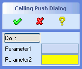 |
(sd-defdialog 'calling_push_dialog
    :dialog-title "Calling Push Dialog"
    :variables
     '((DO_IT      :push-action (progn)
                   :title "Do it"
                   :subaction-name a_non_embedded_subaction
                   :default (list parameter1 parameter2)
                   :after-input
                     (setq parameter1 (first do_it)))
       (PARAMETER1 :value-type :display-only)
       (PARAMETER2 :value-type :string))
    :ok-action
     '(pprint (list do_it parameter1 parameter2)))
|
The value returned by the subaction is assigned to the
:push-action variable, that is, to DO_IT in the
above example, and can be of any arbitratry LISP type.
The above subaction contains two additional variables, called
ACCEPT and ABORT, that control the positive and
negative completion of the subaction, by means of the local macros sd-accept-dialog and sd-abort-dialog.
Further dialog options for a subaction are as follows:
T.nil, the subaction UI will appear in
a separate non-embedded window, provided :taskBarPage is set to nil.:embedded-ui to
nil to achieve best UI display performance. This choice has
no impact on the UI appearance, unless the options
:embedded-location or :taskBarPage have also
been specified. If :embedded-location is specified in the
calling variable, then :embedded-ui should be set to
t, the default. If :taskBarPage is set to
nil in the subaction, then :embedded-ui should
be set to nil as well.:close-behavior are
:no-cancel, the default, causes the subaction window
to disappear without exiting the subaction.:cancel causes the subaction window to disappear. The
subaction will be cancelled together with the calling dialog(s).:x-offset in the calling
variable.:y-offset in the calling
variable.t then the
:help-action defined in the subaction will be used when the
subaction is active.The following example illustrates a subaction with an embedded UI.
Note that this is the default case, hence the keyword
:embedded-ui need not be specified.
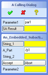 |
(sd-defdialog 'an_embedded_subaction
    :dialog-type :subaction
    :variables
     '((STRING_1 :value-type :string
                 :initial-value (extract-first-string default))
       (A_PART   :value-type :part)
       (STRING_2 :value-type :string
                 :initial-value (extract-second-string default))
       (ACCEPT   :push-action (sd-accept-dialog)
                 :toggle-type :grouped-toggle)
       (ABORT    :push-action (sd-abort-dialog)
                 :toggle-type :grouped-toggle))
    :ok-action
       '(subaction-ok-action string_1 string_2))

(sd-defdialog 'a_calling_dialog
    :dialog-title "A Calling Dialog"
    :variables
     '((PARAMETER1 :value-type :string)
       (RESULT     :value-type :string
                   :title "SA Result"
                   :subaction-name an_embedded_subaction
                   :embedded-location parameter2
                   :default result)
       (PARAMETER2 :value-type :string))
    :ok-action
       '(show-my-subaction-results result parameter1 parameter2))

(defun extract-first-string (a-str)
 (when (sd-string-p a-str) (car (sd-string-split a-str " "))))
(defun extract-second-string (a-str)
 (when (sd-string-p a-str) (cadr (sd-string-split a-str " "))))
(defun subaction-ok-action (str1 str2)
  (format nil "~A ~A" str1 str2))
(defun show-my-subaction-results (res p1 p2)
 (display
  (format nil "~%Result : ~A~%Param1 : ~A~%Param2 : ~A~%"
          res p1 p2)))
|
Subactions can be used to implement top level dialogs that have very
similar functionality but minor differences in behavior and in the user
interface. The following example illustrates two dialogs abc
and bcd that call the same subaction
visible_subaction with different sets of visible variables. The
two dialogs abc and bcd are essentially wrappers
that call the subaction in it's different variations:
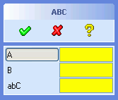
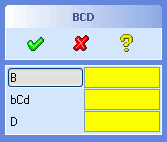 |
(sd-defdialog 'visible_subdialog
   :dialog-type :subaction
   :embedded-ui nil  ;;since calling dialog has no UI
   :variables
     '((A   :value-type :number
            :initial-visible (getf default :a-visible))
       (B   :value-type :number
            :initial-visible (getf default :b-visible))
       (C   :value-type :number
            :initial-visible (getf default :c-visible))
       (D   :value-type :number
            :initial-visible (getf default :d-visible)))
   :after-initialization
     '(progn
        (sd-set-dialog-title (getf default :dialog-title))
        (sd-set-variable-status 'c :title (getf default :c-title)))
   :ok-action '(format nil "~A-~A-~A-~A" a b c d))

(sd-defdialog 'caller_abc
   :dialog-control :sequential
   :variables
   '((DUMMY :value-type :string
            :subaction-name visible_subdialog
            :default '(:a-visible t
                       :b-visible t
                       :c-visible t :c-title "abC"
                       :d-visible nil
                       :dialog-title "ABC"))))

(sd-defdialog 'caller_bcd
   :dialog-control :sequential
   :variables
   '((DUMMY :value-type :string
            :subaction-name visible_subdialog
            :default '(:a-visible nil
                       :b-visible t
                       :c-visible t :c-title "bCd"
                       :d-visible t
                       :dialog-title "BCD"))))
|
Note that the top level dialogs abd and bcd
possess a variable called DUMMY that is immediately entered
when the dialog is instantiated. That variable then launches the subaction
together with its initial values, as specified via the options
:subaction-name and :default.
Since the calling dialogs abc and bcd have no
UI, the subaction visible_subdialog must be specified to be
non-embedded.
All load and save commands in Creo Elements/Direct Modeling are triggered from a common File Manager. The file manager displays all the files which match with the currently active file type patterns within a directory.
The selection of a file type in the file manager triggers an associated command. That command will then receive all further input, either from the file manager or from other input sources - like the input area or mouse picks in a viewport.
In some cases the selection of the file type enables the 'Options' button that allows the user to view and specify further command-related parameters.
In save commands, the file manager also displays a a 'Select' button and a list region that contains the objects to be saved.
The last file type of the load file manager, named "All", triggers the so-called universal load command. This command compares the entered file name with the registered file type patterns and loads the file with the dialog that has a matching pattern. If the given file does not match with any of the patterns, then a predefined set of load commands are blindly executed until one of them succeeds.
The universal load command is executed when files are dragged and dropped into Creo Elements/Direct Modeling.
This section describes how to register a new load or save command to the
file manager by specifying further options to the sd-defdialog
definition.
File types can also be registered explicitly, thus supporting more sophisticated situations (see File Manager Customization).
The macro SD-DEFDIALOG supports the connection of a filename
and a selection variable with the file manager.
Consider the following simple examples:
    (sd-defdialog 'my_load_command
       :filing-variables '(load_file)
       :file-type :my-file-type
       :variables
         '((LOAD_FILE :value-type :filename)
           (OPTION_1  :value-type :boolean)
           (OPTION_2  :value-type :number))
       ...)

    (sd-defdialog 'my_save_command
       :filing-variables '(save_file save_part)
       :file-type :my-file-type
       :variables
         '((SAVE_FILE :value-type :filename)
           (SAVE_PART :value-type :part)
           (OPTION_X  :value-type :boolean)
           (OPTION_Y  :value-type :number))
       ...)
The variables listed in :filing-variables are connected to the UI
of the file manager. The first command, my_load_command, possesses a
filing variable, LOAD_FILE, of the type :filename in the
:filing-variables list and is therefore a candidate to be
inserted into the load file manager. The second command,
my_save_command, contains both a :filename variable and
a selection variable in the :filing-variables list and is
therefore a candidate to be inserted into the save file manager.
The variable definitions in :variables remain untouched by
the file manager connection. However, some of the special keywords valid for
:filename have no effect, when the variable is connected to a
file manager.
Dialog variables that are not included in :filing-variables
and are visible can be displayed on request by pressing the Options button
in the file manager. Thus, for example, the variables OPTION_1 and
OPTION_2 are displayed on request in the Options window.
The keyword :file-type triggers the registering of the file type which in turn inserts the entry, e.g. my-file-type, into the file type list of the appropriate file manager. The selection of the file type my-file-type in the load file manager causes the command my_load_command to execute. The save file manager causes the command my_save_command to execute.
The file variable that has been connected to the file manager, via the
:filing-variable list, has a special behavior, that differs
from normal :filename variables. As soon as a value has been
assigned to such a file variable, the dialog immediately enters the
:ok-action.
The presence of the two keywords :filing-variables and
:file-type suffice in order to connect a dialog to the file
manager.
However, a number of further keywords generally need to be specified to more precisely control the file type registration, thus overriding default values:
  Property                        Default               Example of Default

  :file-type-title                file-type            "MY-FILE-TYPE"
  :patterns                       (*.file-type)        ("*.my-file-type")

  :in-cmd-file-type-match         nil                  nil
  :out-cmd-file-type-match        nil                  nil
  :override-elements-text         nil                  nil
  :attempt-in-form-with-any-file  nil                  nil
  :exclude-from-universal-load    nil                  nil
  :universal-load-with-user-units nil                  nil

  :enable-form                    t                    t
  :display                        t                    t

  :in-patterns                    nil                  nil
  :out-patterns                   nil                  nil
  :in-display                     t                    t
  :out-display                    t                    t
  :in-enable-form                 LISP-form            nil
  :out-enable-form                LISP-form            nil
  :in-form                        generated_by_sd-defdialog
  :in-title                       nil                  nil
  :out-title                      nil                  nil
  :in-cmd-show-options            nil                  nil
  :out-cmd-show-options           nil                  nil

  :auto-complete-on-filename      :action-routine
  :allow-old-revision             nil
  :allow-load-as-version          nil
See Connection to File Manager for explanations of these options.
If the same file type is used in both a load and a save command, then the
above parameters will be shared between the two dialogs. Thus, it is then
sufficient to specify the parameters :file-type-title,
:patterns, :enable-form (or :display)
in any of the two dialogs.
If the keyword :filing-variables is supplied and
:file-type is not supplied, then the dialog will not be linked
to the file manager and is rather useless. However, in this case, the
registration can be established explicitly by means of one of the
registering functions, e.g. sd-register-file-type (see File Manager Customization).
The functionality described in this section is based on a Persistent Data Storage (PDS) system that is used within Creo Elements/Direct Modeling, e.g. for storing module data.
Values of persistent dialog variables are stored from one interactive dialog invocation to the next and from one Creo Elements/Direct Modeling session to the next Creo Elements/Direct Modeling session.
The variable option
:persistent-data-storage {t nil :session :simple :session-simple} ; default = nil
can be used to persistently store the value of that dialog variable:
t will store and reinsert a variable value
within a session and across sessions.:session will store the variable value during a
session but not across sessions.:simple and :session-simple are
alternatives to t and :session, respectively,
that employ a simpler and faster value insertion technique but that have
some limitations (see below description of Simple Method).The following kinds of variables support persistent storage:
The following kinds of variables should not use persistent data storage:
Values of persistently stored variables are set aside within working memory each time the dialog is interactive and is terminated via OK or CANCEL. If storage across sessions is required, then the values are stored to the file system when Creo Elements/Direct Modeling is exited. The storage file is all_data.lsp in the user customization directory.
Two strategies are available to insert a persistent value:
:persistent-data-storage is
t or :session:initial-value, :after-initialization
and :after-initialization-ui - are executed in the usual way,
i.e. without reference to persistent values. Afterwards - once the
interactive state is reached - the persistently stored values are entered
into the dialog by means of the put-buffer approach, which is equivalent
to a user input. The insertion of the persistently stored value triggers
the standard options - like :before-input,
:check-function, :after-input, and
:after-input-ui - thus ensuring a consistent dialog
state.:persistent-data-storage is
:simple or :session-simple:initial-value and :after-initialization (but
not :after-initialization-ui) are executed in the usual way,
without reference to persistent values. The persistently stored values are
inserted by means of the call (sd-set-variable-status ... :value ...)
immediately after the execution of the :after-initialization
code. This call incorporates the :before-input,
:check-function and :after-input code but not
the :after-input-ui code of the persistent variable.The following behavior applies to both methods:
sd-call-cmds wrapper.Note: In order to reduce the volume of persistently stored data
and to reduce the overall dialog initialization effort, values are only
stored and inserted if they differ from the internal dialog specific initial
values (as specified by the :initial-value and the
:after-initialization code).
  :persistent-proposals {t nil :session}  ;default = :session
                                          ;(when applicable)
controls the persistent storage of proposals.
This option is only applicable if :auto-add-proposals is set to
t, in which case :persistent-proposals is by
default set to :session, thus making the proposals persistent
during a user session but not between sessions.
The indicators of mutually excluded variables can be made persistent via the following dialog option:
:mutual-exclusion-persistent-data-storage {BOOLEAN or LIST-of-BOOLEANS [nil]}
(see here for more details).
Persistent dialog data only contains user input and is by default stored in the top level user customization directory. Alternatively, the dialog data can be stored in a subdirectory of the top level user customization directory by means of the following dialog option:
:persistent-data-storage-module {STRING} ; default="ALL"
The supplied string must correspond to a predefined application that is supported by the PDS system, as described in the readme.txt file in the user customization directory. A new application and its associated subdirectory (and other parameters) can be generated by means of the function sd-add-application-data.
:persistent-data-storage-variant-variable dialog-variable ; default = nil
supports multiple sets of persistently stored values. The value of
dialog-variable must be a keyword and must be defined at
initialization time before the dialog becomes interactive (that is, before
the persistent values are inserted into the dialog variables). The variant
variable need not have the :value-type :keyword.
Each keyword value of dialog-variable is associated with a separate set of persistent values.
Consider the following dialog
(sd-defdialog 'pds_variant
  :persistent-data-storage-variant-variable 'mode
  :variables
   '((MODE :value-type :keyword)
     (BOOL :value-type :boolean
           :persistent-data-storage t)
     (NUM  :value-type :number
           :persistent-data-storage t)))
This dialog can, for example, be initialized by command inputs that
specify arbitrary keywords for the MODE variable, e.g.
"pds_variant :mode :on" and "pds_variant :mode :off"
The MODE variable is intialized before the dialog becomes
interactive. The above two calls lead to two sets of persistently stored
values, one for the mode :on and another one for the mode
:off.
Variant variables can also be used in subactions in order to adapt
persistent initial values of the subaction to the calling dialog. This can
be used as an alternative to passing a DEFAULT argument to the
subaction.
(sd-defdialog 'pds_sub_variant
  :persistent-data-storage-variant-variable 'mode
  :dialog-type :subaction
  :variables
    '((MODE :initial-value (getf default :mode))
      (S :value-type :string
         :persistent-data-storage t)
      (B :value-type :boolean
         :persistent-data-storage t)
      (D :value-type :face)))


(sd-defdialog 'my_pds_with_sub_on
  :variables
   '((BOOL :value-type :boolean
           :initial-value t
           :persistent-data-storage t
     )
     (SUB :value-type :list
          :subaction-name pds_sub_variant
          :default '(:mode :on))
    ))

(sd-defdialog 'my_pds_with_sub_off
  :variables
   '((BOOL :value-type :boolean
           :initial-value t
           :persistent-data-storage t
     )
     (SUB :value-type :list
          :subaction-name pds_sub_variant
          :default '(:mode :off))
    ))
The global function sd-get-pds-variable-value provides a means to freely access the persistent value of a dialog variable.
See 3.3 3D Copilot Functions, drag options or quickview options or separate document 3D Copilot.
T and
NIL: character that refers to a
non-existing package, e.g. foo:variable_1 is illegal
unless the symbol variable_1 is exported from the package
foo.A large number of commonly desired variable names for object selections (like :value-type = :part or :value-type = :face) are internally reserved. The following list contains reserved object selection variable names that should not be used within a dialog definition:
PARTFACEsd-defdialogs and
:variables should contain underscores rather than hyphens.
For example, BEND_RADIUS or SHEET_THICKNESS
comply with the Creo Elements/Direct Modeling standard, while
BEND-RADIUS and SHEET-THICKNESS do not.
The above compatibility only applies for a variable that is visible on the screen and is associated with an input token.
:variables names are case-insensitive, e.g. the
following names QE_PART, QE_Part,
qe_ParT, and qe_part all refer to the same
variable.
For the sake of enhanced readability, a variable requiring user input should be written in capital letters while the other variables are written in small letters. A variable once written in capital letters should be written consistently throughout the whole dialog definition code.
:local-function names are case-insensitive, like all
LISP symbols. In this document, the definition of a local function are
written in capital letters, while the calls to this function are written
in small letters. Dialog variables and local function are hence treated in
the same way.
An application file can contain any number of sd-defdialog
forms as well as arbitrary other LISP forms.
It is highly recommended to give the application file the
.lsp extension, which is standard for LISP source files.
All application code should be specified within a private application
package. The name of the package is typically defined as a keyword, for
example :foo or :application. The introduction of
a private package eliminates the chance of an unintended symbol conflict
with existing Creo Elements/Direct Modeling functions and global variables.
All functions and global variables can be named freely within the private
package, as long as they do not coincide with the imported symbols.
The following setup procedure handles all the necessary package definitions and relations:
      (in-package :my-dialog-package)  ;specify own package
      (use-package :oli)               ;import all exported :oli symbols

      (sd-defdialog 'my_dialog_name    ;define first dialog
            ...)

      (defun my-function (arg1 arg2)   ;an application specific function
            ...)
(load my-dialog-file) ;load own application
Note that the application file imports all exported symbols from the
package called :oli, which includes the symbol
sd-defdialog. The symbol my_dialog_name will
automatically be exported from :my-dialog-package (like all
action routines), thus making it accessible for the Creo Elements/Direct
Modeling ribbon bar.
All symbols of the private dialog package must be called with a package
qualifier when being accessed from the prompt area of Creo Elements/Direct
Modeling during testing. For example, the function my-function,
can be called from the prompt area via (my-dialog-package::my-function
1 2).
A dialog can be defined within a lexical scope, e.g. as follows:
      (in-package :my-dialog-package)
      (use-package :oli)

      (let ((my-variable nil))
        (sd-defdialog 'my_dialog_name
           ... manipulate my-variable ...)
        (defun my-function ()
           ... manipulate my-variable ...)
      )
Warning: The compilation of a file that contains a dialog definition within a lexical scope can cause the dialog generator system to become inconsistent. After compiling such a dialog file, it is therefore recommended to load the source or compiled file before referencing the dialog interactively or referencing it as a subaction call in some other dialog.
![Integration Kit What's New [Integration Kit What's New]](../Nav02_WhatsNew.png) |
| © 2024 Parametric
Technology GmbH (a subsidiary of PTC Inc.), All Rights Reserved |