Using a Filter
PTC Arbortext Content Delivery enables you to use a filter for a product that controls the content displayed in the interface. You can restrict the available product information based on things such as the type of accessories.
 |
Objects with the specific filter get filtered out and those with no filter applied, are displayed.
|
Setting the Filters
PTC Arbortext Content Delivery supports the following types of filters on the UI:
• Context filter: This is the default filter that gets applied when you select a specific product. This limits the search to a specific context. For more information, see Finding a Place in the Product Hierarchy.
• Serial Number filter: This filter allows filtering the content based on a specific serial number and a context. Click inside the  box at the top of the interface and enter the serial number. For more information, see Finding a Serial Number.
box at the top of the interface and enter the serial number. For more information, see Finding a Serial Number.Once a serial number is set, the filter displays the content when the object has the specified serial number or a serial number range applied, or no range applied on the object.
| | If your data contains serial number ranges that are either numeric or alphanumeric, those get filtered.For example, you can use range as: • SN001~SN100 • SNABC~SNXYZ This is applicable for the Date filter too. |
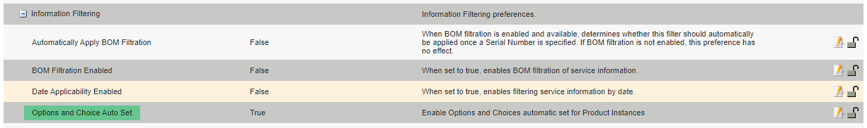
• Options and Choices filter: This filter allows filtering the content based on options and choices applied on the objects. The options and choices are auto-populated on the filter flyout based on the product hierarchy (PH logical expression), or product hierarchy and Serial Number (PH+PI logical expression) based on enabling or disabling the Options and Choice Auto Set preference under Information Filtering in the Administration Preferences. For more information, see the Preferences topic in the PTC Arbortext Content Delivery Administration Help Center. The default value is True.
◦ If the Options and Choice Auto Set preference value is set to true, when you select a serial number (SN), the options and choices auto set is based on the PH+PI logical expression considering the options and choices of PI are the subset of PH. The filter results are based on these options and choices.For example, PH1 has options and choices as COLOR = RED, BLUE, GREEN and PI1 (SN) has COLOR = RED, BLUE. If you select PI1 (SN), only RED and BLUE options are auto set on the Filter flyout.If you select only PH1 and not PI1 (SN), RED, BLUE, and GREEN all are auto set on the Filter flyout.
In the above case, you can remove all the filters by clicking Clear All. If you remove all the options and choices from the Filter flyout and click Apply, the filter result is displayed irrespective of the options and choices.
You can modify the existing options and choices individually. In this case, the filter result is visible based on the set of the options and choices available on the Filter flyout.
If you click Back to Default, the default options and choices based on the PH+PI logical expression is auto set on the Filter flyout and the filter results are displayed based on it.
| | • The default value of the Options and Choice Auto Set preference is true and this is applied unless it is set to false by the administrator. • The the default Options and Choices get auto set based on the Serial Number (SN) or product. The custom filter is applied only for the selected SN or product. When you switch to a different SN or product, the default Options and choices will get auto set. • When you click Back to Default, the filter result is modified only after you click the Apply button. |
◦ If the Options and Choice Auto Set preference value is set to false, the option and choices are auto set based on the product hierarchy (PH logical expression) or the product.For example, PH1 has options and choices as COLOR = RED, BLUE, GREEN , if you select PH1, RED, BLUE, and GREEN all are auto set on the Filter flyout
In the above case, you can remove all the filters by clicking Clear All. If you remove all the options and choices from the Filter flyout and click Apply, the filter result is visible irrespective of the options and choices.
You can modify the existing options and choices individually. In this case, the filter result is visible based on the set of the options and choices available on the Filter flyout.
If you click Back to Default, the default options and choices based on the PH logical expression is auto set on the Filter flyout and the filter results are displayed based on it.
Click the  drop-down to select the specific options and choices that are applied on the selected product hierarchy model as shown in the following image.
drop-down to select the specific options and choices that are applied on the selected product hierarchy model as shown in the following image.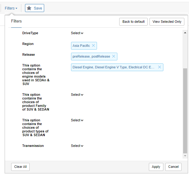
Set the options by which you want to filter by clicking the Select control beside the filter options and selecting the respective choices. Click the name of the filter to close it. When you are done setting your filters, click the Apply button. The filters are set and the only information that appears in the available content is that matching the filter values you have chosen. The View Selected Only button enables you to just display the filters for which you have set a value in the window.
| | Those objects that have the selected option but a different choices value from the one which you selected, gets filtered out. The objects that do not have an option selected get displayed. |
When you have filters turned on, the  option displays the number of set filters. Click the X to cancel the filter.
option displays the number of set filters. Click the X to cancel the filter.• Date filter: This filter allows filtering the content based on a specific date and context. Once a date is set it tries to show the content when the object has the specific date, or a date range applied, or no range applied on the object. Click the  option to open a calendar where you can choose a date. When the date is set, it appears in the option as
  .
.
option to open a calendar where you can choose a date. When the date is set, it appears in the option as .| | By default, the Date filter is disabled. You must enable it from the administration Preferences by setting the Date Applicability Enabled property to True in the Information Filtering preference. |
Add-on Operations on Filters
• Enabling or Disabling a Filter:
When the filters are on, the filter slider is set to green: 
You can click the slider button to turn the filter off without canceling the filters: 
• Saving a Filter:
To save a filtered product, click on the Save button  to open the Save product window:
to open the Save product window: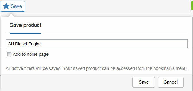
Click Save.
• Accessing a Filtered Product:
The filtered product is saved to the Products tab in your bookmarks:

Mobile Touch Interface
In the Filters flyout the list of options is aligned to the left. Tap the Select option to open the list of choices. To close the choices drop-down, tap outside the choices drop-down. Rest all functionality is like the desktop view.


Filter Panel Mechanism for the Mobile Touch Interface
• When you are on the home page and navigating to the IS node, the complete pane of filters is visible by default, as shown in the following image.

• If you set the SN in the SN search box, complete pane is again visible as shown in the following image.

• If you try to navigate to the content of IS node without any SN or prodcut name in the SN search, then the SN search box is collapsed showing only the expand collapse icon as shown in the following image.

• You can expand and collapse this pane by using the expand-collapse icon, shown in the following image.
