Add 2D Buttons
Now that you’ve completed the 3D portion of your experience, let’s add some 2D elements.
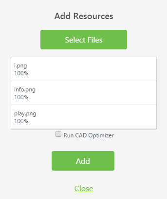
Add Resources
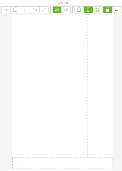
1. On the canvas toolbar, click 2D.
2. In the PROJECT pane, click the green + sign next to RESOURCES.
3. The Add Resource window appears.
4. Navigate to the location where you extracted the contents of the BluePumpKit.zip file.
5. Use the Ctrl key to select the following files:
◦ play.png—the image used to activate the disassembly/re-assembly animation
◦ info.png—the image used to display or hide the Warranty information card
◦ i.png—the image used to display or hide the 3D Label
6. Click Open.
7. Click Add on the Add Resource window.
8. Click Close on the Add Resources window.
Add Buttons
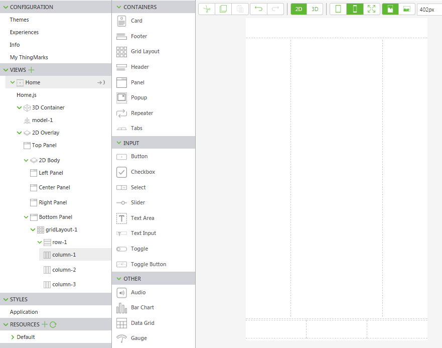
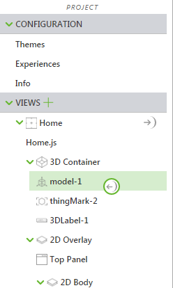
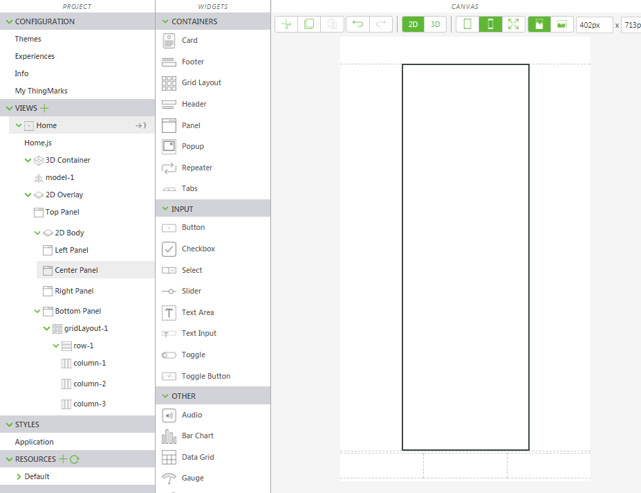
1. In the PROJECT pane, navigate to > > .
2. Drag and drop a Grid Layout widget onto the bottom panel.
| Scroll down on the canvas to view the bottom panel. |
3. In the PROJECT pane, navigate to > > > > > , click row-1 to select it.
4. In the DETAILS pane, click on Add Column two times. The bottom panel is now divided into three equal sections.
5. Select the first column on the canvas, or click column-1 in the project tree.
6. In the DETAILS pane, set Alignment to Center.
7. Repeat this process for column-2 and column-3, setting their Alignment to Center as well.
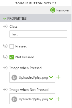
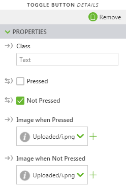
8. Drag and drop a Toggle Button widget into the first column.
| There are both a Button widget and Toggle Button widgets; make sure you use Toggle Button. |
9. In the DETAILS pane, change both Image when Pressed and Image when Not Pressed to the play.png image using the drop-down menu under the fields.
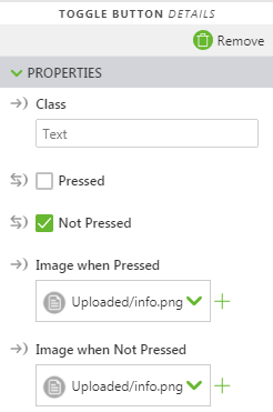
10. Drag and drop a Toggle Button widget into the second column.
11. In the DETAILS pane, change both Image when Pressed and Image when Not Pressed to the info.png image using the drop-down menu under the fields.
12. Drag and drop a Toggle Button widget into the third column.
13. In the DETAILS pane, change both Image when Pressed and Image when Not Pressed to the i.png image using the drop-down menu under the fields.
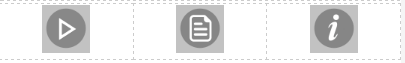
14. Your button layout should look similar to this:
Bind the Toggle Buttons
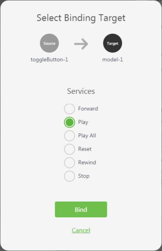
1. Select the toggle button in the first column, or click toggleButton-1 (Play icon) in the project tree.
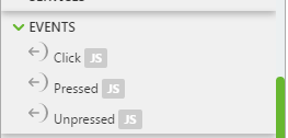
2. In the
DETAILS pane, scroll down to the
Click event and drag the binding icon

next to the
Click event and drop it onto
model-1 in the project tree.
3. On the Select Binding Target window, select Play.
Now, whenever the Play toggle button is pressed, the Blue Pump’s disassembly animation plays. If you press the Play toggle button again, the pump reassembles.
4. Next, create an overlay section that we can selectively hide or display.
5. On the canvas, click on the Center Panel to select it.
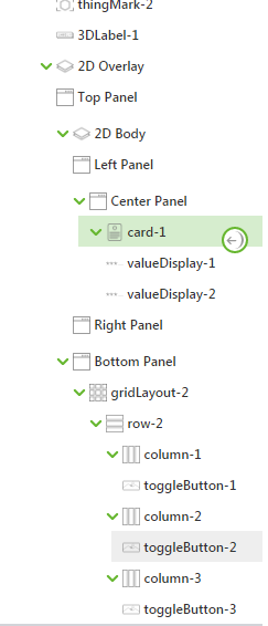
6. Drag and drop a Card widget into the Center Panel in the canvas area. This creates a static area onto which we can then add additional widgets.
7. Drag and drop two Value Display widgets onto the Card in the Center Panel.
8. Click on the top Value Display to select it or select valueDisplay-1 in the project tree.
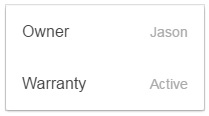
9. In the DETAILS pane, enter Owner in the Label field.
10. In the same manner, enter your own name in the Value field.
11. Click on the bottom Value Display to select it or select valueDisplay-2 in the project tree.
12. Enter Warranty Status in the Label field.
13. Enter Active in the Value field.
14. Since we have our Card widget, let’s bind a button to it that we can use to make it visible or invisible. Select the toggle button in the second column, or click toggleButton-2 in the project tree.
15. Make sure that the checkbox beside Pressed is not selected. This causes the toggle button to start out not-pressed, so that your Warranty Info Card is not visible to begin with.
16. In the
DETAILS pane, drag the binding icon

next to
Pressed and drop it onto
card-1 in the project tree.
| There are two different Pressed sections under DETAILS. For this step, select the Pressed at the very top of the DETAILS pane. |
17. In the Select Binding Target window, select Visible.
Now, whenever the Info toggle button is pressed in Vuforia View, the Card that you’ve created becomes visible or invisible. This is a great way to get more information into your AR experience without using up screen real estate.
18. Next, let’s make the last toggle button hide or display the 3D Label. Select the toggle button in the third column or click toggleButton-3 in the project tree.
19. Ensure that the checkbox beside Pressed is selected. This causes the toggle button to start out pressed so that your 3D Label is visible from the start.
20. In the
DETAILS pane, drag the binding icon
next to
Pressed and drop it onto
3DLabel-1 in the project tree.
| There are two different Pressed sections under DETAILS. For this step, select the Pressed that is at the very top of the DETAILS pane. |
21. On the Select Binding Target window, select Visible.
Now, whenever the i toggle button is pressed in Vuforia View, the 3D Label you’ve created becomes visible or invisible each time you press it.
