Weibull Probability Plots
Weibull analysis studies the relationship between the life span of a component and its reliability by graphing life data for an individual failure mode on a Weibull probability plot. Weibull analysis is most often used to describe the time to failure of parts. These can be light bulbs, ball bearings, capacitors, disk drives, printers or even people. Failure modes include cracks, fractures, deformations or fatigue due to corrosion, excessive physical stress, high temperature, infant mortality, wear-out, etc..
When plotting the time-to-failure data on a Weibull probability plot, engineers prefer using median rank regression as the parameter estimation method. Median rank regression finds the best-fit straight line by using least squares regression (curve fitting) to minimise the sum of the squared deviation (regressing X on Y). Median rank regression is considered the standard parameter estimation method because it provides the most accurate results on the majority of data sets.
Typically, the horizontal scale (X-axis) measures the component age, and the vertical scale (Y-axis) measures the cumulative percentage of the components that have failed by the failure mode under consideration.
A Weibull probability plot has a linear/nonlinear time-scale along the abscissa and another nonlinear scale for the distribution function along the ordinate. These nonlinear scales are selected in such a way that the model used for data is an appropriate one. If the scales match the data, the graph turns out to be a straight line. Because of their simplicity and usefulness, probability graphs have been used for many years in statistical analysis. However, it must be noted that the probability plotting methods to derive distribution parameters are independently and identically distributed. This is usually the case for non-repairable components and systems but may not be true with failure data from repairable systems.
In Figure 7-1, the Weibull probability plot considers the times to failure for a unique failure mode. When a number of parts are tested under normal operating conditions, they do not all fail at the same time for the same cause. The failure times for any one cause tend to concentrate around some average, with fewer observations existing at both shorter and longer times. Because life data is distributed or spread out like this, they are said to follow a distribution. To describe the shape of a distribution, which tends to depend upon what is being studied, statistical methods are used to determine a formula. If the plotted data points fall near the straight line, the Weibull probability plot is considered reasonable.
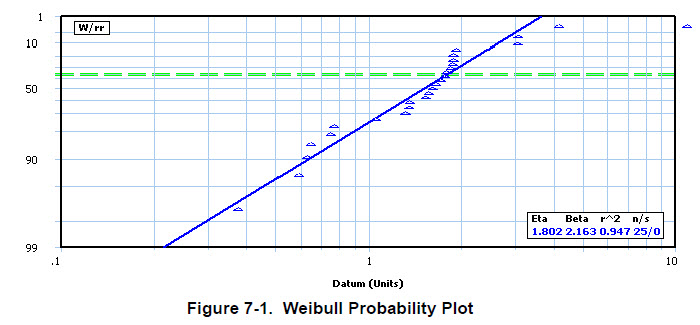
Although the Y-axis values are probabilities that go from 1 to 99, the distances between the tick marks on this axis are not uniform. Rather than being based on point changes, the distances between tick marks on both the Y and X axes of the Weibull probability plot are based on percentage changes. Known as a logarithmic scale, the distance from 1 to 2, which is a 100 percent increase, is the same as the distance from 2 to 4, which is another 100 percent increase. A logarithmic scale provides for like-to-like comparisons of several series. In addition to offering more insight into the problem, this visual representation helps to identify the distribution method that best fits a straight line to the data set. |
While the previous figure plots occurrences, it is very common to plot the age of components at failure. In these cases: