
 displays in the toolbar of the layout definition pane.
Edit the layout element information for the attribute group. | Edit the layout element information for the attribute group by adding or modifying the Group Display Name and Group Description. These fields are both optional. The Group Display Name, if specified, displays in the user interface for the screen types where the attribute layout is used. Ensure that the value entered for the Group Display Name provides a meaningful label for the group in the end-user user interface. If the attribute group is inherited, the inheritance icon  displays next to the Group Display Name field. The Group Display Name and Group Description can be changed on inherited attribute groups on an inherited attribute layout. displays next to the Group Display Name field. The Group Display Name and Group Description can be changed on inherited attribute groups on an inherited attribute layout. | ||||||
Make the attribute group the default group for the layout. | If you want new attributes created on the type to be automatically added to this attribute group, select the Make default group checkbox in the layout element information pane. Having a default group designated on an attribute layout is optional. There can be only one default group designated on an attribute layout. A group with a dynamic attribute cannot be a default group. (Translated text attributes are not automatically added to the default group.)
| ||||||
Set the attribute label display location for the attribute group. | Select the desired label location by clicking the appropriate icon in the toolbar of the layout definition pane: • Left • Top
| ||||||
Set the display behavior for attributes without values. | Select the desired display for attributes without values: • Show attributes without values • Hide attributes without values | ||||||
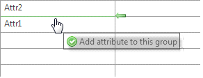
Add attributes to, reorder attributes within, or remove attributes from the attribute group. | Add attributes to the attribute group as needed. From the Available Attributes list, drag-and-drop individual attributes into the central attribute group display pane. When you hover over an available location with your mouse, an Add attribute to this group prompt appears.  Once an attribute is used in an attribute group, it is no longer available for use in any other attribute group in the same attribute layout.
Reorder the attributes within the attribute group. To arrange the attributes in the order you would like them to appear. drag-and-drop the attribute to the appropriate location in the table. When you hover over an available location with your mouse, a Reorder attribute prompt appears. 
To remove an attribute from the attribute group, drag-and-drop the attribute back to the Available Attributes list. Attributes can be moved to a different attribute group in the same attribute layout using drag-and-drop. If the attribute layout is inherited from a parent type, only attributes created on the subtype are included in the Available Attributes list, and can be added or removed from the attribute group pane. Inherited attributes in an attribute group are identified with the inheritance icon  . Inherited attributes cannot be removed from the group or moved to a new group, but can be reordered within the group using drag-and-drop if the display style for the attribute group is Organized in Grid. . Inherited attributes cannot be removed from the group or moved to a new group, but can be reordered within the group using drag-and-drop if the display style for the attribute group is Organized in Grid.
| ||||||
Set the display style for the attribute group. | Select the desired display style for the group: • Alphabetical List
• Organized in Grid The display style can be switched as needed.
| ||||||
Arranging attributes in the Organized in Grid display style | When using the Organized in Grid display style, you can further arrange the display of the attributes: • Attributes can be positioned in any open cell in the grid. Drag-and-drop an attribute from cell to cell until it is in the desired location. Blank cells can be left in the grid. If you drop an attribute in a cell in the last column on the right or the bottom row of the grid, an empty column or row is dynamically added to the grid. This empty row or column does not display in the client user interface. • Attributes can span multiple cells. Select an attribute, and click the edit size of selected attribute icon • Click the grow left icon
• If the selected attribute already spans more than one cell, you can shrink the size of the attribute by clicking the shrink left
| ||||||
Edit the display properties of an attribute within the attribute group. | To edit the display properties of an attribute within the attribute group, select the attribute and click the edit icon |