Toggle
What Does This Widget Do?
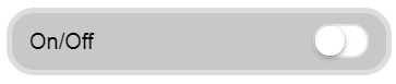
The Toggle widget is similar to the Checkbox widget, but follows the mobile convention, optimizing for touch.
When Should I Use This Widget?
Use a Toggle when you want to present the experience viewer with an option or setting that they can toggle on or off. For example, if you want to give a user an option to show or hide a toolbar bar, you could use a Toggle to display or hide the bar.
Are There Any Special Properties, Services, Events, or Actions?
This widget does not have any unique properties, services, or events.
To view a list of common widget properties, services, and events, see Common Widget Properties, Services, and Events.
The Widget in Action
Here’s an example of what your widget might look like!
|
Minimum Steps Required for Use
|
What It Looks Like
|
|---|---|
|
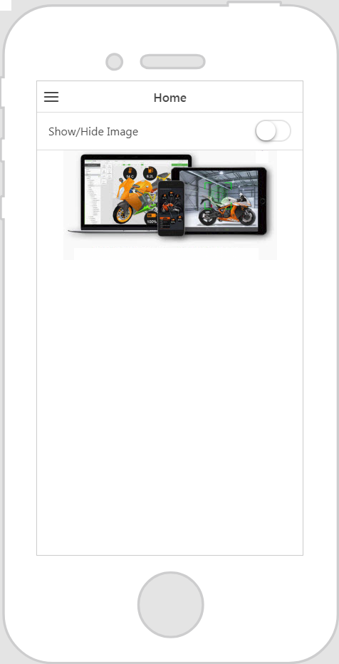
1. Drag and drop a Toggle widget onto the canvas.
2. Bind the Value property or Click event of the Toggle widget to another widget or service. For this example, we’ve bound the Value property of the Toggle widget to the image below it, and selected Visible on the Select Binding Target window. This will show or hide the image when the toggle is pressed.
|
 |
Style the Widget with CSS
You can use CSS to style the widget! The following is an example of a CSS class you could create and apply:
 |
Keep in mind that it’s best to give your classes unique names so they do not conflict with other classes or OOTB properties.
|
|
CSS Example
|
What It Looks Like
|
|---|---|
.ptc-toggle {
|
 |
For more information on implementing CSS classes, see Application Styles.