Time Series Chart
What Does This Widget Do?
The Time Series Chart widget is designed for use with time series data where the x-axis is time. This chart only supports line and/or point marker rendering.
|
|
Data must be bound to the Time Series Chart.
|
When Should I Use This Widget?
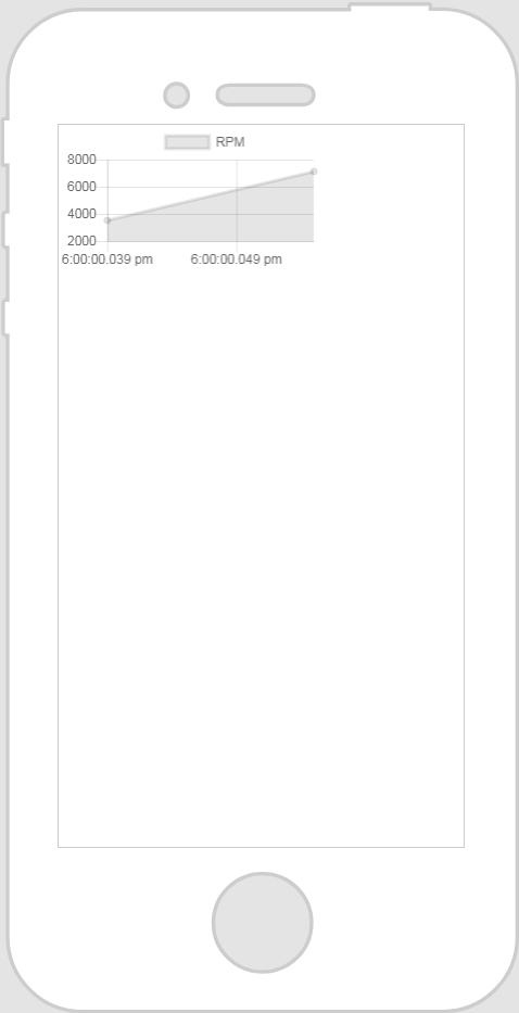
Use a Time Series Chart when you want to illustrate data points at consecutive intervals of time. For example, if you want to display a chart that shows the RPMs of a truck over the last hour, you could use a Time Series Chart widget and bind the RPM property of the connected truck to the widget as Data.
Are There Any Special Properties, Services, Events, or Actions?
To view a list of common widget properties, services, and events, see Common Widget Properties, Services, and Events.
|
Property
|
JavaScript
|
Type
|
Description
|
|---|---|---|---|
|
X-axis Field
|
labelsField
|
string
|
The data that displays for the X-axis of a chart. Manually enter the field name. For example, type “Name.”
|
|
Y-axis Field
|
valuesField
|
string
|
The data that displays for the Y-axis of a chart. Manually enter the field name. For example, type “User.”
|
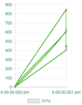
The Widget in Action
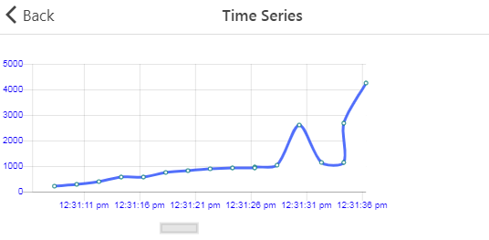
Here’s an example of what your widget might look like!
|
Minimum Steps Required for Use
|
What It Looks Like
|
|---|---|
|
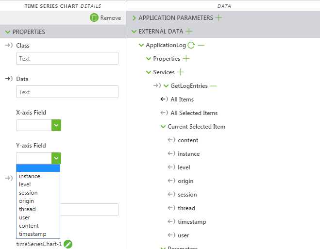
1. Drag and drop a Time Series Charts widget onto the canvas.
2. From the Data pane, search for an entity with a service that returns historical data.
3. Once the service has been added, drag and drop All Items onto the widget and select Data on the Select Binding Target window.
4. Select a property from the X-axis Field drop-down. In the example, we selected Speed.
5. Select a property from the Y-axis Field drop-down. In the example, we selected RPM.
|
 |
Assisted Configuration Fields After Binding ThingWorx Data
After you’ve bound ThingWorx data to the widget some fields are populated with options in a drop-down list. For example, if you bind All Items to the Time Series Chart widget and select Data on the Select Binding Target window, the X-axis Field and Y-axis Field properties populate with available options.
Style the Widget with JavaScript and CSS
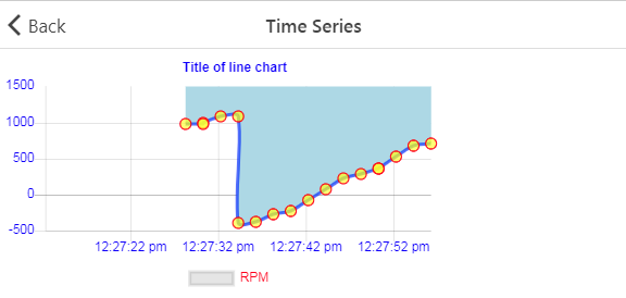
You can use JavaScript to style the widget! The following is an example:
|
|
Keep in mind that it’s best to give your classes unique names so they do not conflict with other classes or OOTB properties.
|
|
Example
|
What It Looks Like
|
|---|---|
|
Enter the following in the JavaScript editor:
// Chart Legends |
 |
|
Enter the following in the JavaScript editor:
1. Enter the following in the JavaScript editor:
// Time Series lines 2. Add the following class in the Application editor:
.ptc-TimeSeries {
3. Enter the new class in the Class field of the time series chart.
|
 |
|
1. Enter the following in the JavaScript editor:
Chart.defaults.global.legend.position="bottom"; 2. Add the following class in the Application editor:
.ptc-TimeSeries {
3. Enter the new class in the Class field of the time series chart.
|
 |
For a full list of properties that can be updated, see https://www.chartjs.org/docs/latest.
For more information, see Using JavaScript in Vuforia Studio and Application Styles.