Tabs
What Does This Widget Do?
The Tabs widget is a special type of container. Each tab within the widget has its own content. Only one tab can be visible at a time, although all tabs load their content for quick switching between tabs.
When Should I Use This Widget?
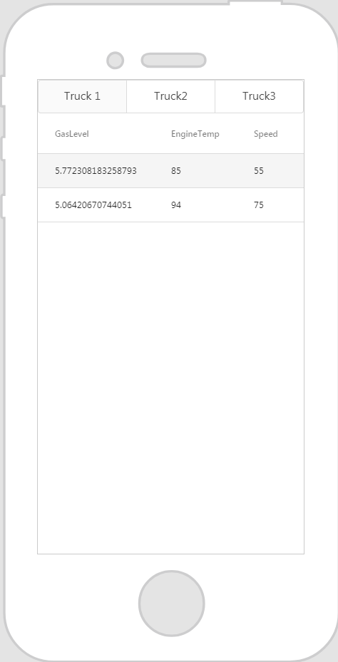
Use Tabs when you want to enable high-level content organization, such as switching between views, data sets, or functional aspects of an experience. For example, if you want to display data for three separate models of a truck, the Tabs would allow an experience viewer to easily switch back-and-forth between the information for all three trucks.
Are There Any Special Properties, Services, Events, or Actions?
To view a list of common widget properties, services, and events, see Common Widget Properties, Services, and Events.
The following tables list properties, services, and events that are specific to this widget.
|
Property
|
JavaScript
|
Type
|
Description
|
||
|---|---|---|---|---|---|
|
Tab Orientation
|
taborientation
|
string
|
Select Vertical or Horizontal.
|
||
|
Tab Padding
|
tabpadding
|
string
|
Sets the padding for the container that houses the tabs and the tab contents. Enter a number followed by one of the supported formats (for example, 10px):
• px
• %
• in
• mm
• cm
• ex
• em
• pt
• pc
If you want to set padding for the different tab contents, you can select them individually in the project tree and edit the individual padding properties.
|
||
|
Tab Strip Class
|
stripclass
|
string
|
Specifies a class specifically for the strip or bar of tabs.
|
|
Event
|
JavaScript
|
Description
|
|---|---|---|
|
Tab Click
|
clicktab
|
Drag the Tab Click event a model in the project tree. Click the JS icon next to the Tab Click event to enter an expression.
|
The following actions are available with this widget.
• Add Tab
If tabs have been added, the following properties are displayed for tabs:
|
Property
|
JavaScript
|
Type
|
Description
|
|---|---|---|---|
|
Title
|
title
|
string
|
Text shown on the tab.
|
The Widget in Action
Here’s an example of what your widget might look like!
|
Minimum Steps Required for Use
|
What It Looks Like
|
|---|---|
|
1. Drag and drop a Tabs widget onto the canvas.
2. Click Add Tab to add as many tabs as you like. For this example, we added two additional tabs.
3. Select a tab, and enter the tab name you want to display in the Title field.
4. Drag and drop the widgets you want displayed for that tab onto where it says Tab Content.
|
 |
Style the Widget with CSS
You can use CSS to style the widget! The following is an example of a CSS class you could create and apply:
 |
Keep in mind that it’s best to give your classes unique names so they do not conflict with other classes or OOTB properties.
|
|
CSS Example
|
What It Looks Like
|
|---|---|
.ptc-tabs .tab-strip-item {
|
 |
For more information on implementing CSS classes, see Application Styles.