Slider
What Does This Widget Do?
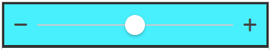
The Slider widget allows for input of numerical values using a slider control.
When Should I Use This Widget?
Sliders are great for adjusting settings that reflect a change in numeric value. For example, if you want to rotate a model within an experience, you could use a slider to specify the increments and degrees in which the model should rotate.
Are There Any Special Properties, Services, Events, or Actions?
To view a list of common widget properties, services, and events, see Common Widget Properties, Services, and Events.
The following table is a list of properties that are specific to this widget.
|
Property
|
JavaScript
|
Type
|
Description
|
|---|---|---|---|
|
Icon Left of Slider
|
iconleft
|
string
|
The icon that appears to the left of the slider.
|
|
Icon Right of Slider
|
iconright
|
string
|
The icon that appears to the right of the slider.
|
|
Maximum
|
max
|
string
|
Maximum acceptable value for the slider.
|
|
Minimum
|
min
|
string
|
Minimum acceptable value for the slider.
|
|
Step
|
step
|
string
|
Specifies the increment each time the slider is moved in either direction.
|
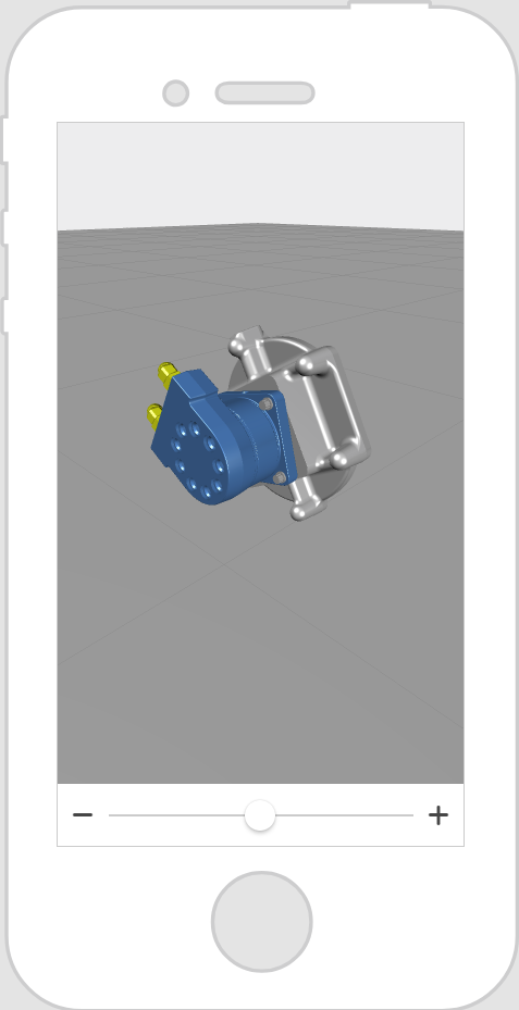
The Widget in Action
Here’s an example of what your widget might look like!
|
Minimum Steps Required for Use
|
What It Looks Like
|
||
|---|---|---|---|
1. From the 3D view, drag and drop a Model widget onto the canvas. Add the 3D model you want to display to the Resource field.
2. Navigate to the 2D view, and drag and drop a Slider widget onto the canvas.
3. In the DETAILS pane for the Slider widget, set the following properties:
◦ Maximum to 360
◦ Value to 0
◦ Step to 15
Maximum is the maximum increment in degrees, Value is the initial value that the slider is set to when the experience loads, and Step is the number of increments that are available on the slider. For example, if you want your model to be able to rotate a full 360 degrees, and you want the user to be able to move the slider to 15 different increments, set the properties as shown above.
4. Next, drag the binding icon
 next to the Value property, and drop it onto model-1 in the PROJECT pane. next to the Value property, and drop it onto model-1 in the PROJECT pane.5. On the Select Binding Target window, select Y Rotation. This ties the numerical value of the slider (0-360) to the angle of the rotation of the model around the Y-axis.
6. When you move the circle on the slider in Preview, the model will rotate left or right.
|
 |
Style the Widget with CSS
You can use CSS to style the widget! The following is an example of a CSS class you could create and apply:
 |
Keep in mind that it’s best to give your classes unique names so they do not conflict with other classes or OOTB properties.
|
|
CSS Example
|
What It Looks Like
|
|---|---|
.ptc-slider {
|
 |
.ptc-slider2 {
|
 |
For more information on implementing CSS classes, see Application Styles.