Label
What Does This Widget Do?
The Label widget can be used like a form label or as an area header, depending on how you use the text alignment and apply styles.
When Should I Use This Widget?
Use a Label when you want to include text within an experience. The Label can be used for just a simple one or two-word label, or for larger amounts of text as well.
Are There Any Special Properties, Services, Events, or Actions?
To view a list of common widget properties, services, and events, see Common Widget Properties, Services, and Events.
The following tables list properties, services, and events that are specific to this widget.
|
Property
|
JavaScript
|
Type
|
Description
|
||
|---|---|---|---|---|---|
|
Enable State-Based Formatting
|
enableStateFormatting
|
boolean
|
Allows you to format the widget based on state definitions that have been defined in ThingWorx.
If the checkbox is selected the following properties appear:
• Dependent Field
• State Definition
For example, if a label has a State Definition value of error, the label turns red.
For more information about style and state definitions in ThingWorx, see Style and State Definitions in the ThingWorx Help Center.
|
||
|
Dependent Field
|
stateFormatValue
|
string
|
This property is visible if the Enable State-Based Formatting checkbox is selected. For more information about style and state definitions in ThingWorx, see Style and State Definitions in the ThingWorx Help Center.
|
||
|
State Definition
|
stateFormat
|
boolean
|
This property is visible if the Enable State-Based Formatting checkbox is selected. For more information about style and state definitions in ThingWorx, see Style and State Definitions in the ThingWorx Help Center.
|
||
|
Wrap Label Text
|
wrap
|
boolean
|
When this checkbox is selected, the label text is allowed to wrap.
|
The Widget in Action
Here’s an example of what your widget might look like!
|
Minimum Steps Required for Use
|
What It Looks Like
|
||
|---|---|---|---|
|
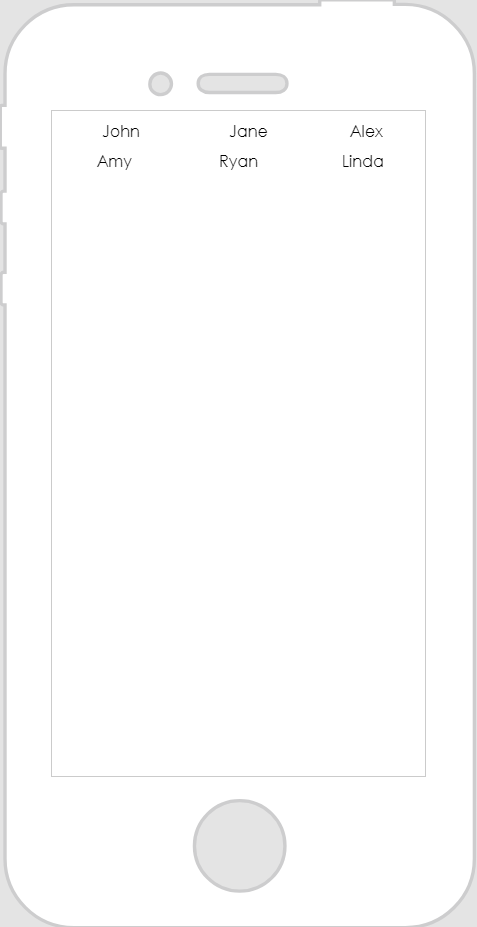
1. Drag and drop a Label widget onto the canvas. For this example, we’ve placed labels in cells of a Grid Layout widget.
2. Enter the text you want displayed in the Text field.
|
|
Style the Widget with CSS
You can use CSS to style the widget! The following is an example of a CSS class you could create and apply:
 |
Keep in mind that it’s best to give your classes unique names so they do not conflict with other classes or OOTB properties.
|
|
CSS Example
|
What It Looks Like
|
|---|---|
.ptc-label {
|
 |
For more information on implementing CSS classes, see Application Styles.